A native Mac app for running multi-angle voice-assistant studies
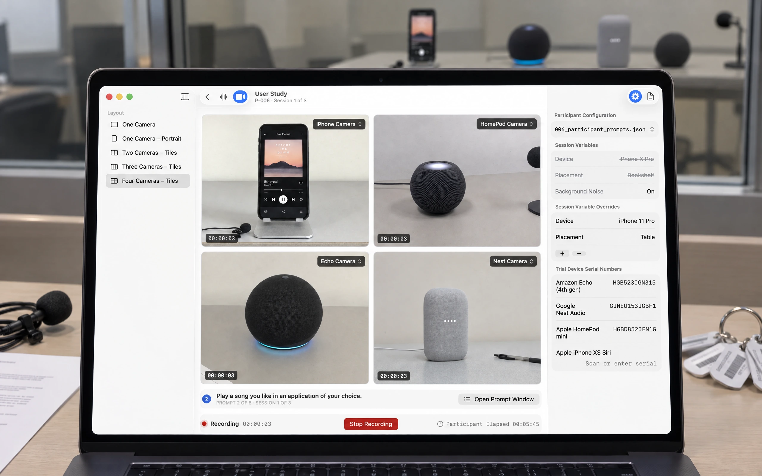
Running user research at scale is a logistics problem as much as a research one. Between juggling devices, camera angles, recordings, and notes across tools that were never meant to work together, it's the setup overhead — not the thinking — that caps how many sessions a team can actually run.
User Study attacks that overhead. It's a native Mac app I designed for Apple, for the researchers running voice-assistant usability sessions — training, testing, and comparing assistants across devices — that brings multi-angle capture into one place, so researchers spend their time on participants instead of on rigging. I led design 0→1, building the tool around the realities of running back-to-back sessions.
Role
I led product design from 0→1, designing the native Mac experience around the realities of running back-to-back, multi-angle research sessions.
A closer look, screen by screen
Every angle on one screen
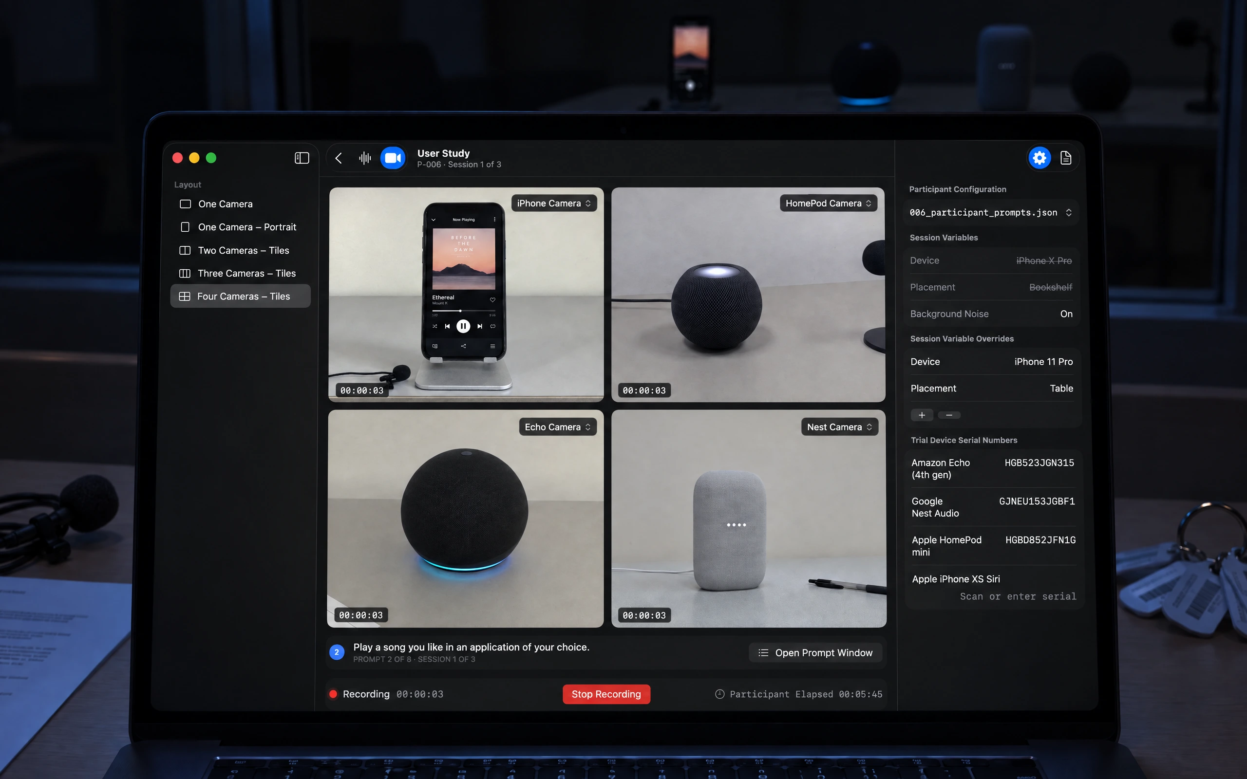
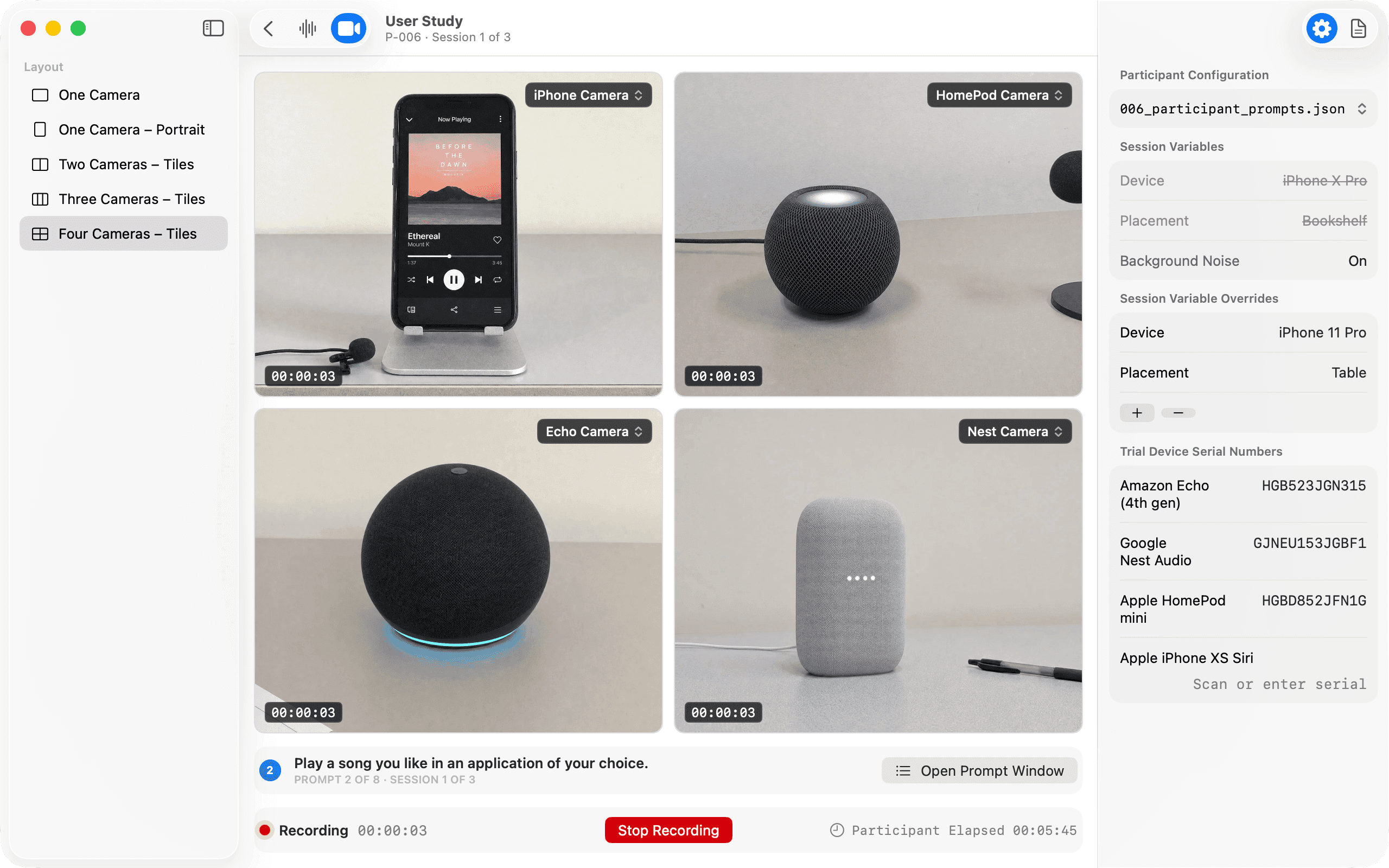
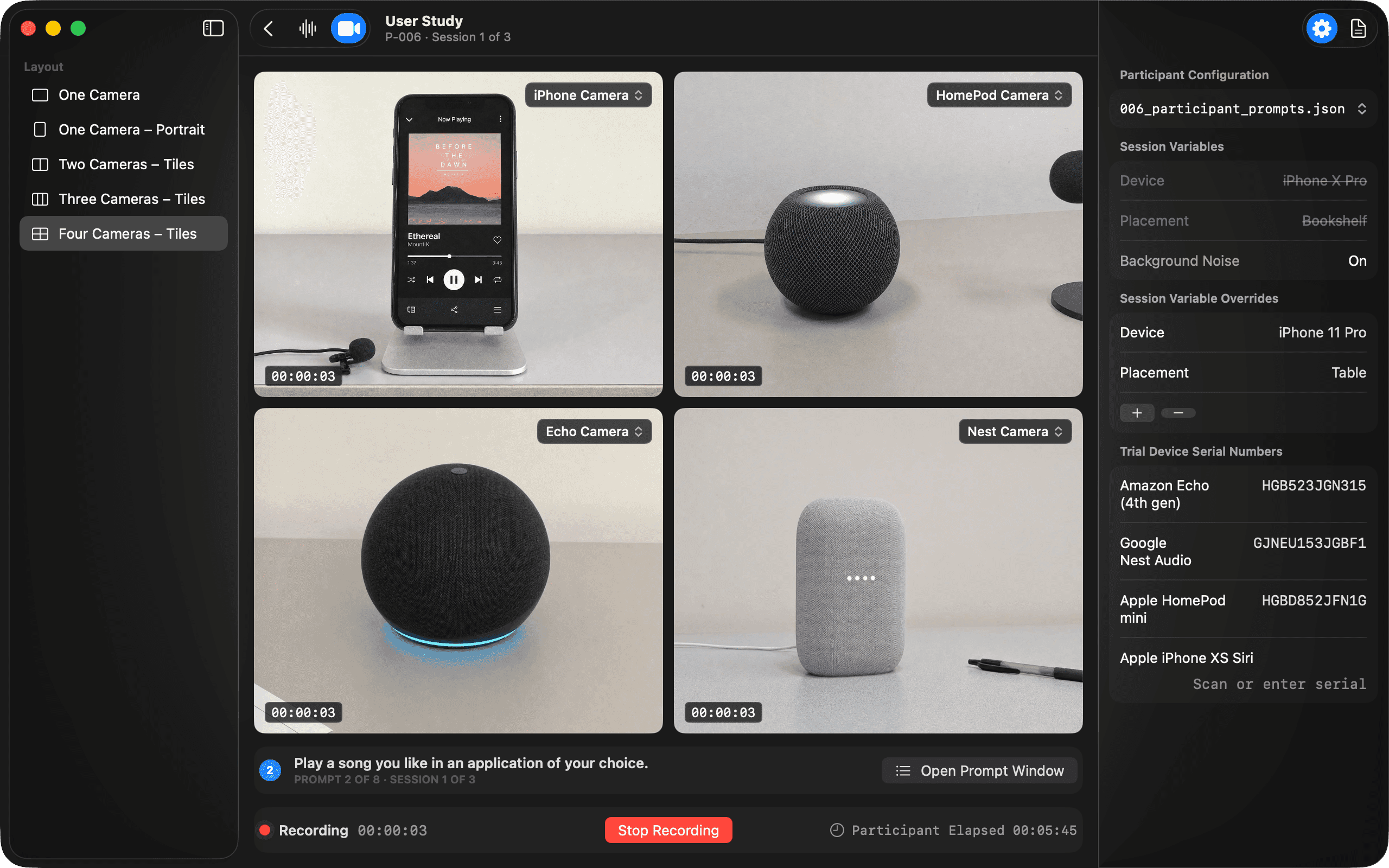
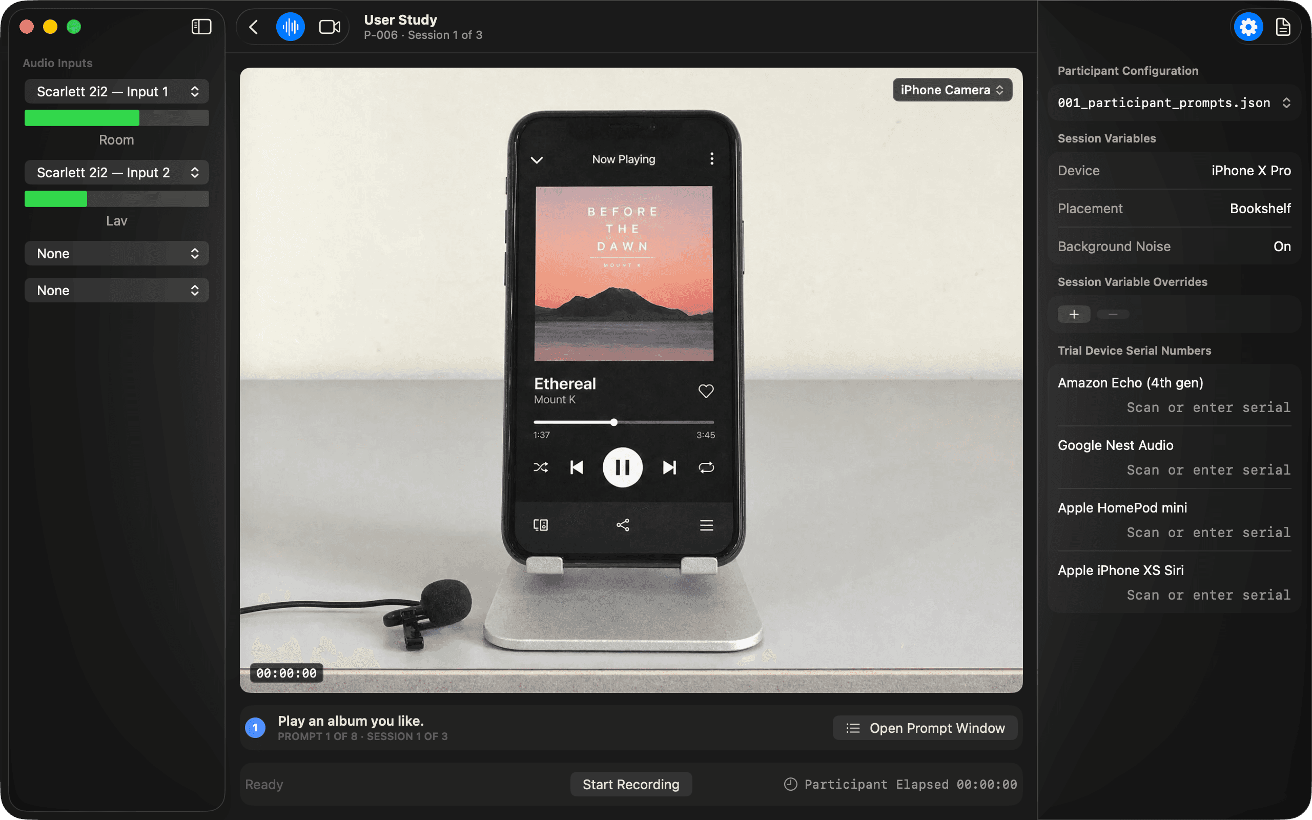
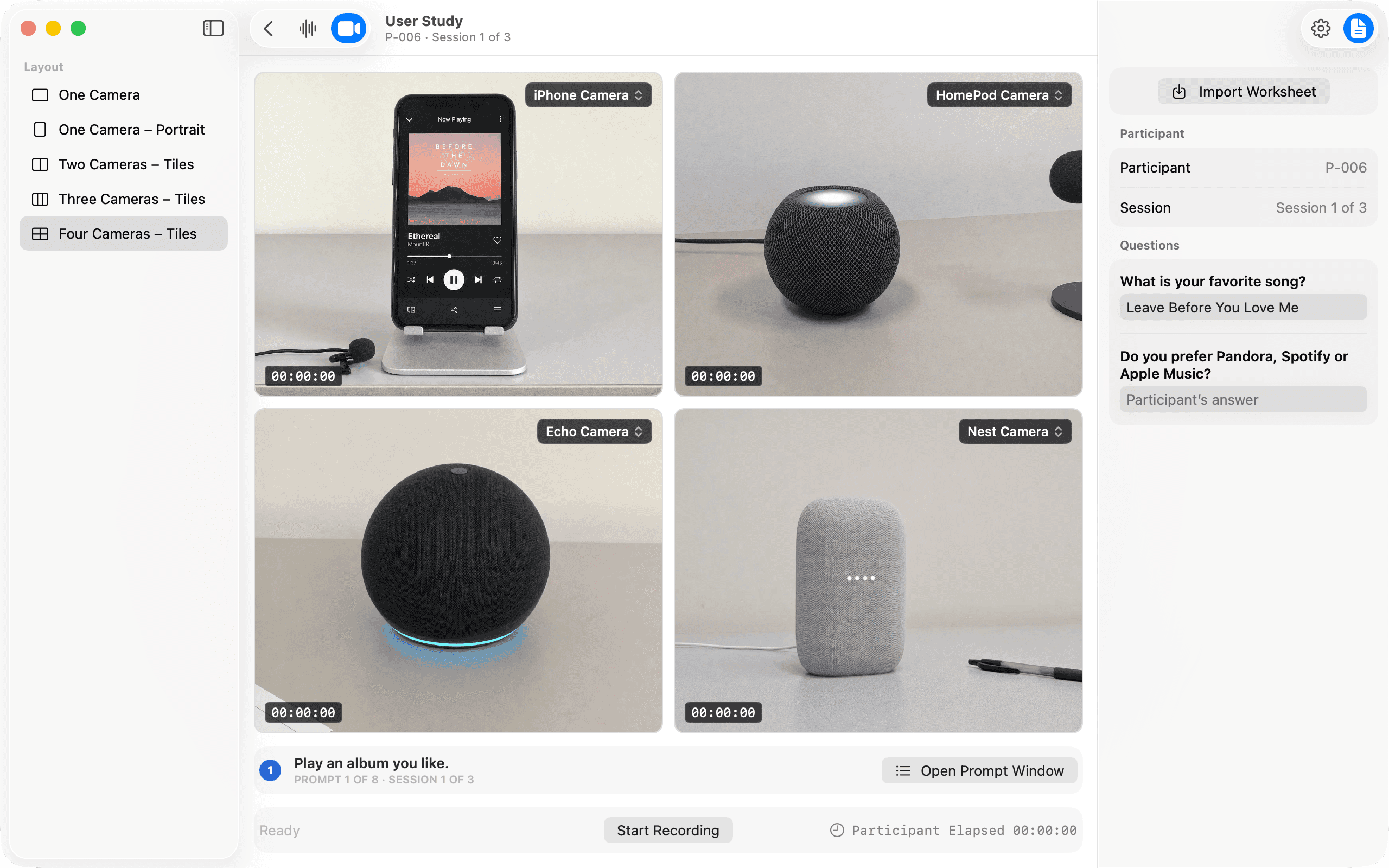
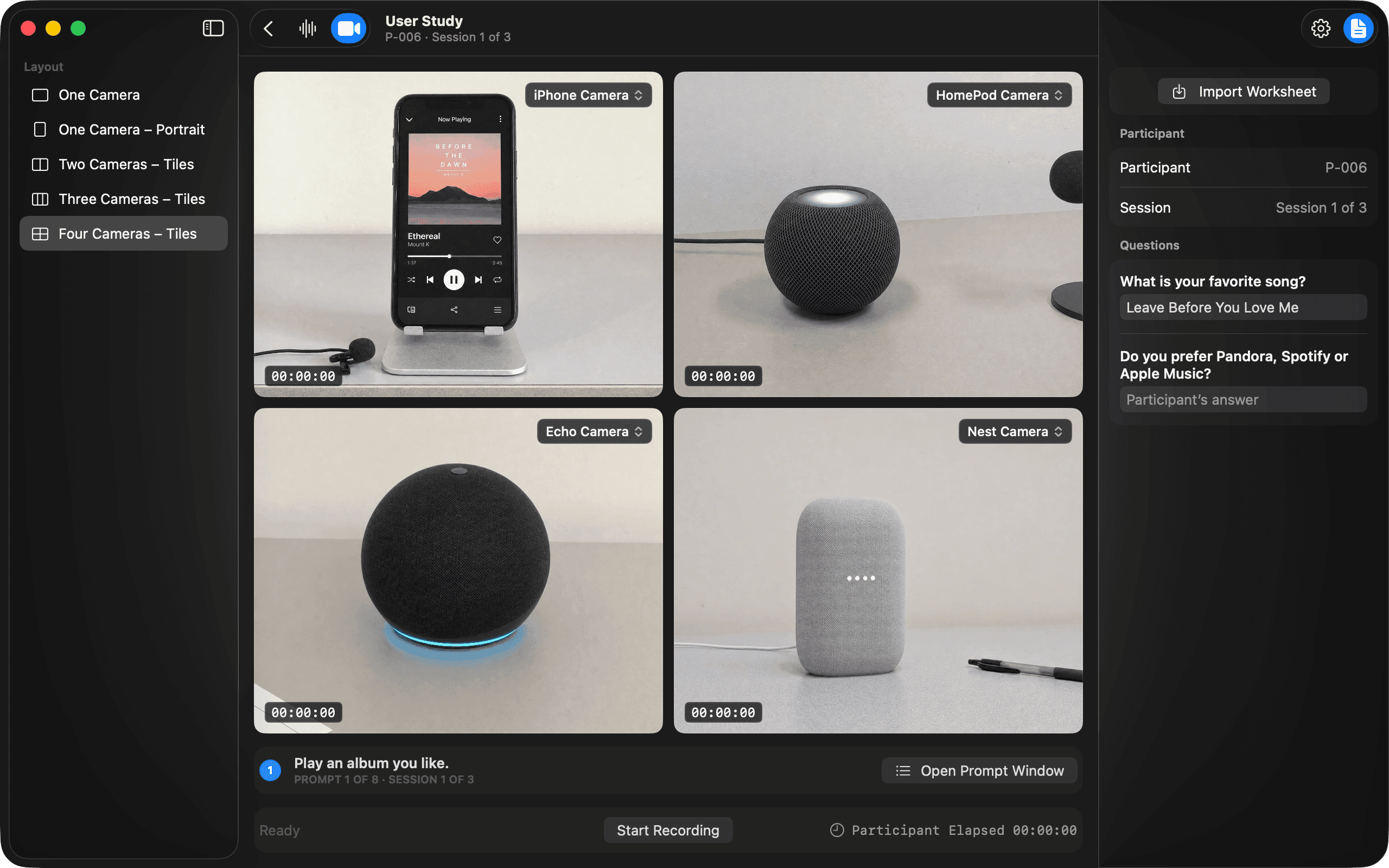
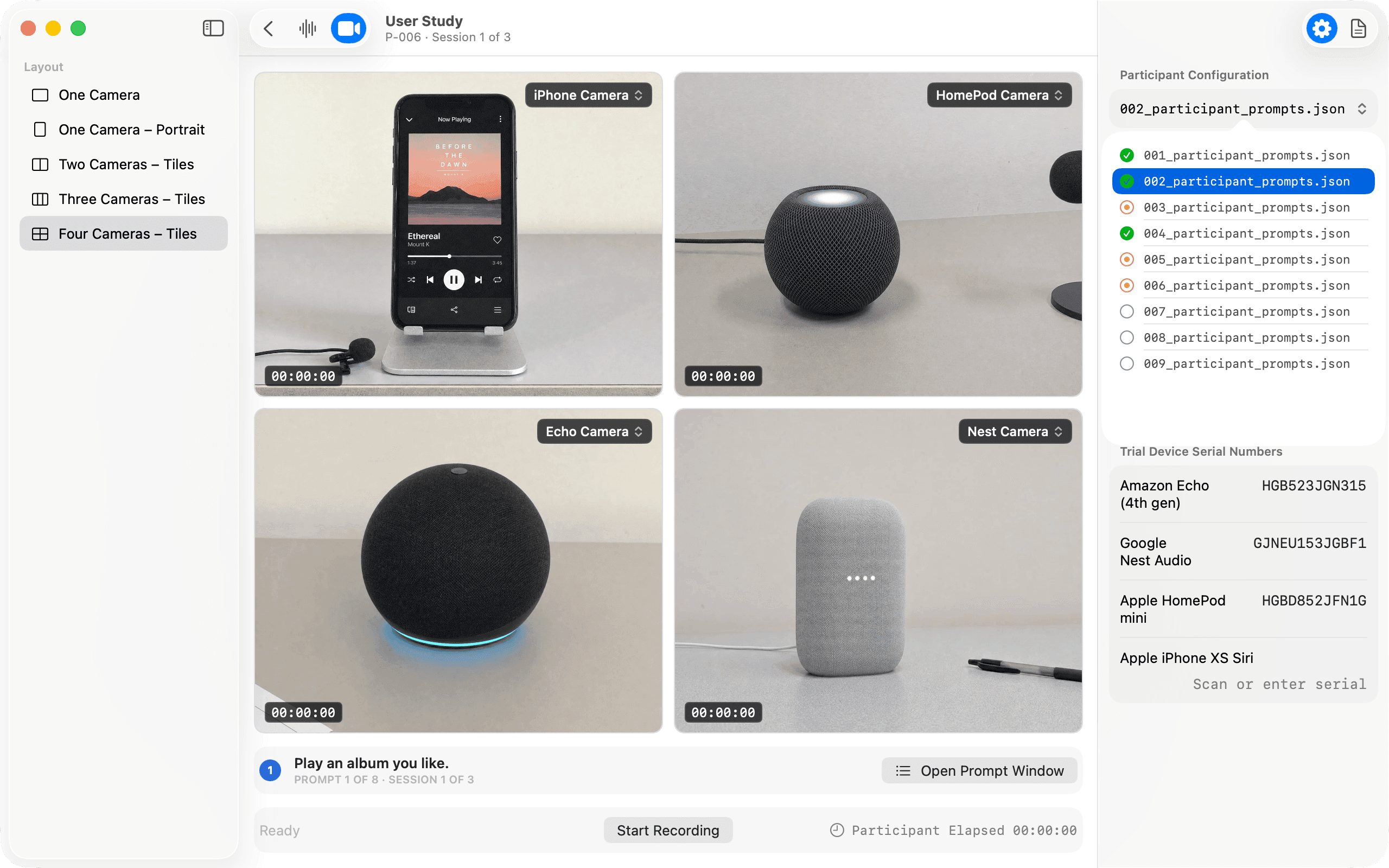
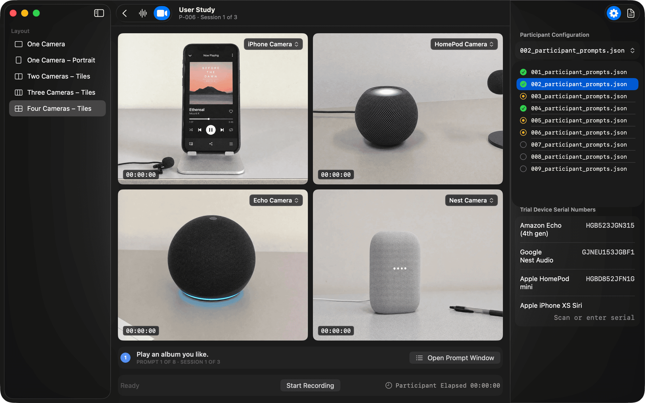
A session is several recordings pretending to be one: the participant's phone screen, their workspace, the assistant on the table, the room's audio. User Study captures them together — pick a layout, check the levels, and everything lands in a single synced recording. During the session the moderator watches all of it at once instead of glancing between devices, and the chrome stays dim so the footage carries the screen.
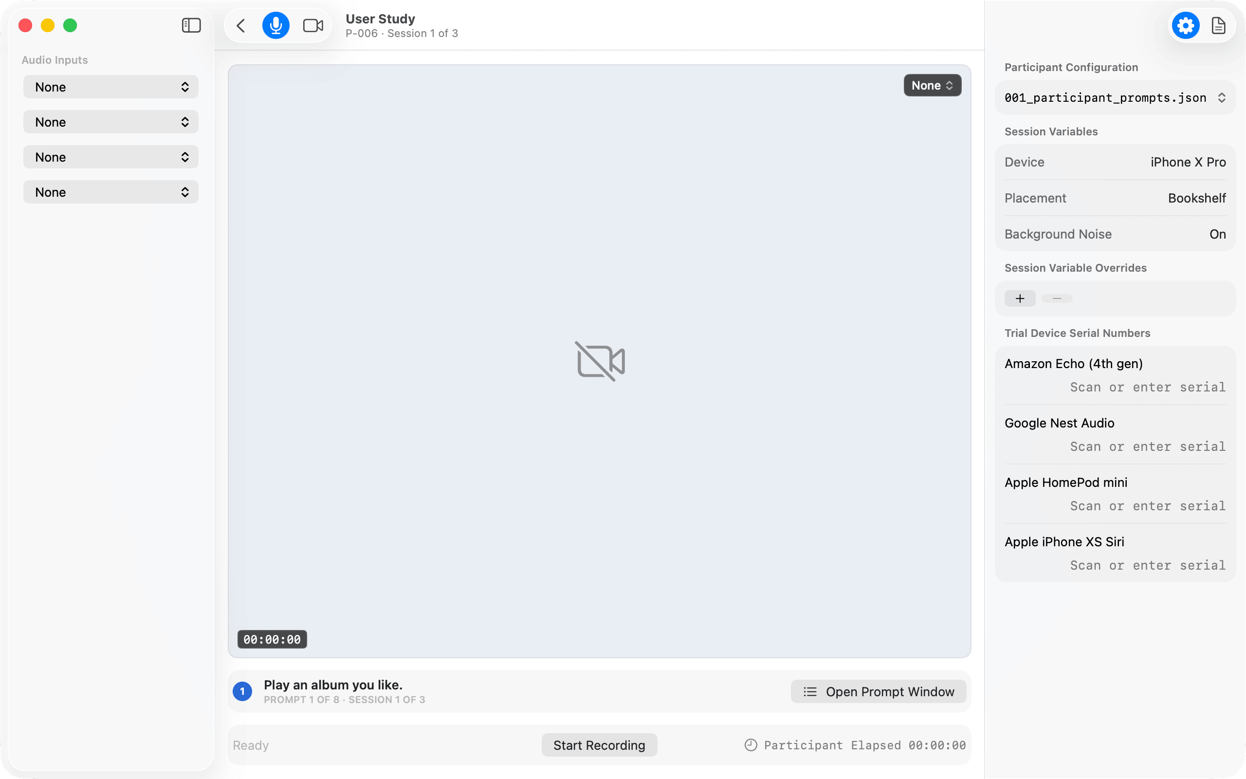
An empty rig
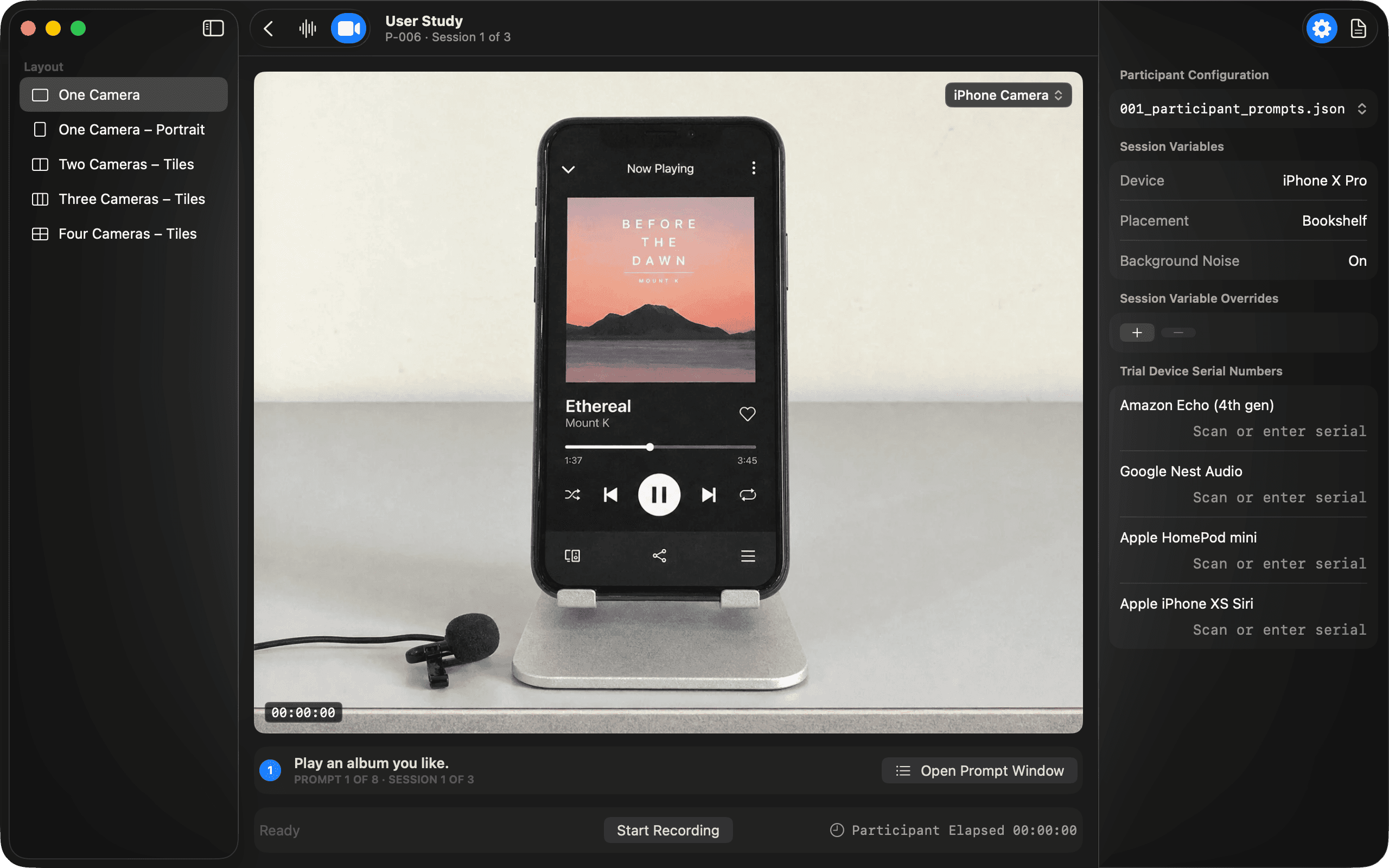
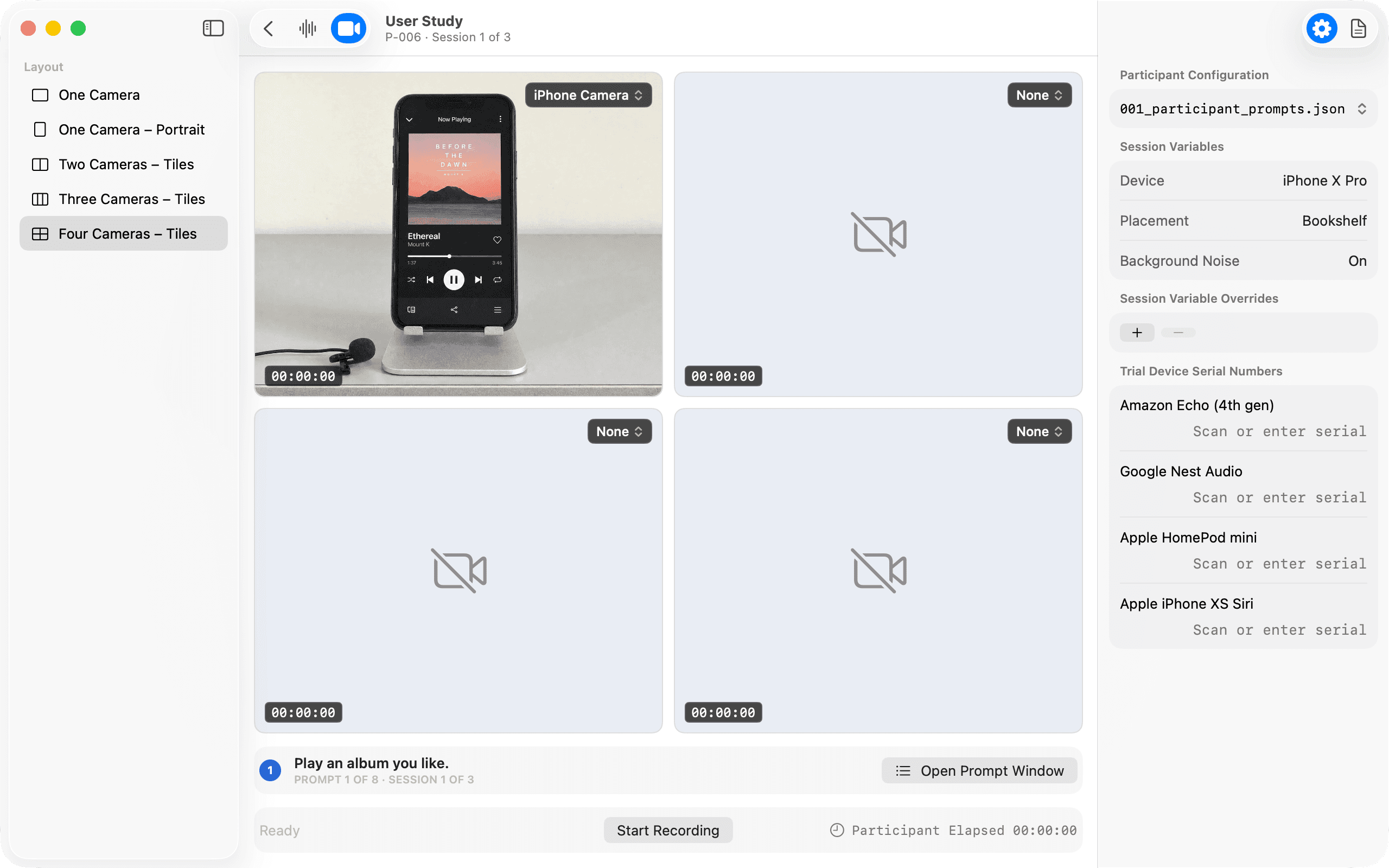
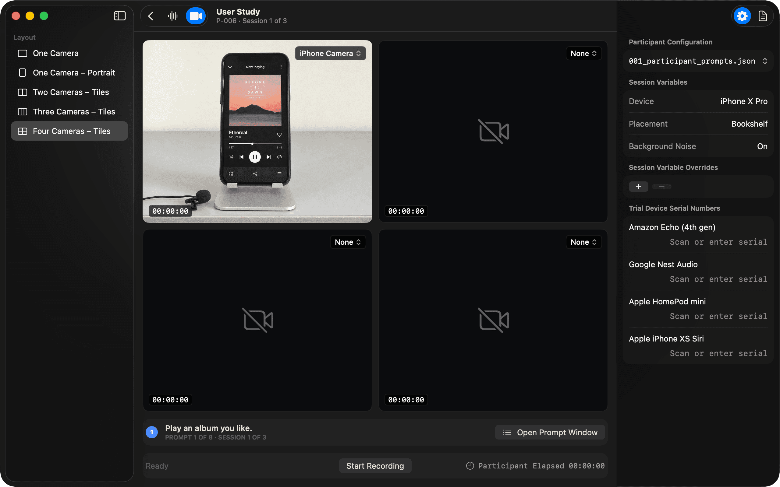
Every session starts from nothing: four input slots reading None, one empty well with a crossed-out camera in it, a clock at zero and a Start Recording button that does not yet know what it would record. That is on purpose. A study runs nine participants through three sessions each, and a setup that remembers the last session wrong costs more than one that remembers nothing. What carries over is the participant — the prompt configuration, the session variables and the serial numbers of the devices on the table — and the rig is built against that, every time.

Rigging, one camera at a time
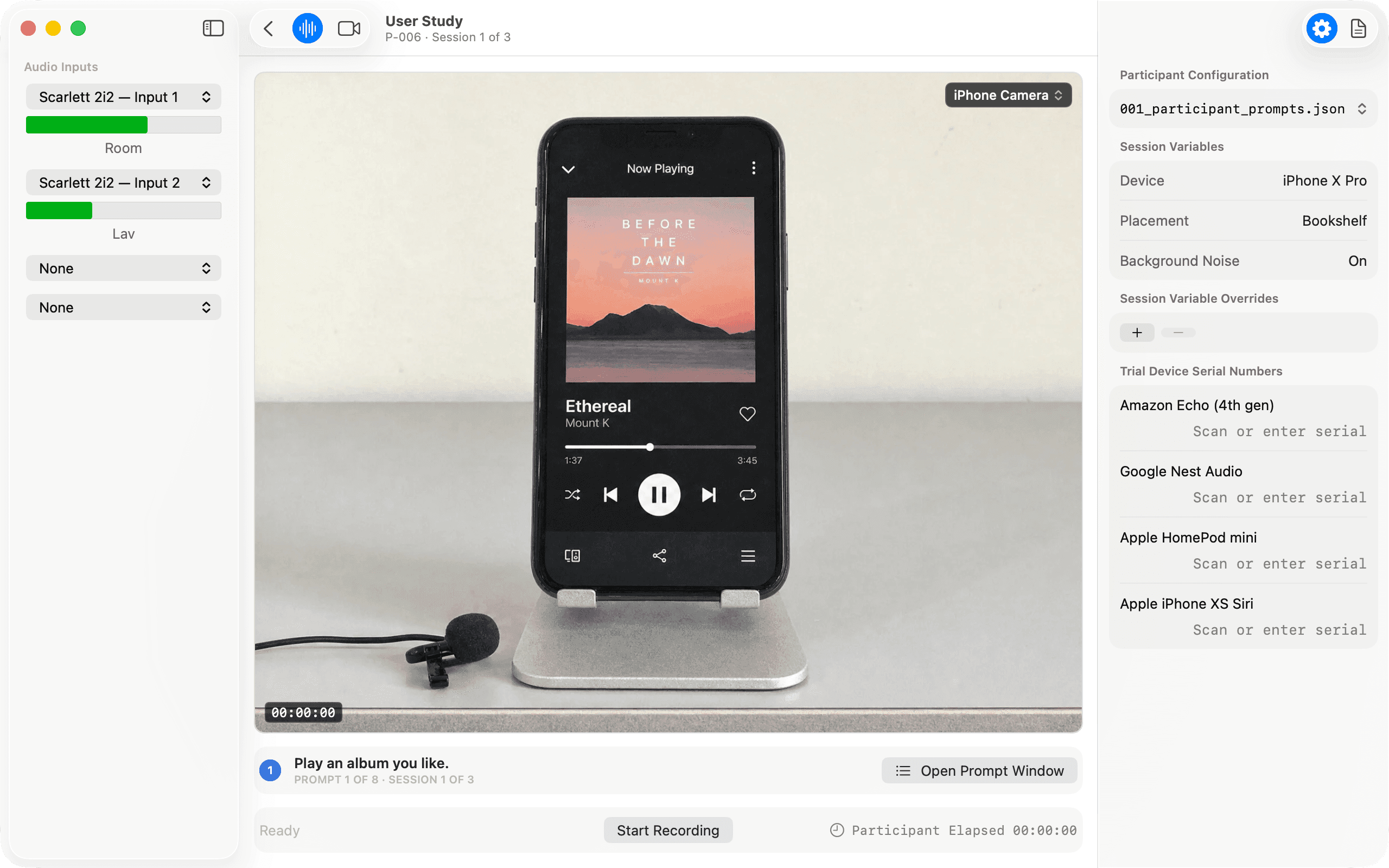
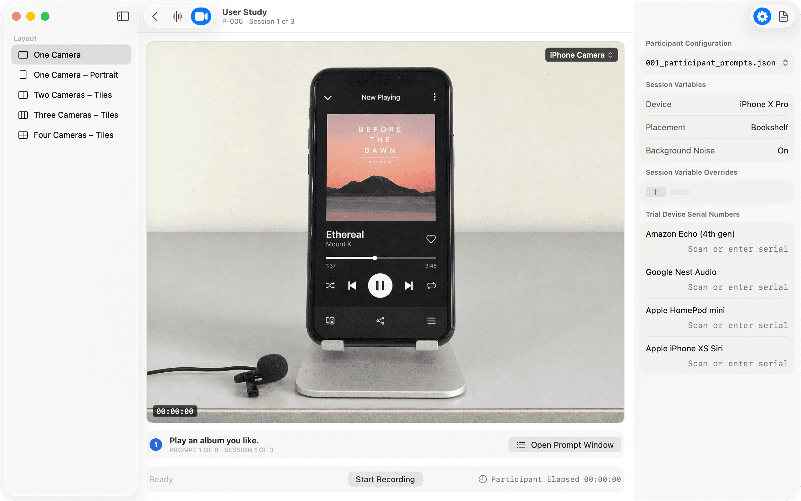
The two toolbar items on the left are not decoration; they switch the rail. Audio shows the four inputs, and the moment one is assigned the icon becomes a waveform and a meter appears under it. Video shows the layouts: one camera, one in portrait, two, three or four in tiles. Then each well is filled from its own popup, and a well that has not been assigned stays empty and says so, rather than repeating a feed to look complete. The rig is done when the stage has the angles the study calls for and nothing else.
One recording, not a rig
The insight was where the time actually went. Researchers lost their margins to rigging — wiring cameras, syncing clocks, reconciling files afterward — so the design collapses the rig into the app. Every angle flows into one recording, the session variables ride along as data, and what used to be an evening of reconciliation simply never exists.
The worksheet feeds the script
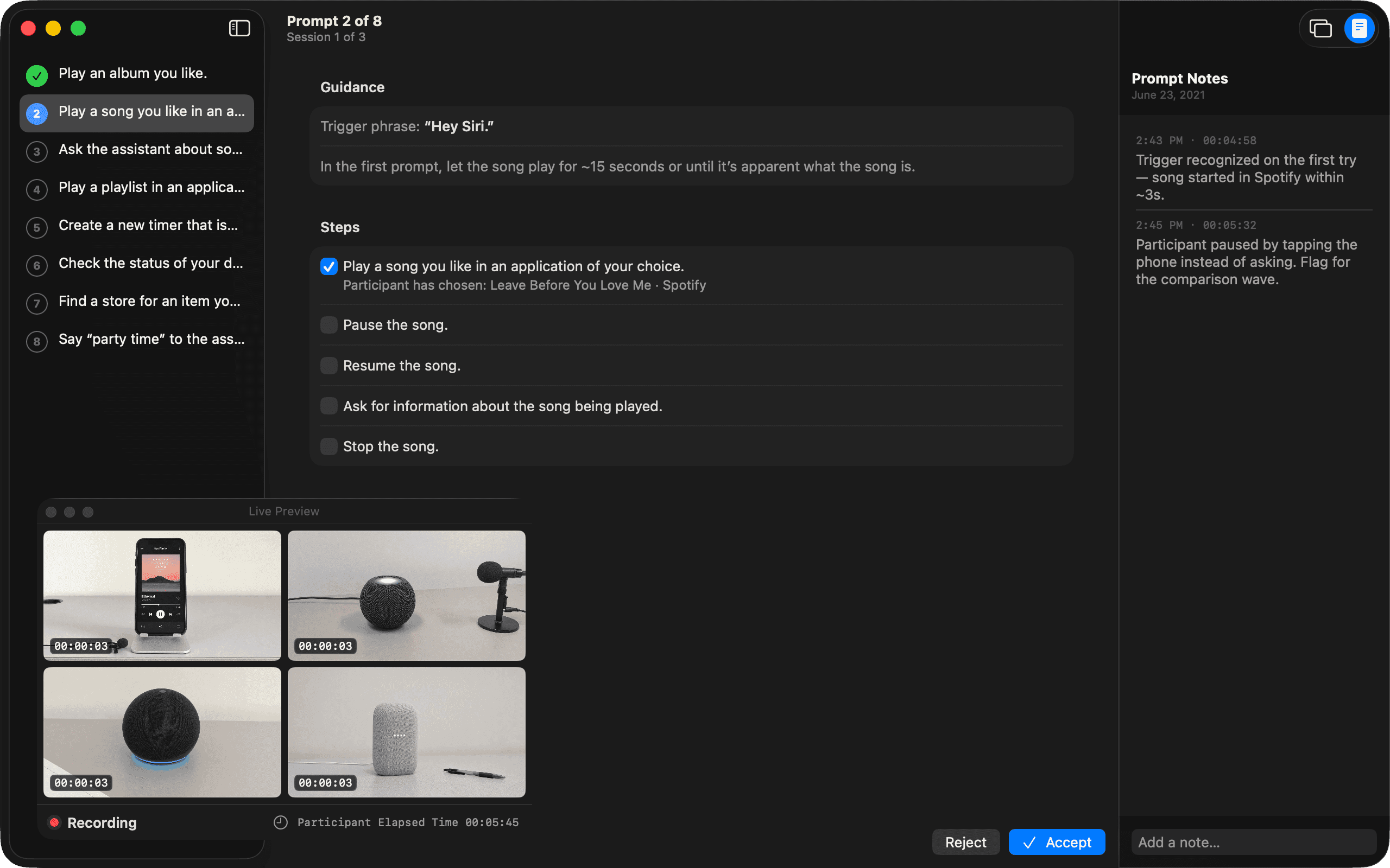
Before the prompts there is a questionnaire — what is your favorite song, do you prefer Pandora, Spotify or Apple Music — and it lives in the inspector rather than on a clipboard, because its answers are not background. When the runner reaches the prompt that asks the participant to play a song they like, it reads back what they said: Participant has chosen Leave Before You Love Me, on Spotify. The moderator never has to remember, and the recording never has to be searched later for what the participant meant.
A session begins on a prompt
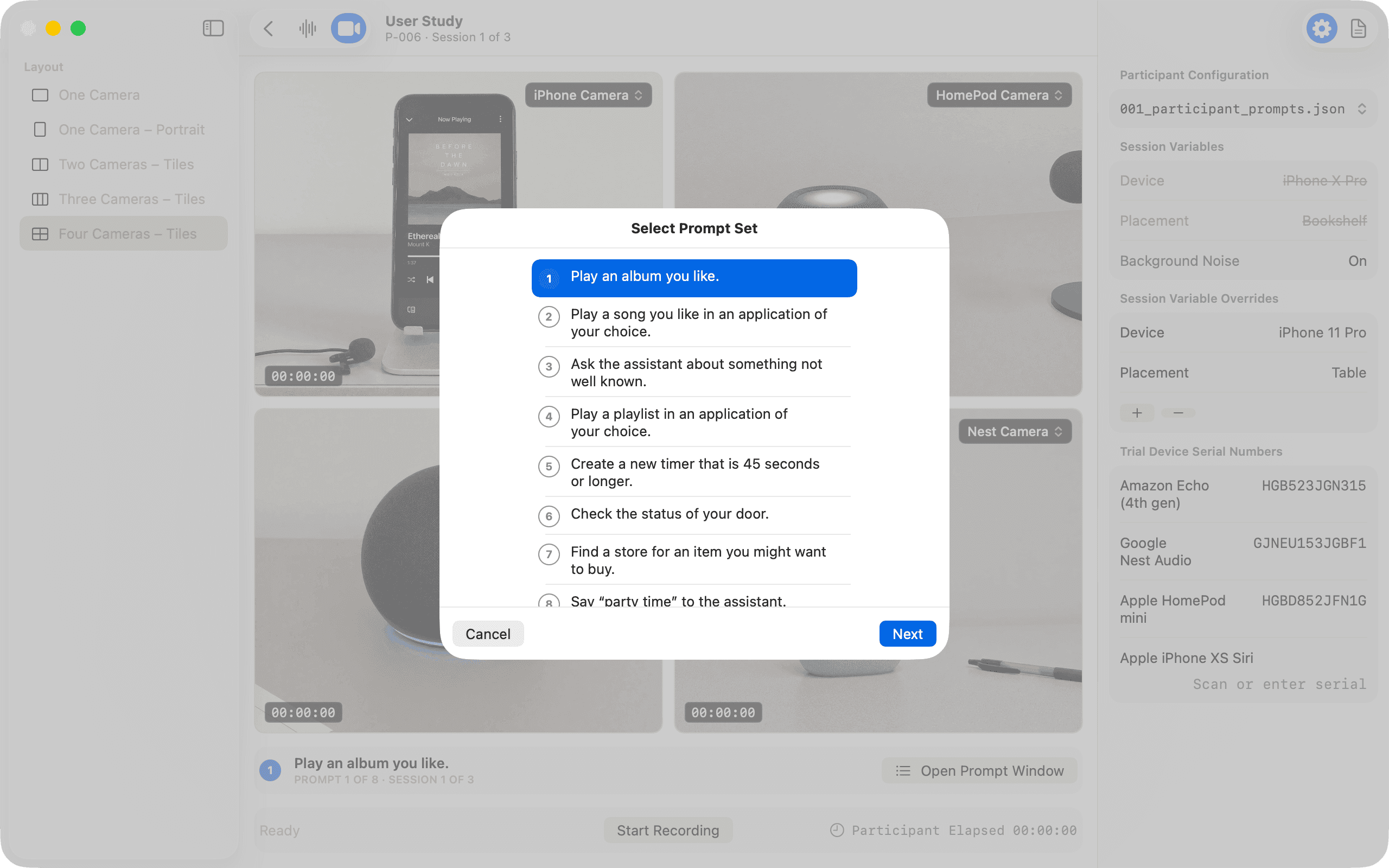
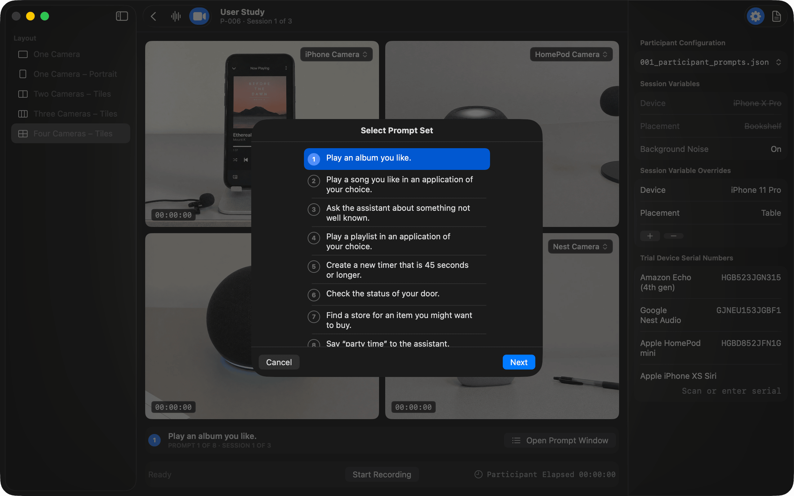
Start Recording does not start the clock. It opens the prompt set, and Next starts the clock on the prompt that was chosen — usually the first, but not always, and that difference is the whole design. The app records a prompt at a time. The timecode on every well is the prompt’s, not the session’s, which is what the participant-elapsed clock in the corner is for.
The script rides along
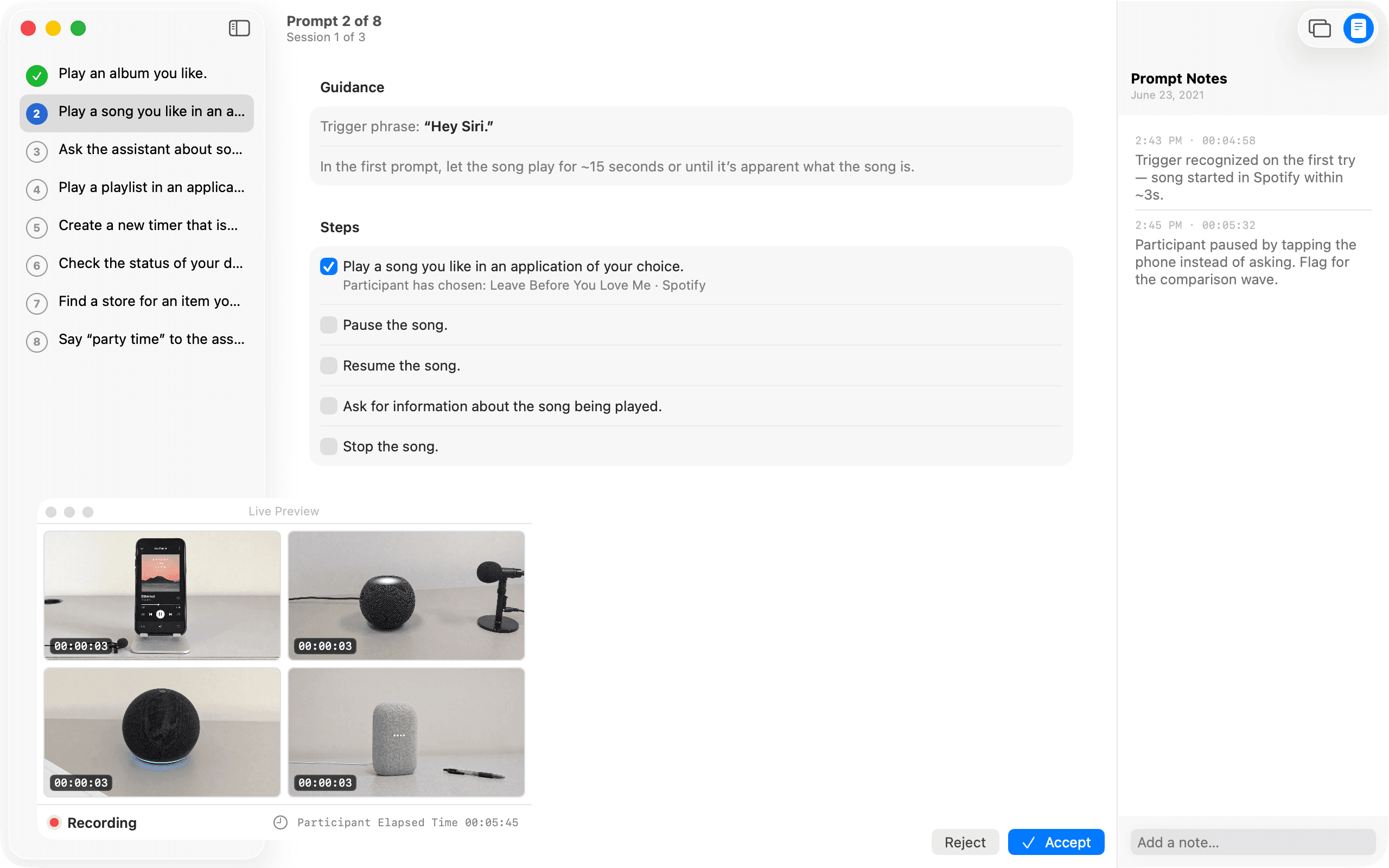
A study is only as good as its consistency, so the prompt script is part of the app, not a printout beside it. The outline tracks where the session is, guidance carries the trigger phrase and pacing, and each step records what the participant actually chose. Notes happen in the moment, pinned to the session as it's captured — and the live preview floats alongside so the moderator never leaves the script to check the cameras.
Quit, reopen, resume
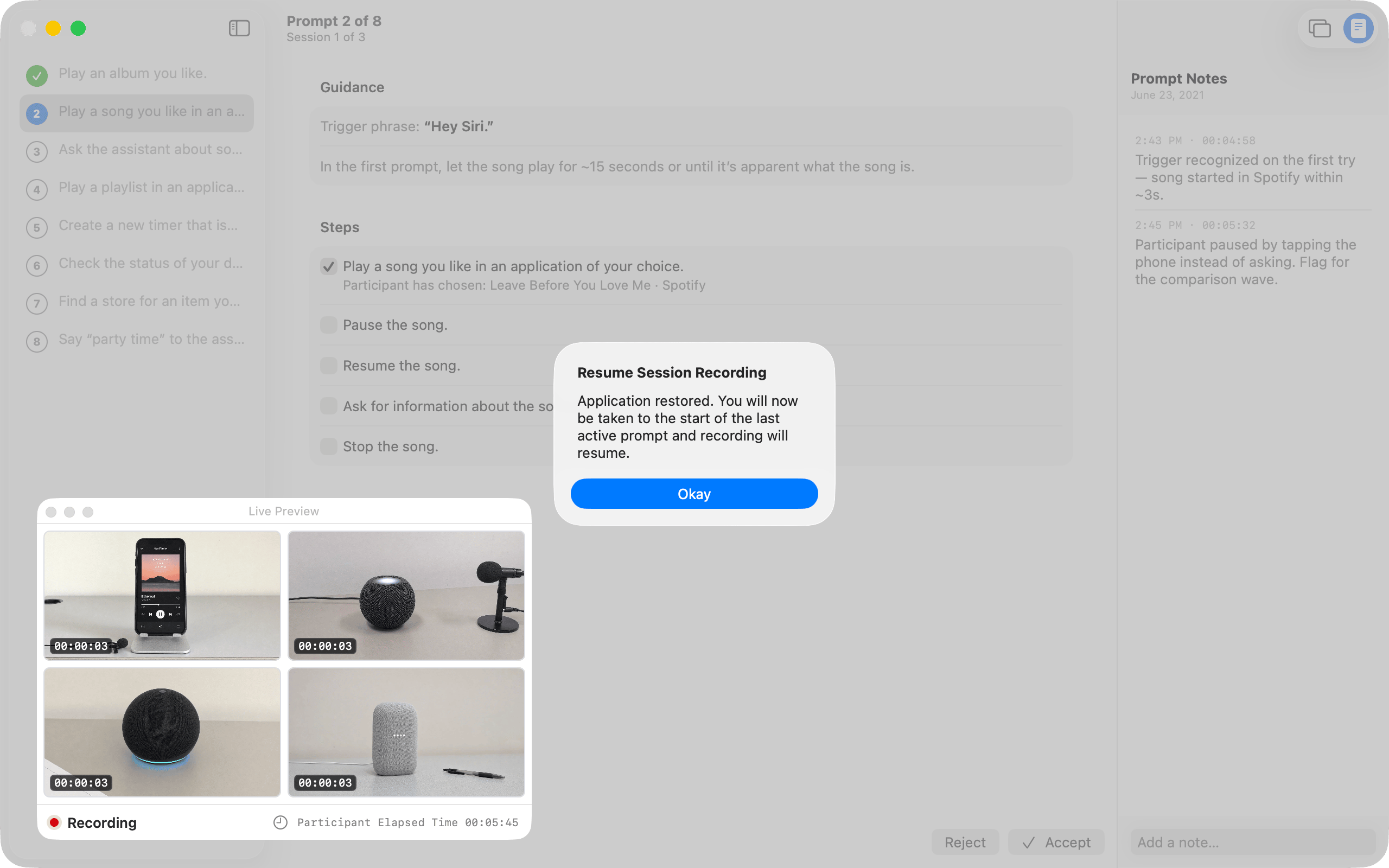
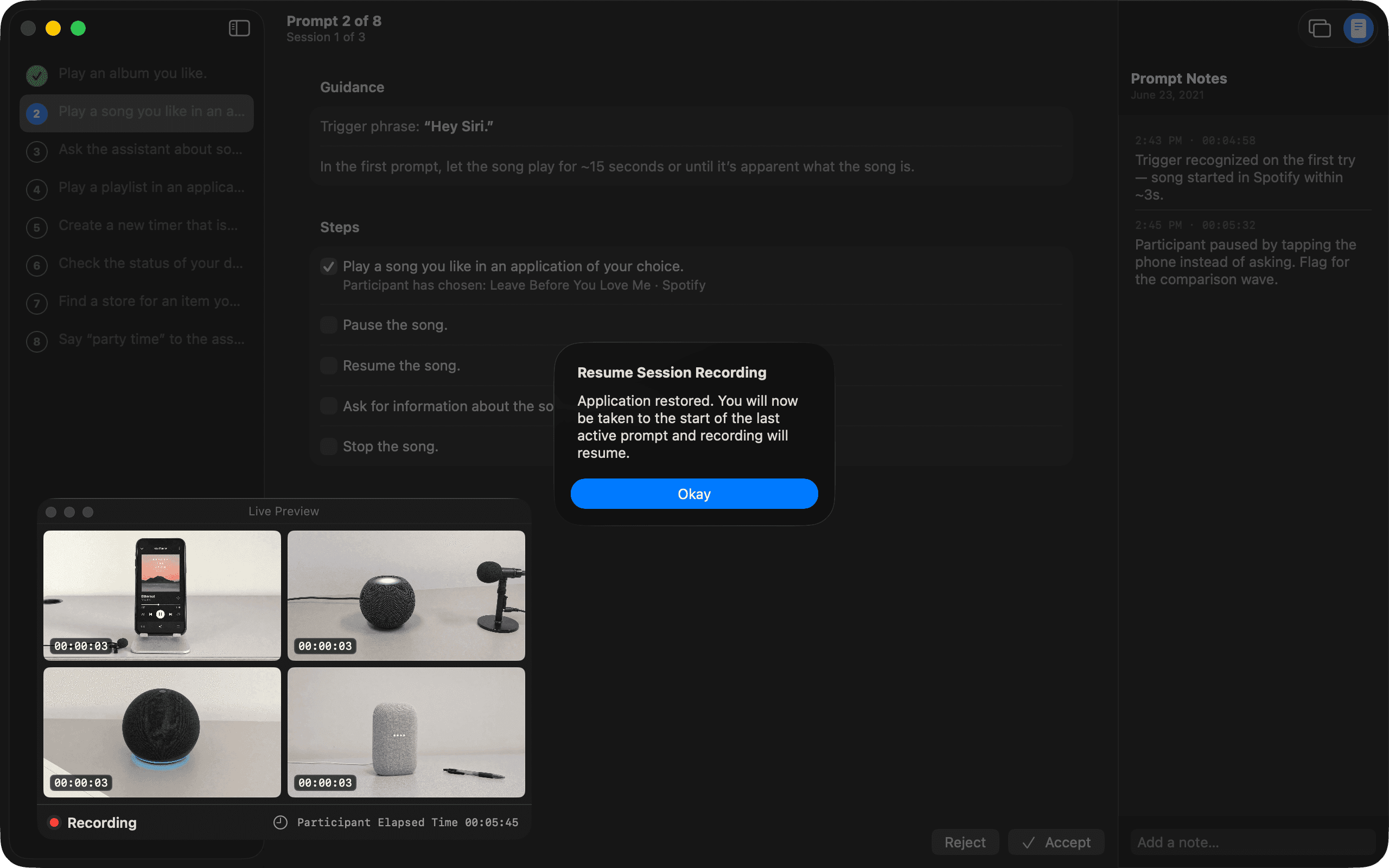
Recording a prompt at a time buys one more thing: a session that survives the app. Quit it, or have it crash, and on the next launch it says so — application restored, you will be taken to the start of the last active prompt and recording will resume. The prompt that was interrupted is recorded again from its beginning, the ones before it are untouched, and the participant loses a minute rather than an afternoon.
Playback that stays in sync
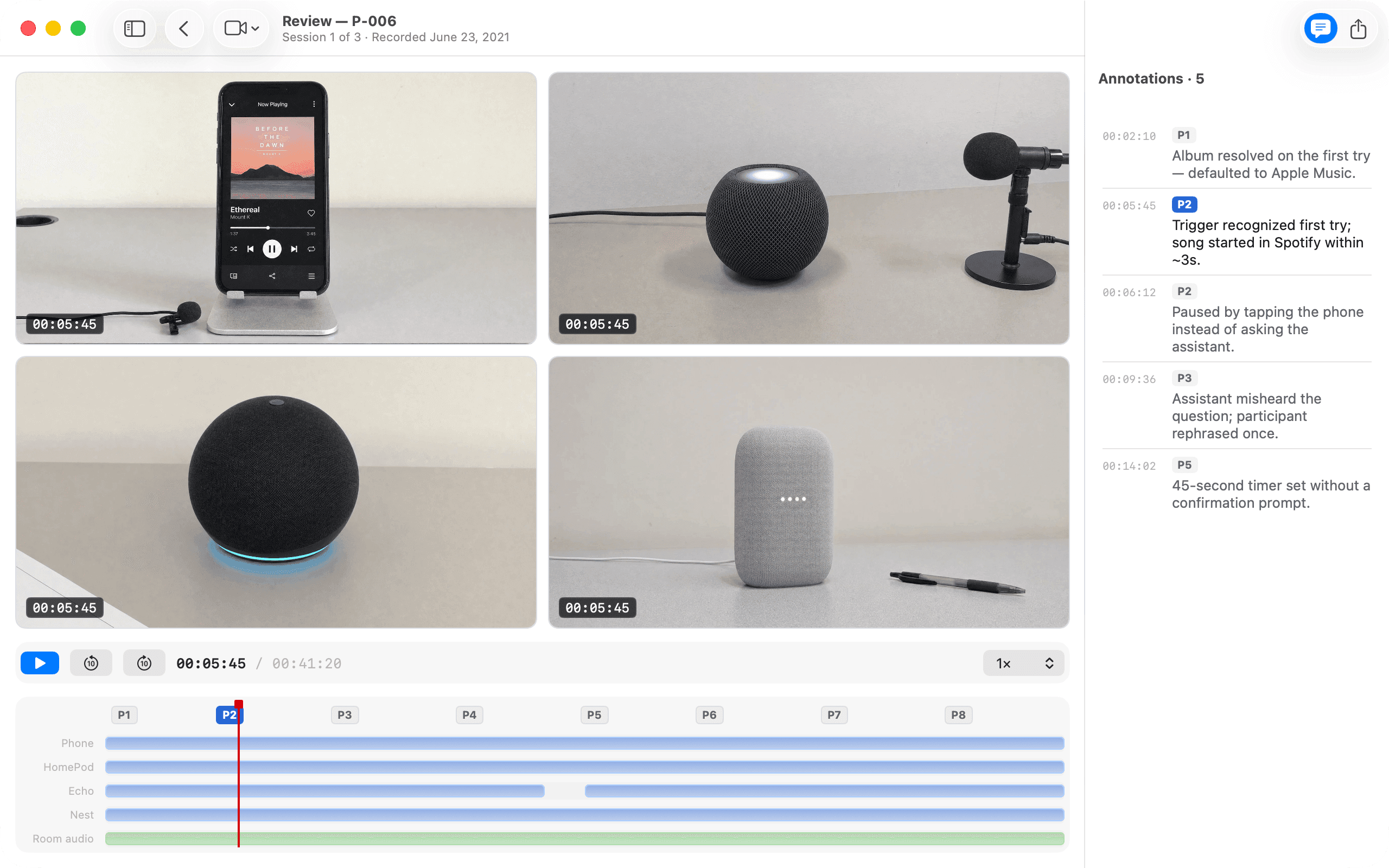
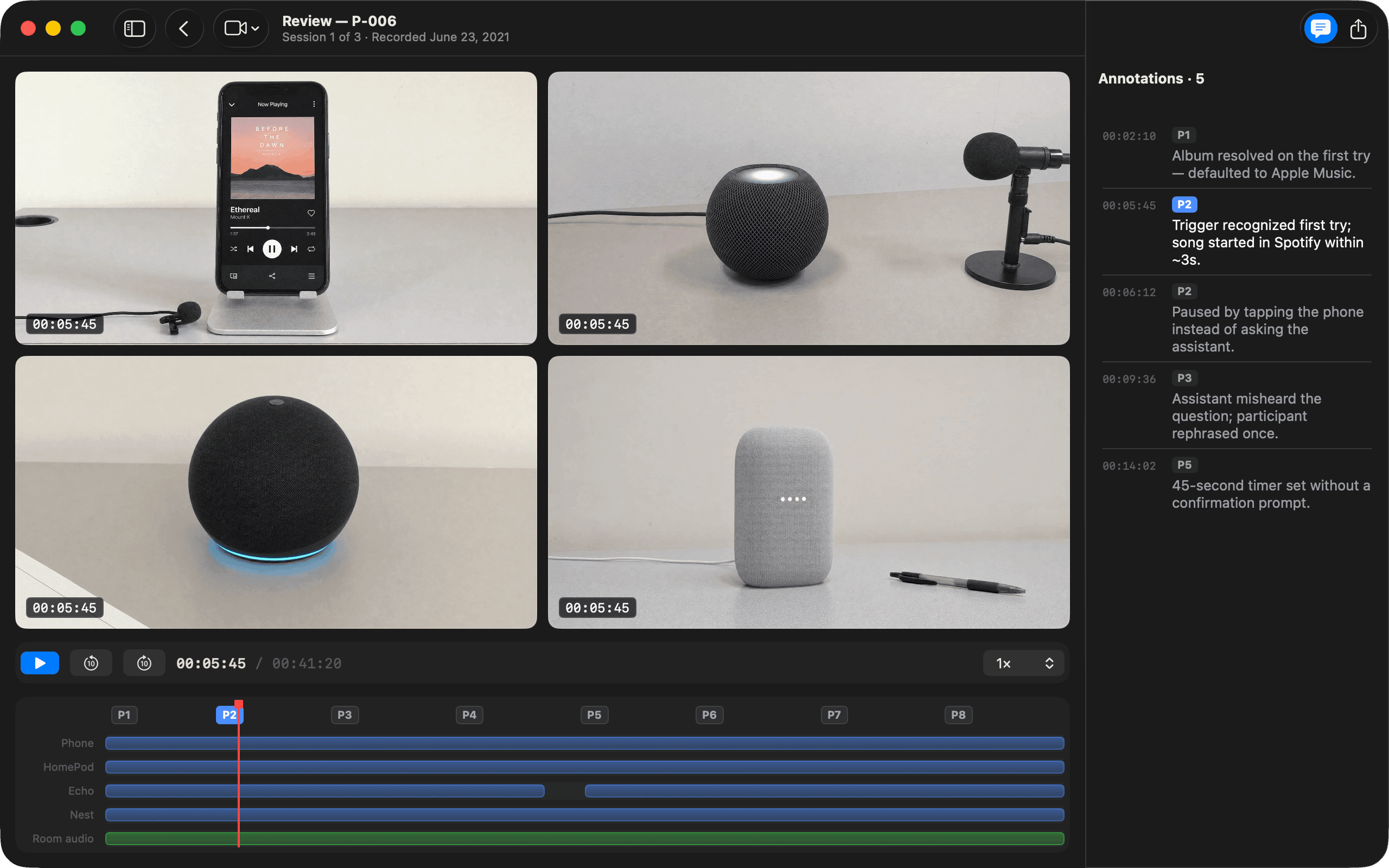
Because everything was captured as one recording, review is one timeline. All four angles scrub together, the prompt script becomes markers along the track, and the notes taken mid-session are already pinned to their moments. Finding what the assistant misheard in prompt three is a click, not an afternoon of lining up files.
The tenth session, same as the first
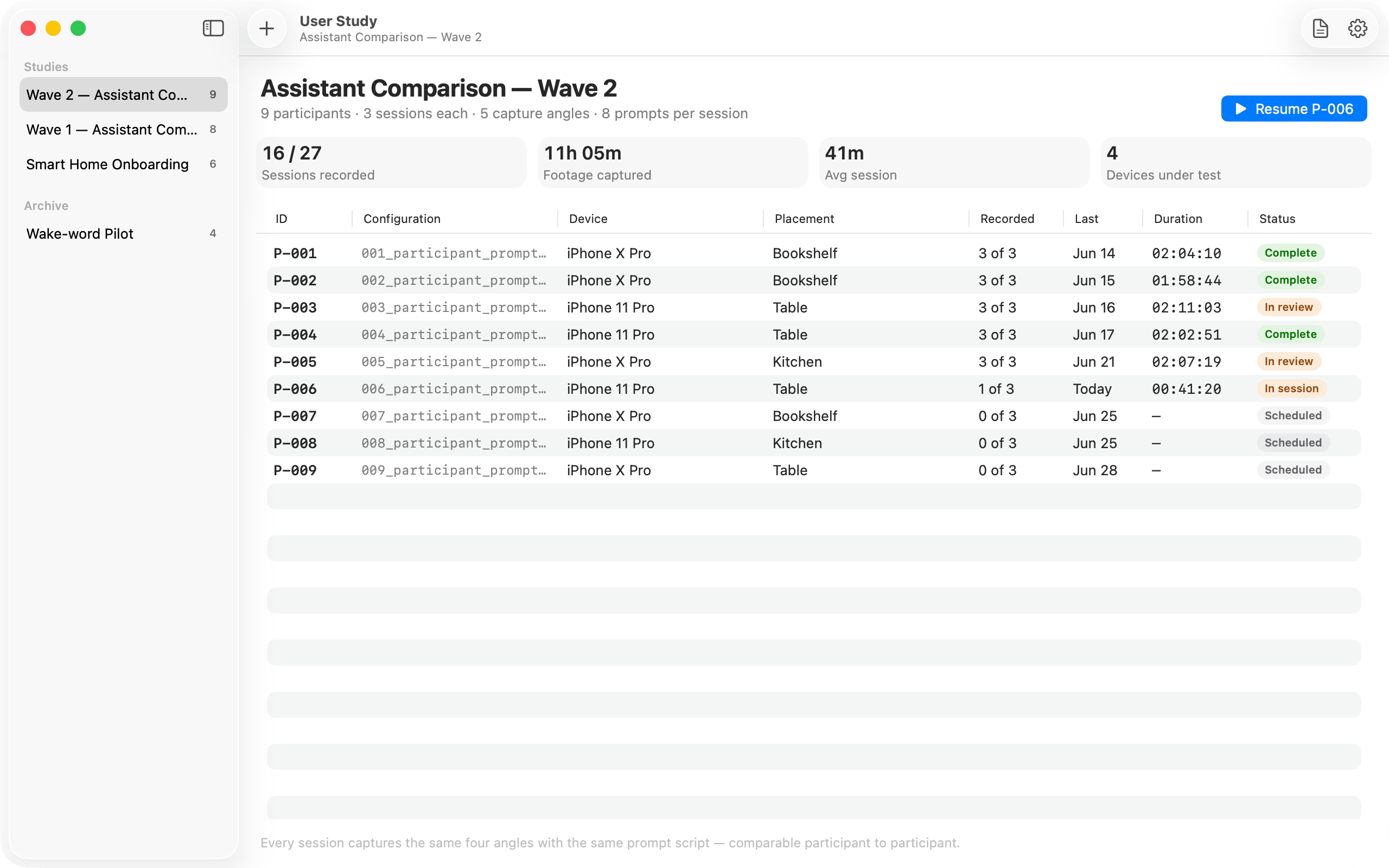
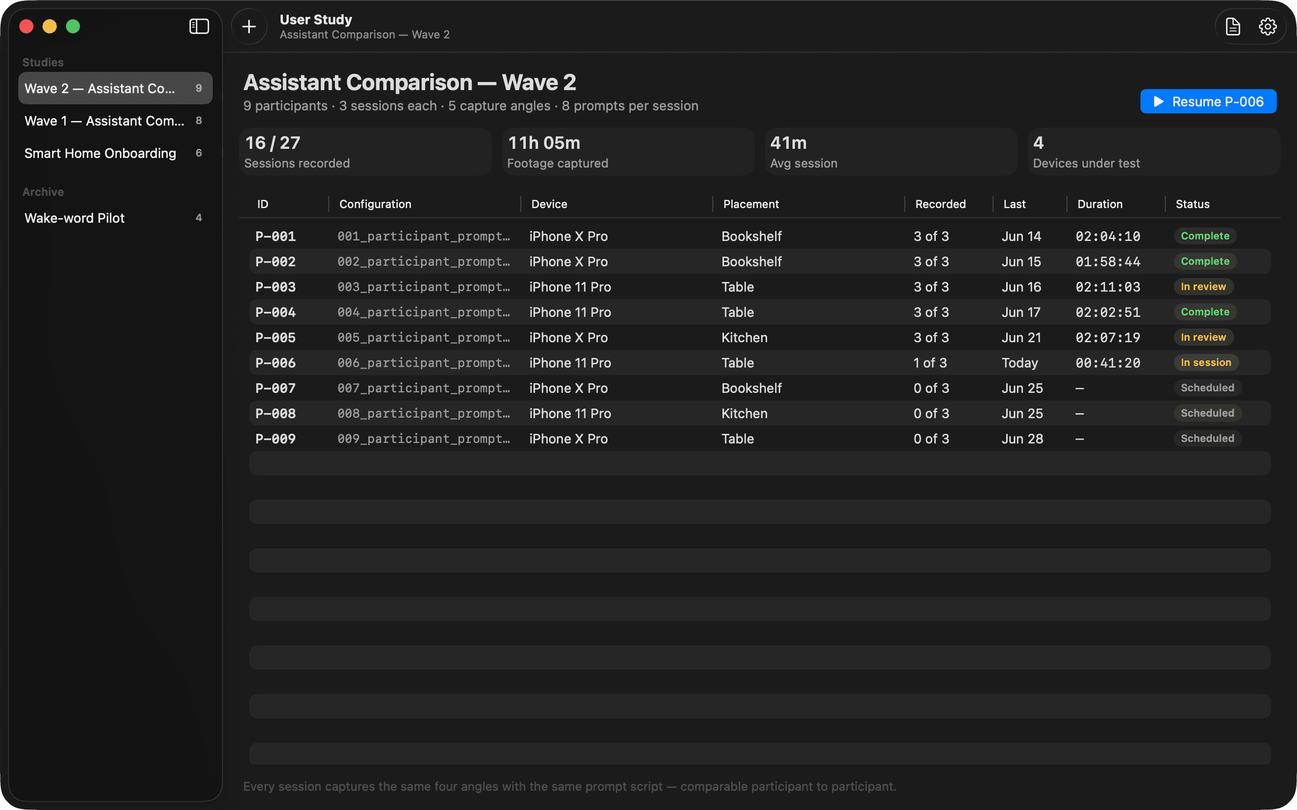
Setup is where sessions usually bleed time, so configuring a capture is quick and repeatable — a participant configuration, a layout, the session variables — the same in session ten as in session one. The stack keeps a whole study scannable and comparable, which is what lets a small team run more sessions than their tools used to allow.
What shipped
Designed a native Mac app that cuts the per-session setup overhead capping research teams.
Centralized multi-angle capture — screen, workspace, and the assistant under test — so a session is one recording, not a rig of separate tools.
Made session setup quick and repeatable, so capturing the tenth session takes no more rigging than the first.
Kept sessions consistent across a study so findings stay comparable participant to participant.
Selected decisions
- 01
Targeted the real bottleneck — setup and logistics overhead — rather than the analysis itself.
- 02
Centralized multi-angle capture — phone screen, workspace, and the assistant under test — into a single session.
- 03
Put every angle on one screen live during the session, so the moderator watches all feeds at once instead of glancing between devices.
- 04
Kept recordings organized in a session stack that's easy to scan across a study.
- 05
Embraced native Mac conventions and a focused dark UI that keeps attention on the footage.