A decade of crowd votes made personal — and what it becomes once the model can explain itself
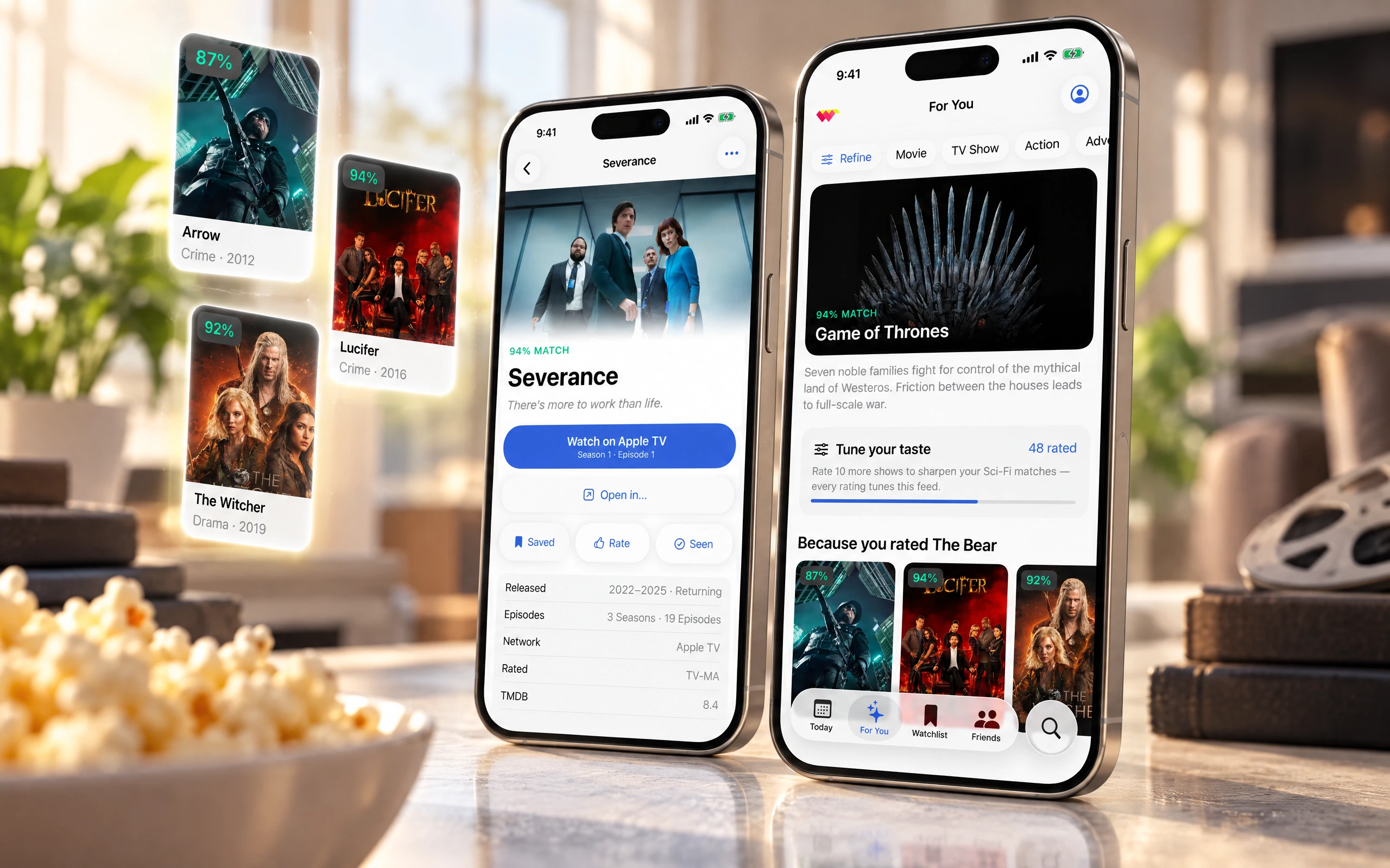
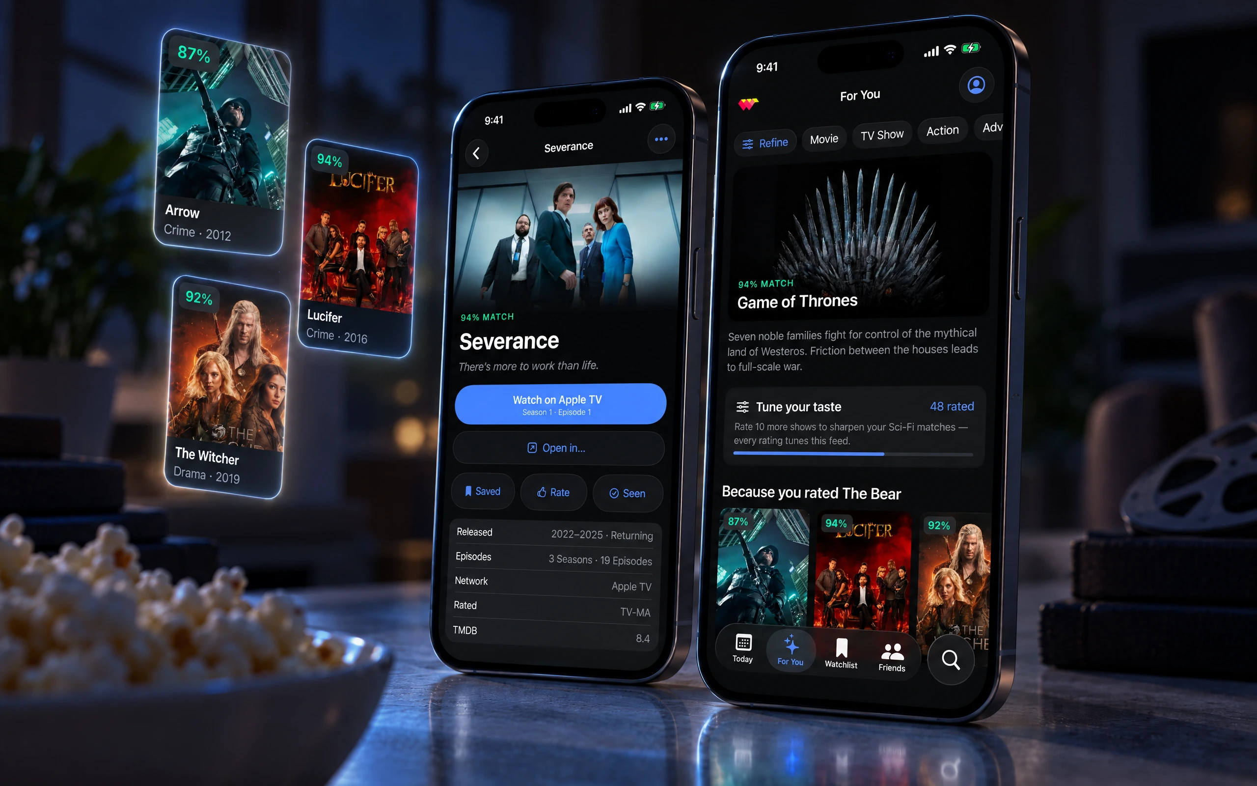
Ranker had spent a decade turning the internet's opinions into data — over a billion votes across tens of thousands of lists, five thousand of them about what people watch. Buried in that pile was a strange, useful truth: statistically, Ozark fans quietly love The Marvelous Mrs. Maisel. Ranker could see patterns like that in a spreadsheet. What it didn't have was a way for anyone else to feel them. WatchWorthy was the experiment — could a decade of vote data become something a person actually reaches for when they can't decide what to watch?
It could. The app was designed in 2019, shipped in March 2020, and is still being shipped today — version 5.0.3 landed in May 2026, six years and 4.6 stars later. What follows is both halves. First the product as it was designed and released: a minute of swiping, a crowd-scored answer, across every service. Then a rebuild I did on my own — unshipped, uncommissioned — to ask the question the original architecture could not. The 2019 app could rank. It could not explain, and it could not be asked.
Role
Product designer, 0→1. I led the work end to end for TheoremOne — the concept, the brand, the design system, and the first full version of the app: every screen, flow, and interaction. The core came together fast, over a single weekend, then sharpened across eight weeks of close, mostly in-person work in LA with Ranker's Sean Bradley (VP Product) and Skylar Wolf (Chief Architect). I prototyped the interactions in Principle so the iOS team had a precise reference for how it should move. The second half of this page is mine alone: no client asked for it, none of it shipped, and it exists to test what the product becomes once the constraint it was designed around has lifted.
A closer look, screen by screen
From open to answer
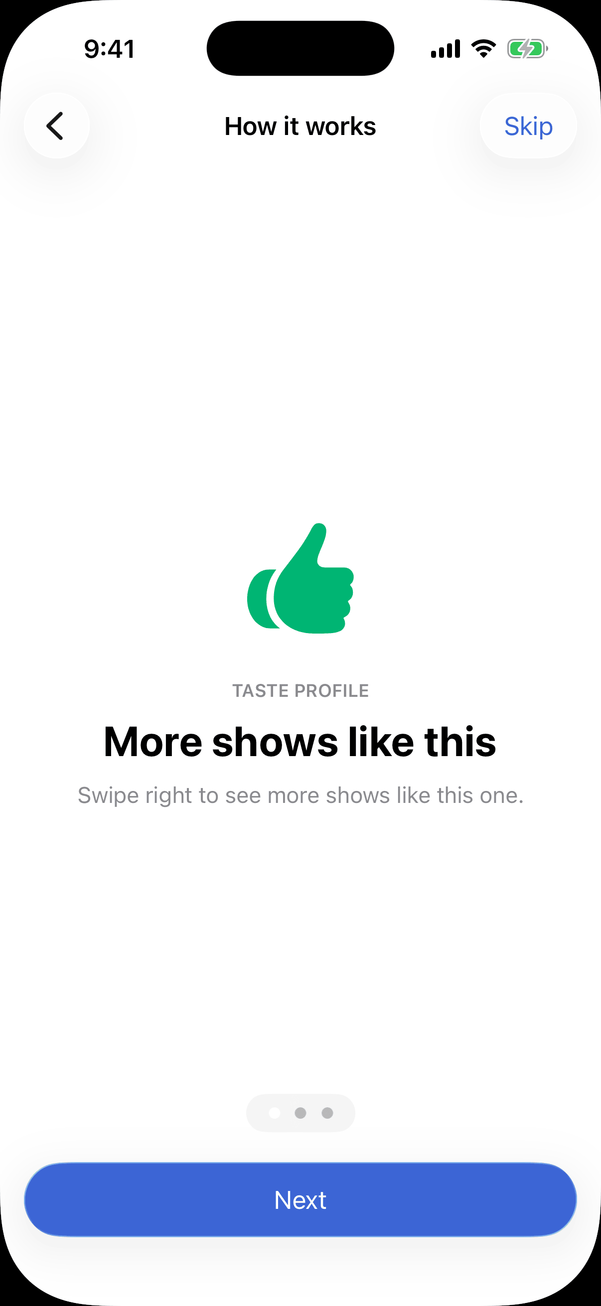
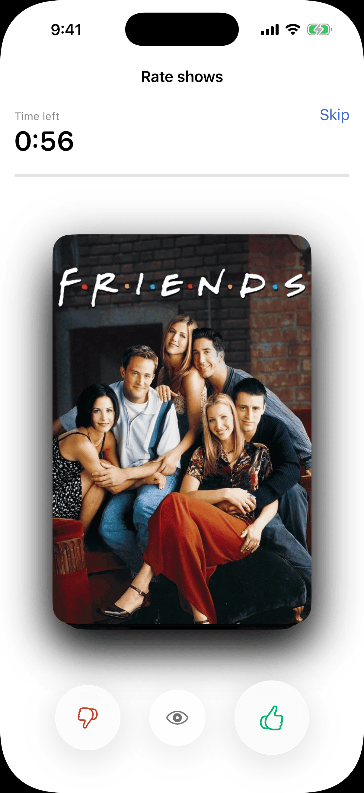
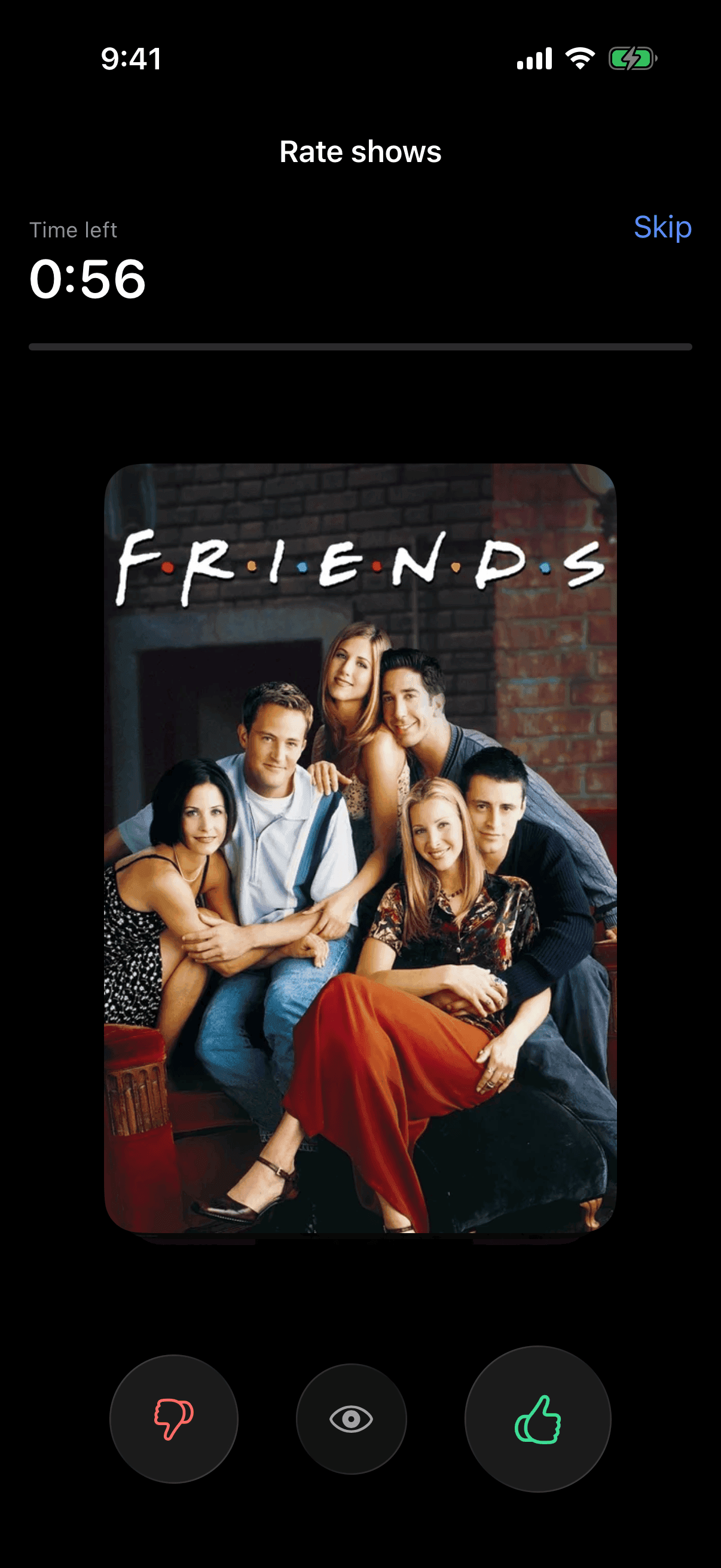
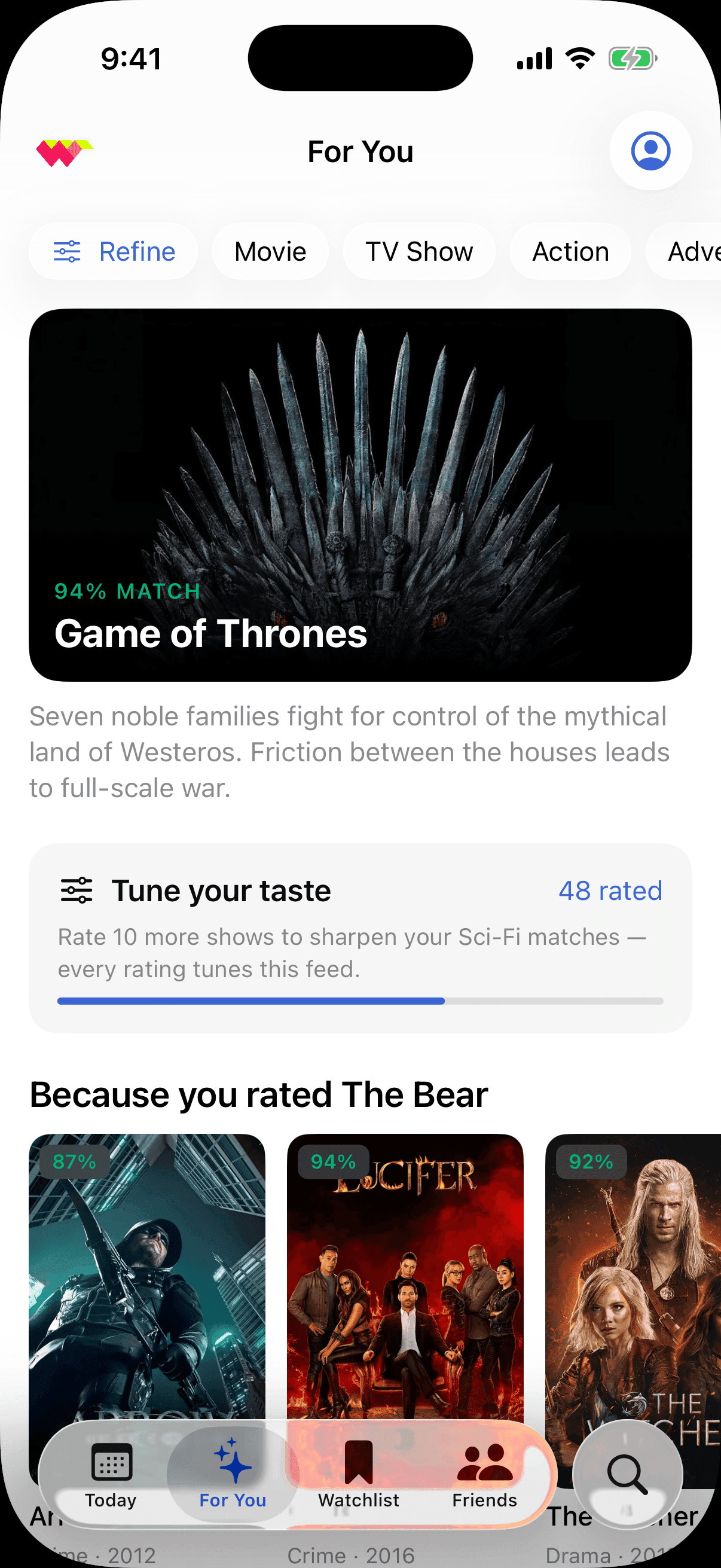
The core loop runs end to end here. WatchWorthy opens on a promise it can keep, turns a minute of swiping into a read on your taste, counts you in, and hands back a short feed it can defend. Each screen earns the next — the app asks for nothing until it has shown it can read you. The walkthrough teaches the whole gesture language in three cards before a single rating, so the very first show already counts as a vote.
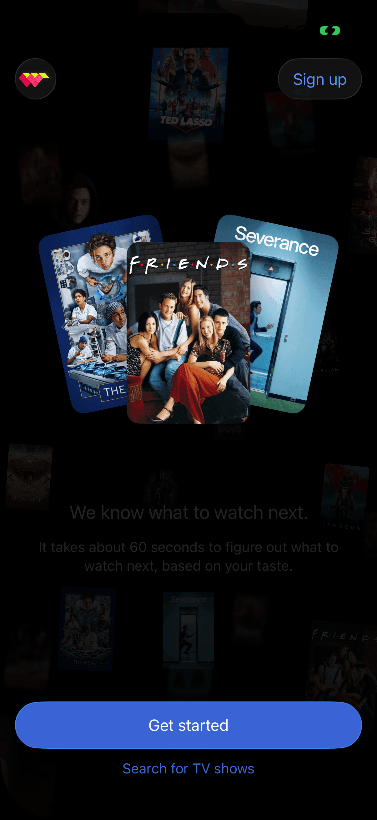
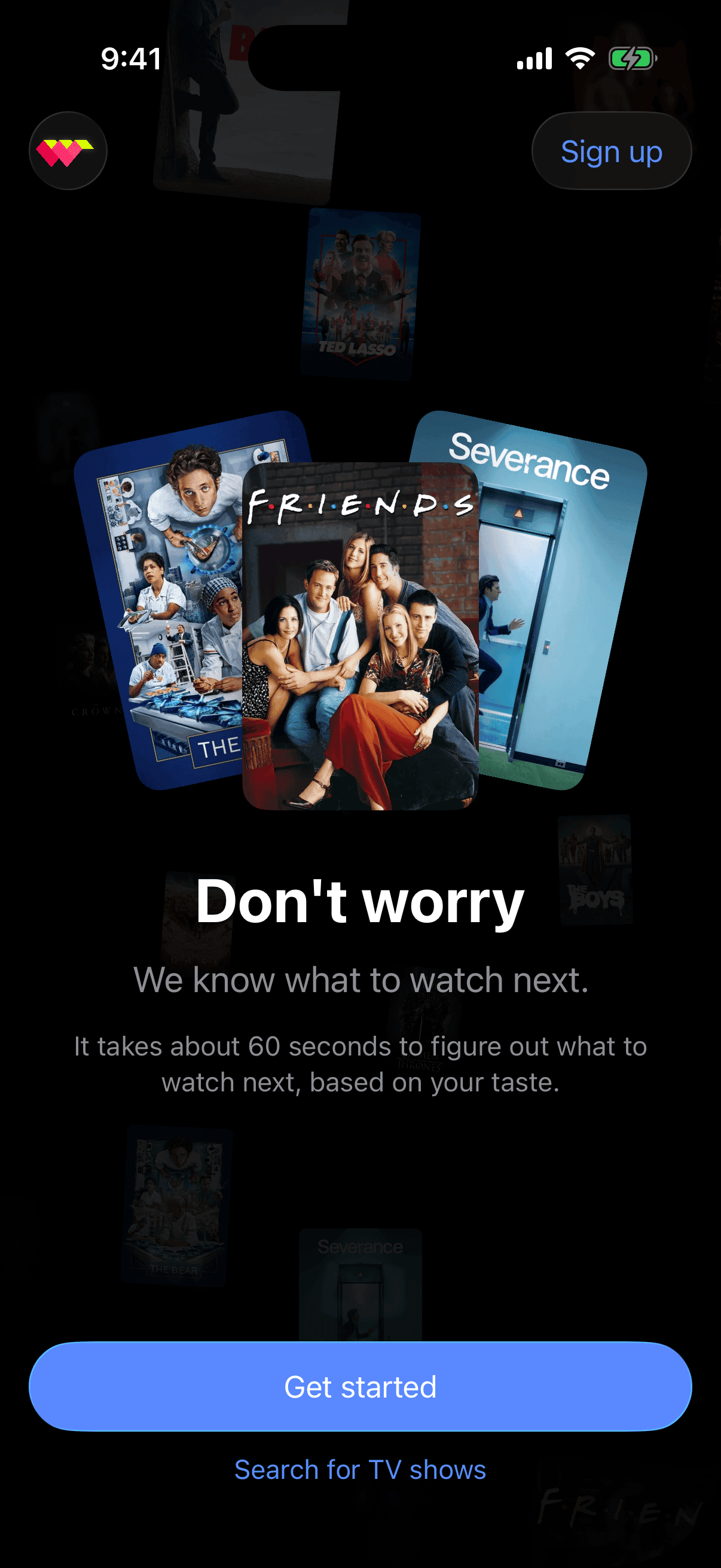
How a minute becomes a match
Under the feed is a simple pipeline. A decade of crowd votes and your sixty seconds of swiping resolve into a single taste fingerprint; every title is scored against it; and that Worthy Score is what ranks the feed, frames the detail view, and orders the watchlist. The model stays invisible — the number is what makes it legible. It is still the centre of the product six years on, which is the strongest evidence the bet was the right one.
Enough to commit
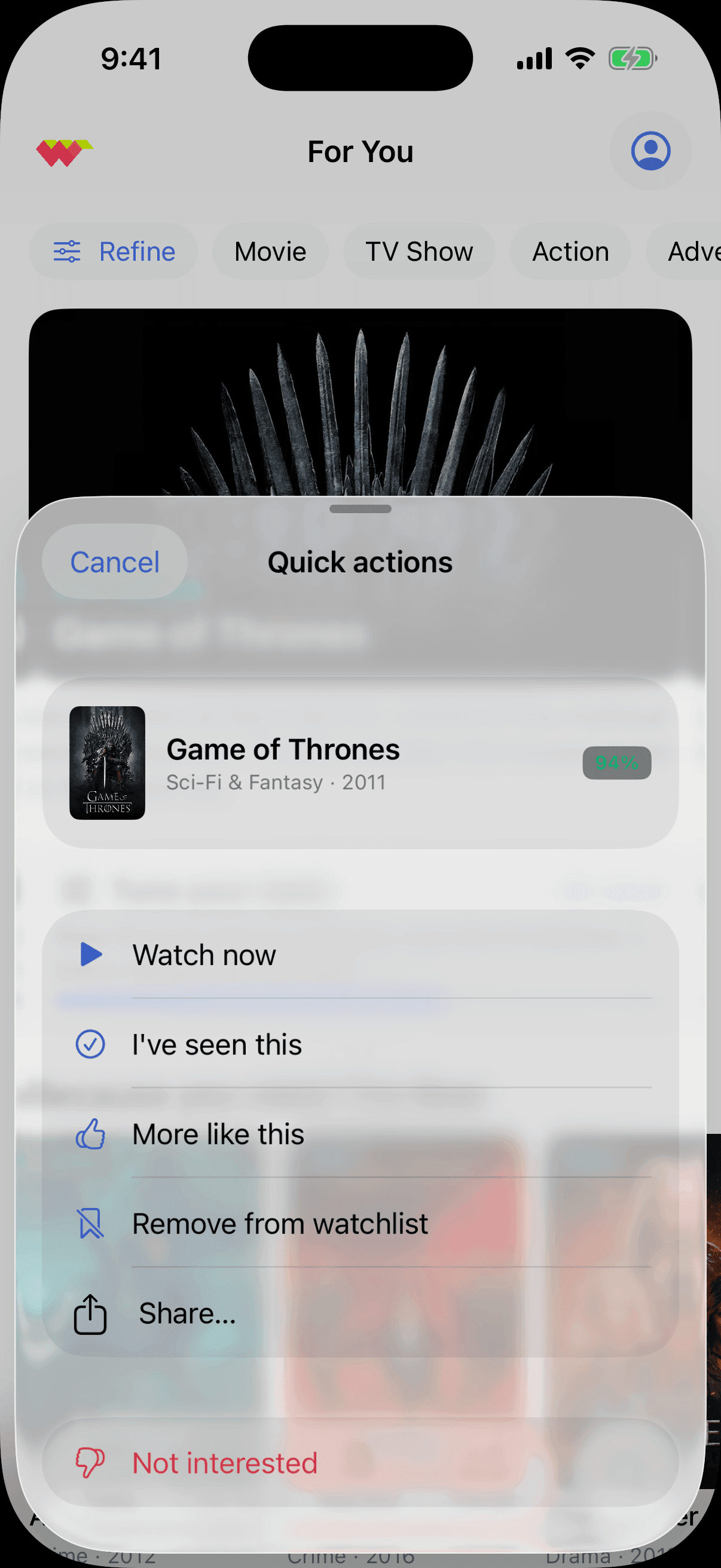
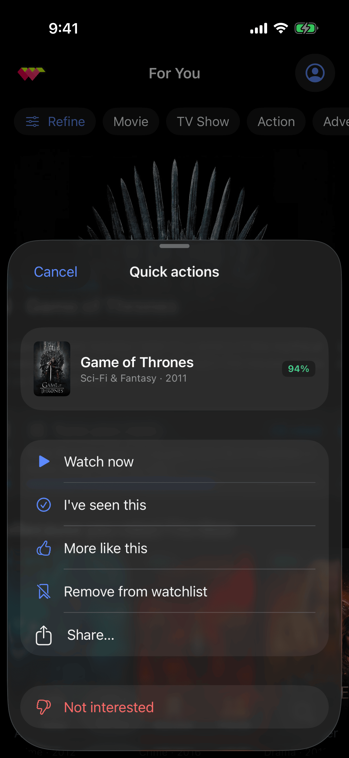
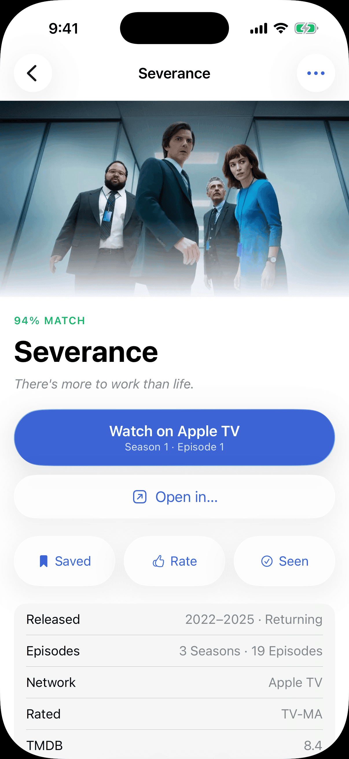
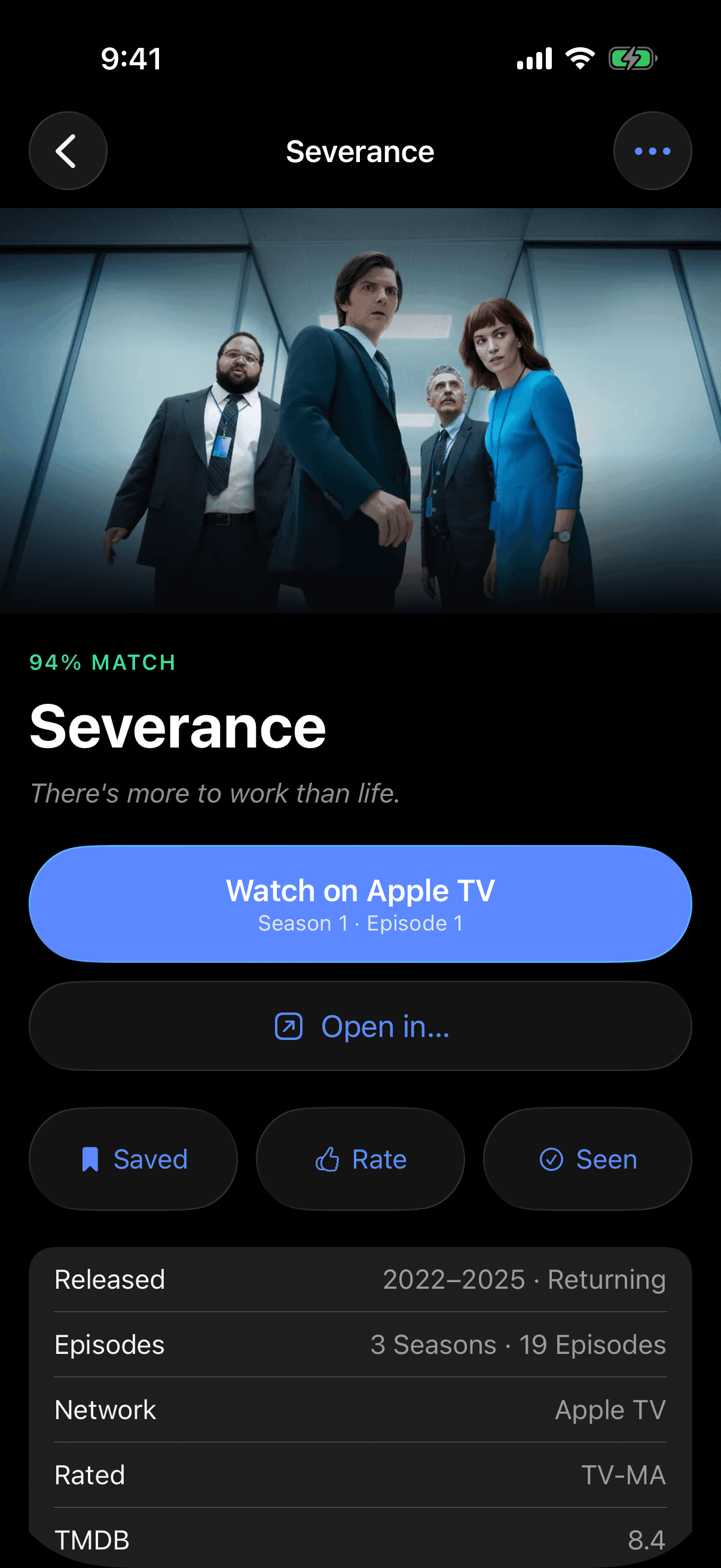
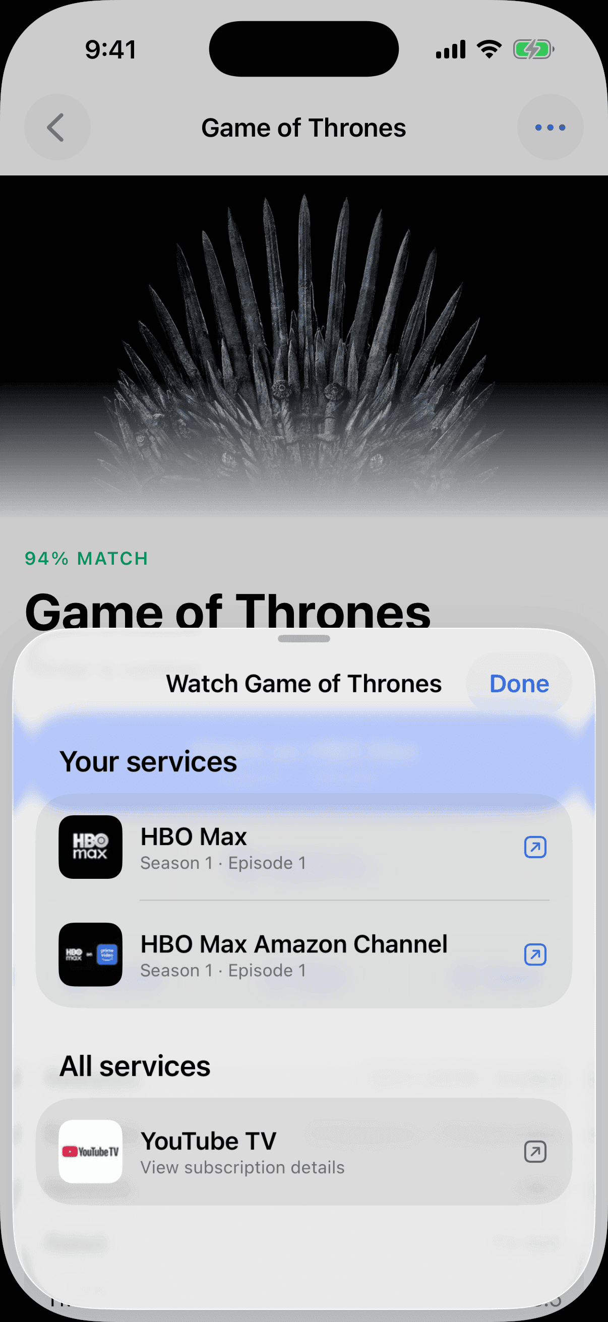
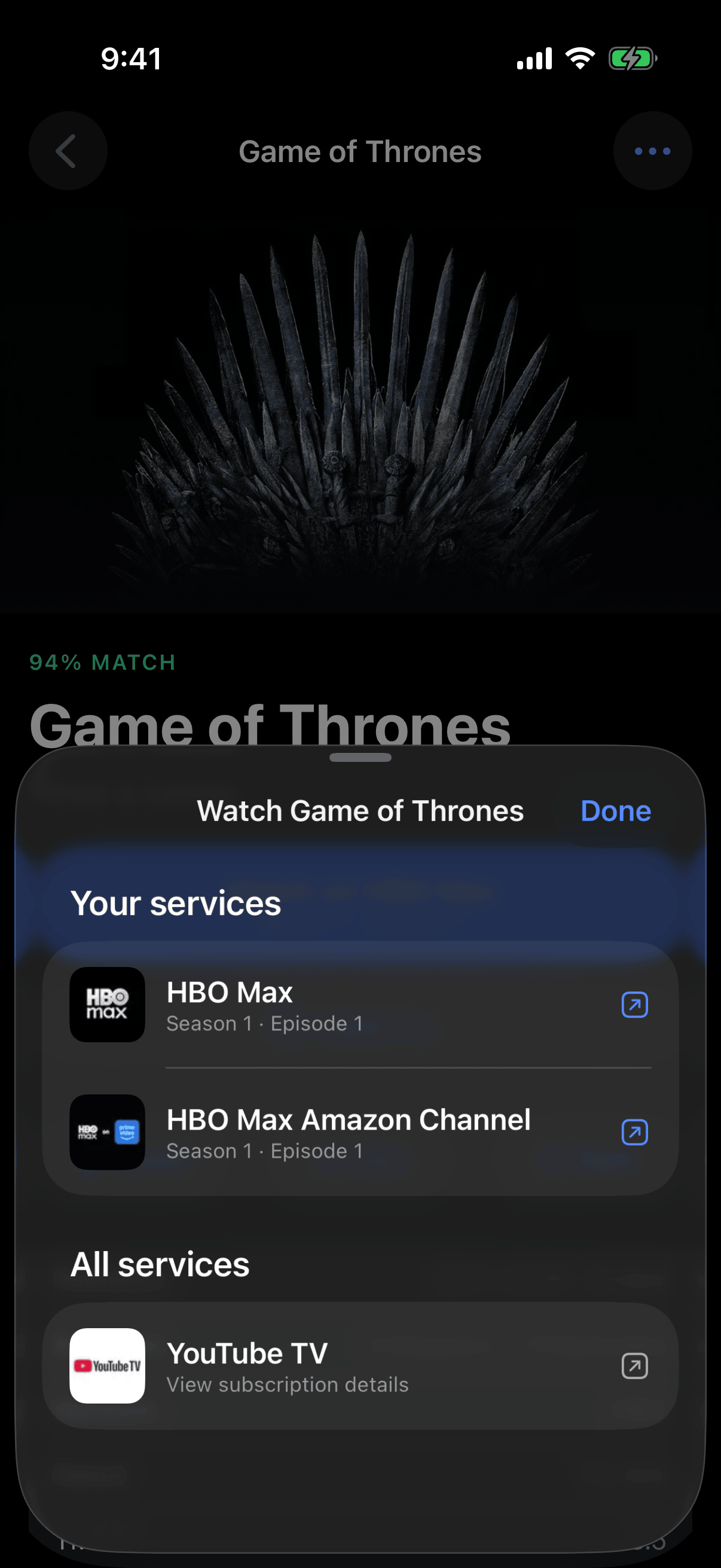
A recommendation is only useful if you can act on it. Tap any pick for the quick actions; the detail view leads with the Worthy Score and the why; and one tap plays it wherever you already have it — across services, not just one. The decision made in seconds, instead of the seven-plus minutes Nielsen had clocked viewers losing to the hop between apps.
Taste you can see, saved and shared
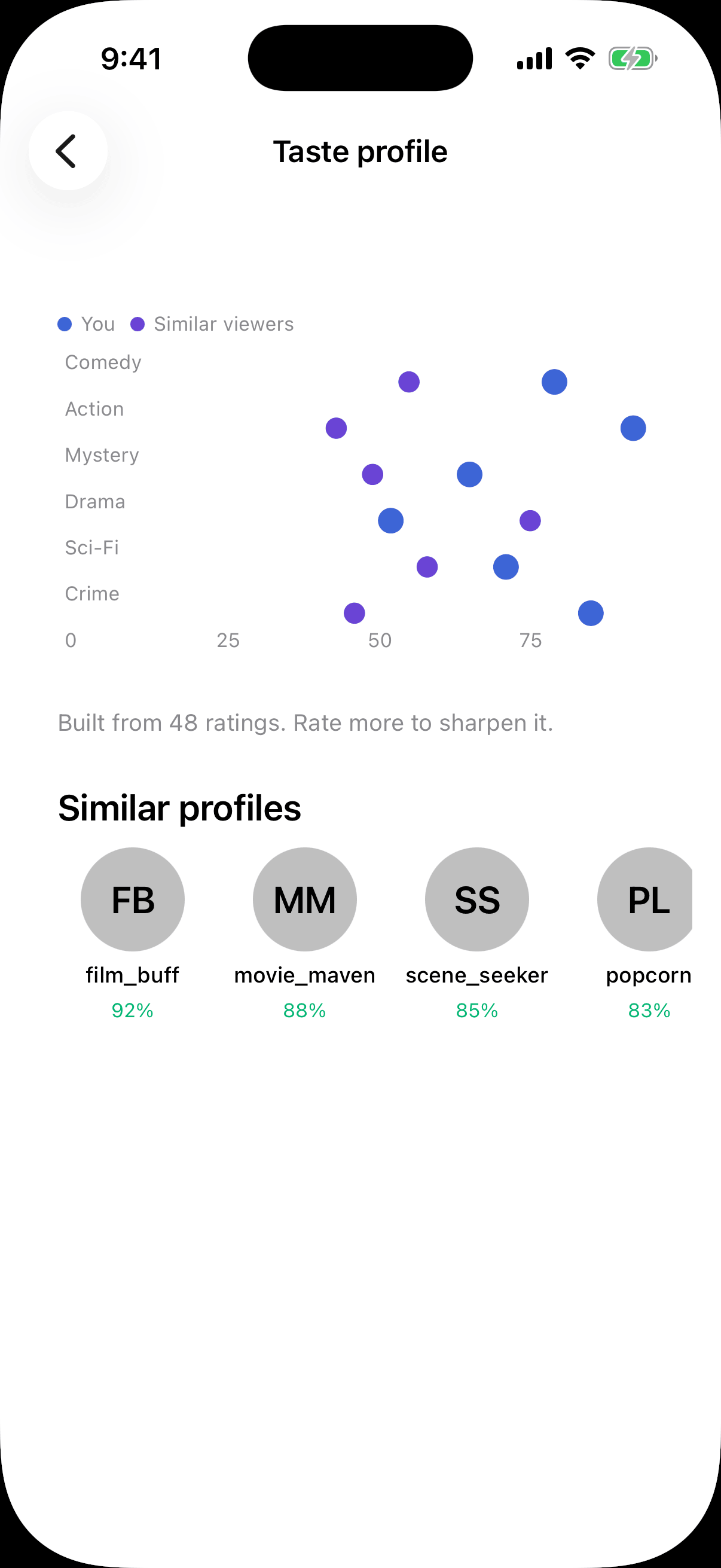
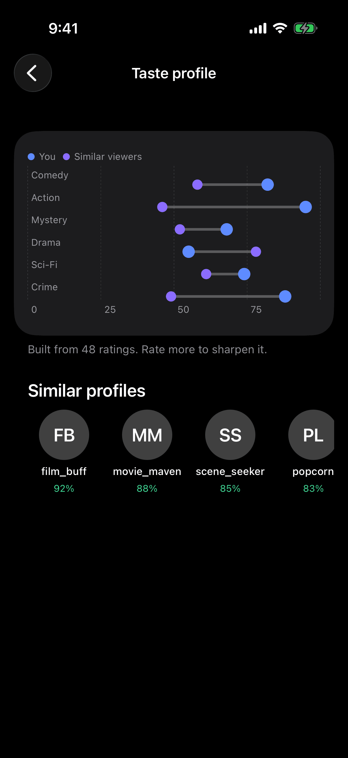
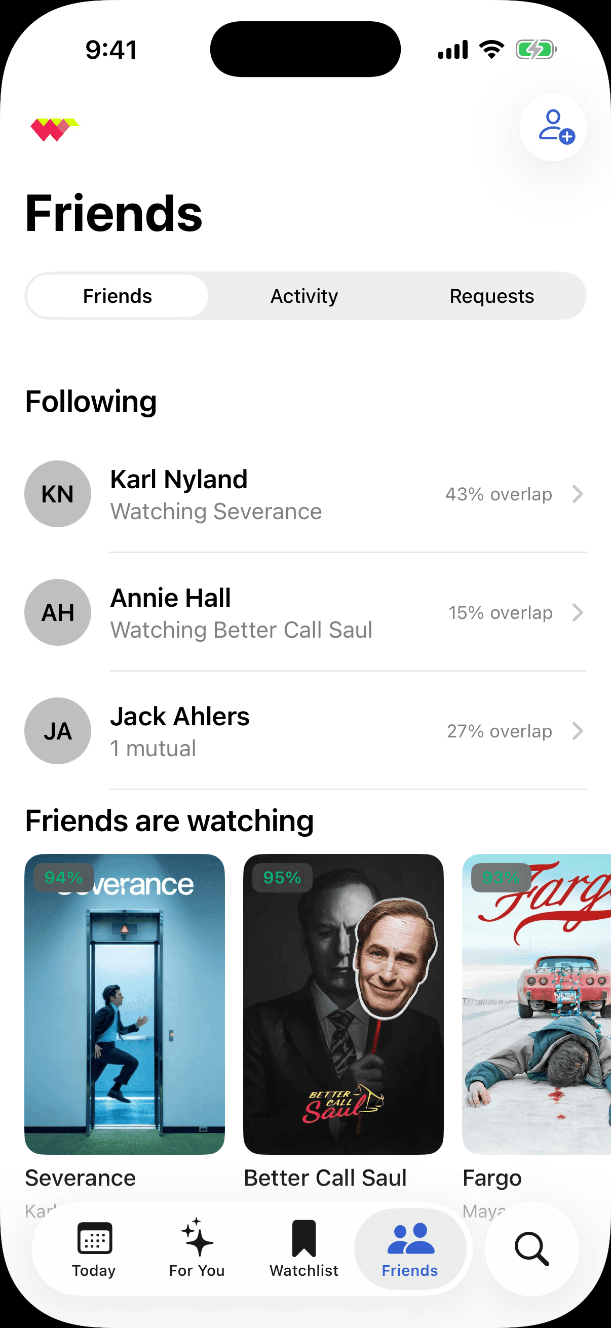
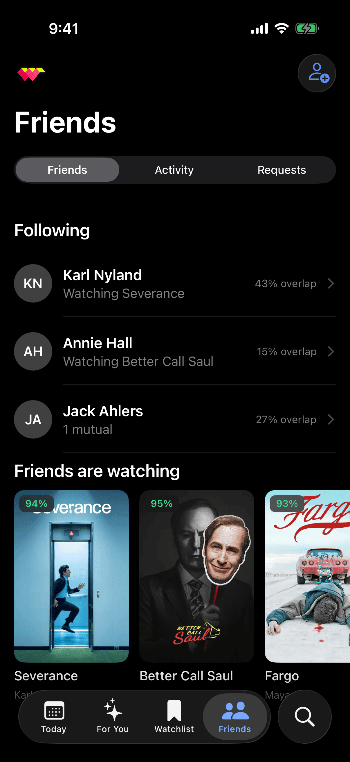
The profile turns the invisible model into something you can read: your genre affinities set against the viewers who share them. Watchlists span services, so the show you saved on a whim is waiting when you are. And the social layer — a community around shared taste, a profile with a taste-overlap read on how alike two people watch — was designed in full and then deliberately cut from v1 to keep the timeline honest. Worth saying how that ended: Ranker shipped shareable watchlists later, on their own schedule, from that groundwork. The scope call was right, and the work wasn't wasted.
What the era could not do
Two ceilings, and both were the data's rather than the design's. First, taste could only be elicited. Explicit votes were the only signal the model had, so the product had to teach itself by making you swipe — a delightful solution to a constraint, but a constraint all the same. Second, the engine could rank but not explain: 94% was a correlation, and there was no version of the app where you could ask it why, or argue. The same limit shows up as catalogue — WatchWorthy shipped television only, and did not add movies until February 2025, because that is where the vote data was deep enough to be worth trusting. Everything above is the best product those two facts allowed.
What got cheap
One thing changed, and it changed both ceilings at once: a model can now read the synopses, the reviews, the episode lengths and your own history, and answer in words. Taste stops having to be demonstrated a swipe at a time — it can also just be stated. And the unit of the answer stops having to be a ranked list, because a list is what you produce when you can score but cannot speak. The interesting question is not whether to bolt a chatbot onto the feed; it is what the app's own signature number becomes when it can finally account for itself, and what it can be asked that it never could before. What follows is my attempt at that, built in the same app on the same data, and shipped nowhere.
First, six years of iOS
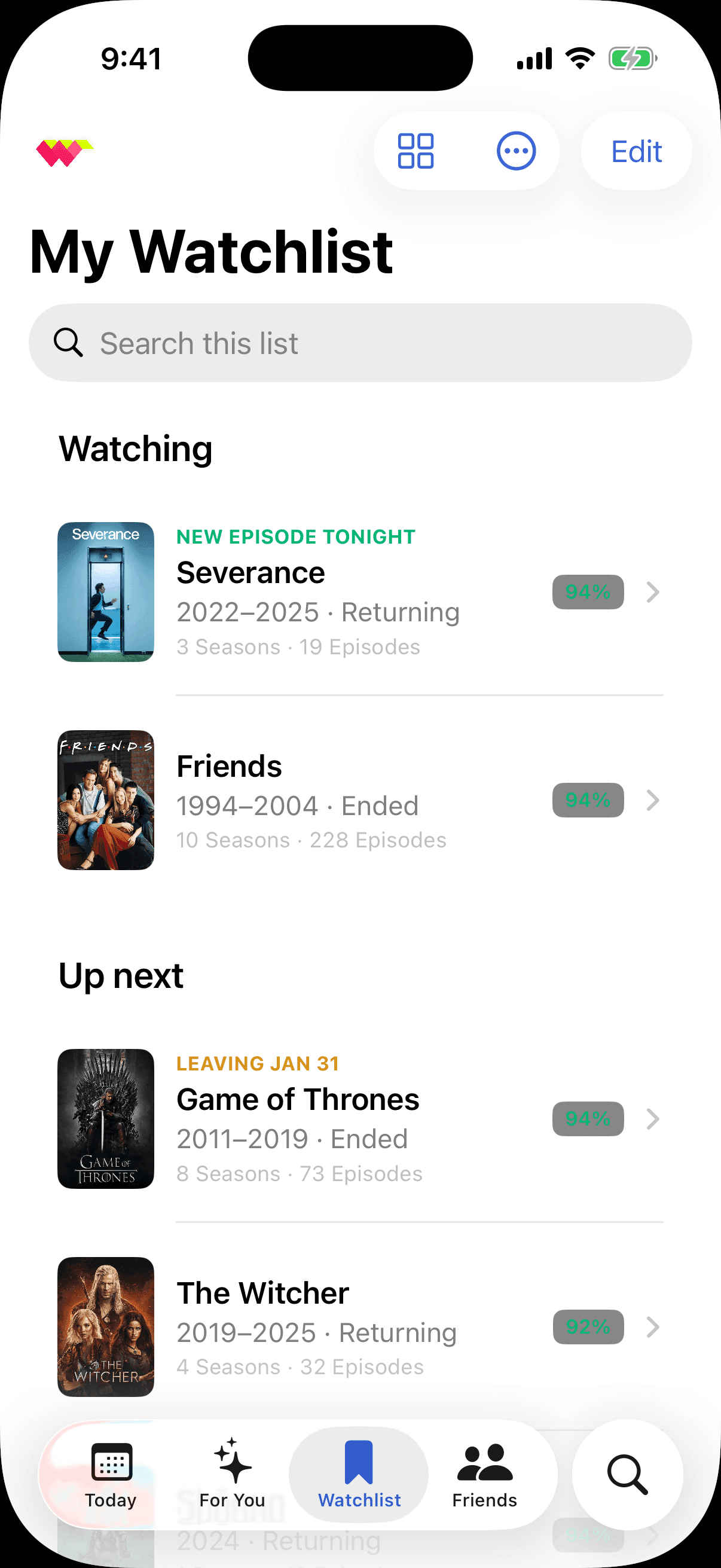
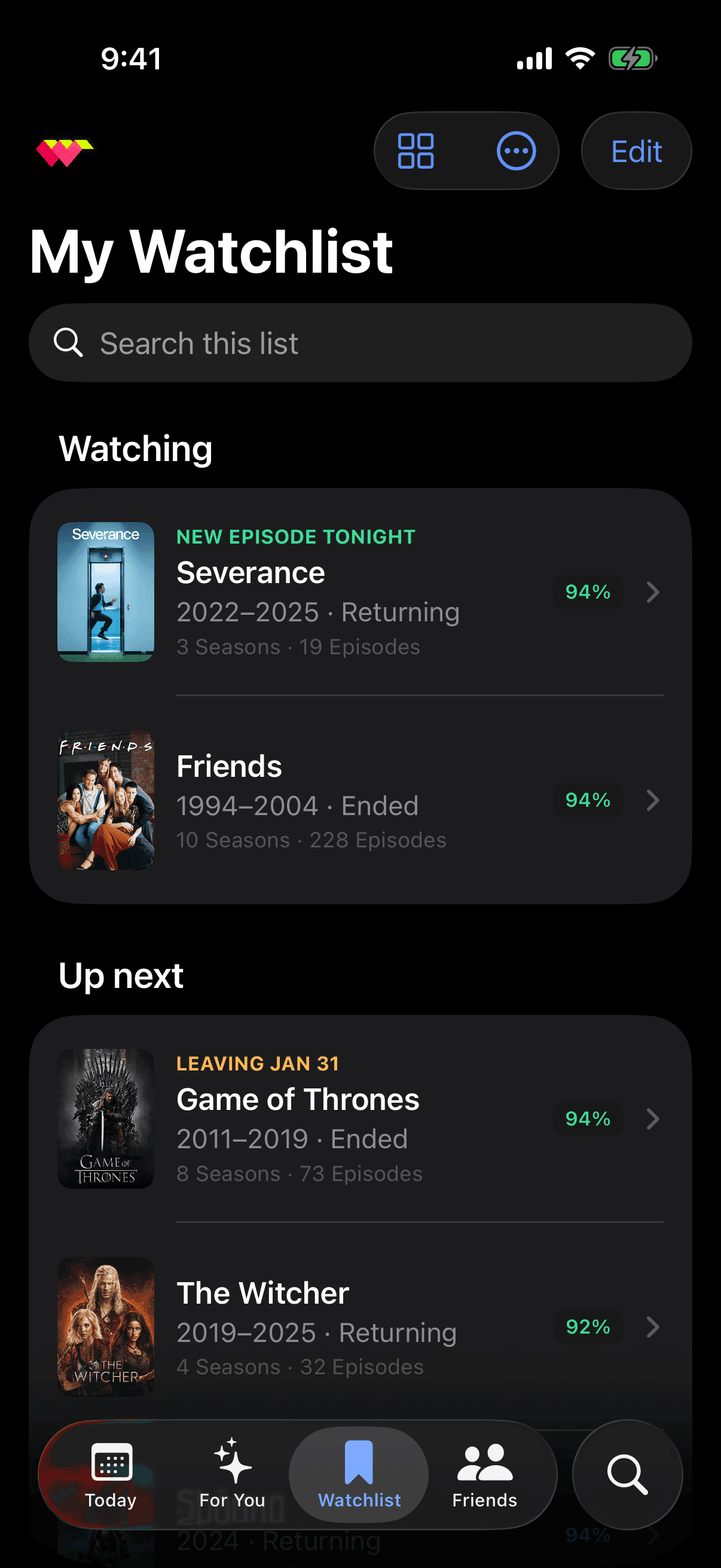
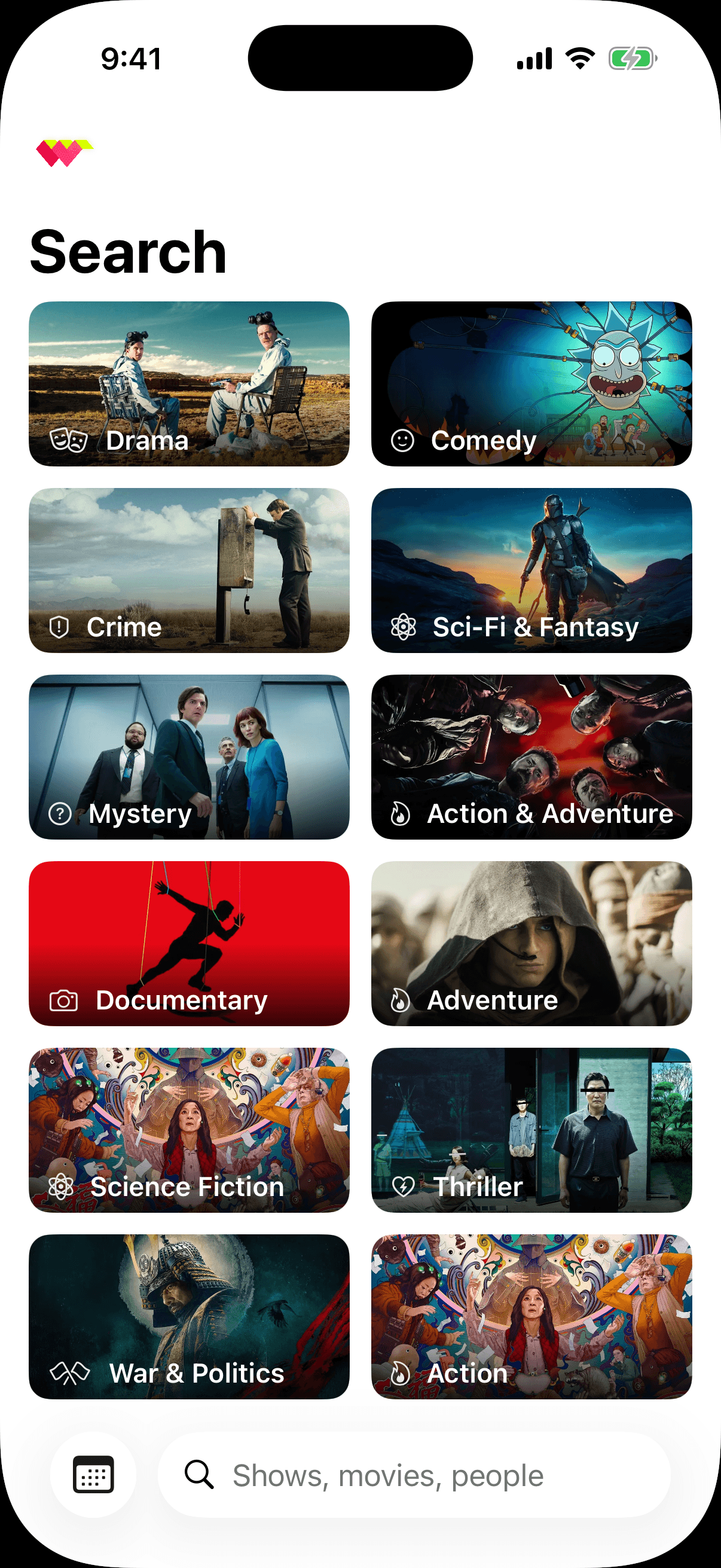
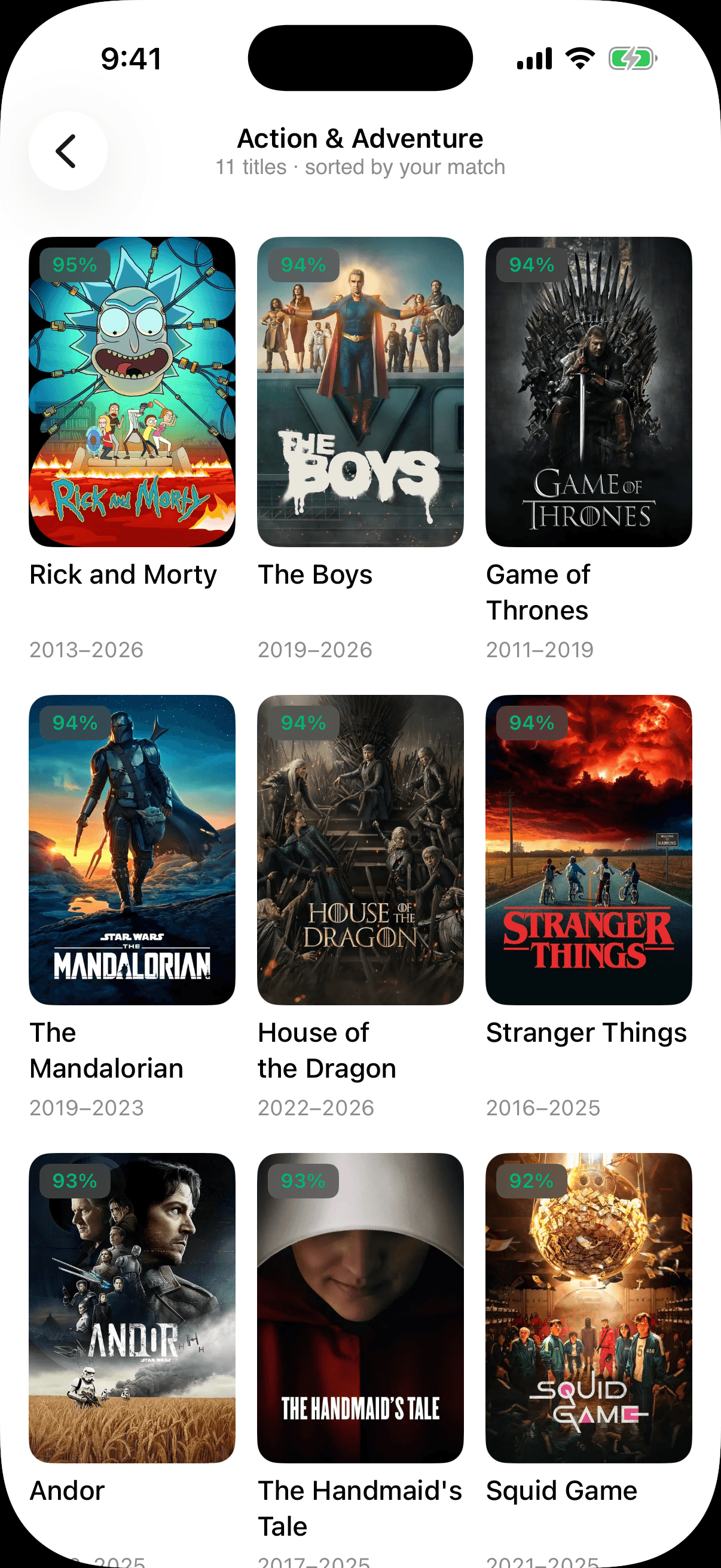
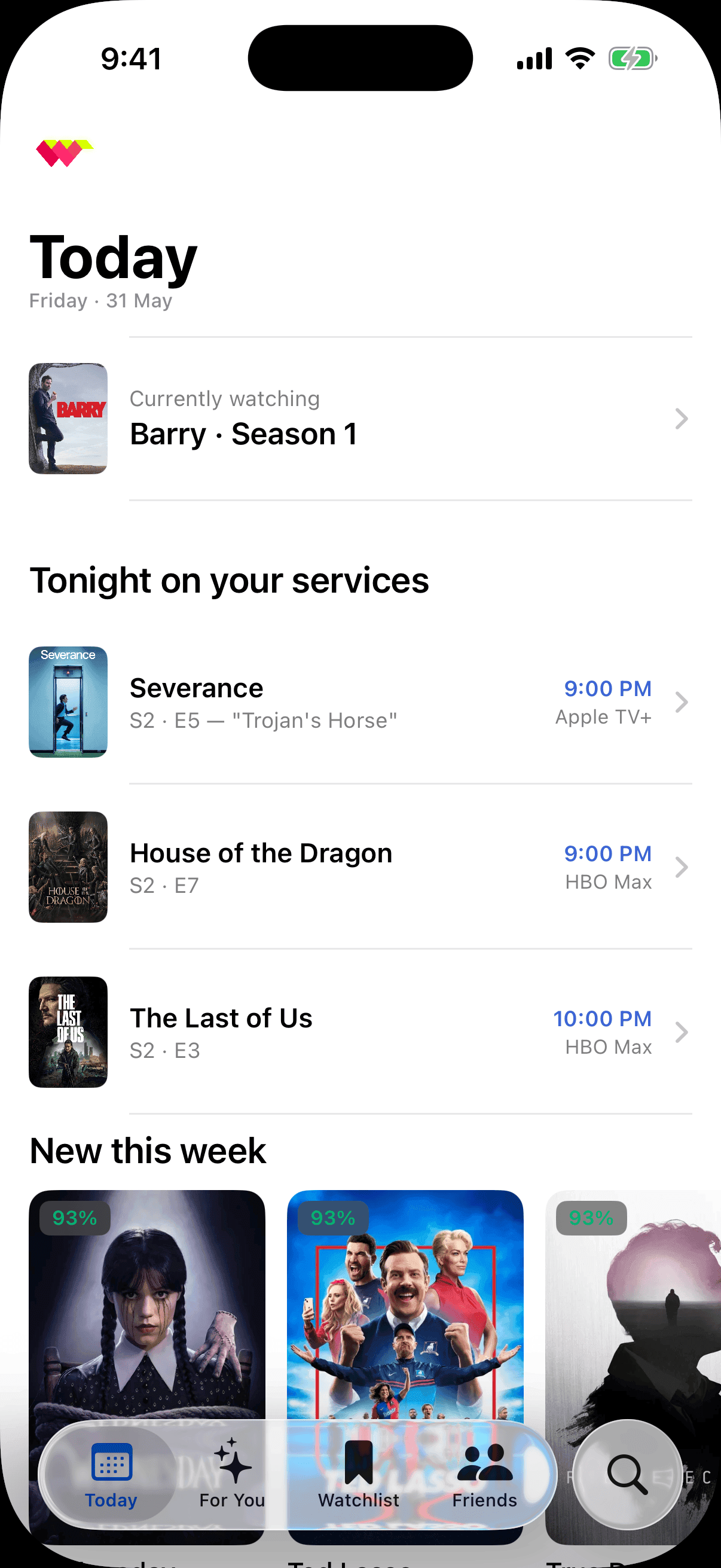
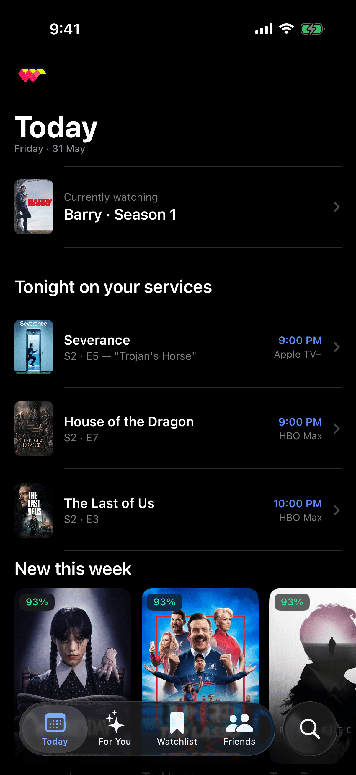
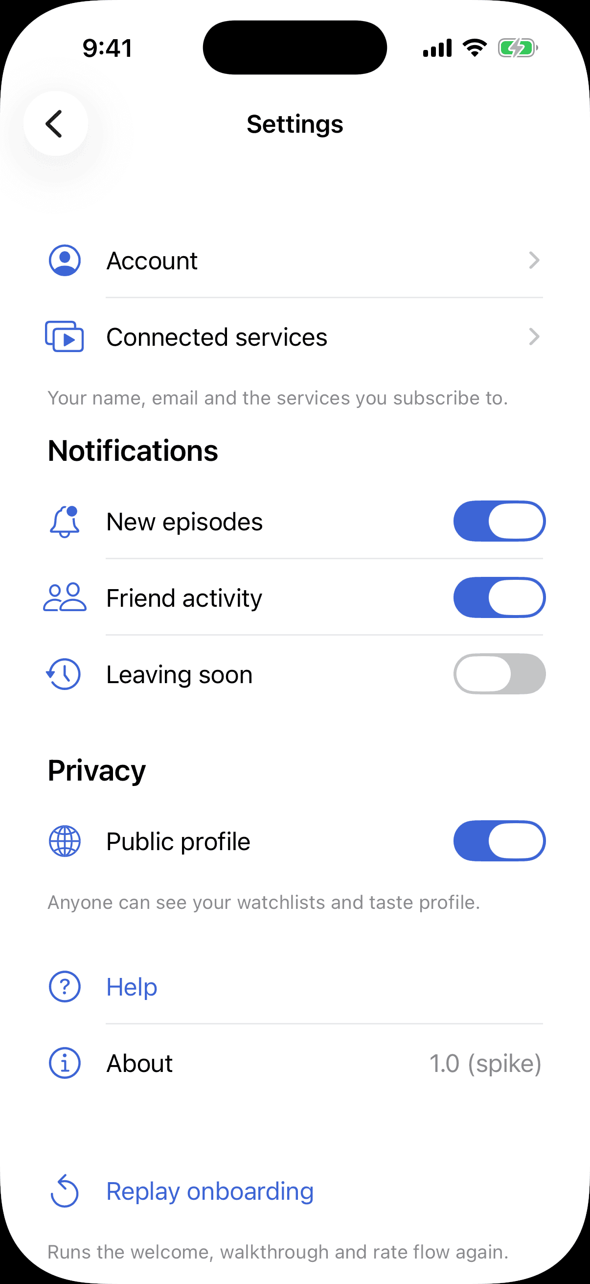
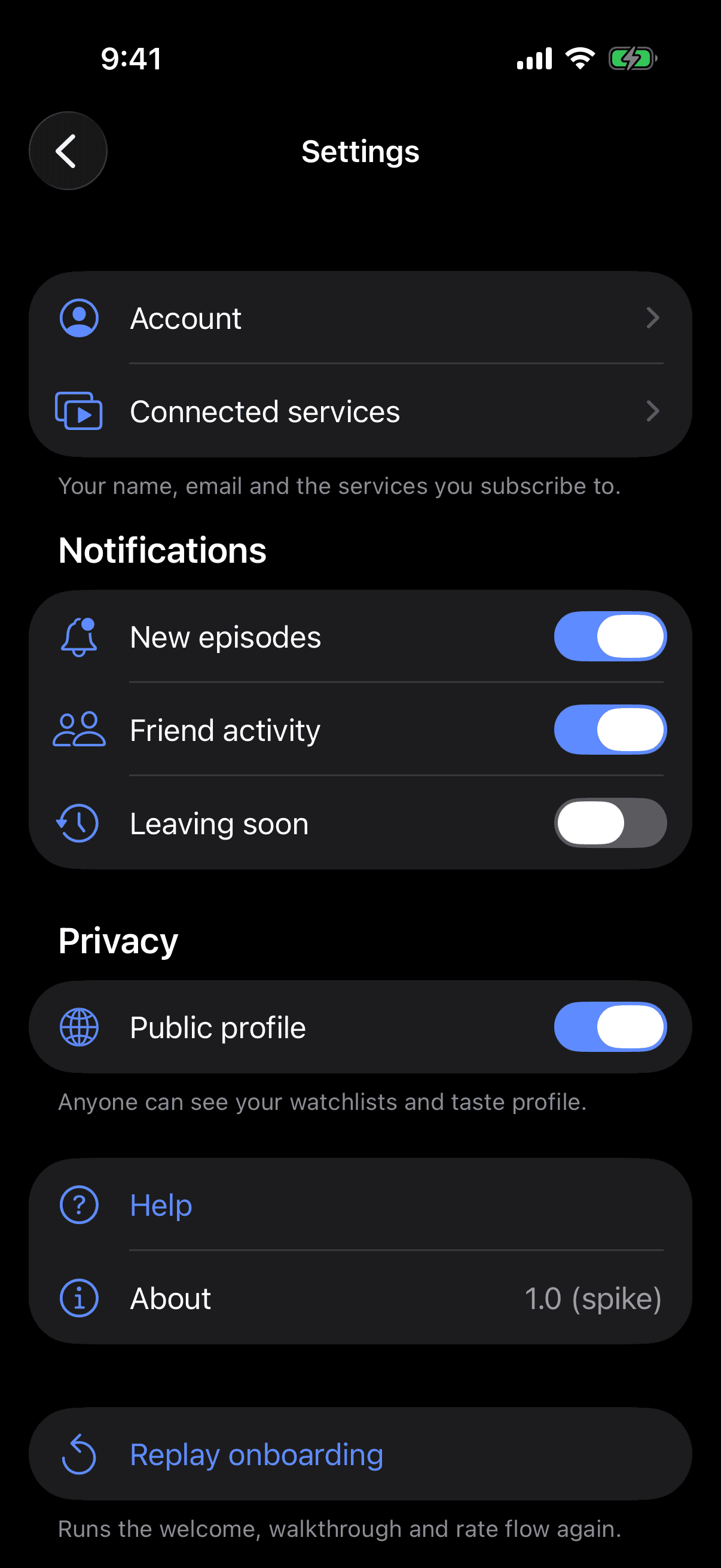
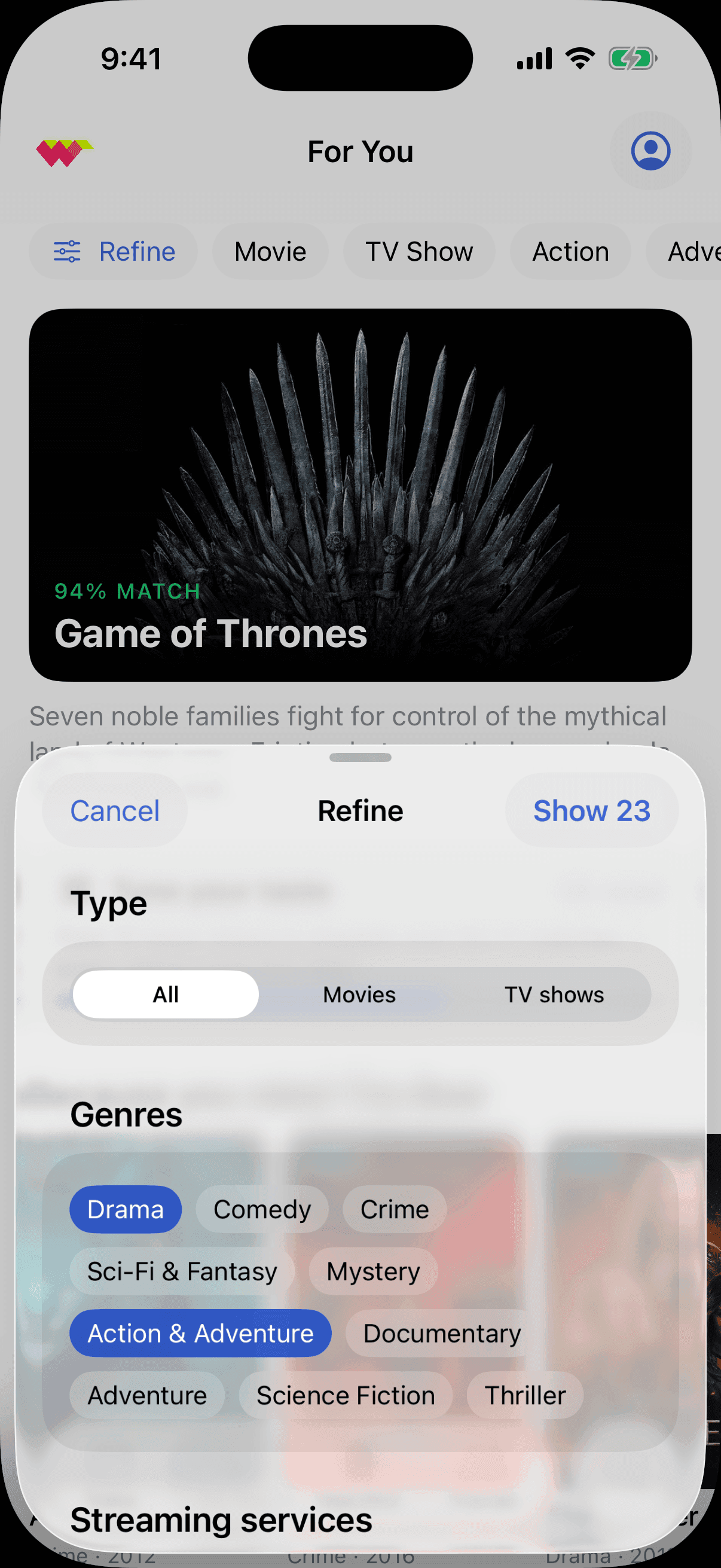
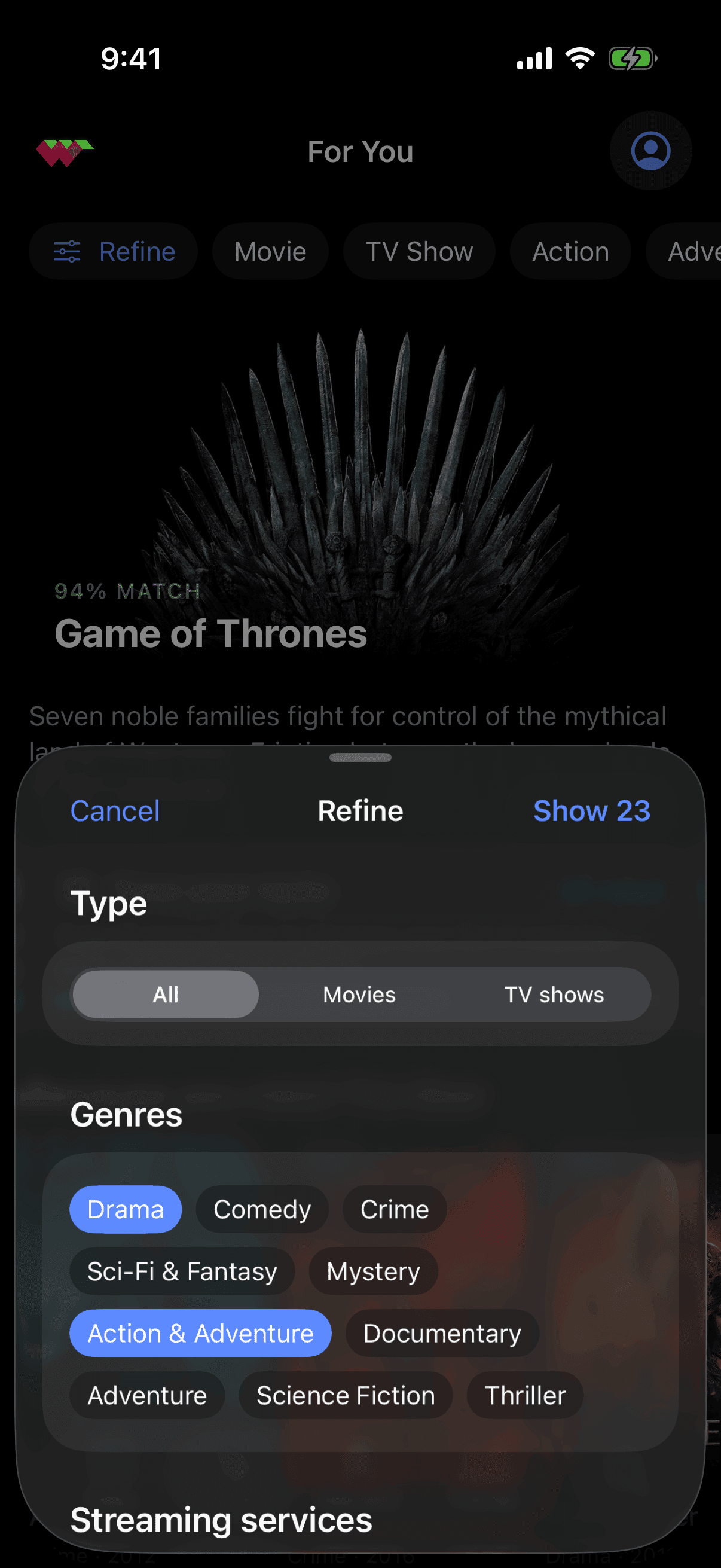
Before any of the thinking, the plumbing: I rebuilt the entire app natively in SwiftUI, on stock iOS 26 components. Lists with real sections, swipe actions and edit mode; forms with live footers; system search with scopes; sheets with detents; the system tab bar, which arrives with a detached search tab and minimize-on-scroll the 2019 design never had. The rule was that if iOS draws it, I don't. It is not a redesign — the screens are the same screens — but it is the honest baseline, because you cannot argue about what a product should become while you are still hand-drawing the things the platform now gives you.
What the platform had a better opinion about
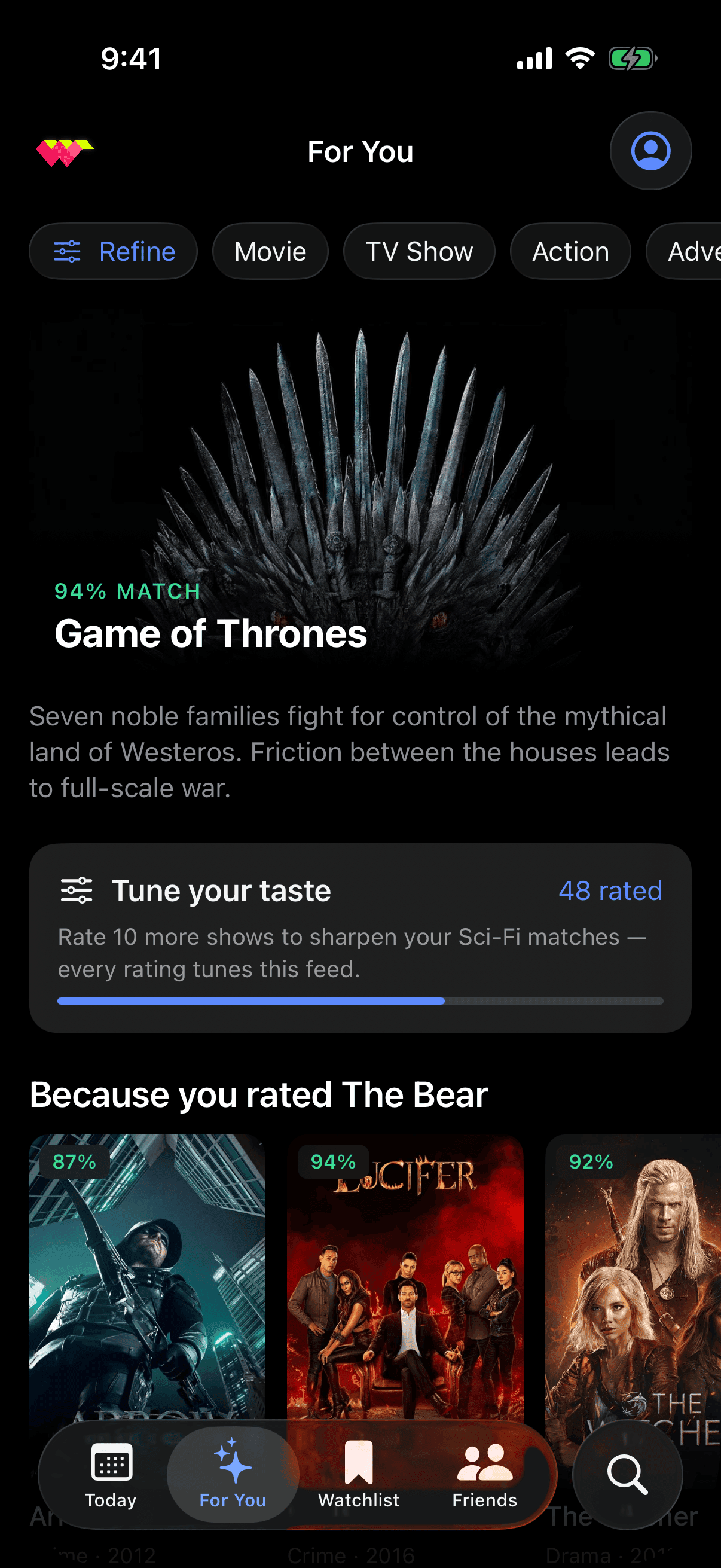
Two findings worth the rebuild on their own. The taste profile was a bespoke SVG radar; radar is not a chart type Swift Charts offers, and hand-drawing one is exactly the habit this exercise exists to break — as a grouped bar comparison the same data is simply easier to read, and the platform turned out to have the better opinion. The second is smaller and more useful: the app's floating glass tab bar was never really glass. It is a dark translucent scrim that happens to be capsule-shaped, and Apple's actual material does the opposite thing — it lifts a dark backdrop where the hand-built one sinks it. Two treatments that look alike in a screenshot and read as opposites in motion. You only learn that by putting them side by side, which is the argument for rebuilding rather than re-skinning.
The number, made accountable
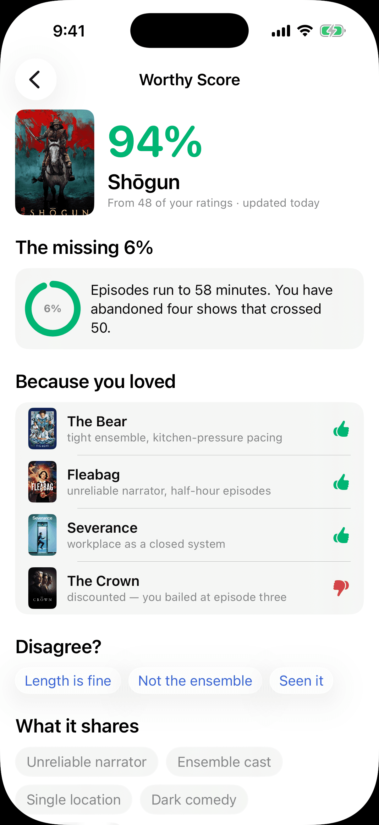
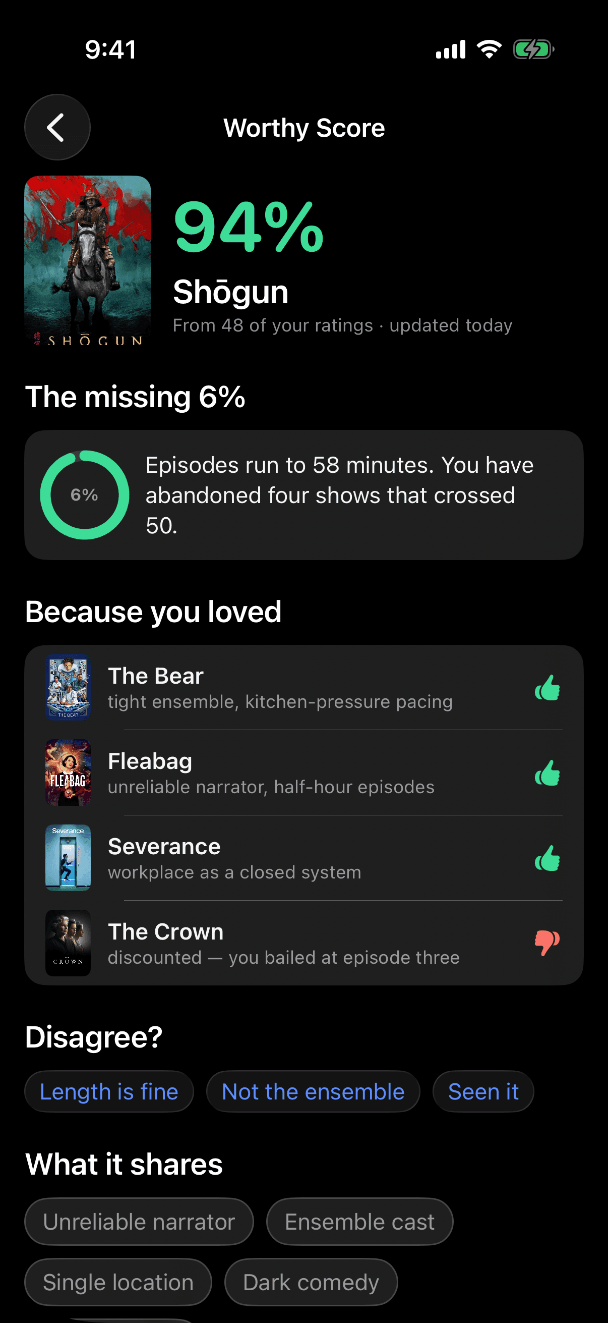
This is the screen the original could not have produced, and the one I care most about. The Worthy Score survived six years as the centre of the product, so the rebuild does not touch what it is — same number, same weight, same green. What changes is that it opens. Ninety-four per cent, and here is the evidence: you rated The Bear, Fleabag and Severance highly, and this shares their ensemble structure, their unreliable narration, their half-hour discipline. Here is the missing six per cent, which is not decoration — season two runs to fifty-eight-minute episodes, and you have abandoned four shows that crossed fifty. And here is where you tell it that it is wrong. In 2019 the score was an oracle: it was right or it was not, and either way the conversation ended. Making it answerable is a smaller change than replacing it, and a much better one.
The question it was never able to take
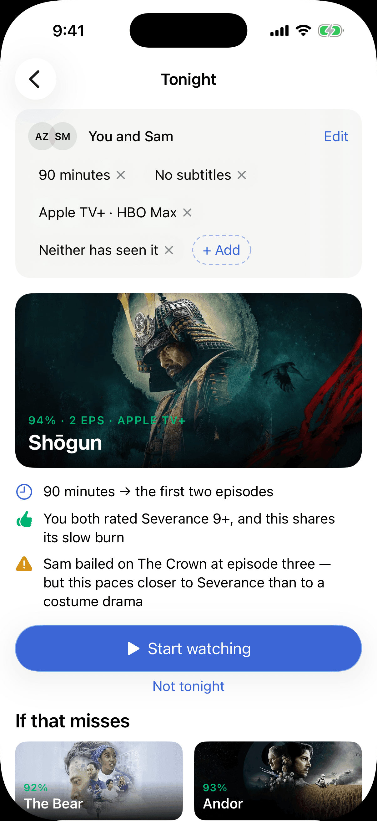
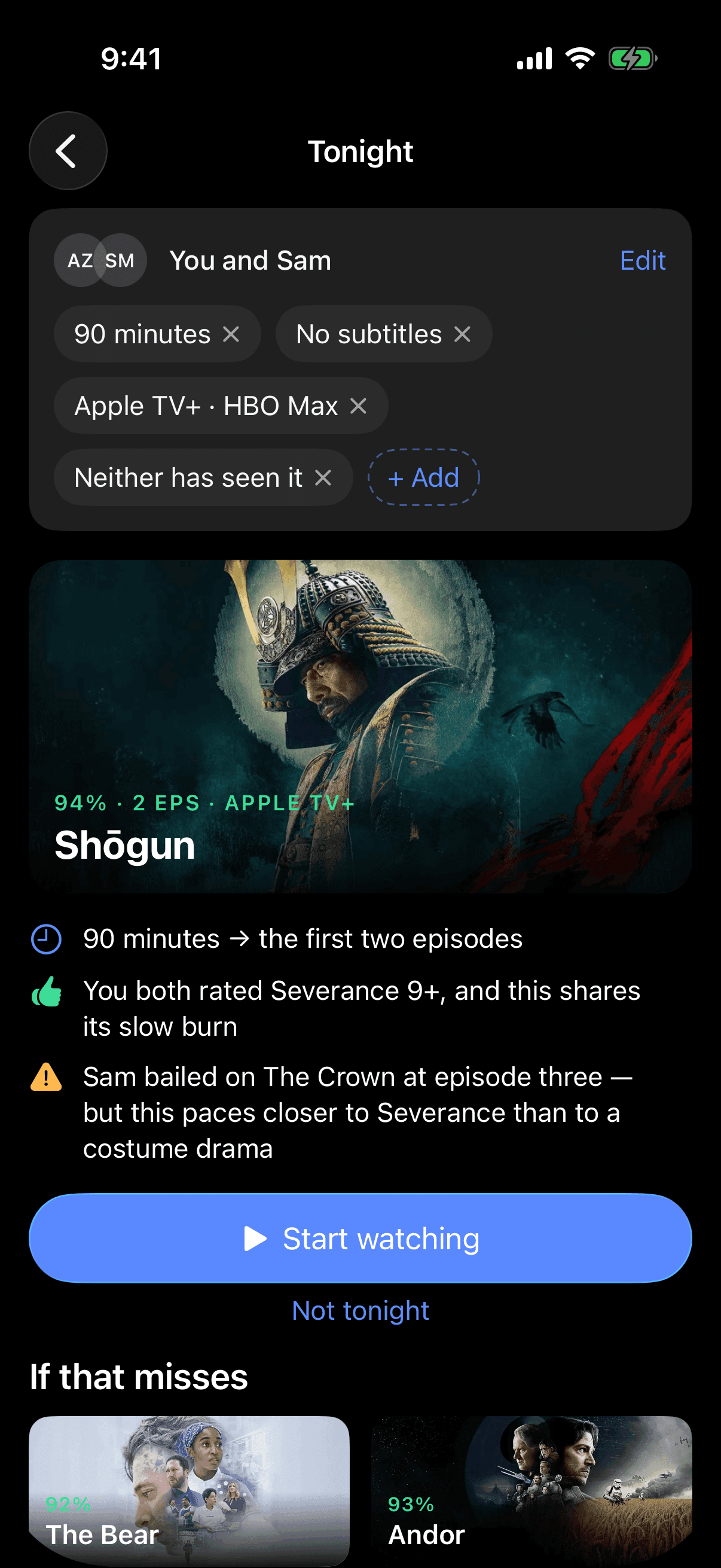
"What should I watch" is the question the app was built for. It is almost never the question anyone actually has. The real one is what should we watch, in the ninety minutes before someone falls asleep, on the two services we both pay for, that neither of us has already started. A single-user taste model cannot answer that — not because it was built badly, but because it holds one profile and has no notion of company, time, or what is already ruled out. So this screen takes the constraints as the input and returns a decision rather than a feed: one pick, a defence you can check, two alternates for when the defence does not land. The defence is the point. It names why Sam is the risk here, and what would change the answer.
The version I built and threw away
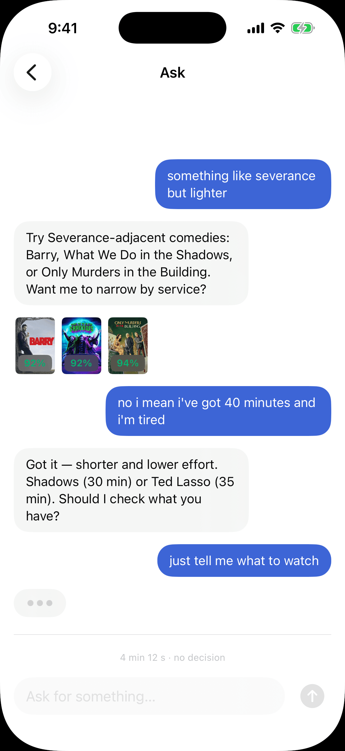
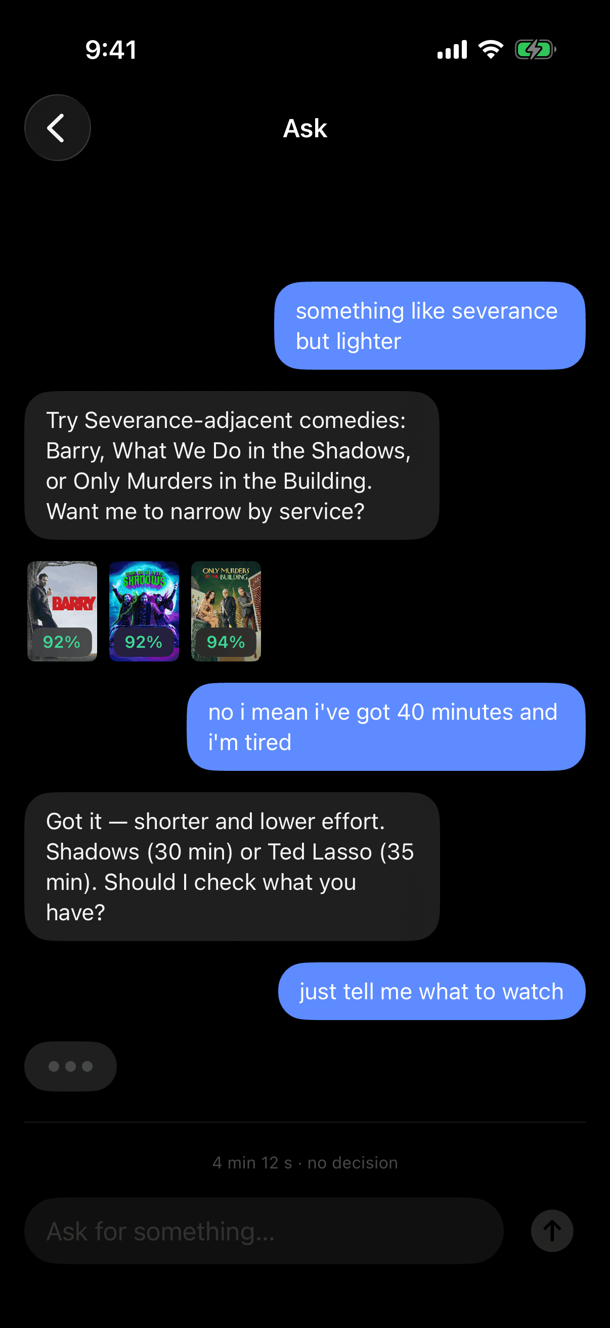
The obvious move in 2026 is to put a chat box on the feed, so I built that first, and it is worse. The transcript on this screen is the real one that killed it: five turns to establish that I had forty minutes and no energy, ending in "just tell me what to watch" — which is precisely the request the original app answered in one screen and no typing. A conversation is a good way to handle the night you know exactly what you want and cannot find it. It is a terrible default, because the feed's actual job is to work on the nights you do not know what to ask, and those are most nights. The model earns its place inside the score and inside the constraint solver, where it does work you can check. It does not earn a text field on the front door. This is the finding I would defend hardest, and it is the reason the rest of this section is not a chatbot.
What shipped
Shipped on iOS in March 2020 and still shipping six years later — v5.0.3 in May 2026, 4.6★ across ~4,000 ratings, now spanning 50+ streaming services.
Validated the core bet: a roughly sixty-second taste read produced recommendations people trusted, and in early testing they settled on something to watch in minutes instead of scrolling across apps.
Proved Ranker's thesis — that a decade of crowd-vote data could carry a consumer product, not just a licensing dashboard.
The deferrals held up. The social layer was designed in full and deliberately cut from v1; Ranker shipped shareable watchlists later, on their own schedule, from that groundwork.
The rebuild in the second half has no results to report. It is a design proposition, not a shipped product.
Selected decisions
- 01
Scoped ruthlessly for product-market fit — the taste read, the recommendation engine, and the watchlist had to be great; the social layer and deep service integrations were designed in full, then deliberately deferred to keep the timeline honest and the bet testable.
- 02
Designed onboarding as a fast, playful swipe — closer to Tinder than a settings form — so the app earned its taste read before asking for anything.
- 03
Made the recommendation legible: a Worthy Score and a visible taste profile that told people why a pick fit, not just that it did.
- 04
Prototyped the key interactions in Principle rather than speccing them in redlines — so the swipe, the pacing, and the transitions were something the engineers could feel and match, not interpret.
- 05
In the rebuild: rebuilt the whole app natively in SwiftUI on stock iOS components, then made the Worthy Score answerable rather than oracular.