A concept, brand, and motion for journey-first analytics

Teams trying to grow products drown in analytics that report what happened but never connect it to what matters — scattered data across tools, and no clear line from a customer's journey to lifetime value and ROI.
Journify's concept makes that line the product: a journey-centric analytics platform that maps the path a customer takes and ties each step to conversion, cost, and revenue. The client came to me with an unlaunched product and one ask, animations to show it off. The first conversation turned that into the whole front door: a single long page that explains the product, takes a waitlist email, and sells lifetime access, plus the feature animations, an animated logotype, and social graphics to launch it with.
Role
I led concept design, branding, web design, and animation — defining how a journey-centric analytics platform is shown, and building the page, the eight Rive animations, the logotype, and the social graphics that tell its story.
An ask for animations that became the launch
The client's objective was clear: they wanted animations to showcase an upcoming product. It became obvious during the first consultation that animations alone would not do the job. Visitors had to learn what the product was before a clip could mean anything, the team needed a waitlist to have someone to launch to, and they wanted to sell lifetime access before the product shipped. So the scope grew into a landing page that does all three, with the animations as its proof.

Fig. 01The whole page, top to bottom: hero, four numbered features with their animations, the roadmap, and the offer. It is still live at color-shoot-871551.framer.app.
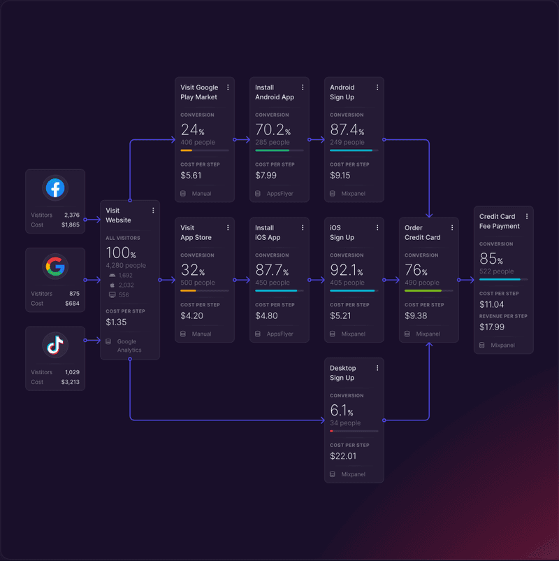
The concept is journey-centric: map the path a customer actually takes, then read conversion and revenue step by step, so the analytics connect cause to outcome instead of reporting totals in isolation. That canvas had to exist before anything else could be animated, so it is where the work began.
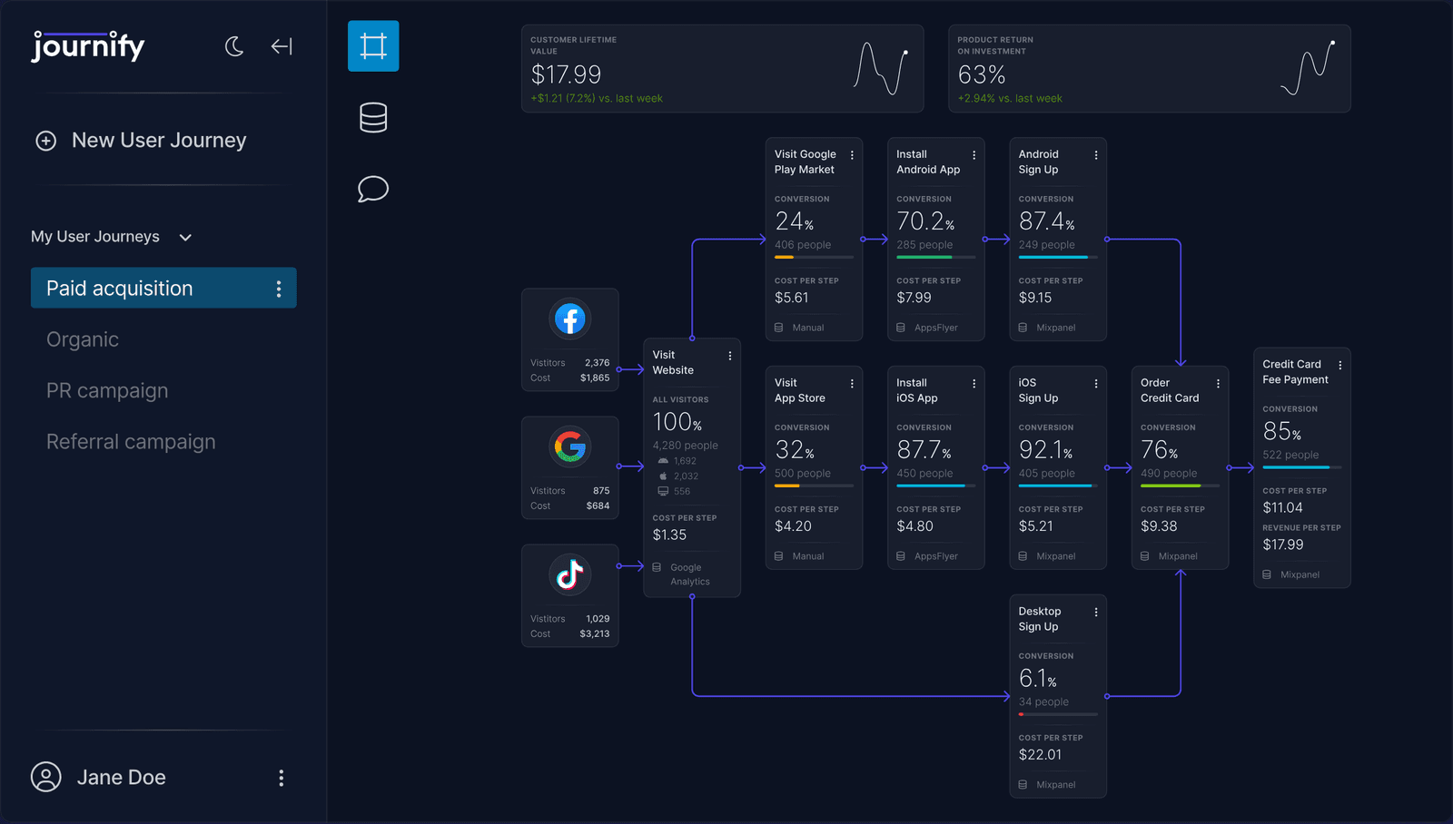
Fig. 02The journey canvas. Facebook, Google, and TikTok feed Visit Website; the path splits into Android, iOS, and desktop; every card carries conversion, people, cost per step, and the source it came from. Lifetime value and ROI sit above as the two numbers the whole map rolls up into.
Four claims, each proven by the product
The page opens on the product's own headline — growing great products has never been easier — with a subtitle that types itself and a work-email field for early access. The canvas rises into frame below it. From there the page is four numbered claims, and once the hero scrolls away they pin under the nav as tabs, so the reader always knows which part of the argument they are in.
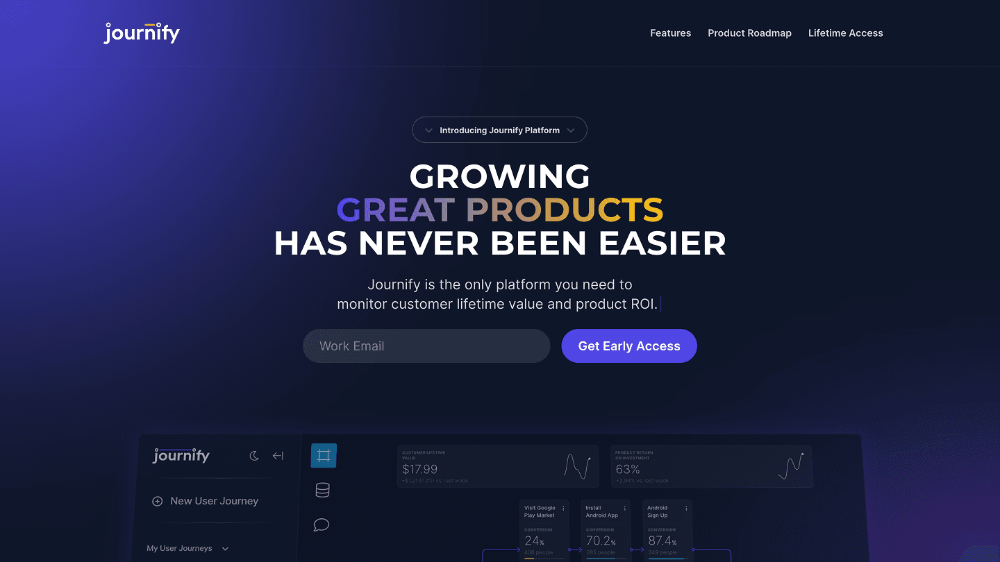
Fig. 03The hero. The gradient across great products is the one flourish on an otherwise restrained dark page.
Each claim is written the way the product works, not the way a brochure does. Build a user journey in a few clicks, or start from an industry template. Track live conversion at each step by connecting to hundreds of sources, or by adding data manually, with no code. Compare your conversions to peer products. Then the same for marketing: connect the channels, and see the price of each journey step so the product's economics are visible rather than inferred.
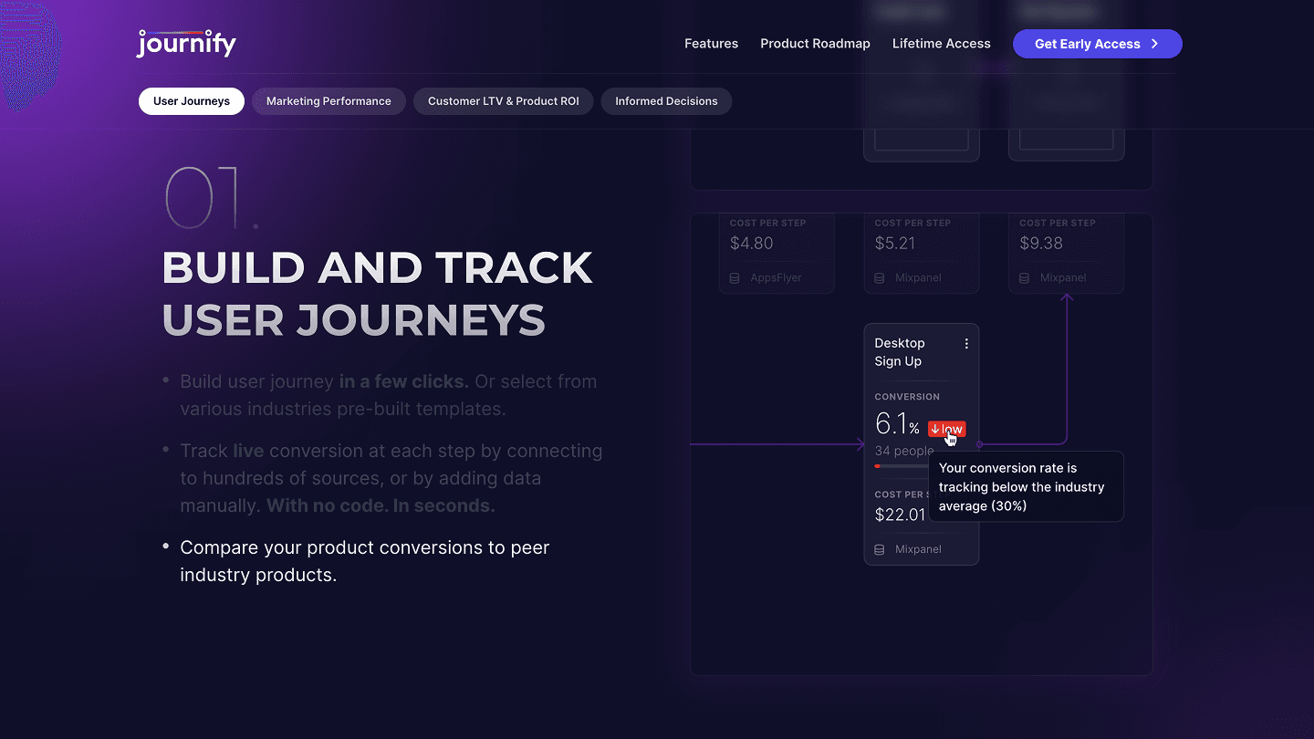
01. Build and track user journeys
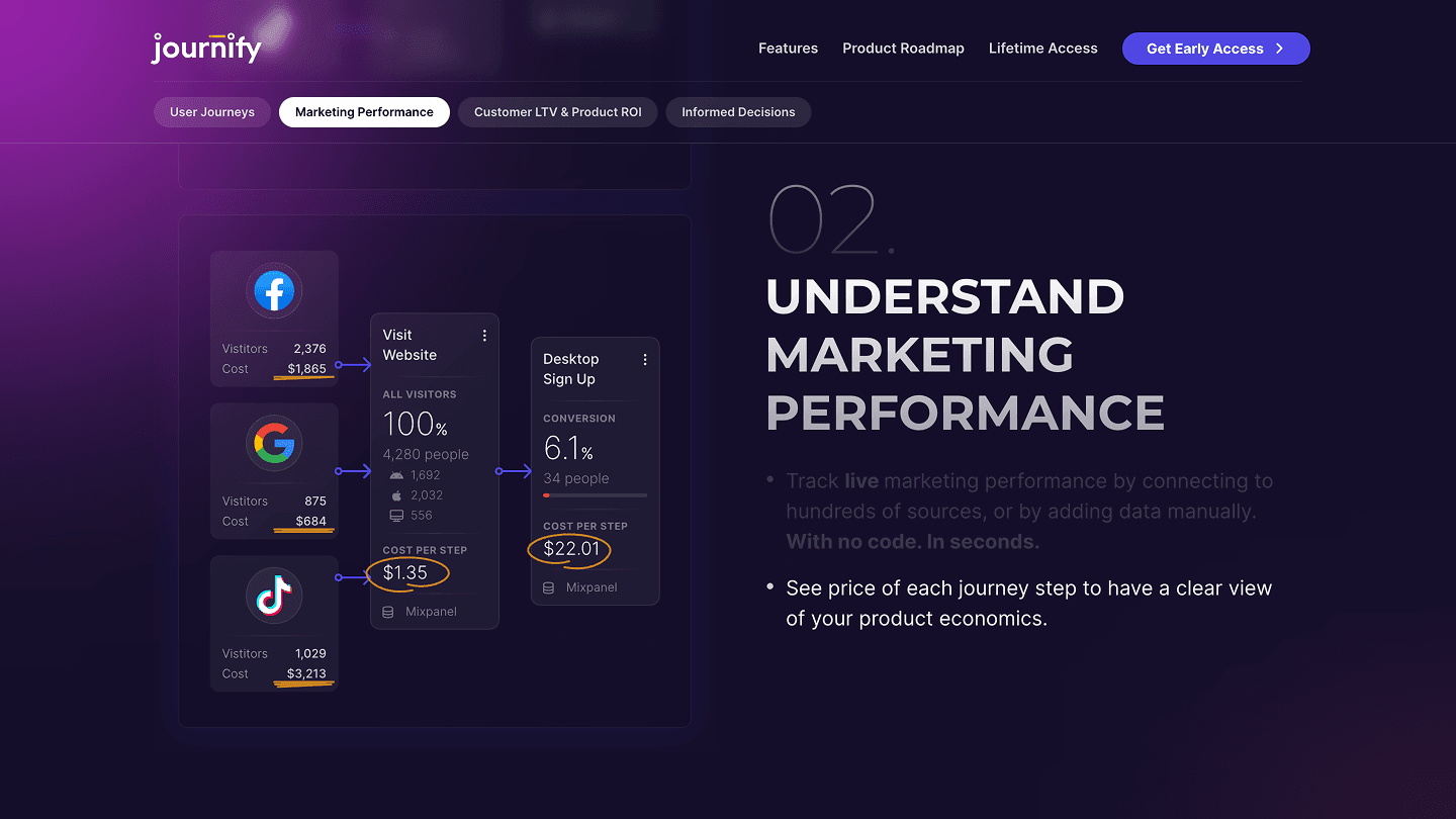
02. Understand marketing performance
Eight animations, one per claim
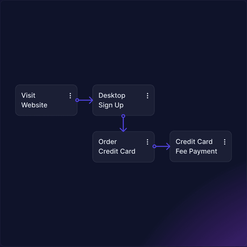
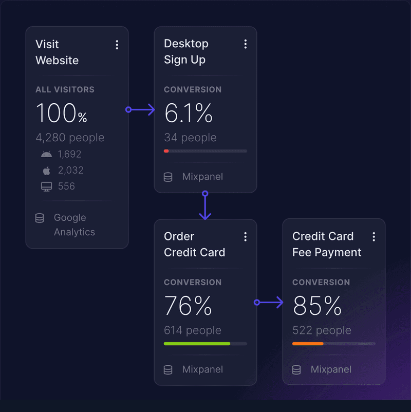
This is what the client originally asked for, and it is still the heart of the page. Each feature bullet has its own Rive animation, and the bullet brightens as its animation plays, so reading the copy and watching the product happen are the same act. The sequences are built from the real canvas: steps are placed one by one, a data source is connected and the placeholders fill with numbers, and a step converting at 6.1% earns a red low badge and a tooltip that says it is tracking below the industry average of 30%.
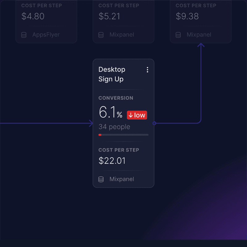

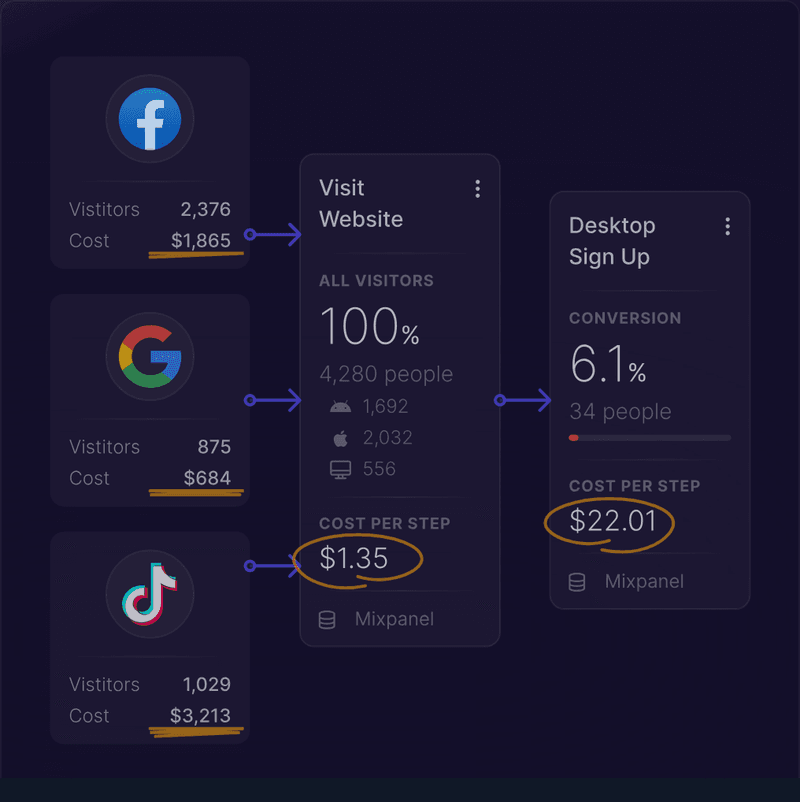
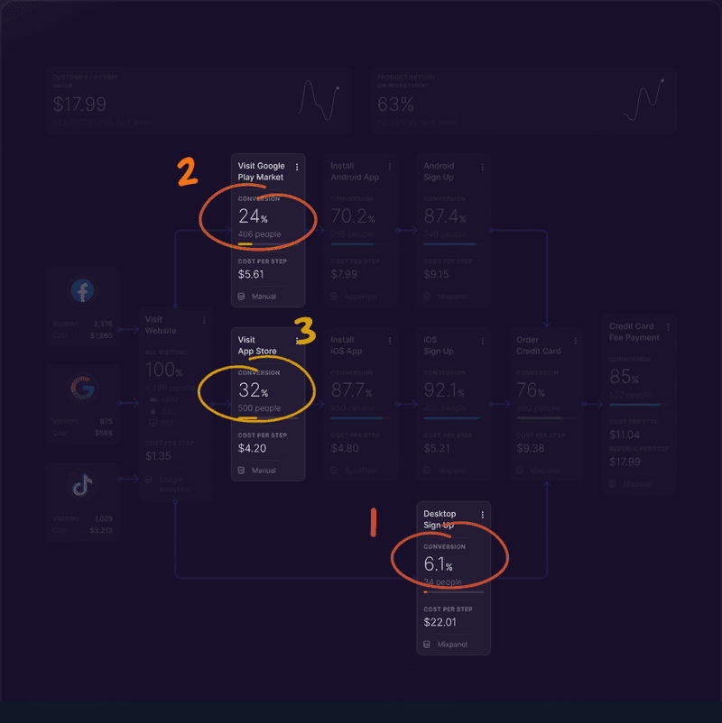
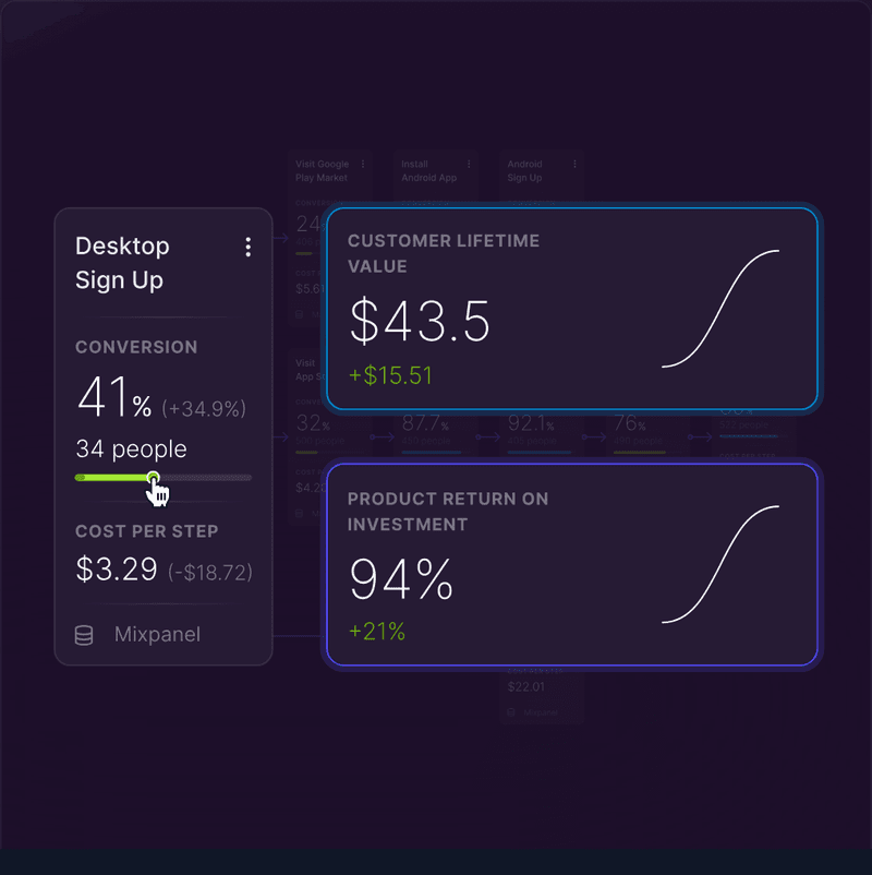
The last two make the case for the product. The first rings the weak steps on the canvas and numbers them. The second is growth mode: a slider on Desktop Sign Up lifts conversion from 6.1% to 41%, cost per step drops from $22.01 to $3.29, and the lifetime value and ROI cards re-run in front of you. A team deciding where to spend its effort can try the answer before committing to it, which is the whole promise of a journey-first tool.
A roadmap, an offer, and a brand to carry them
A pre-launch product has to show where it is going before it asks for money, so the page closes with a roadmap in four releases: journey maps, thirty-plus source connectors, ROI and lifetime-value tracking, and growth mode in 1.0; emotional-experience and pain-point tracking in 2.0; a bank of journey templates and analytics partnerships in 3.0; AI benchmarking and per-step recommendations in 4.0. Then the offer, a one-time $199 for lifetime access, with the figure set enormous behind the headline and the button going straight to checkout.

The roadmap, 1.0 through 4.0
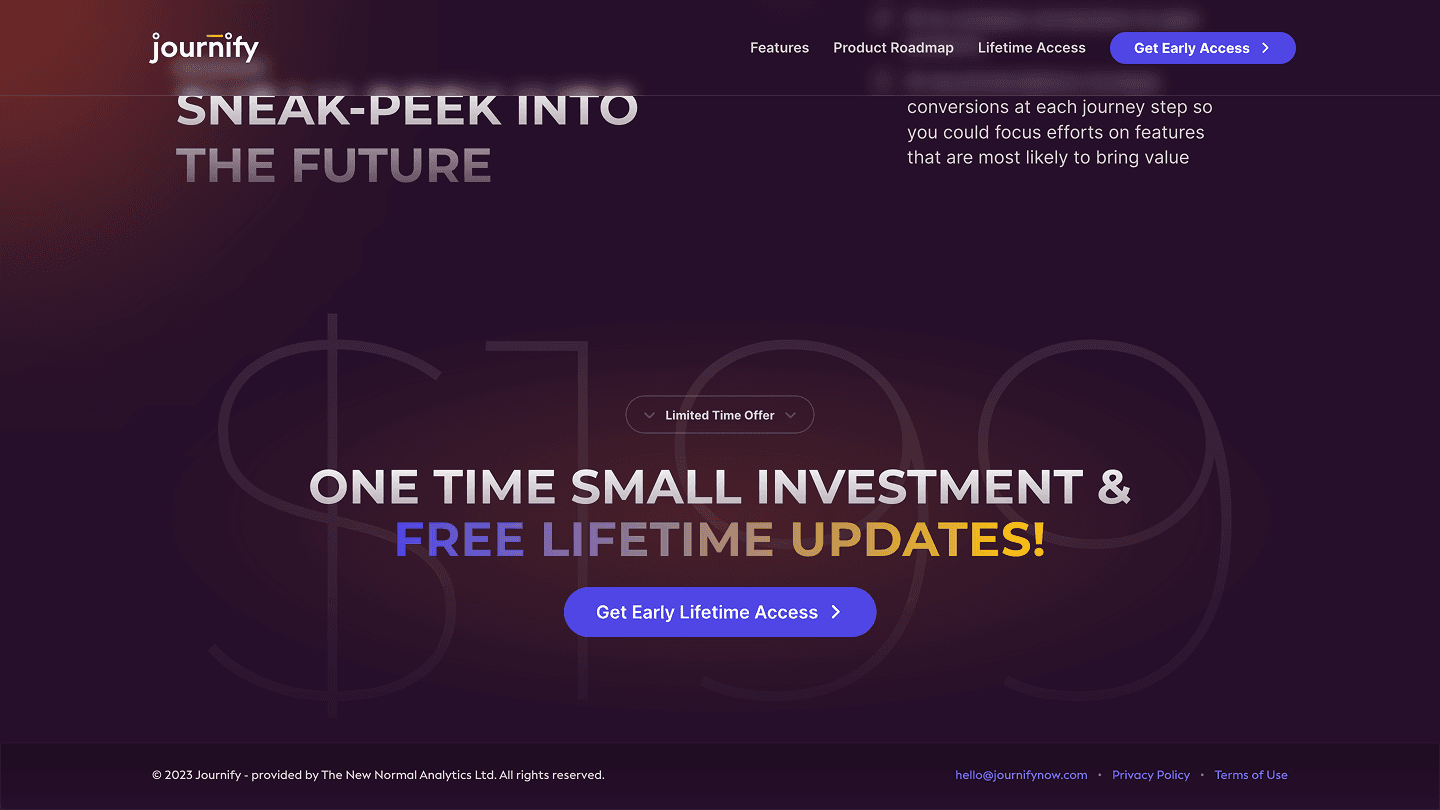
The lifetime-access offer
The brand wraps all of it in a dark, restrained identity: Montserrat set in capitals for the claims, Inter for everything that has to be read, a single indigo for the interactive layer, and the gradient reserved for the headline. The wordmark carries a bar over its first letters that the animated logotype draws in, and the same headline and canvas fragments became the social graphics the product launched with.

Fig. 04The launch graphic: the headline over tilted fragments of the canvas, used for social and as the site's share image.
What shipped
Turned a request for animations into a launch: a one-page site that explains the product, collects a waitlist, and sells lifetime access through Stripe.
Designed the product's journey canvas — sources on the left, steps in the middle, conversion, cost, and revenue on every card — and used it as the site's centrepiece.
Built eight Rive animations, one per feature claim, so each capability is demonstrated by the product rather than described.
Created the Journify wordmark, an animated logotype, and social graphics for the launch.
Selected decisions
- 01
Built the concept around journeys — map a journey, then read conversion, cost per step, and revenue per step on every card.
- 02
Gave the page four numbered claims (build and track journeys, understand marketing performance, monitor lifetime value and ROI, make informed decisions) and pinned them as tabs that follow the reader through the features.
- 03
Let the product benchmark itself: a step converting at 6.1% gets a red low badge and a tooltip that names the industry average of 30%.
- 04
Designed growth mode — drag conversion on one step and watch cost per step, lifetime value, and ROI re-run — as the closing argument of the page.
- 05
Closed with a quarter-by-quarter roadmap from 1.0 to 4.0 and a $199 lifetime-access offer, because a pre-launch product has to show where it is going before it asks for money.