A launch site for a frontier AI model, on a speaking-tour deadline
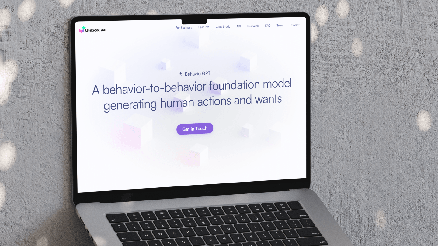
Unbox AI's BehaviorGPT is a behavior-to-behavior foundation model: trained on sequences of what people did, it predicts what they will do and want next. That is a hard idea to sell on one page, and the audience was mixed — retail operators, AI researchers, and the investors the founders were meeting on a European speaking tour that was already underway.
The brief was a launch site on the tour's timeline. I took the keynote material and organised it as a single page with nine anchored sections: a plain statement of the model, why behavior matters to a business, what it does in three industries, one retail deployment with numbers, the API, the research pedigree, an FAQ that carries the technical argument, the team, and a mailbox. Built in Framer and live in October 2023, in time for the tour.
- Client
- Unbox AI · BehaviorGPT
- Role
- Web design
- Built in
- Framer, one page, nine sections
- Shipped
- October 2023, for a European speaking tour
Role
I led web design — the narrative order, a visual direction lifted from the keynote, the copy structure, and the Framer build — on a tight, tour-driven timeline.
A closer look, screen by screen
The plainest possible statement
The site opens on the plainest possible statement of a complex thing — a behavior-to-behavior foundation model generating human actions and wants — because the first job was comprehension, not persuasion. Above the headline sits a small eyebrow, the model's name beside a running figure that became its mark; below it, one button. Get in Touch is a mailto to the founders, and it is the same button in the header and at the foot of the page. The header carries the whole page as nine anchors, so a link shared after a talk can land on the case study or the API without a scroll.
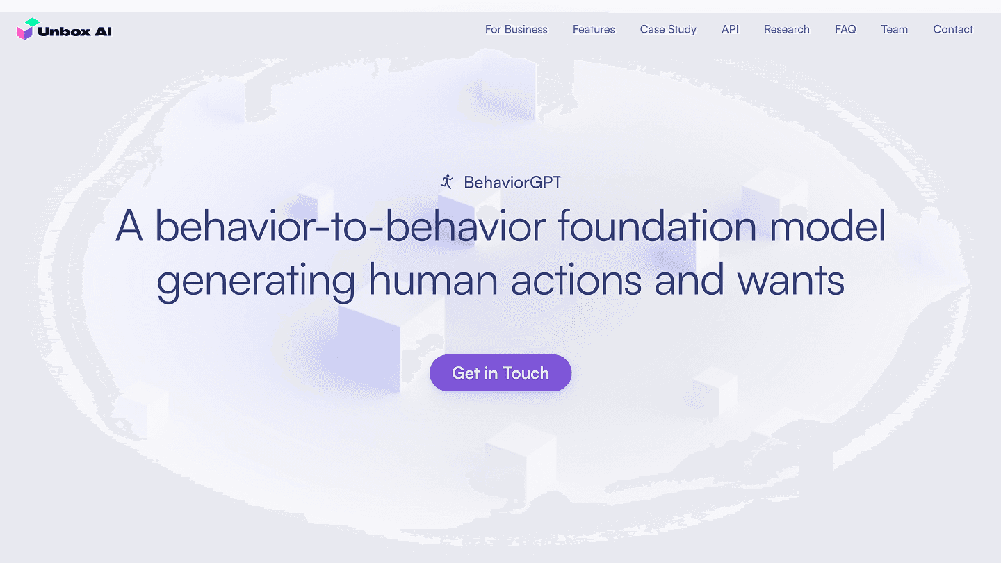
Fig. 01The hero: the model named once, the claim in one sentence, one button. Pastel isometric cubes fade in behind it, the only decoration on the page.
Why a business should care
It then translates the research into a reason to care: behavior drives business, and predicting the next step of customers, suppliers, and employees is the value — stated before any architecture is mentioned. The picture under it explains training and inference without a diagram. Four coloured tiles on the left, each a voxel figure mid-motion and labelled Behavior A through D, sit under the words "trained on past behaviors"; on the right a second figure steps out of the first, labelled "future actions".
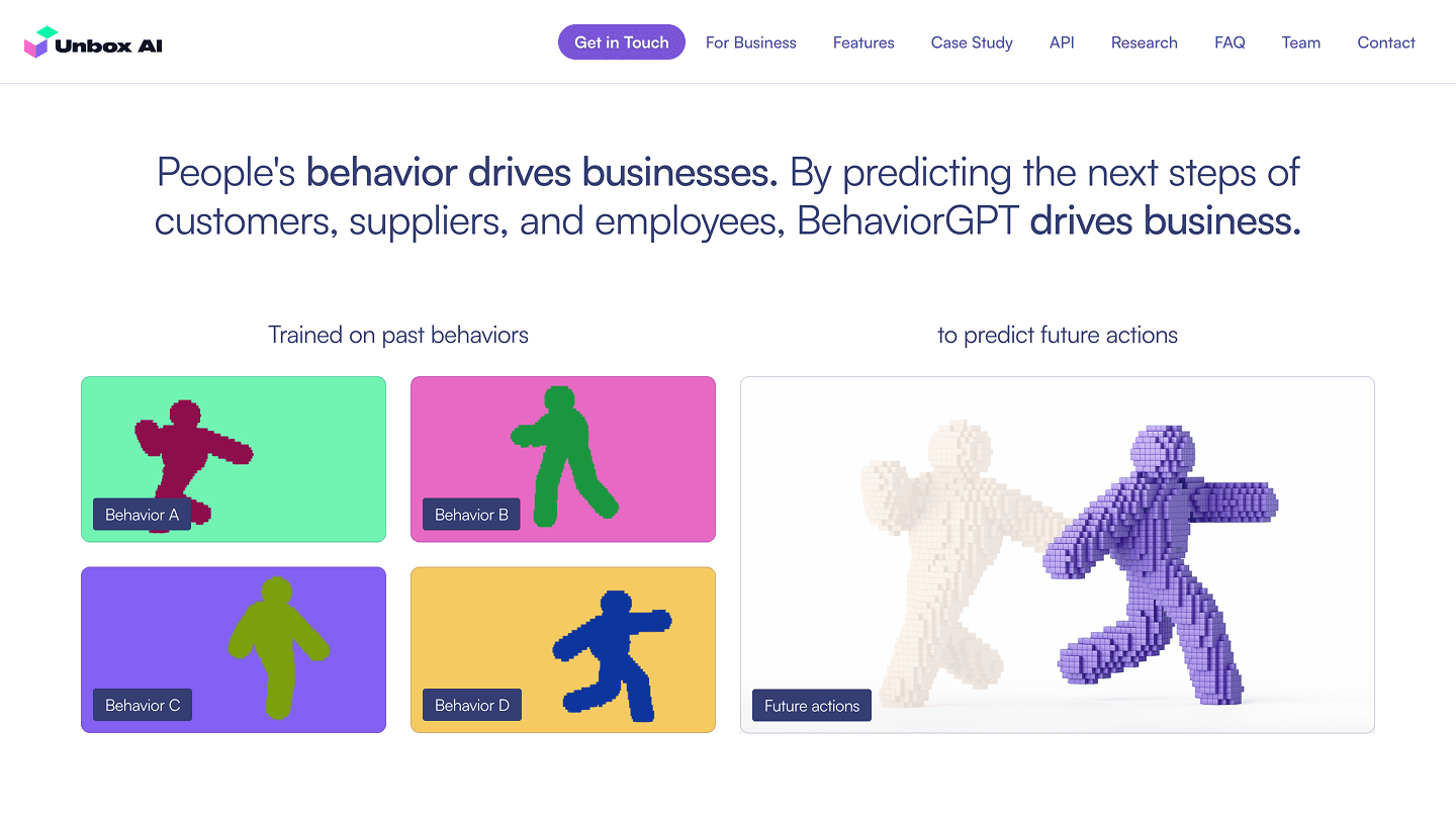
Fig. 02Past behaviors on the left, the predicted one on the right. The voxel figures came from the keynote.
Three industries, twenty-three capabilities
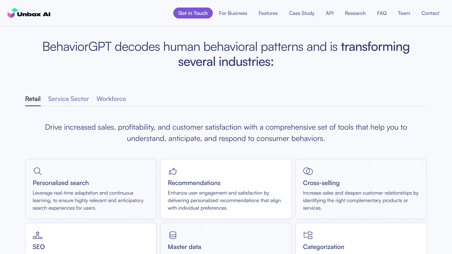
Use cases by industry give different visitors a concrete hook, so a non-expert can see themselves in it within a few seconds. A tab strip splits them into Retail, Service Sector and Workforce; each tab opens with one sentence and then a grid of cards, an icon, a name and a line apiece. Retail has nine — personalized search, recommendations, cross-selling, SEO, master data, categorization, fraud detection, attrition, business intelligence. Service and Workforce have seven each, from proactive issue resolution and pricing strategies to talent acquisition and workforce planning. Nobody reads all twenty-three; everybody finds the three that are theirs.
Retail
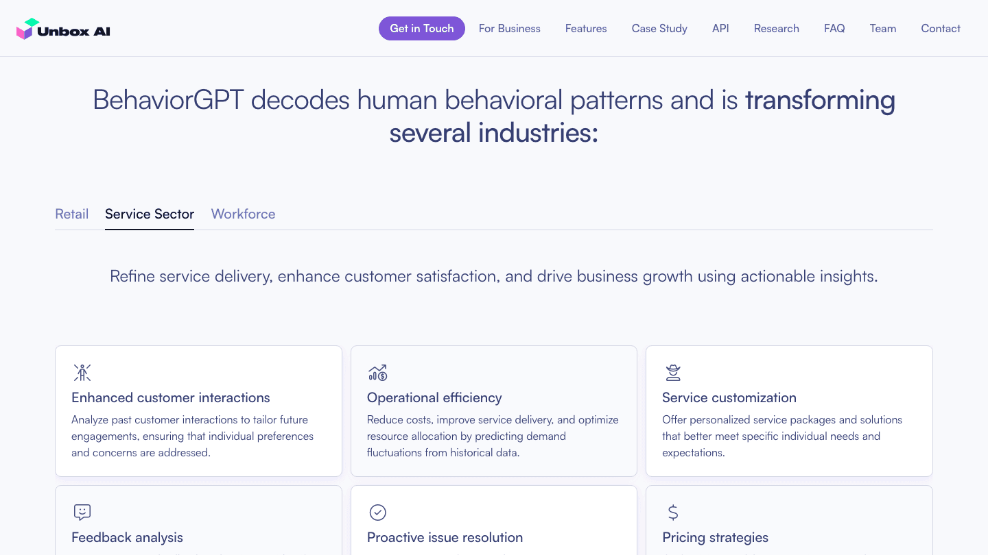
Service Sector
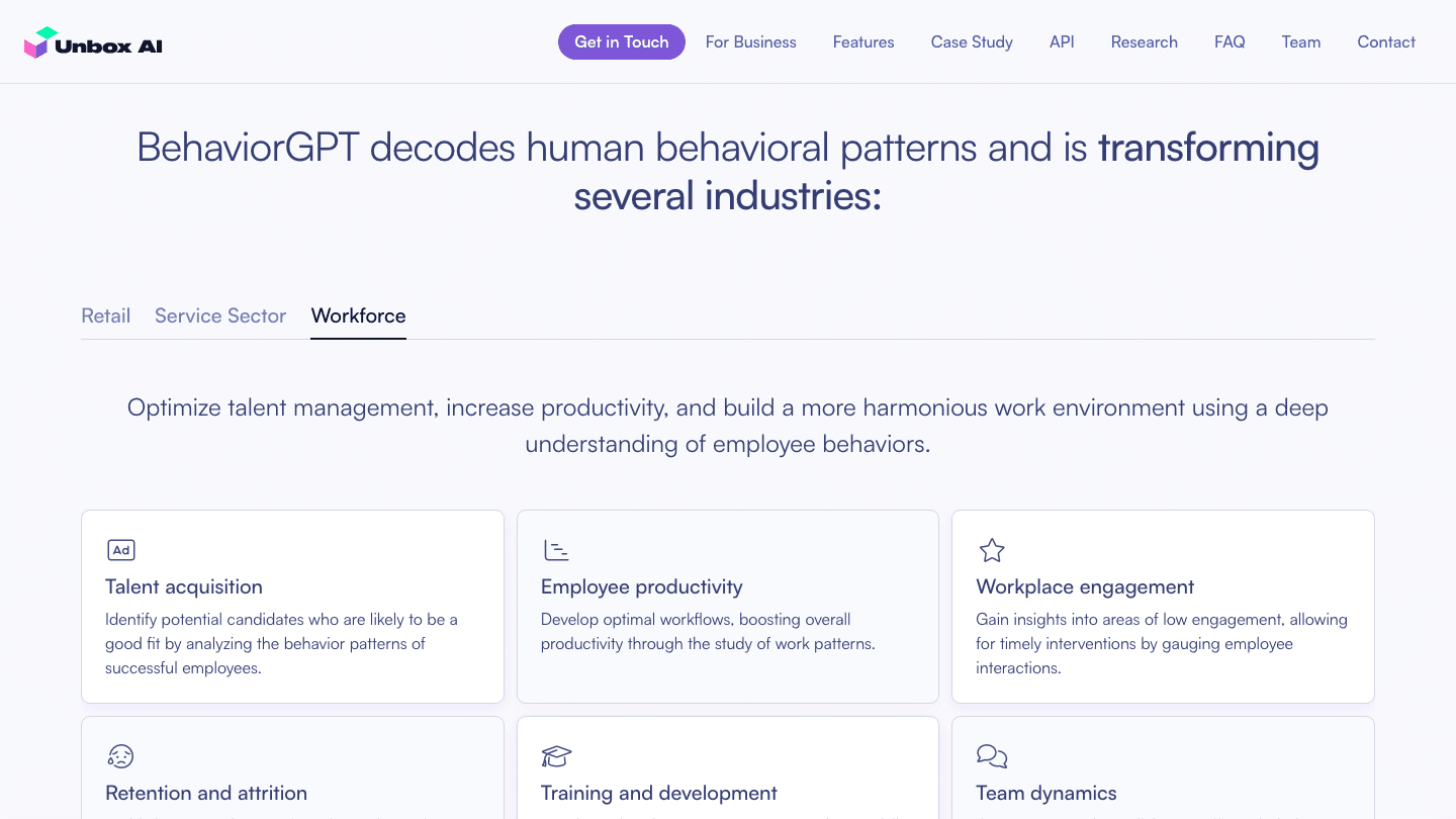
Workforce
The same section three times over. One sentence per industry, then the capability grid for it.
The one section with numbers
The site makes exactly one quantified claim, and gives it a section of its own. For a retail client, BehaviorGPT was trained completely unsupervised, and the outcomes are laid out as five cards: +16% sales via search, +14% by improving assortment and SEO, +11% from dynamic categories, +24% via recommendations, and 12x less manual work. The figures are Unbox's, presented as they gave them; the design decision was to keep them to one row, in green, with nothing else competing on the screen.
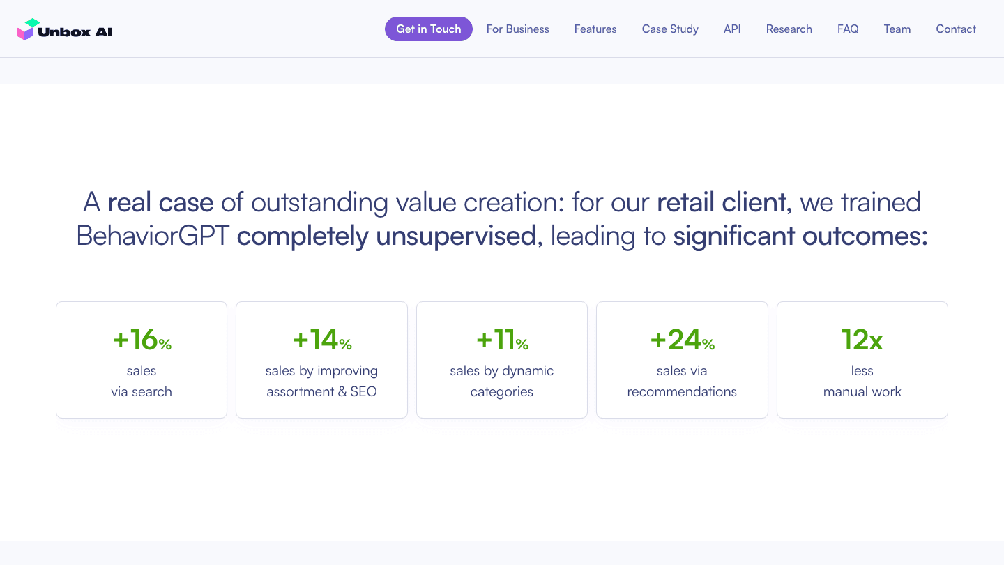
Fig. 03The case-study section, the only numbers on the site. The claim is one sentence and five cards.
The API in one sentence
For the developer audience the API section deliberately says nothing technical. One sentence carries the scale — trained on 15B datapoints, reaching 5M people daily — and the promise that endpoints can be up and running in a few weeks. The illustration is two cards, BehaviorGPT and Your Business, joined by a hand-drawn plug. The ask is a conversation, not a docs page, because at launch a conversation was what existed.
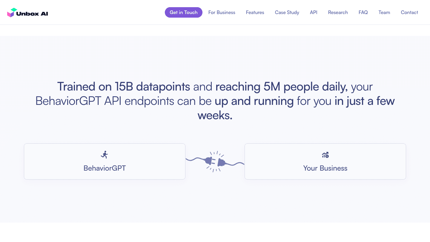
Fig. 04Two cards and a plug. Scale in the sentence, nothing else on the screen.
Credentials, then a two-minute video
The research section is the investor's section. It leads with "Leaders in the field", cites publications referenced by more than 14,000 AI researchers, and embeds the founder's MIT lecture — Self-Supervised Learning and Foundation Models, cut to two minutes. A researcher gets the pedigree; everyone else gets a video they can actually finish.
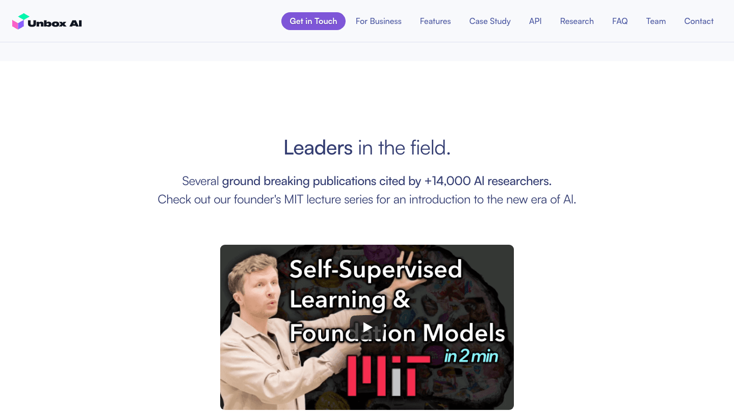
Fig. 05The research section: one credential, one embedded lecture.
Placed against what a reader already knows
A comparison to ChatGPT and Stable Diffusion does the heavy lifting by analogy — related technologies, different purposes. Three cards share the same three rows, input, output and main use-case, so the unfamiliar one can be read off the familiar two: text in and text out for a general assistant; text or image in and an image out for visual art; behavior and time-series data in, wants and actions out, for consumer behavior. BehaviorGPT sits in the middle, raised, and is the only card in full colour.
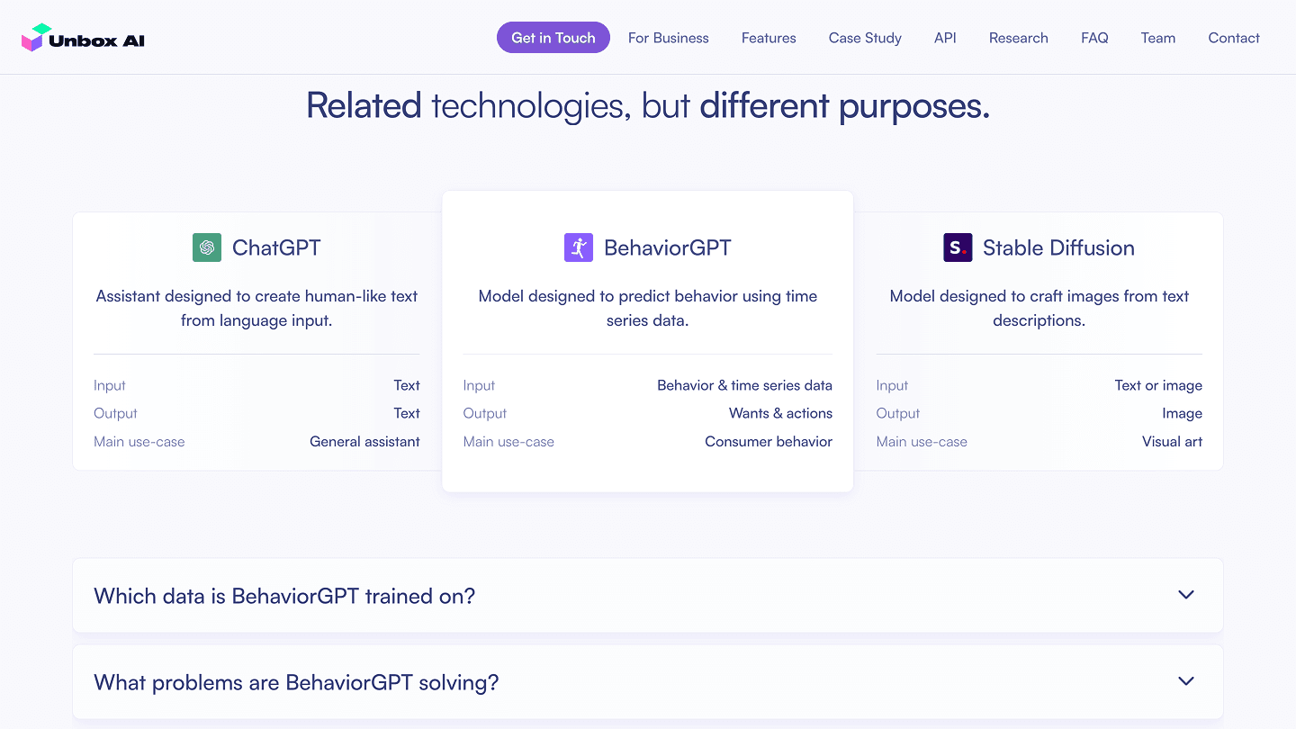
Fig. 06Three models, three rows. The comparison is the fastest explanation on the page.
The FAQ carries the technical argument
Four questions under the comparison hold everything the page above chose not to say. Which data is it trained on — time series of human behavior, mostly retail. What problems does it solve — predicting customer behavior, recommendations, assortment planning, dynamic pricing, store planning. Can it be customised — yes, for retail, service and workforce today. And the long one, how BehaviorGPT differs from a large language model, is the longest text on the site: five bullets a side, from SKU variability and generalising to unseen events to learning from suboptimal behavior and triangulating a detergent purchase against a cheese one. It lives behind an accordion so only the person who wants it opens it.
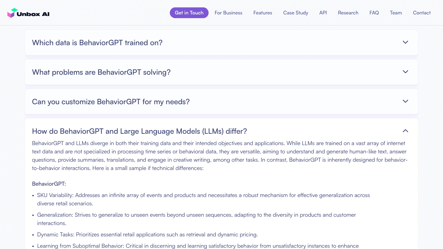
Fig. 07The FAQ with the LLM question open. The technical depth is on the page, one click down.
The team is the proof
For an investor the team section is the claim that matters, so it gets two tiers. The three co-founders — Gunnar Carlsson, Stanford professor and Ayasdi co-founder; Rickard Brüel Gabrielsson, Stanford and MIT, lecturer on foundation models; John Brüel Gabrielsson, engineer and serial entrepreneur — get large portraits and full bios, two of them linking out. Ten researchers and engineers follow in a compact grid with a one-line credential each: Stanford, MIT, KTH, IIT Madras, Citadel, Microsoft, KPMG.
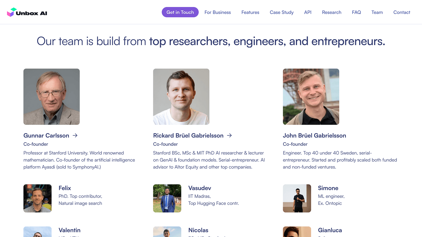
Fig. 08Founders large, team small. The credentials are the copy.
It ends at a mailbox
The page closes the way it opened: Get in touch, one line — for demos, onboarding support, or product questions — and the founders' address in a single card. A footer with the copyright and three social links, and that is the whole site. All of it shipped in time for the speaking tour.
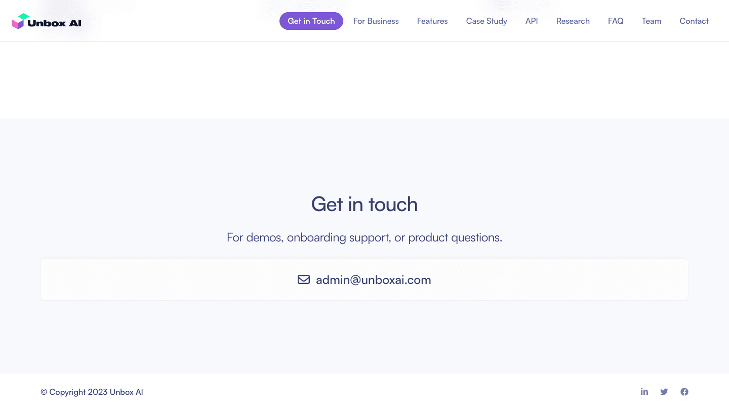
Fig. 09The contact section and footer. One address, no form.
What shipped
Delivered a launch-ready site for the BehaviorGPT model, live in October 2023 and on time for the investor tour.
Defined a clear story for an emerging behavior-to-behavior foundation model: nine sections a visitor can read in order or jump into from the header.
Translated keynote material into a cohesive visual direction — pastel isometric cubes, voxel figures, soft purple on white.
Built the experience to speak to business, research, and developer audiences at once, with a section addressed to each.
Selected decisions
- 01
Led with the model's plain-language promise — generating human actions and wants — front and center.
- 02
One page, nine anchors: For Business, Features, Case Study, API, Research, FAQ, Team and Contact all sit in the header, so a link sent after a talk lands on the right section.
- 03
Three industry tabs — Retail, Service Sector, Workforce — each with its own capability grid, so a non-expert finds their own business within seconds.
- 04
One retail deployment with figures, one sentence on the API, one research credential with a video: each claim gets a section and nothing else.
- 05
Kept the brand light and minimal — soft purple accents over generous white space — so nothing competed with the one idea.
- 06
A single call to action throughout: Get in Touch opens an email to the founders. No form, no gate.