A SaaS UX audit that became the team's build roadmap
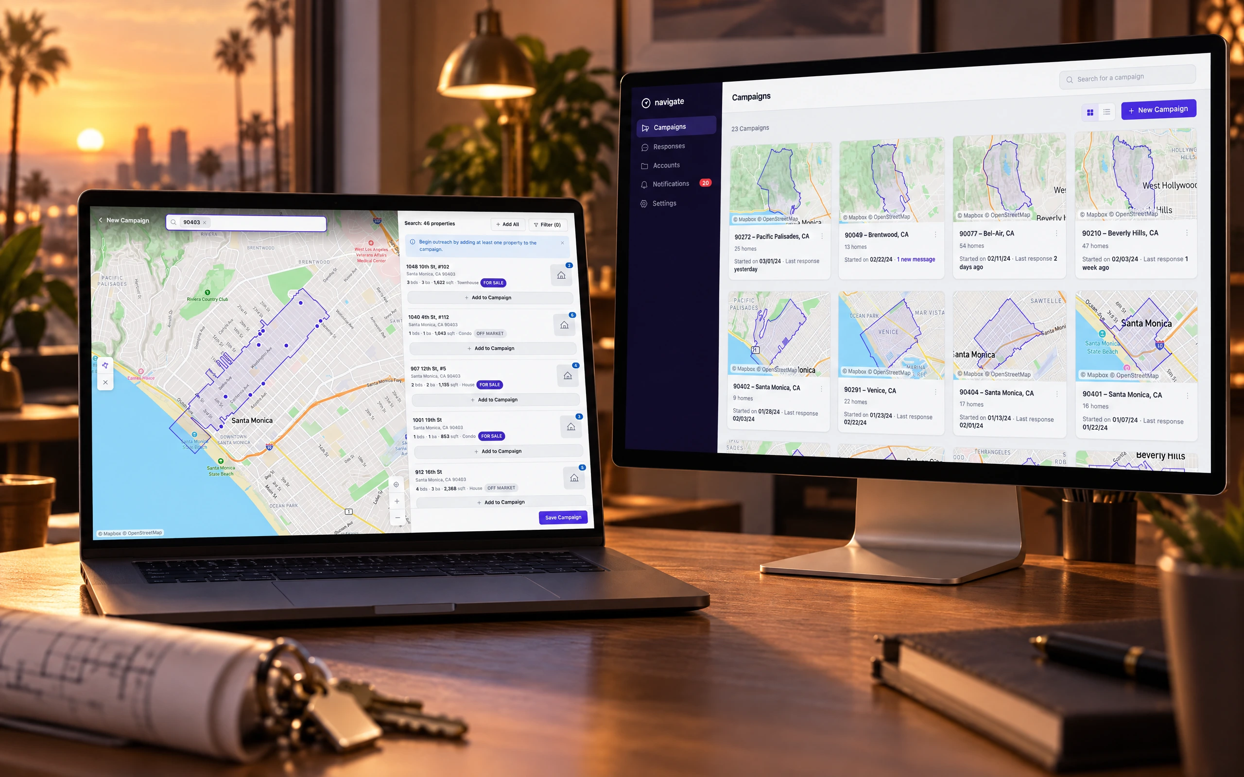
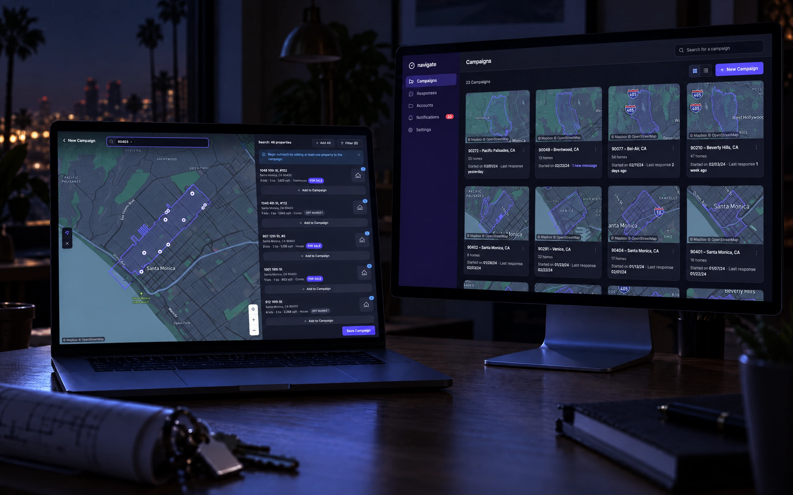
Navigate turned a large real-estate dataset — property details and owner contacts for whole neighborhoods — into a tool agents could run outreach campaigns on. The prototype worked, but it had grown faster than its UX: the core actions an agent needs were buried, and the day-to-day workflow wasn't obvious.
This was an audit, not a build. I worked the product the way an agent would — spinning up area campaigns, targeting homes on a map, tracking responses — found where the experience and interface broke down, and delivered a prioritized spec that became the team's build roadmap. The deliverable was judgment about what to fix first, not a finished interface.
That is the engagement, and it is the first half of this page. The second half is not: it is what I built afterwards, unasked, because working a product that closely turns up questions the brief has no room for.
Role
I led the UX audit as product designer — reviewing the prototype end to end, recommending experience and interface improvements, and packaging them into a spec the team could build against.
A closer look, screen by screen
The audit, not a build
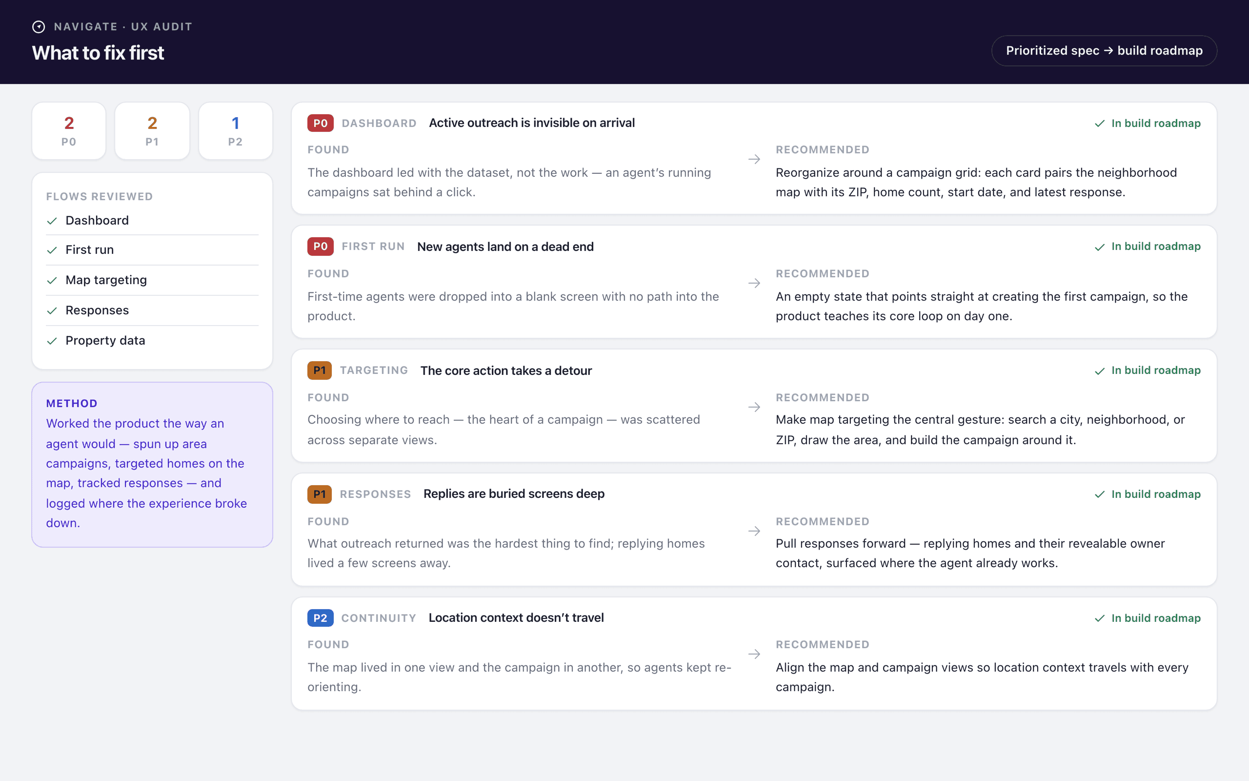
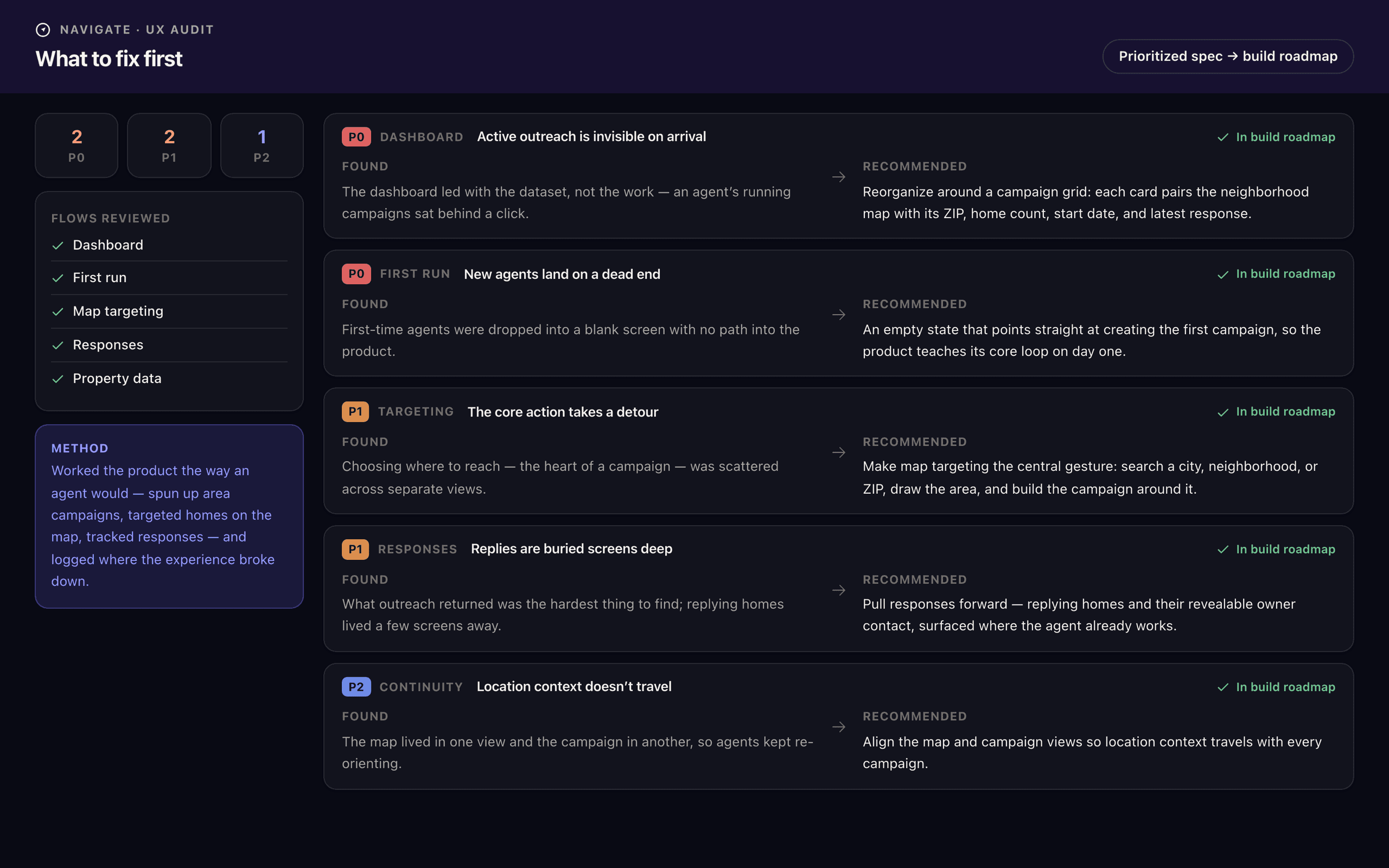
The engagement produced a document before it produced a pixel. I worked the prototype end to end the way an agent would and logged where it broke down — then ranked every finding by how much friction it removed from the daily loop. Two P0s, two P1s, one P2, each written as a pair: what I found, and the state I recommended. That pairing is what let the spec double as a roadmap — the team could build straight from it.
Campaigns become the front door
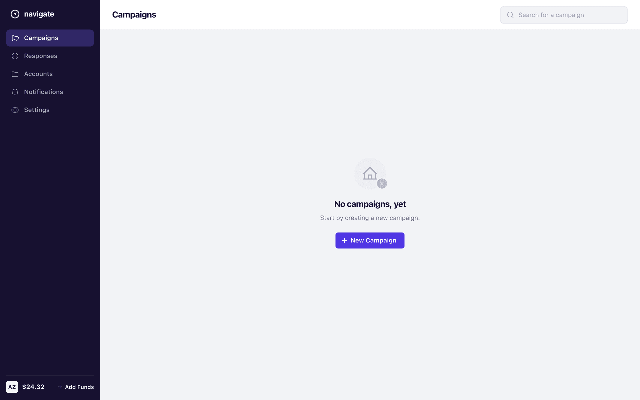
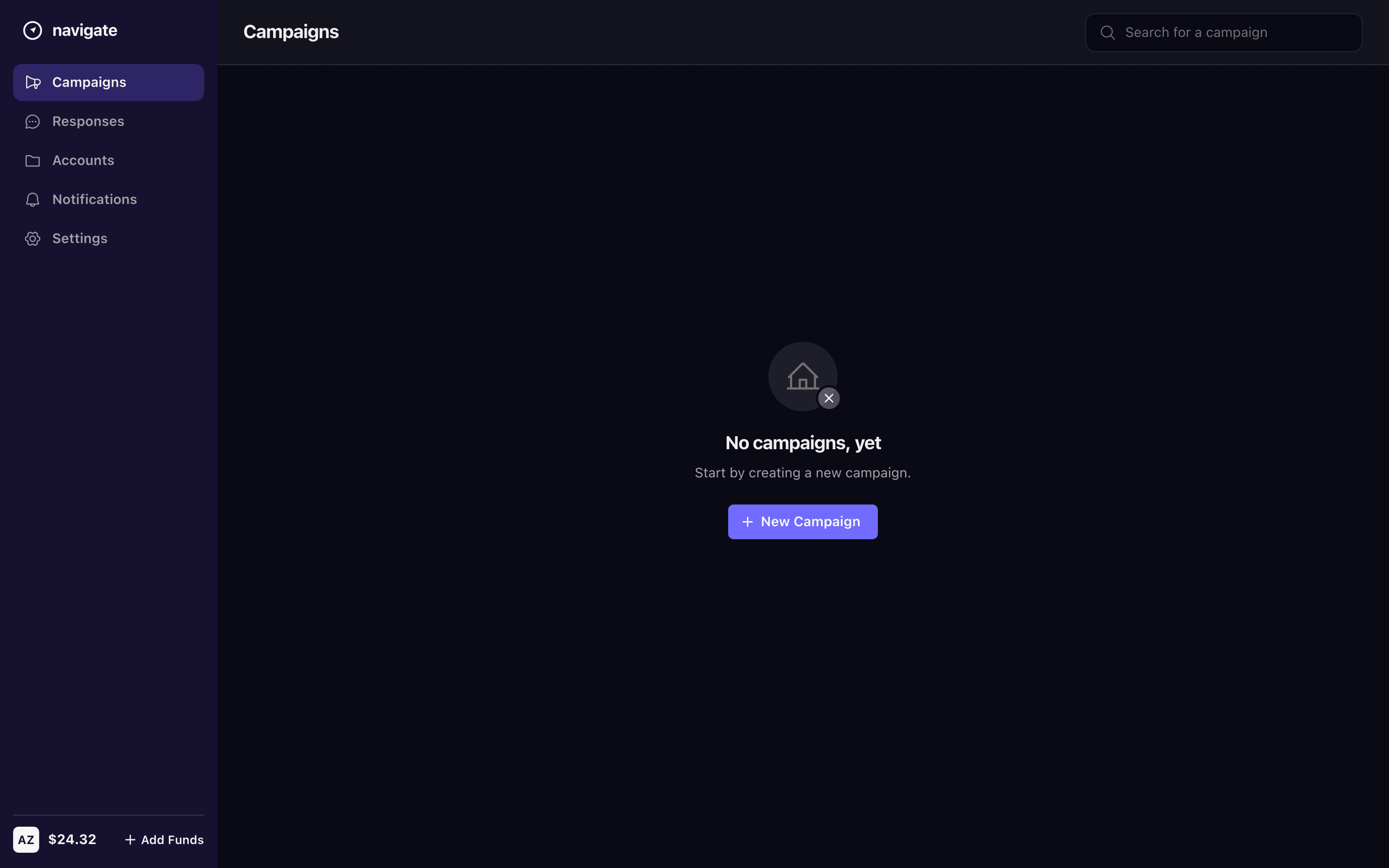
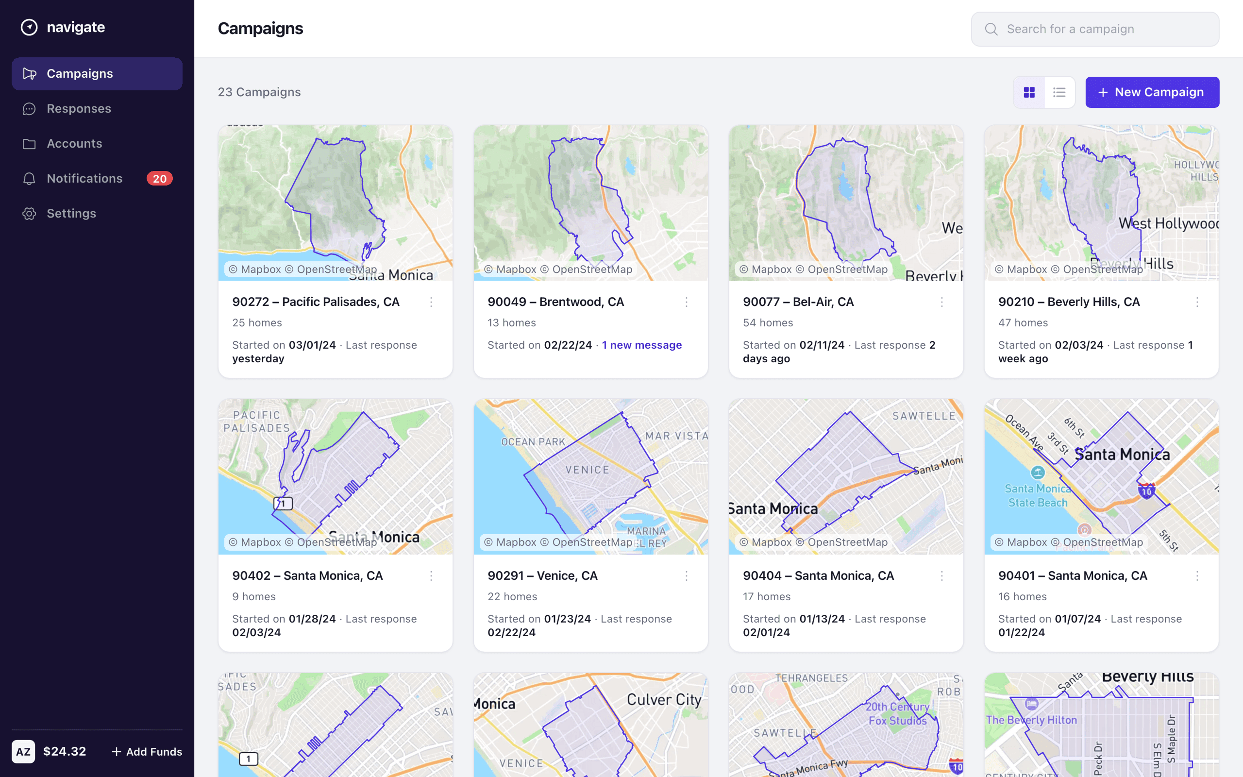
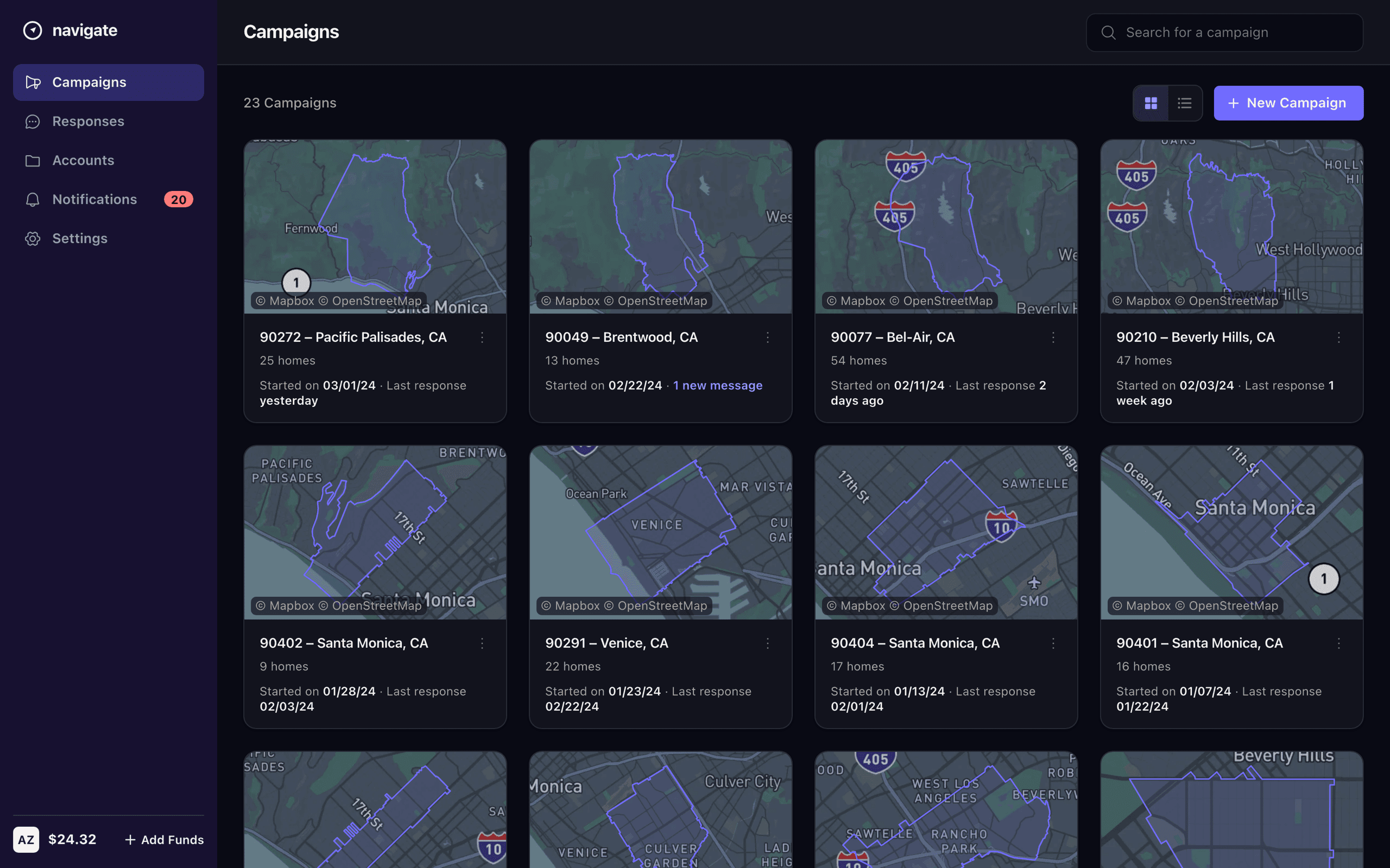
The first recommendation reorganized the dashboard around campaigns, so an agent's active outreach is what they see on arrival: a grid of cards, each pairing a neighborhood map with its ZIP, home count, start date, and latest response. And where agents had been dropped into a blank screen on day one, the recommended empty state points them straight at creating their first campaign — the product teaches its core loop before it shows anything else.
Targeting is the core gesture
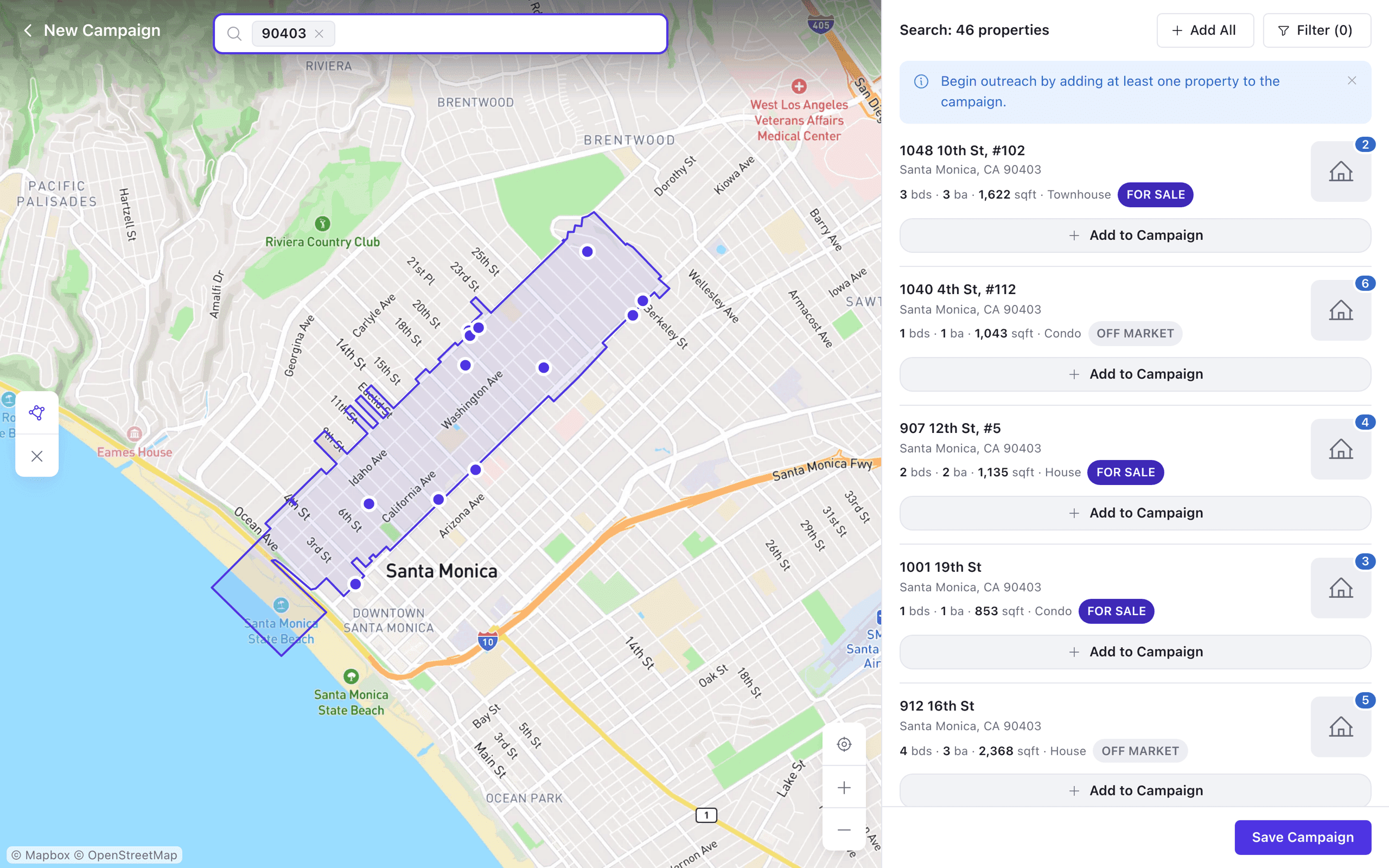
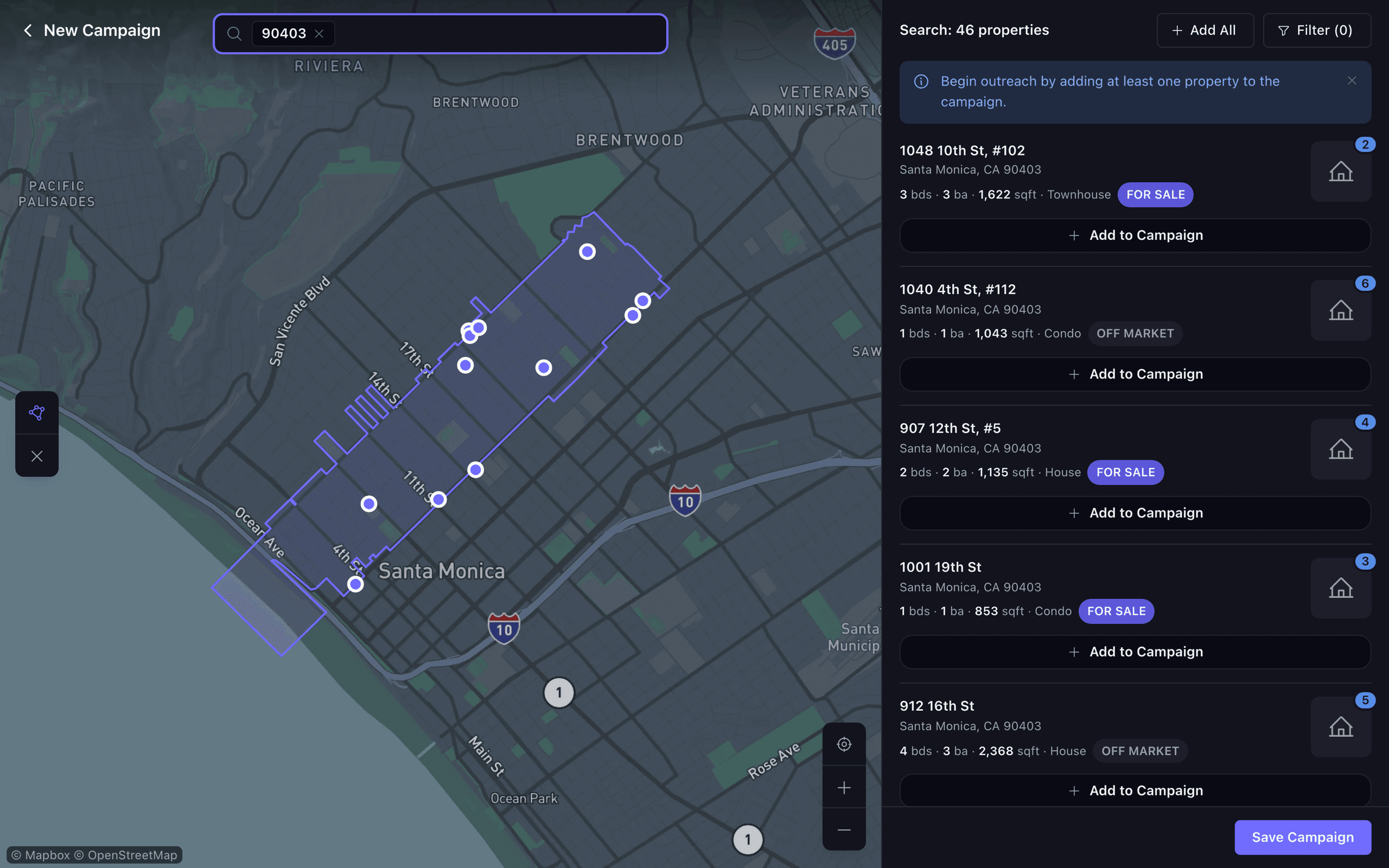
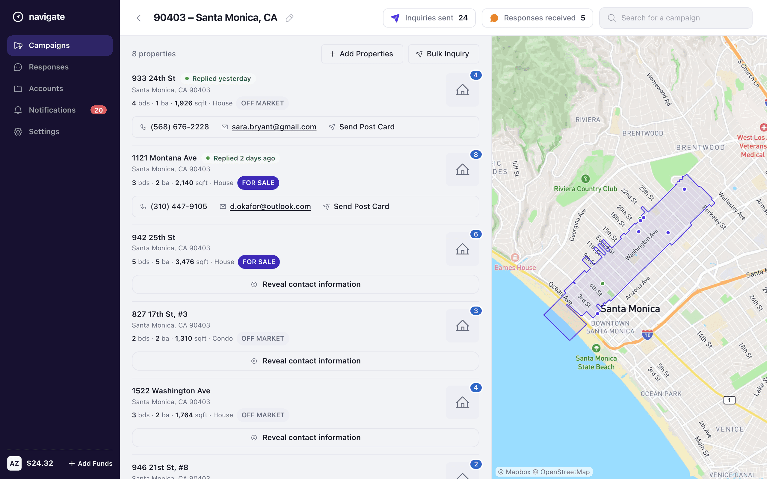
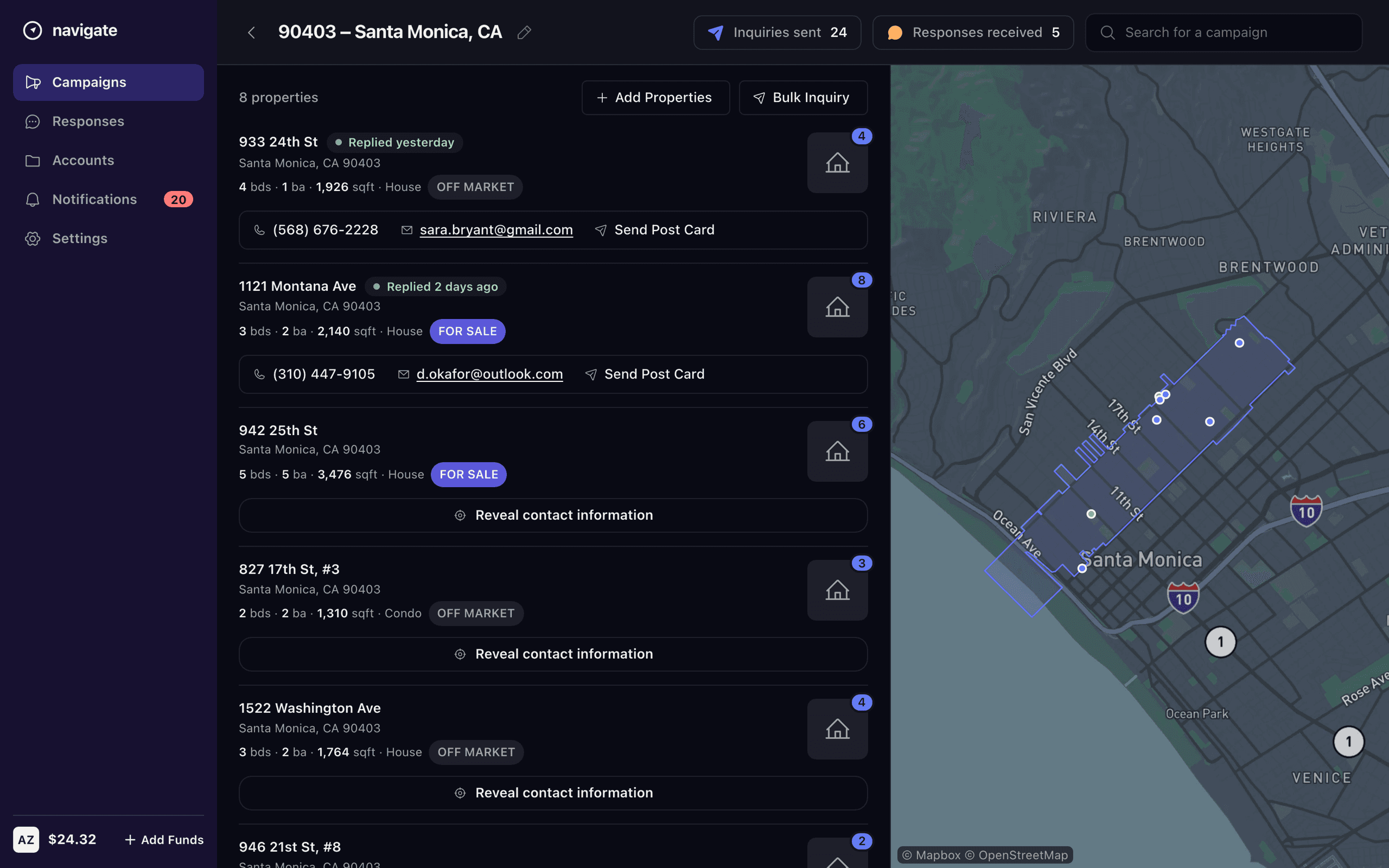
The core action is choosing where to reach, so map-based targeting became the central gesture — search a city, neighborhood, or ZIP, draw the area, and build a campaign around it, watching the homes it covers as you go. Location context travels with the campaign instead of living in a separate view.
Responses pulled forward
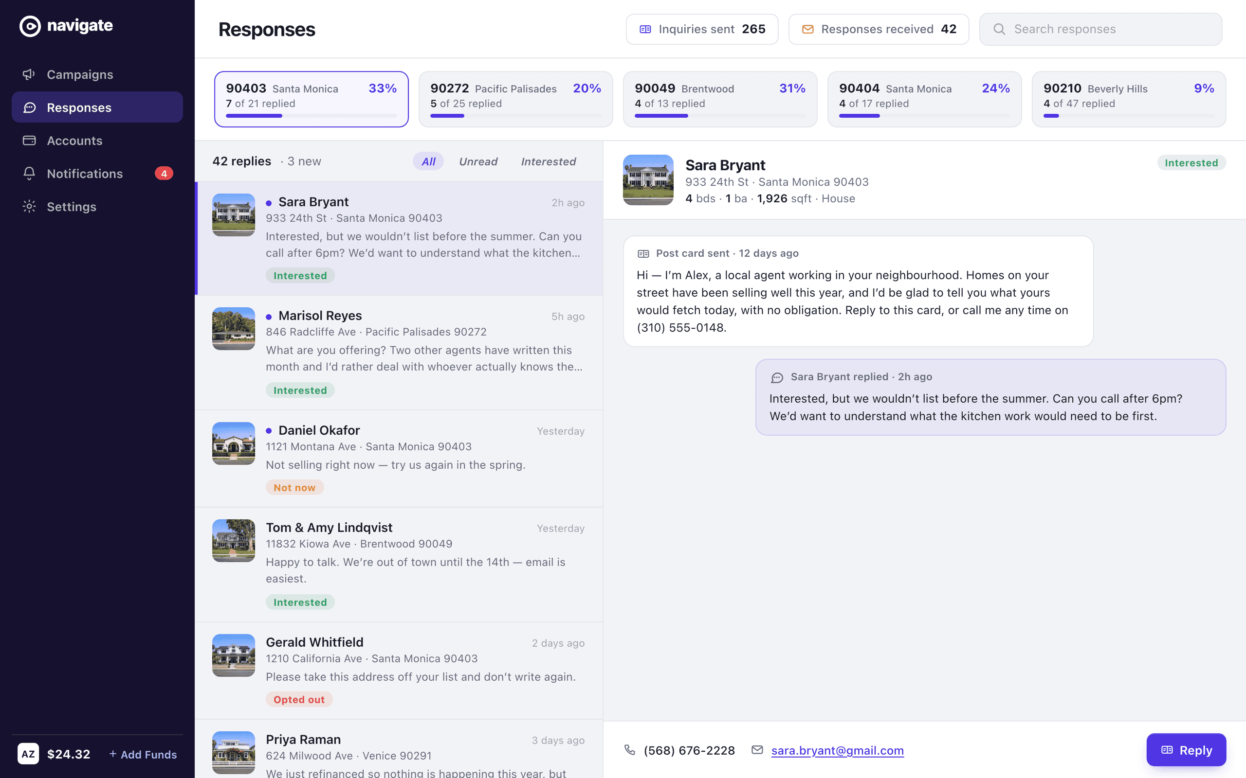
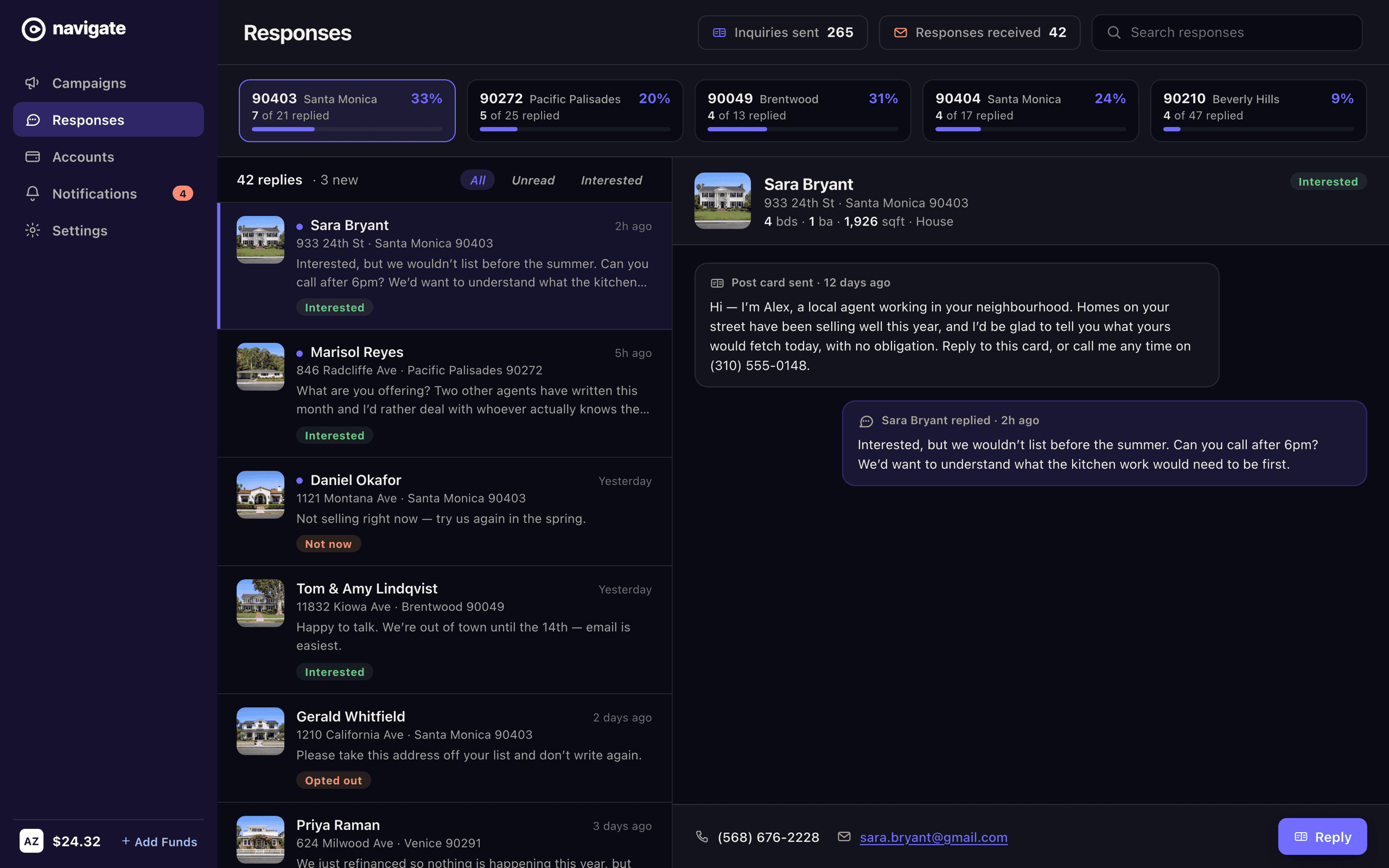
Outreach is only useful if you can see what it returns, so the spec pulled responses forward — a campaign's replying homes and their revealable owner contact, surfaced where the agent is already working rather than buried a few screens deep. Underneath it all is the data that makes outreach possible — property and owner detail — kept legible so an agent can read a home and act on it without leaving the flow.
Judgment as the deliverable
Sometimes the most valuable thing a senior designer hands over isn't pixels. Working inside someone else's product, the job was to see clearly, rank honestly, and write it down in a form engineers could act on. The spec's structure — every finding paired with its recommended state, ordered by priority — is what turned an outside review into the team's own plan.
What the audit was not asked
The spec above is the engagement: five findings against the product as it stood, ranked by how much friction each one removed. Working it that closely turns up a different kind of problem, and the brief had no room for it. Every screen in the prototype — all seventeen of them — sits under Campaigns. The sidebar promises five destinations and exactly one exists. The word “message” appears nowhere in the file, in a product whose entire job is to send one. And the wallet in the corner of every screen, which is how the thing is paid for, never says what anything costs. The audit answered what to fix first, honestly and inside its scope. It could not ask what was missing. What follows is my own answer to that — screens built in the same system, that no client asked for and that have not shipped.
The message, at last
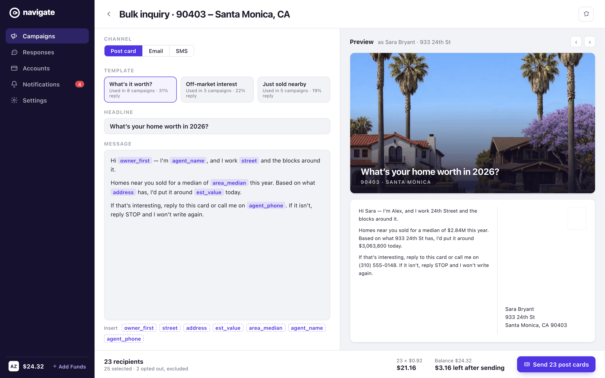
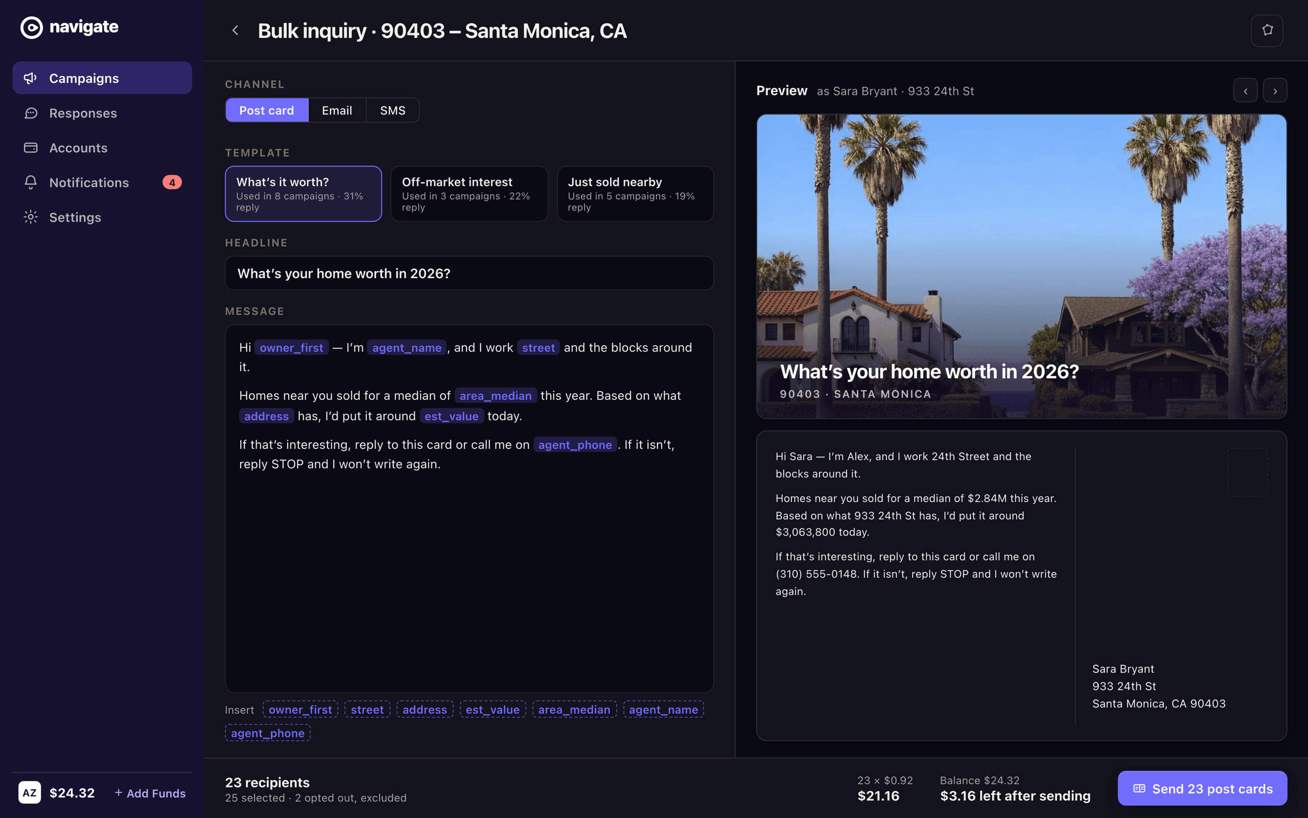
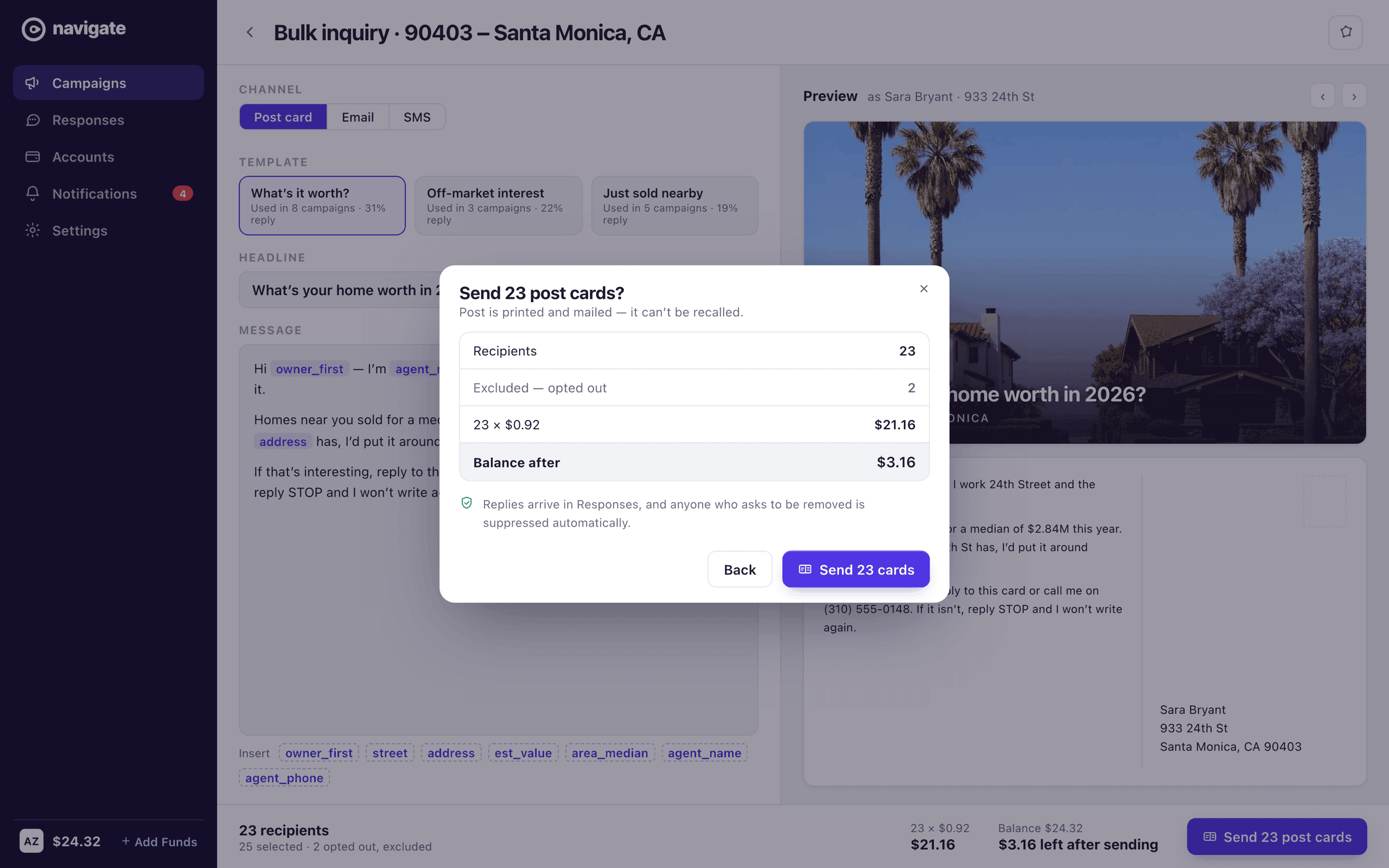
Outreach is a message, and the prototype never showed one. There are buttons that send — Send Post Card, Bulk Inquiry — and the thing they send is never displayed, never edited, never previewed. That is the largest variable in whether any of this works, because a reply rate is mostly a function of what the card says. So the copy sits on the left with its merge fields visible as fields, and the card itself sits on the right with those fields resolved against a real recipient: Sara Bryant, 933 24th St, and the estimate the dataset was already holding. Writing it once and seeing what one homeowner opens are the same screen.
The bill next to the button
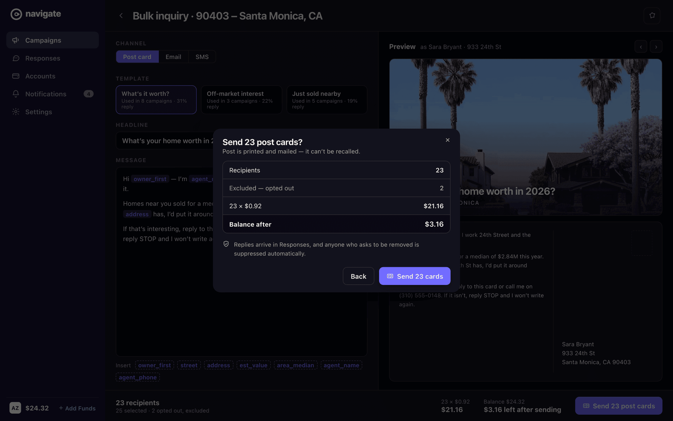
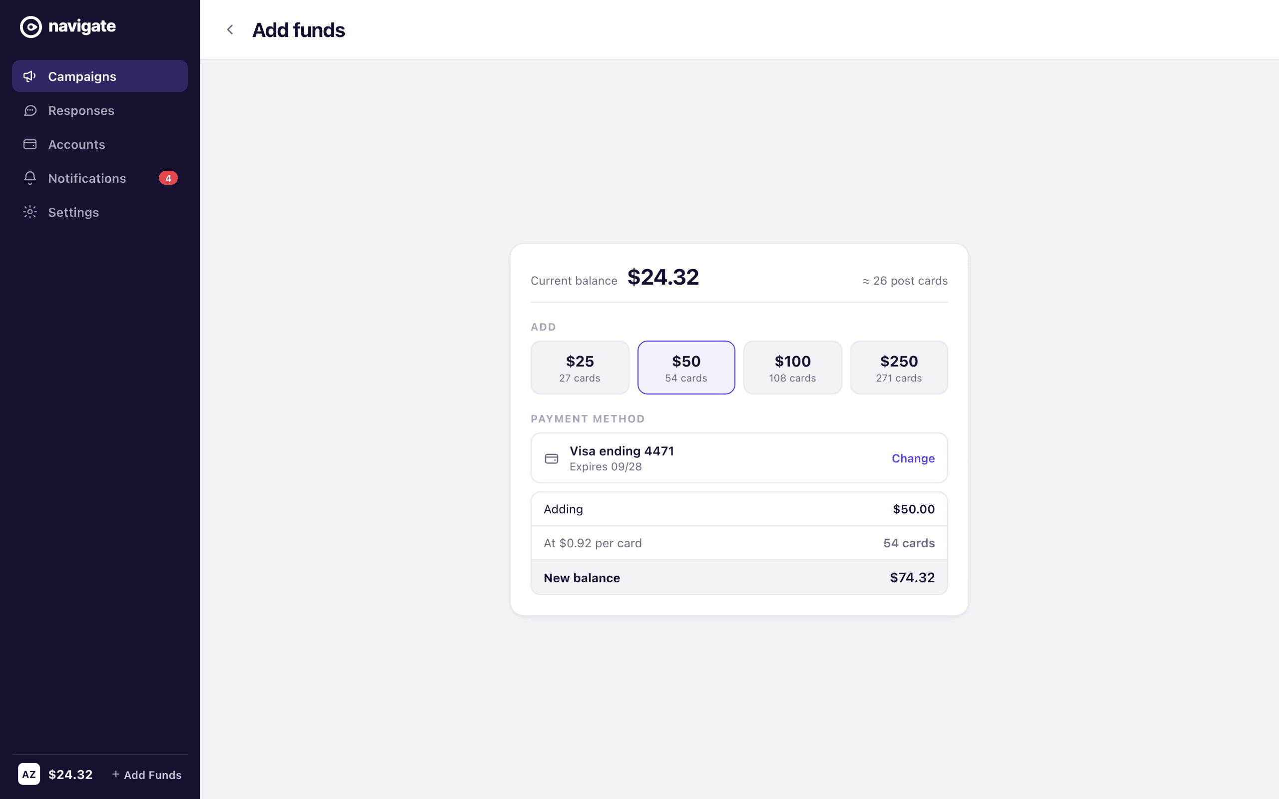
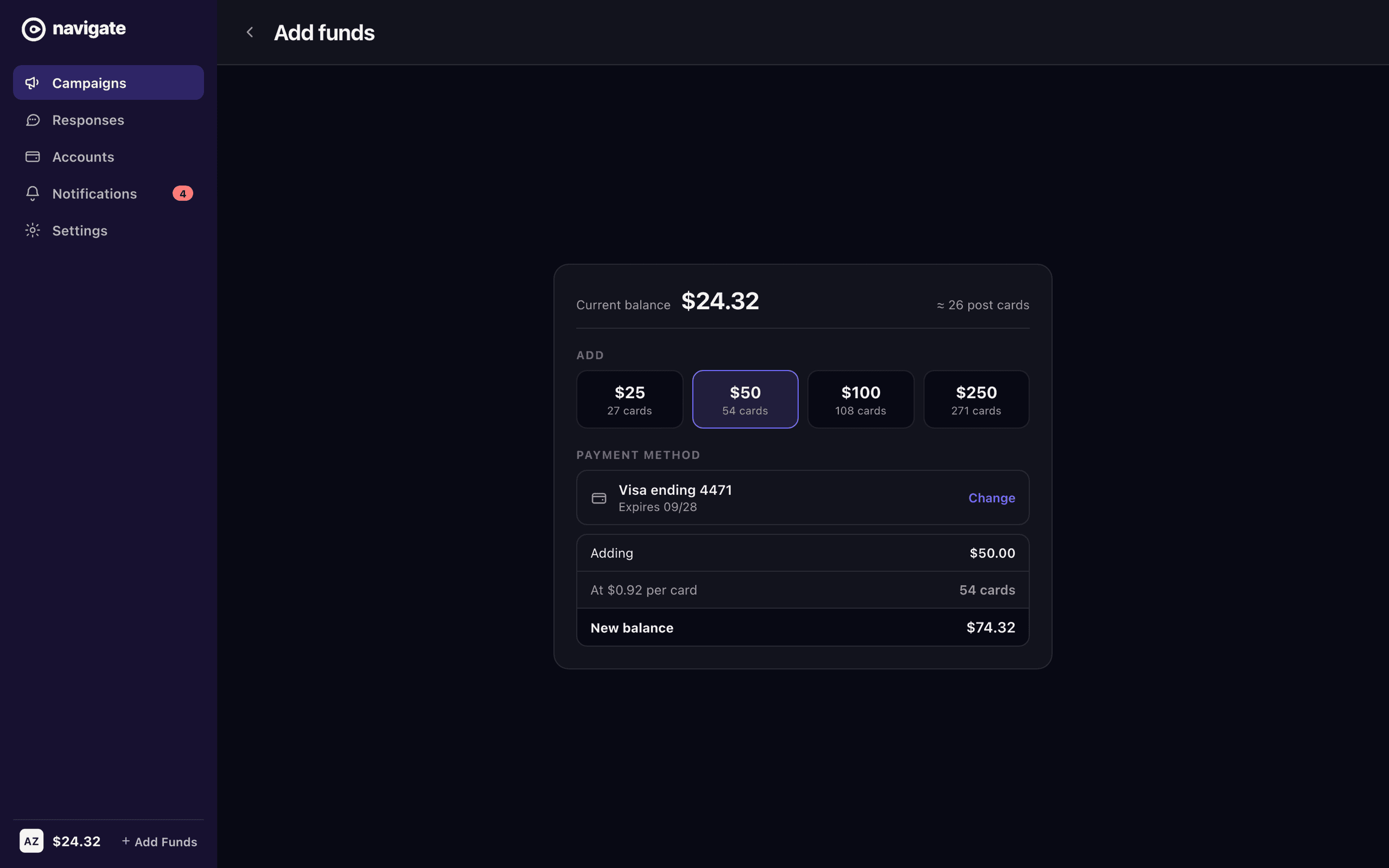
The wallet sits in the corner of every screen — a balance, and a link to add to it — and no screen ever says what anything costs. Post is priced per piece, so a campaign has a price the moment it has recipients. The send bar carries it: twenty-three recipients, twenty-five selected, two of them excluded because their owner opted out, twenty-three at ninety-two cents, and what the balance looks like afterwards. When the campaign is larger than the balance the same bar says so before the writing starts rather than after the click. The confirmation restates it at the last moment that can still be changed, because post is printed and mailed and there is no unsend.
A person, not an address
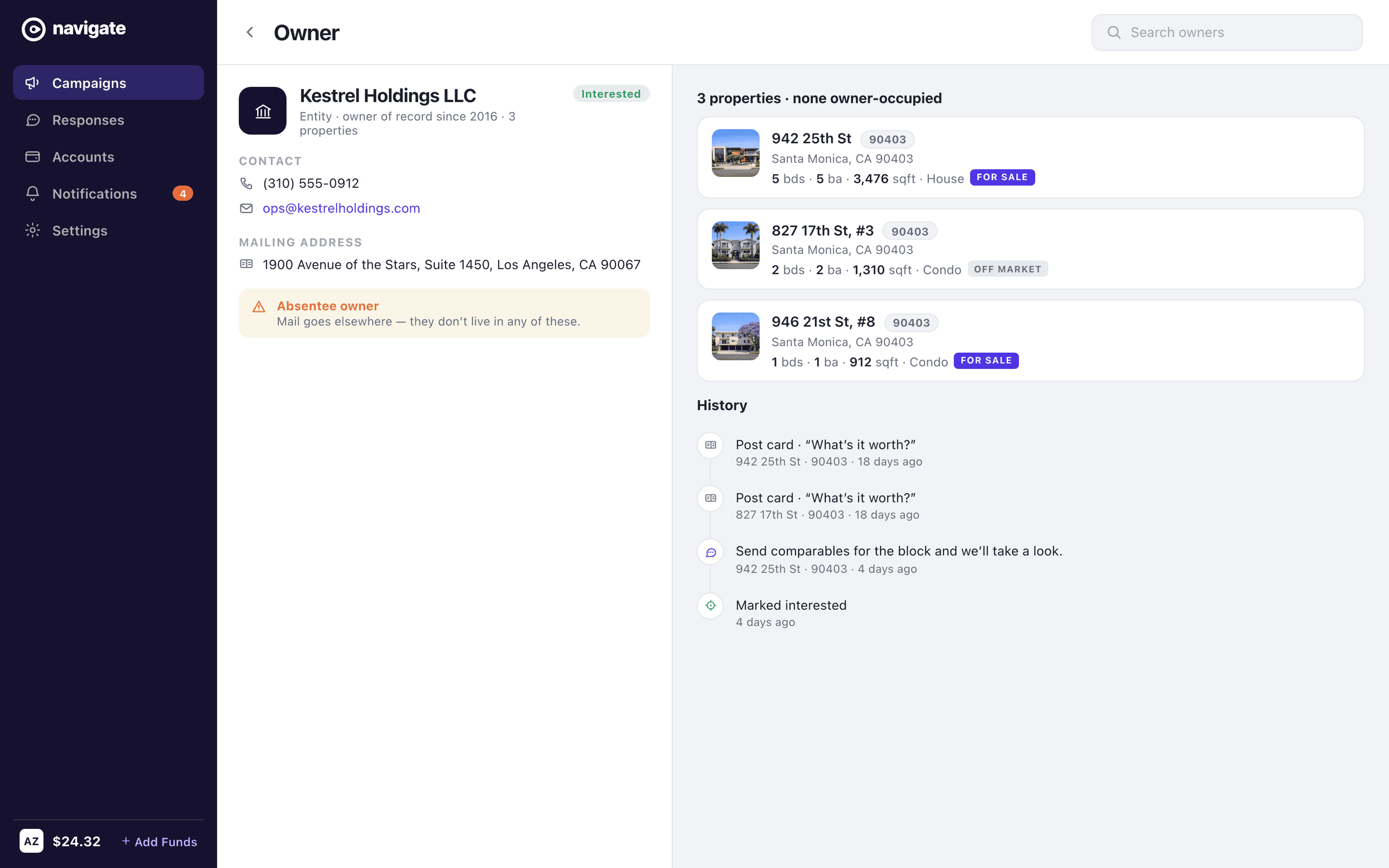
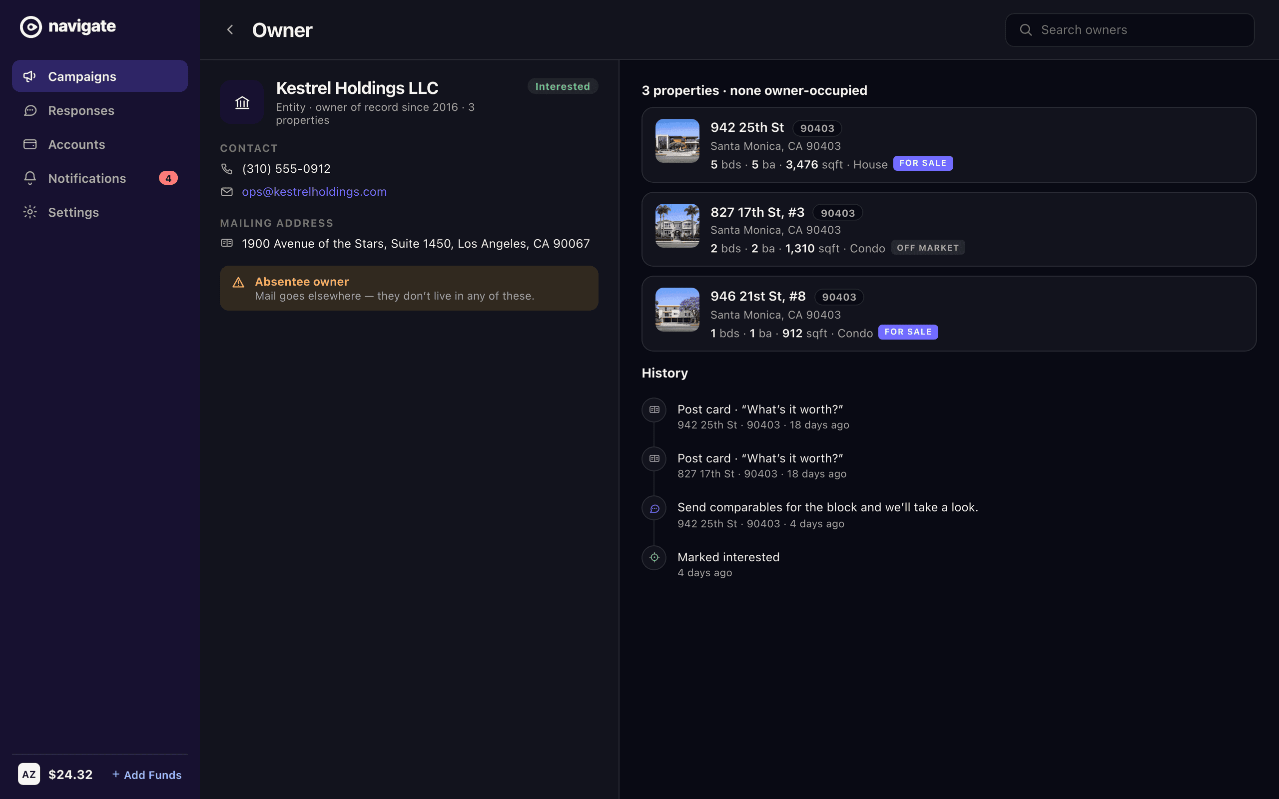
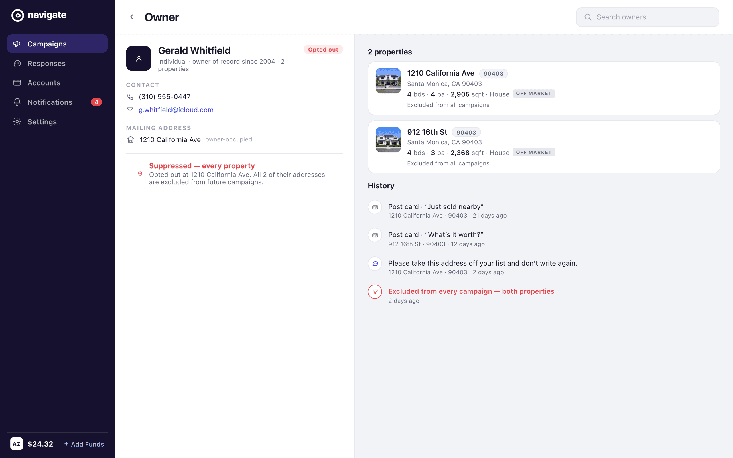
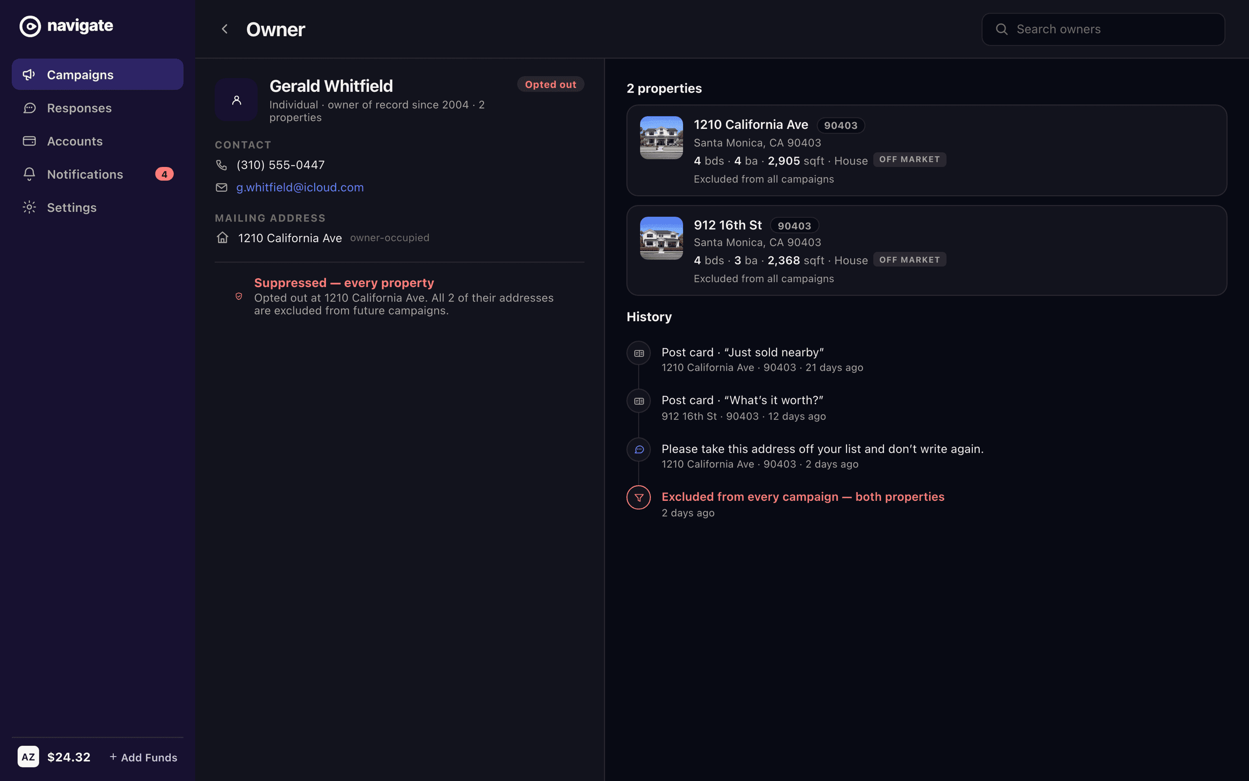
Everything in the product is addressed to a property, but outreach lands on a person, and the two are not the same shape. Kestrel Holdings owns three of the homes in one campaign and appears as three unrelated rows — the best lead in the dataset rendered as noise — with its mail going to an office in Century City, which is the strongest listing signal the data holds and had nothing to attach itself to. The failure runs the other way as well. Gerald Whitfield asked to be taken off the list at one address and owns another in the same ZIP; suppressing the address honours the letter of that and breaks the promise. Modelled as a person, one opt-out removes both, and the count on the send bar moves without anyone editing it.
What it cost, and where to go next
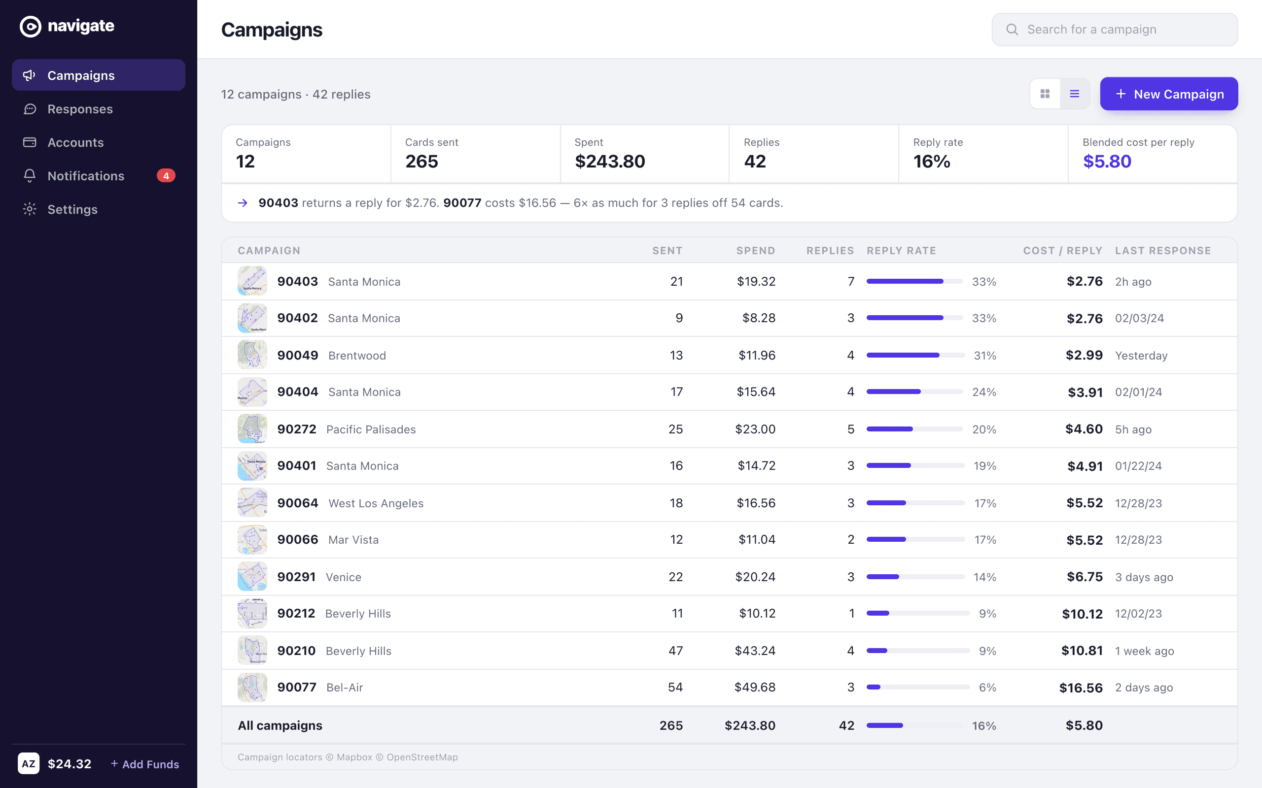
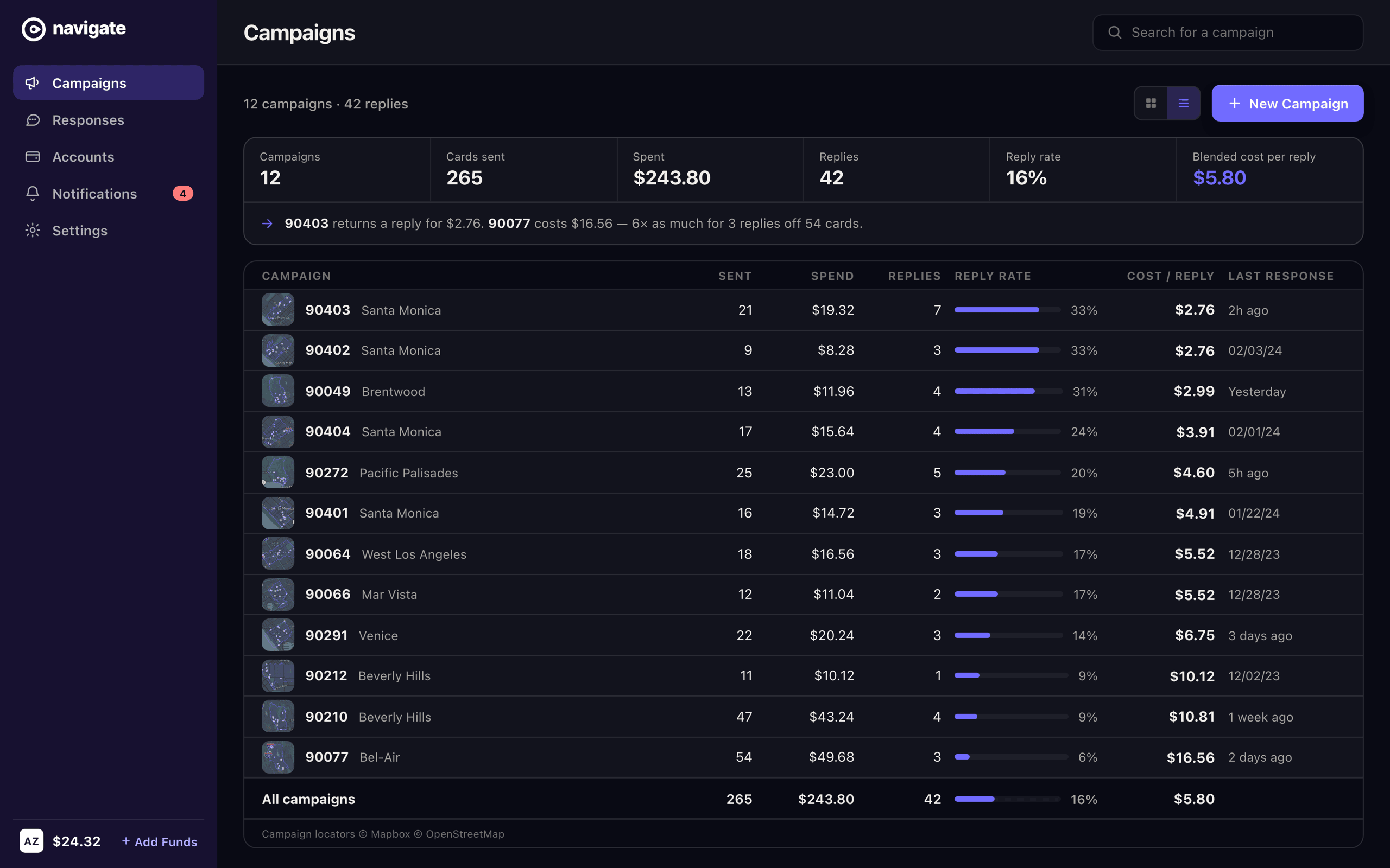
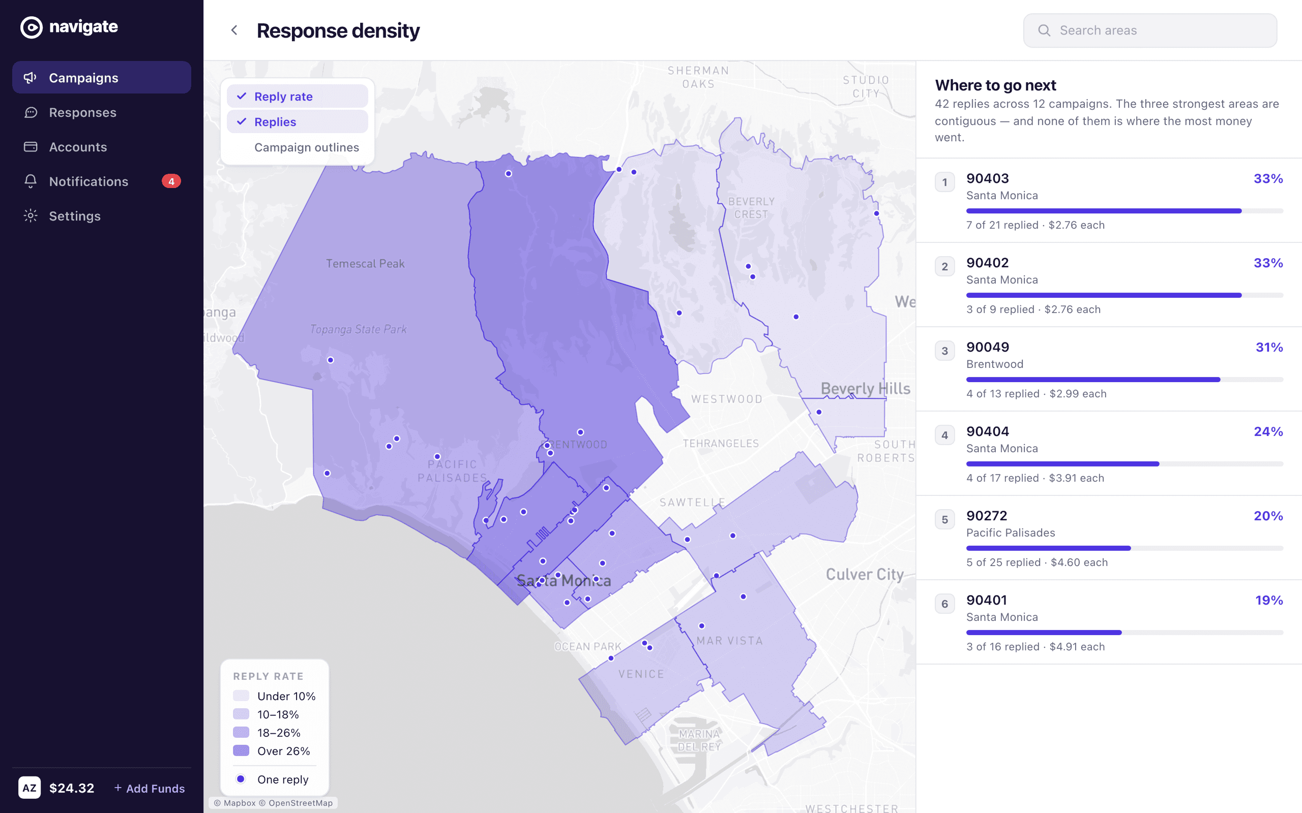
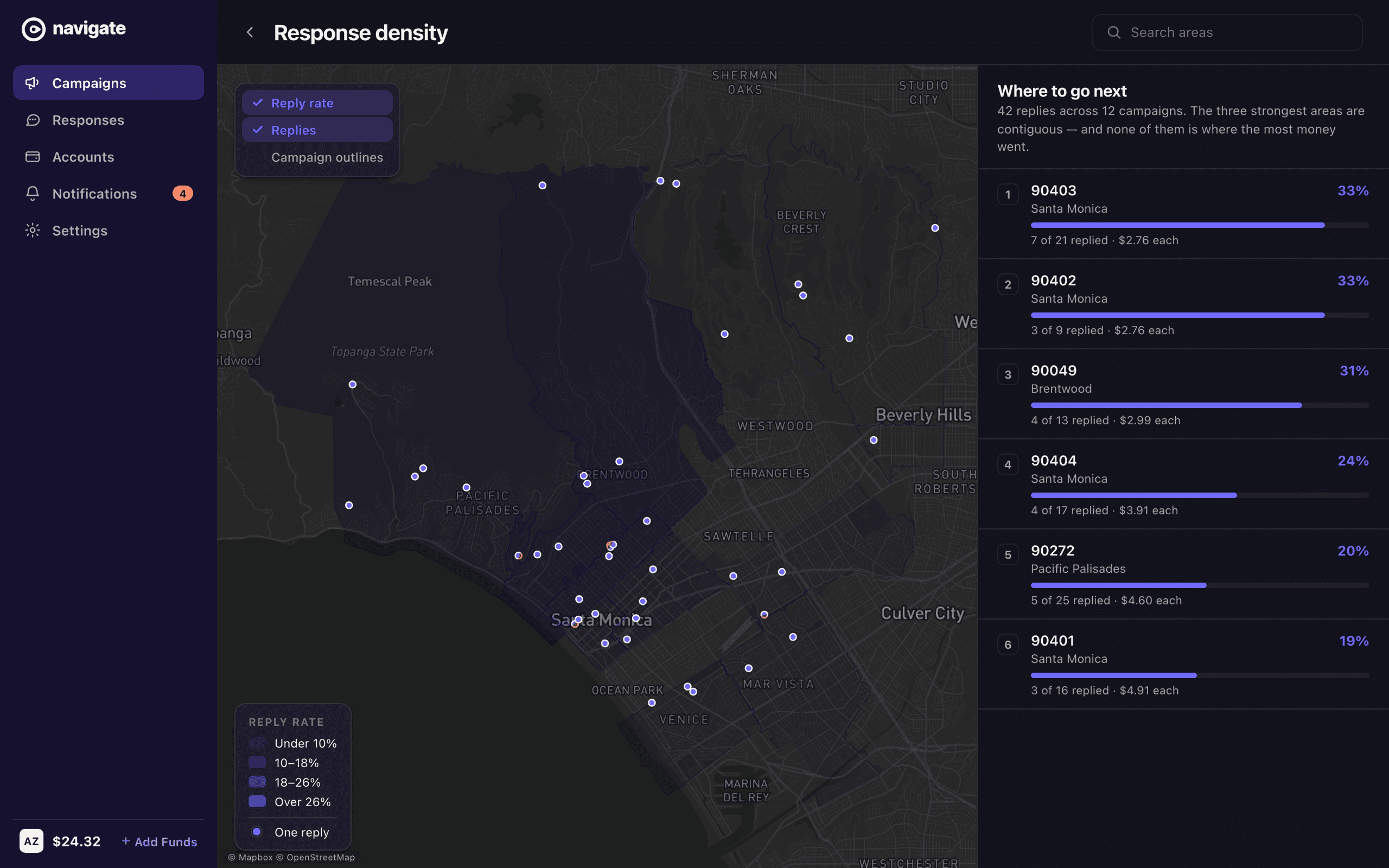
The dashboard the audit recommended reports activity: homes, start date, latest response. All of it true, none of it an answer to the only question that decides the next month. Post has a price and replies have a count, so dividing one by the other was always available and never done. Bel-Air took fifty-four cards and returned three replies, at sixteen dollars and fifty-six cents each; 90403 took twenty-one and returned seven, at two seventy-six. The two largest campaigns on the old dashboard are the two worst investments in the portfolio. Put the same numbers back on the map and the answer acquires a location — the areas that answer are contiguous, a band running from Santa Monica up through Brentwood, and none of them is where the money went.
What shipped
Delivered a prioritized design spec that doubled as a build roadmap.
Recommended targeted UX and UI fixes across the highest-friction flows.
Reframed the dashboard around campaigns, so an agent's active outreach leads.
Aligned the map and campaign views so location context travels with every campaign.
Selected decisions
- 01
Centered the dashboard on a campaign grid — each card pairing a neighborhood map with its ZIP, home count, start date, and latest response.
- 02
Made map-based targeting the core gesture: search a city, neighborhood, or ZIP and build a campaign around that area.
- 03
Surfaced response tracking so agents can see which campaigns are landing at a glance.
- 04
Designed an empty state that points a first-time agent straight to creating their first campaign.