A 0→1 marketplace for fine-mineral collectors, built on trust
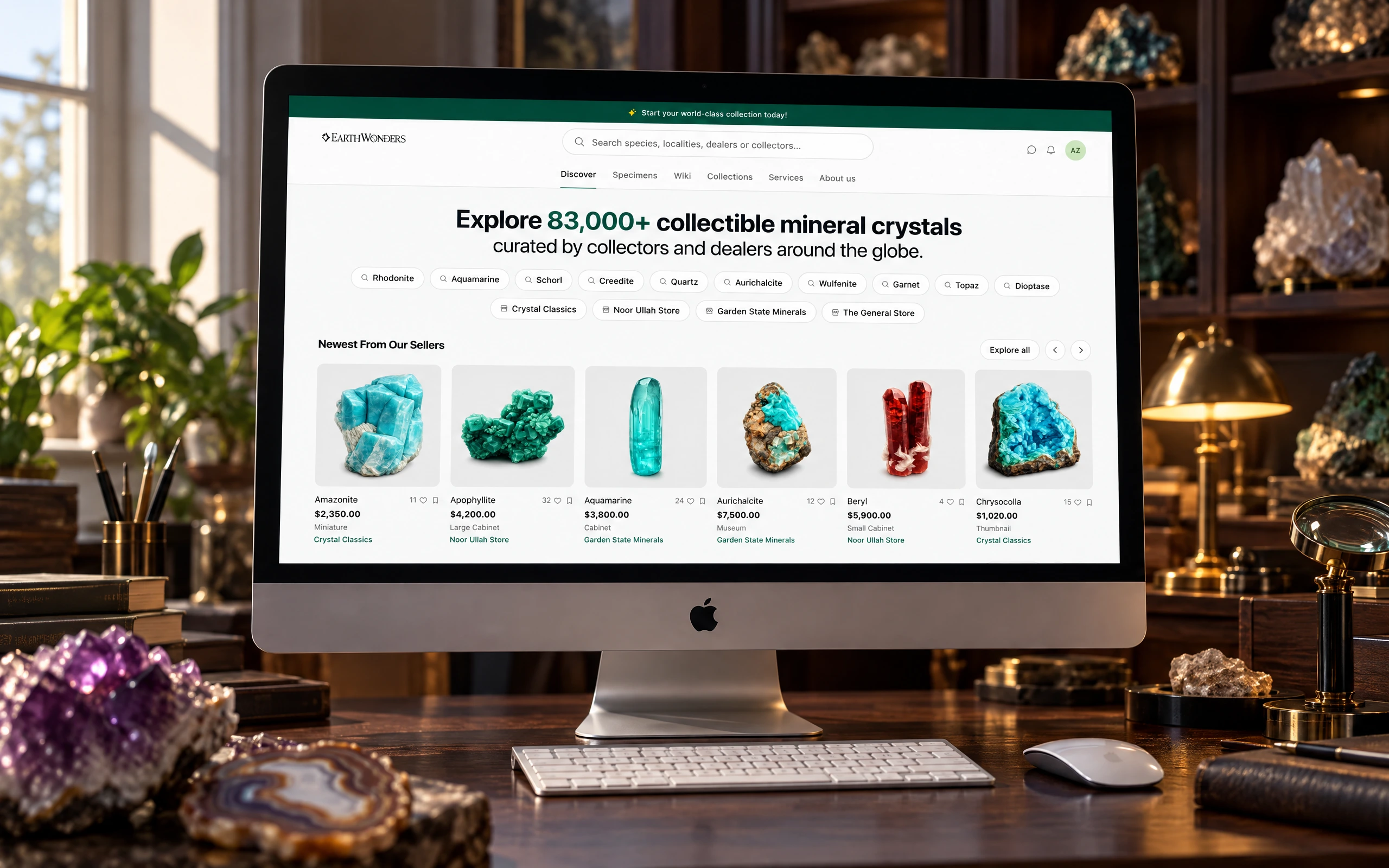
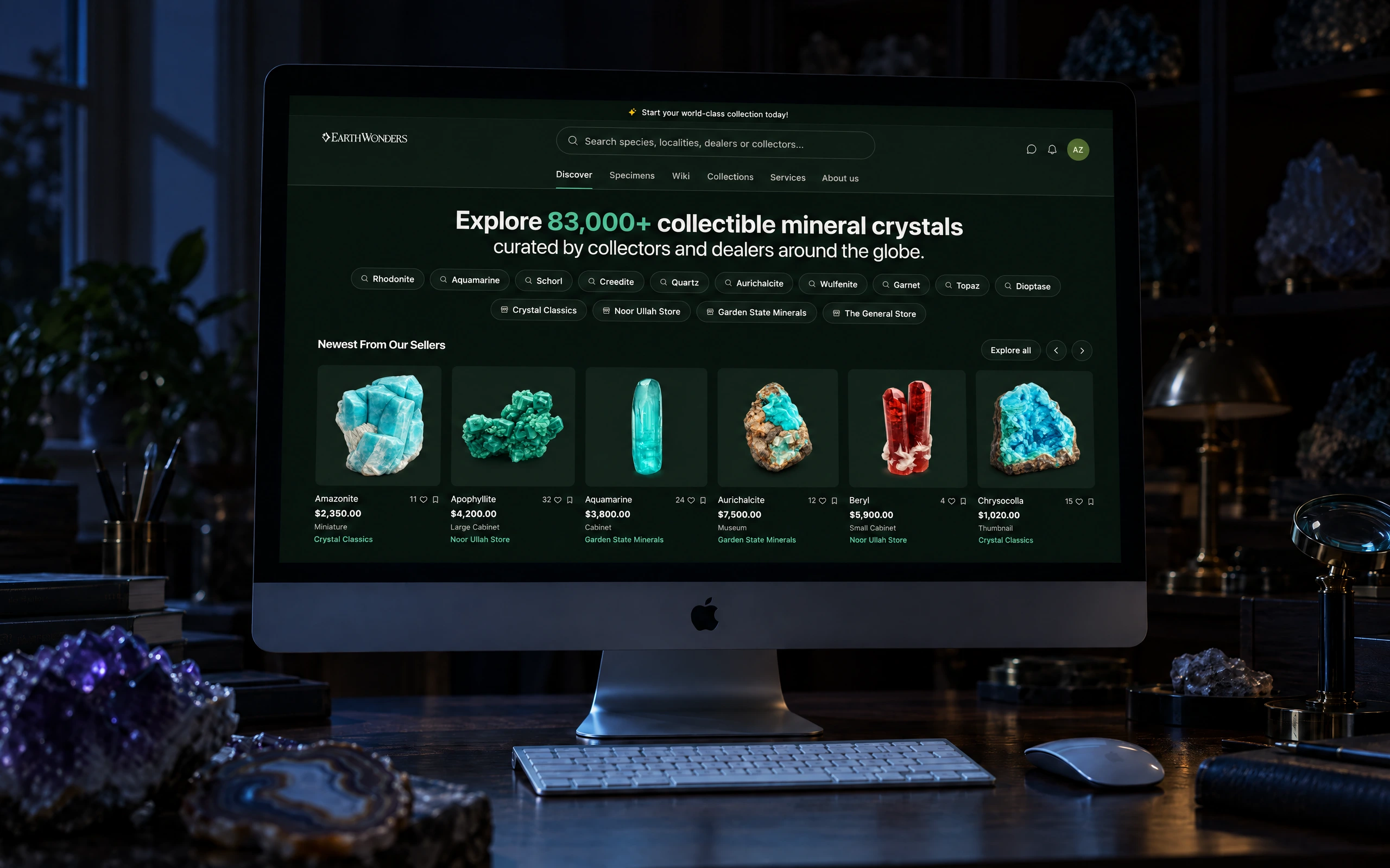
Fine-mineral collectors will spend thousands on a single specimen they have only seen in a photo. Before EarthWonders they did it over Instagram DMs and one-off dealer sites — negotiating in the comments, wiring the money, and trusting a stranger to ship the right piece. The opportunity was a real marketplace for them; the actual problem underneath it was trust.
Trust is hard to manufacture and hardest at the start. We launched with no inventory, no buyers, and no reputation, into a community of experts who know every dealer and every price and would see through any seeded supply immediately. What follows is the chain of decisions that earned it — a few of them unglamorous, and one that had me writing production code myself to get unstuck.
- Engagement
- 0→1 marketplace, founding team
- Role
- Principal Product Designer
- Scope
- Research, brand, design system, production UI
- Timeline
- Six months to MVP
Role
Principal Product Designer, 0→1. I led product design and strategy with the founding team, covering research, prototyping, the design system, and delivery with engineering. When iteration speed became the constraint, I took GitHub access and built the hard surfaces as working prototypes — AI-assisted, against real data — so the team could argue with something they could click instead of a comp.
Dealers & collectors
0
Onboarded by the six-month MVP.
Specimens listed
0
Seeded from dealers' own public catalogs.
Months to MVP
0
Concept to a marketplace with real supply on both sides.
Steps to list
0
Down from one long abandoned form. Photography first.
A closer look, screen by screen
The chain, end to end
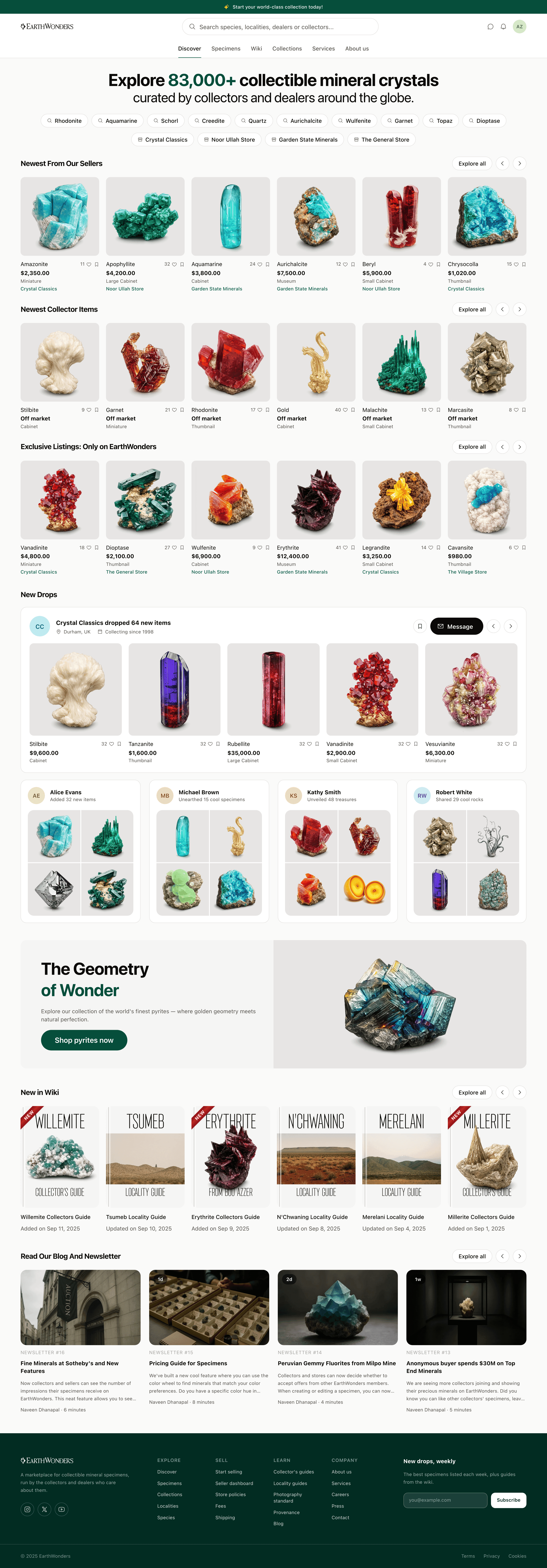
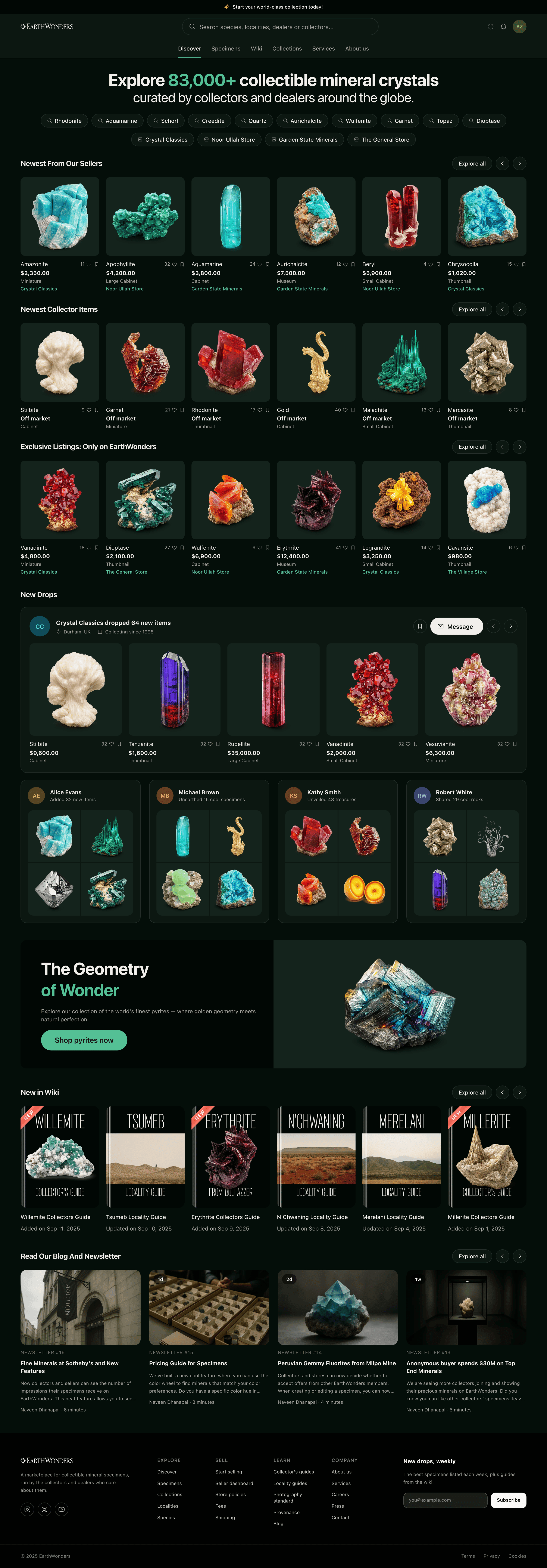
The product's job was to make a four-figure purchase of something you can't hold feel safe, and no single screen does that alone. A buyer lands on supply that is clearly real, finds their way in by species or by place, narrows it with the vocabulary collectors actually use, reaches a listing that can prove where the piece has been, and pays through a checkout that tells them what happens next and roughly when. Each step lends the next its credibility, and the last one is where most marketplaces stop caring — a confirmation that says only "thank you" hands the buyer straight back to the anxiety the rest of the chain just spent six screens undoing.
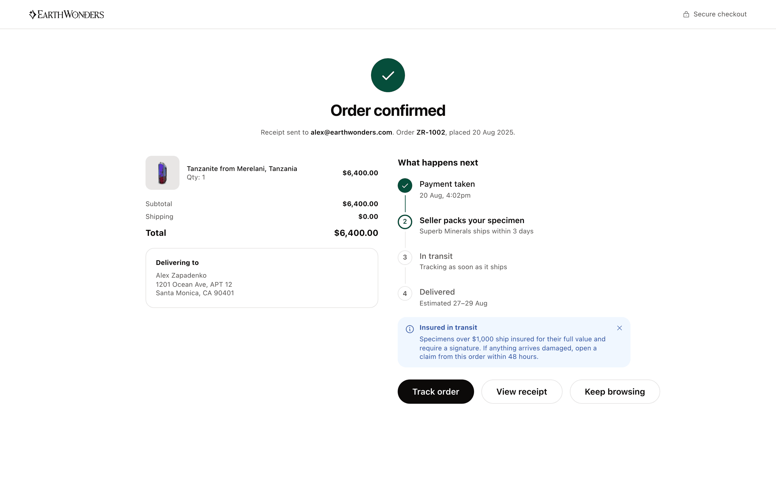
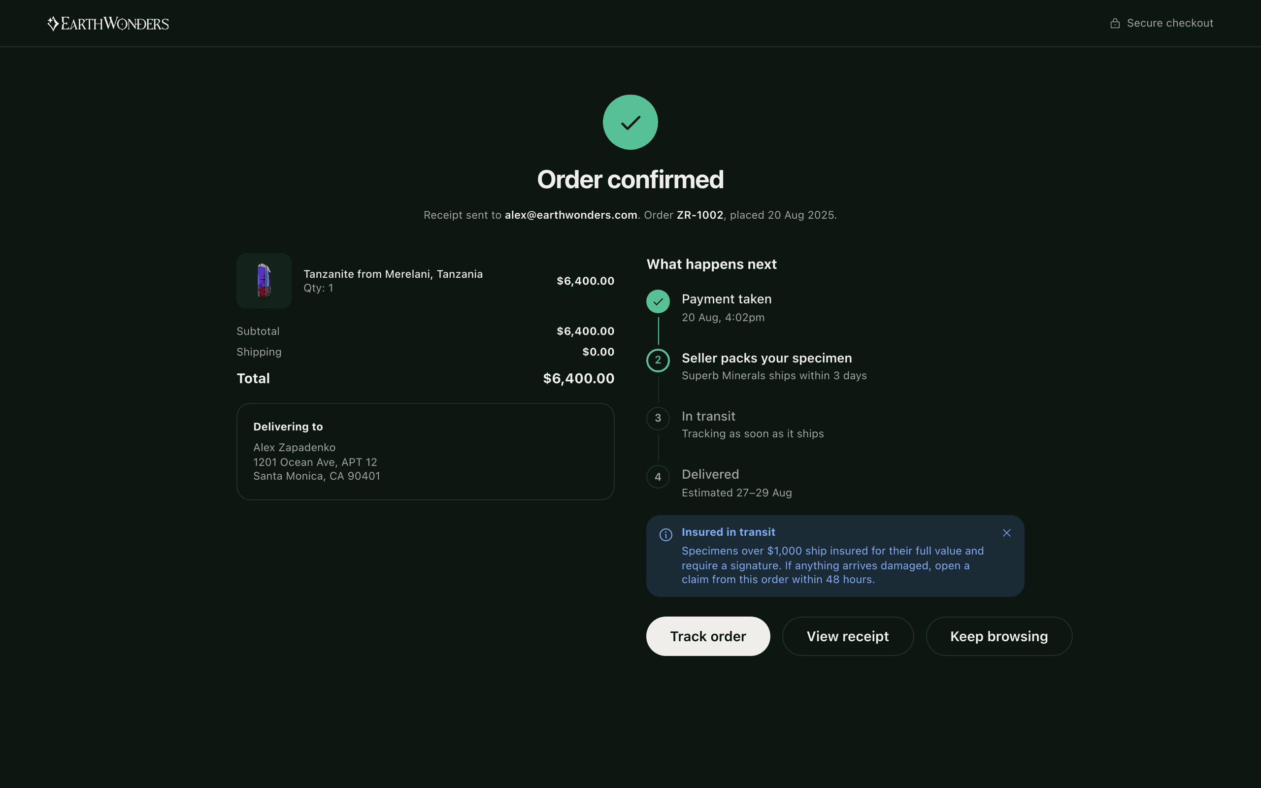
One screen becoming the next
Side by side, the six steps can be counted and compared, which is how you check that the order is right. What that view cannot show is the handover, and the handover is where the argument actually lives — a buyer leaves each screen having got the one thing they came for, and arrives at the next already expecting it. Played as a single run the chain stops reading as six designs and starts reading as one path, with the weight falling on the joins: search handing off to a grid that answers as it narrows, the grid handing off to a listing that can prove where the piece has been, the listing handing off to a checkout that never makes anyone decide again.
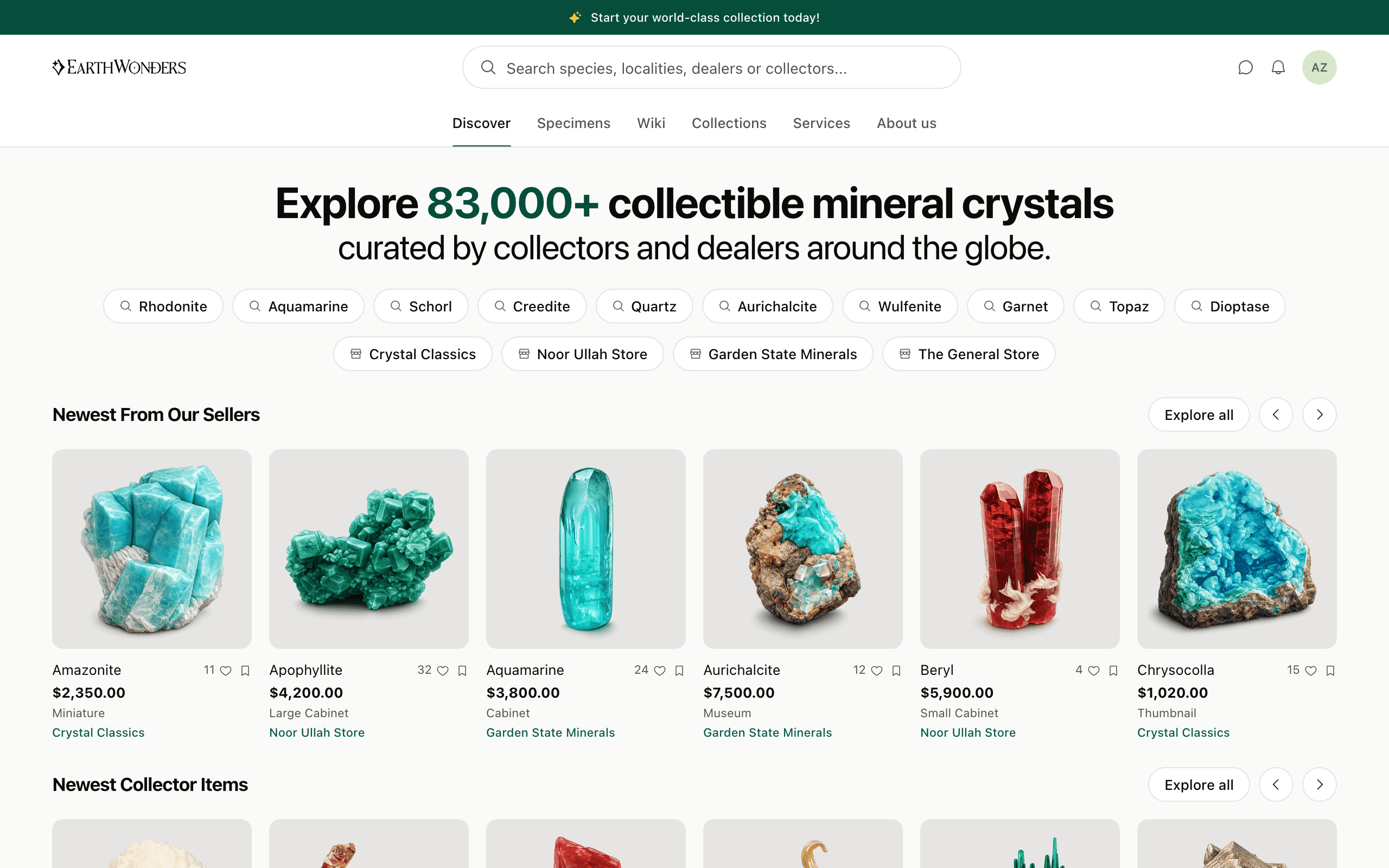
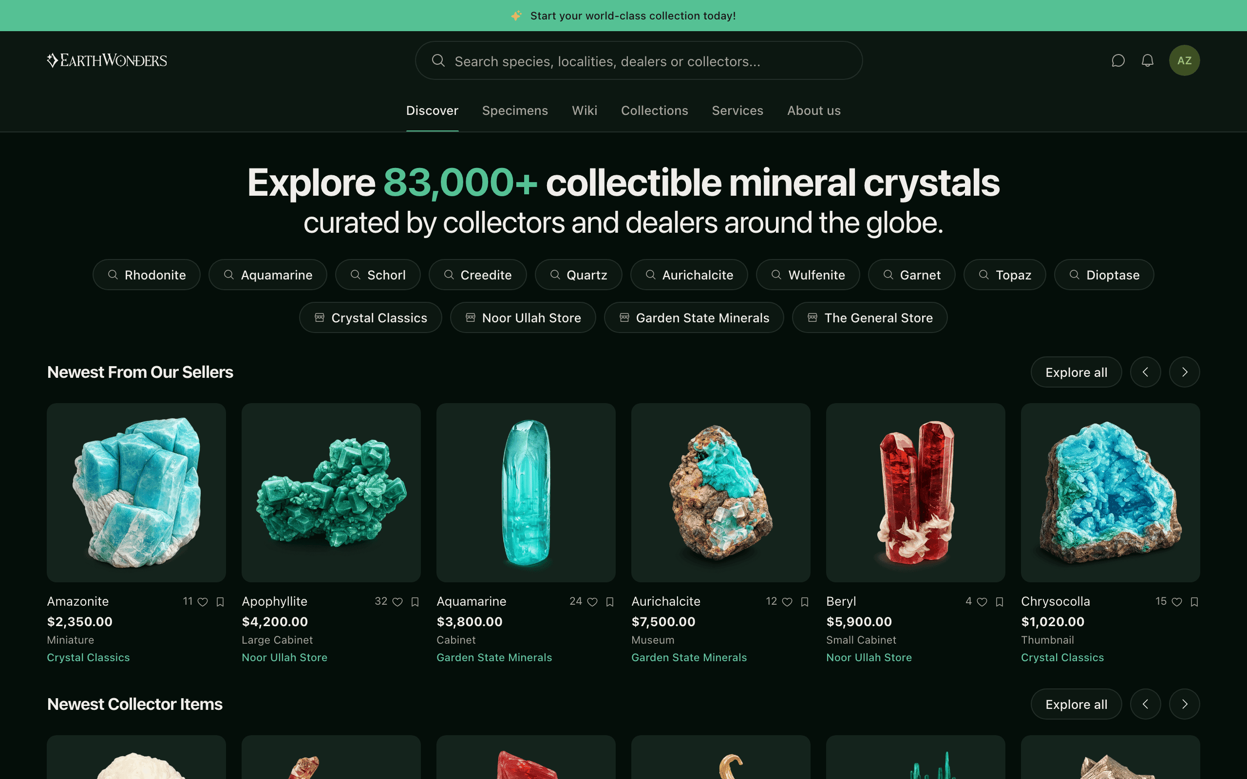
A marketplace that opened full
Buyers arrive for inventory and sellers arrive for buyers; at launch we had neither, and collectors know every dealer and every going rate, so seeded fakes were never an option. We grew real supply instead — scrapers mirrored dealers' public catalogs into our data model before onboarding, so a dealer's first encounter with the platform was their own storefront, hundreds of specimens already listed and priced. The front door could honestly say 83,000+ specimens because they were really there.
Destinations before merchandise
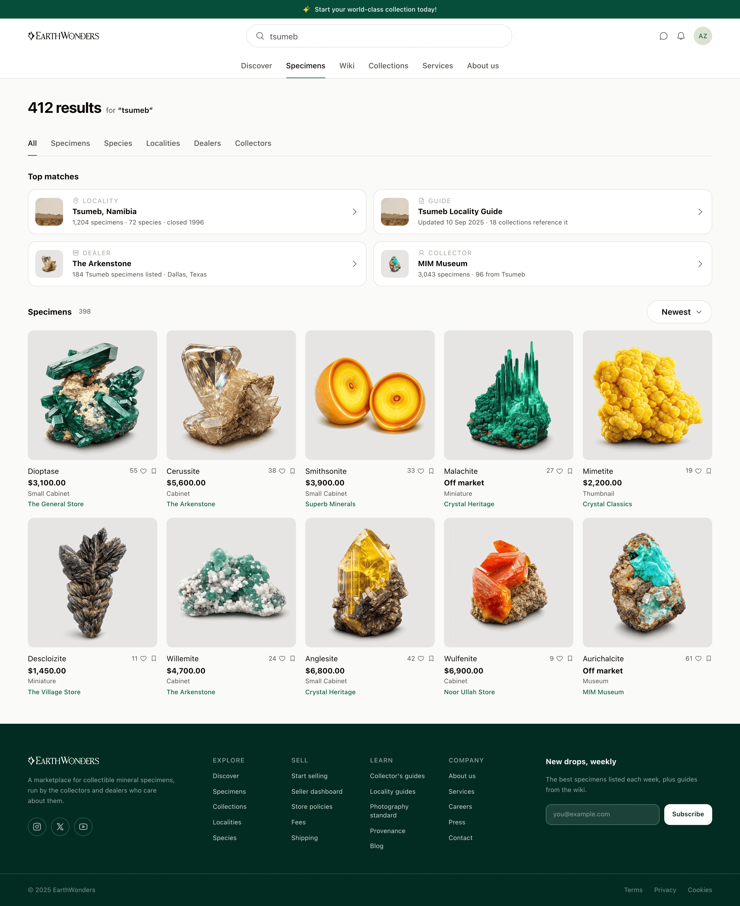
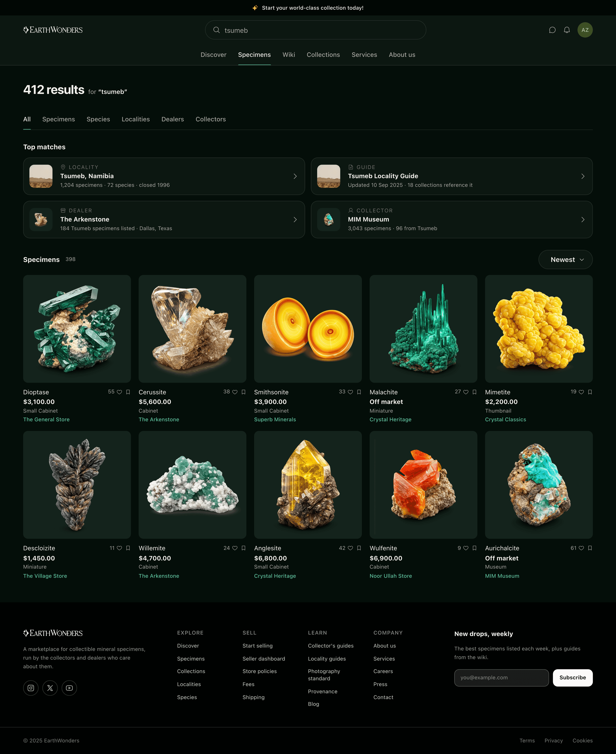
The search field promises four different kinds of thing — species, localities, dealers, collectors — and only one of them is for sale. Someone typing "tsumeb" is almost never asking for a grid of forty cards that happen to mention it; they are asking to be taken to Tsumeb, a mine in northern Namibia that closed in 1996 and that a certain kind of collector organizes their shelf around. So the direct hits come first and look nothing like merchandise: wide, low, one per row, a place and a guide and a dealer before a single price. The specimens follow underneath, where they belong.
The grid answers as you narrow
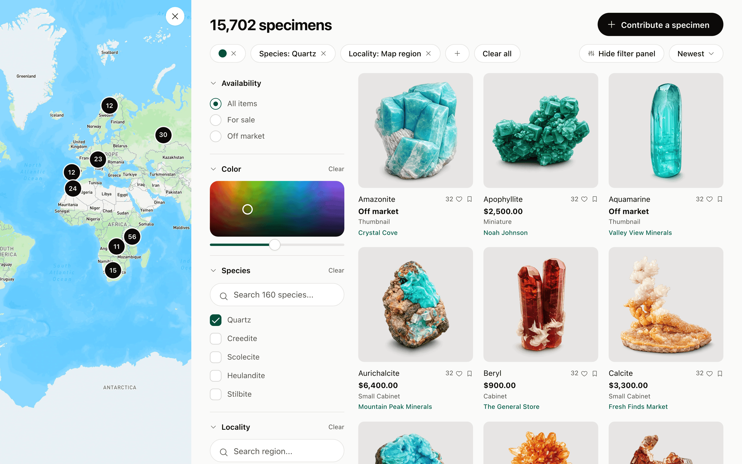
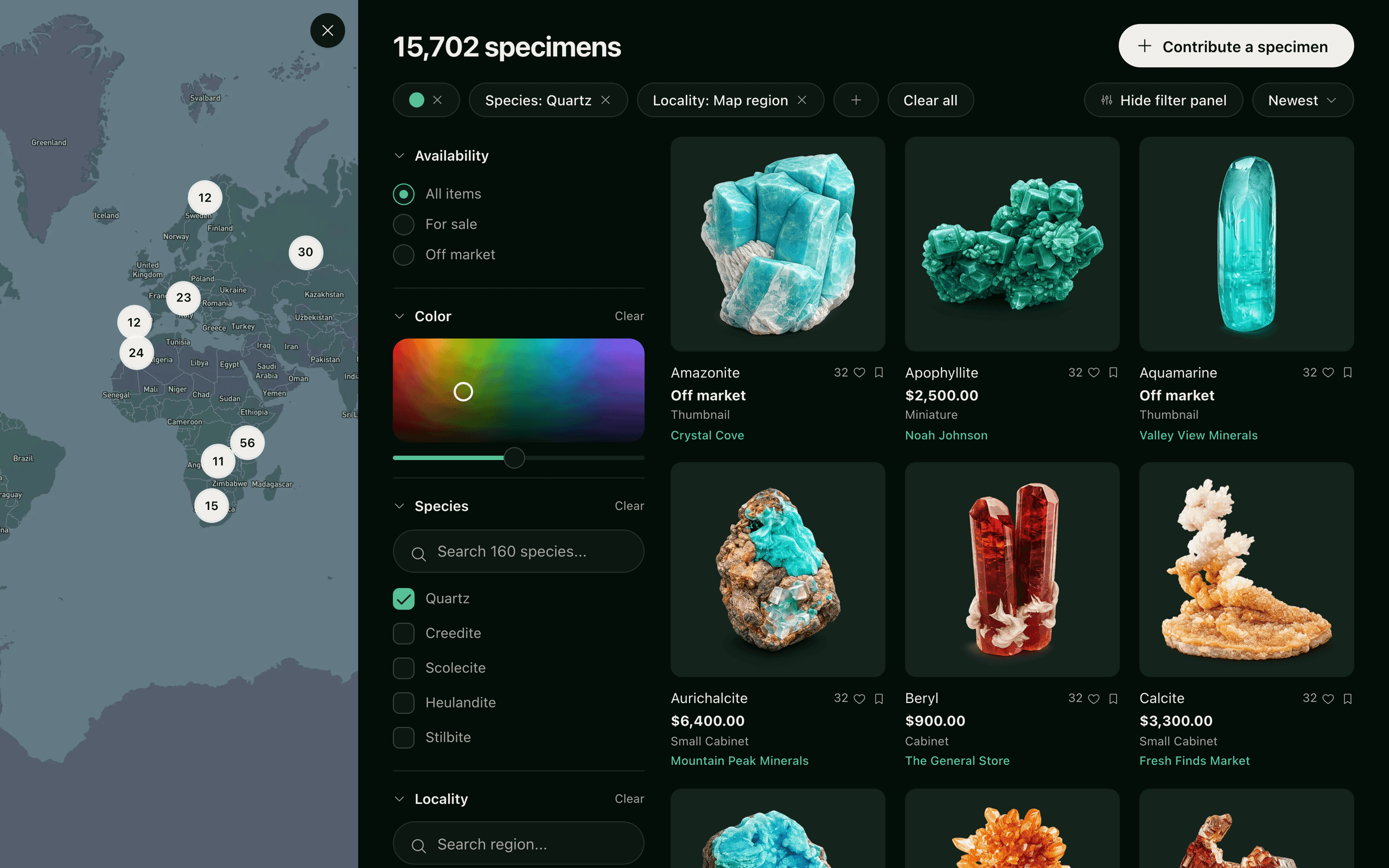
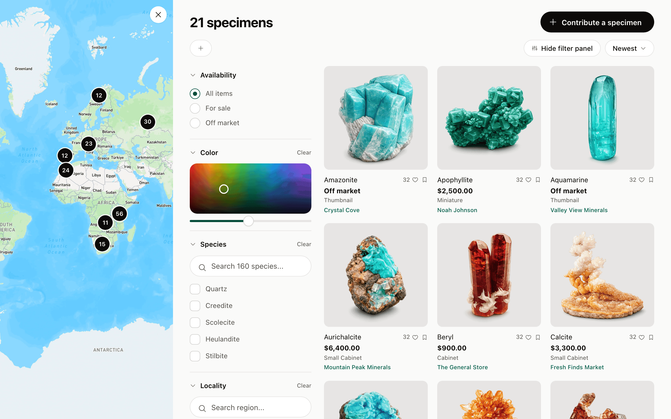
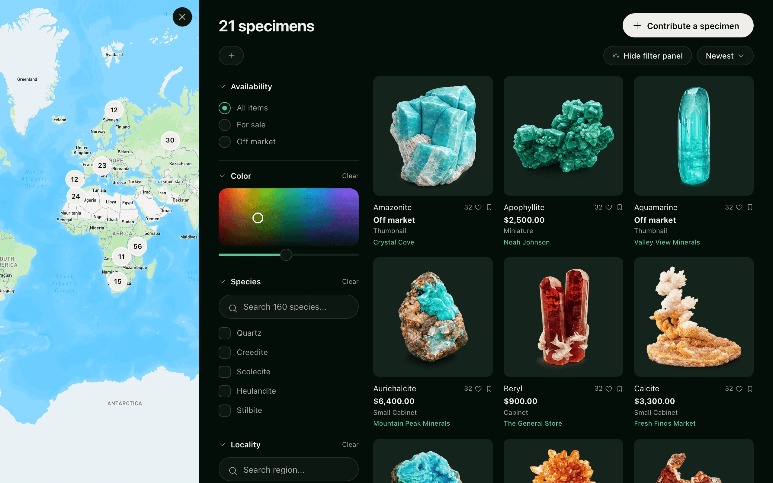
Filters were the hardest part of the interface. A comprehensive filter modal tested poorly because minerals are visual and collectors expect the grid to respond as they narrow, not after they commit. The limiting factor was iteration speed more than the design: every version of the rail had to be specified, drawn and queued before anyone could say whether it felt right, and by the time it came back the question had gone cold. So I stopped drawing it and built it — a left rail with a live-updating grid, put together with AI assistance over a weekend and running against the real catalogue. The weekend is not the interesting part; the fact that the team could open it is. A prototype everyone can click settles a disagreement that a spec and a static comp can only restate, and engineering got to read the thing they were being asked to build rather than a description of it. That version is what we shipped. The taxonomy behind it is the community’s own: species, locality, formation, rarity, with locality important enough to browse on a map.
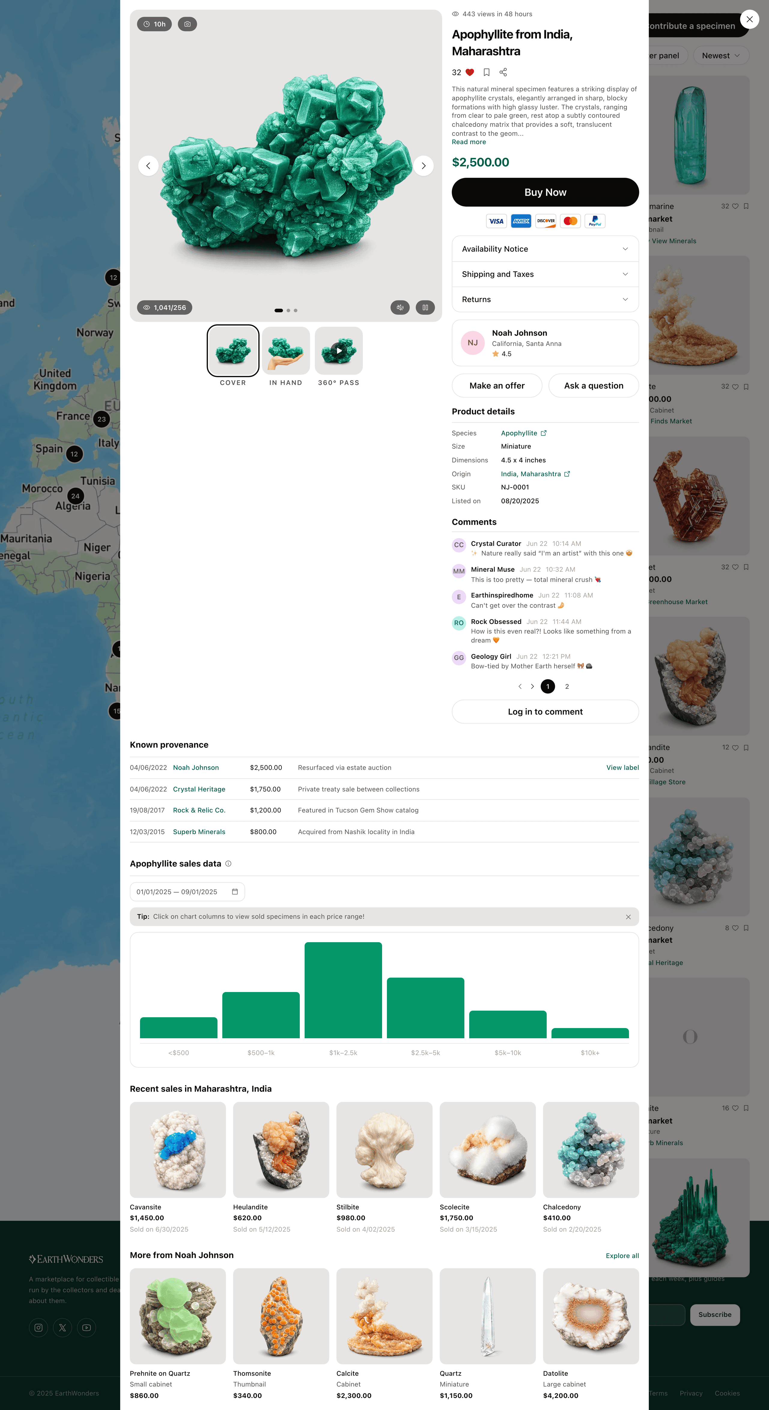
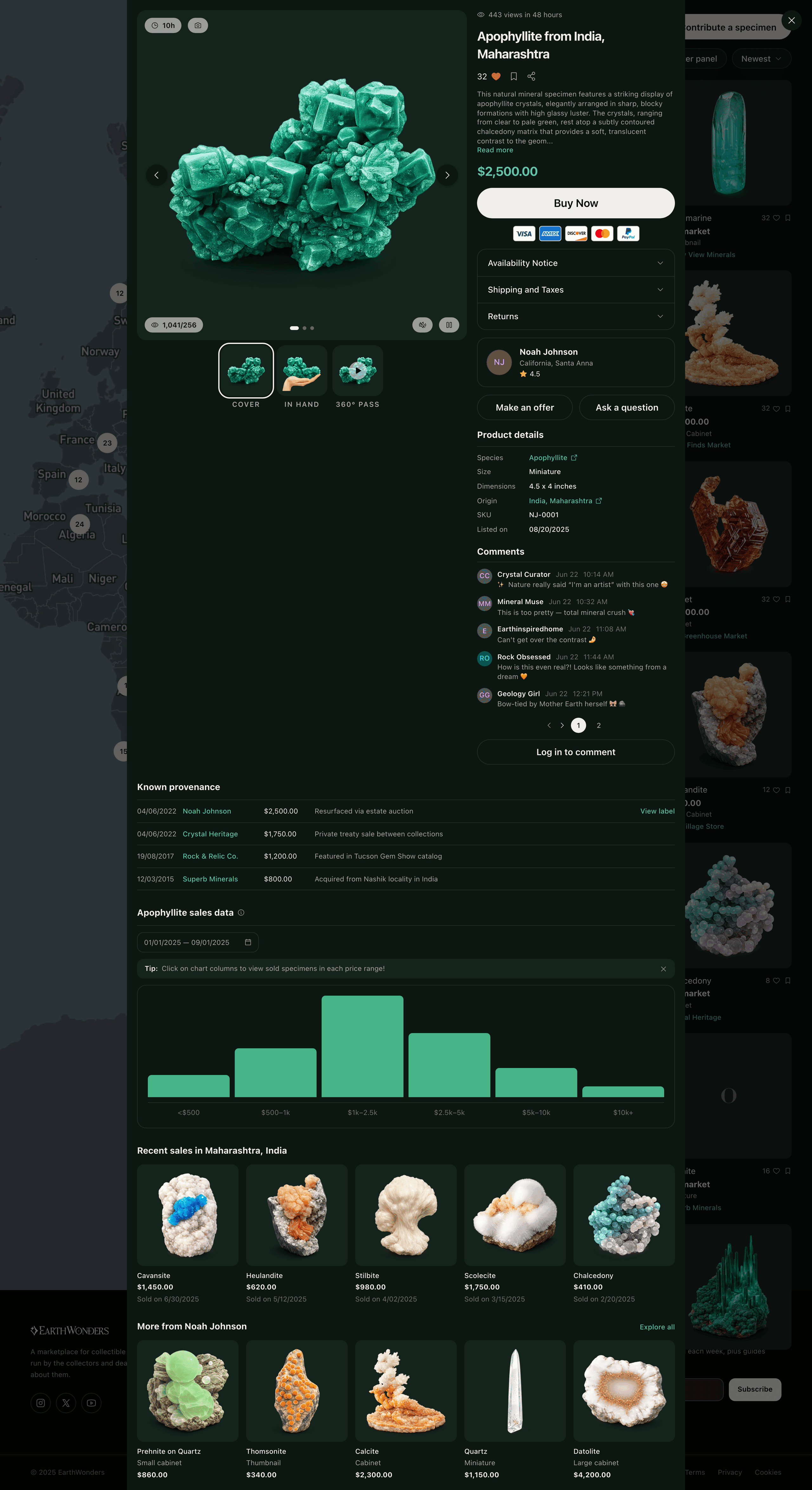
A listing with standing
Buying a physical object online comes down to the information a buyer can rely on. Provenance is built into each listing as a structured record — prior ownership, collection locality, and any exhibition or publication history — which gives a listing the standing of an auction-catalog entry. Around it sits the photography standard: a full view, a hand-scale reference, macro detail, and a 360-degree pass, so the piece shows how it actually takes light. The whole thing opens over the results rather than replacing them, because the alternative to this specimen is the one two rows up, and a buyer comparing four pieces should never lose their place.
The one screen with no way out of it
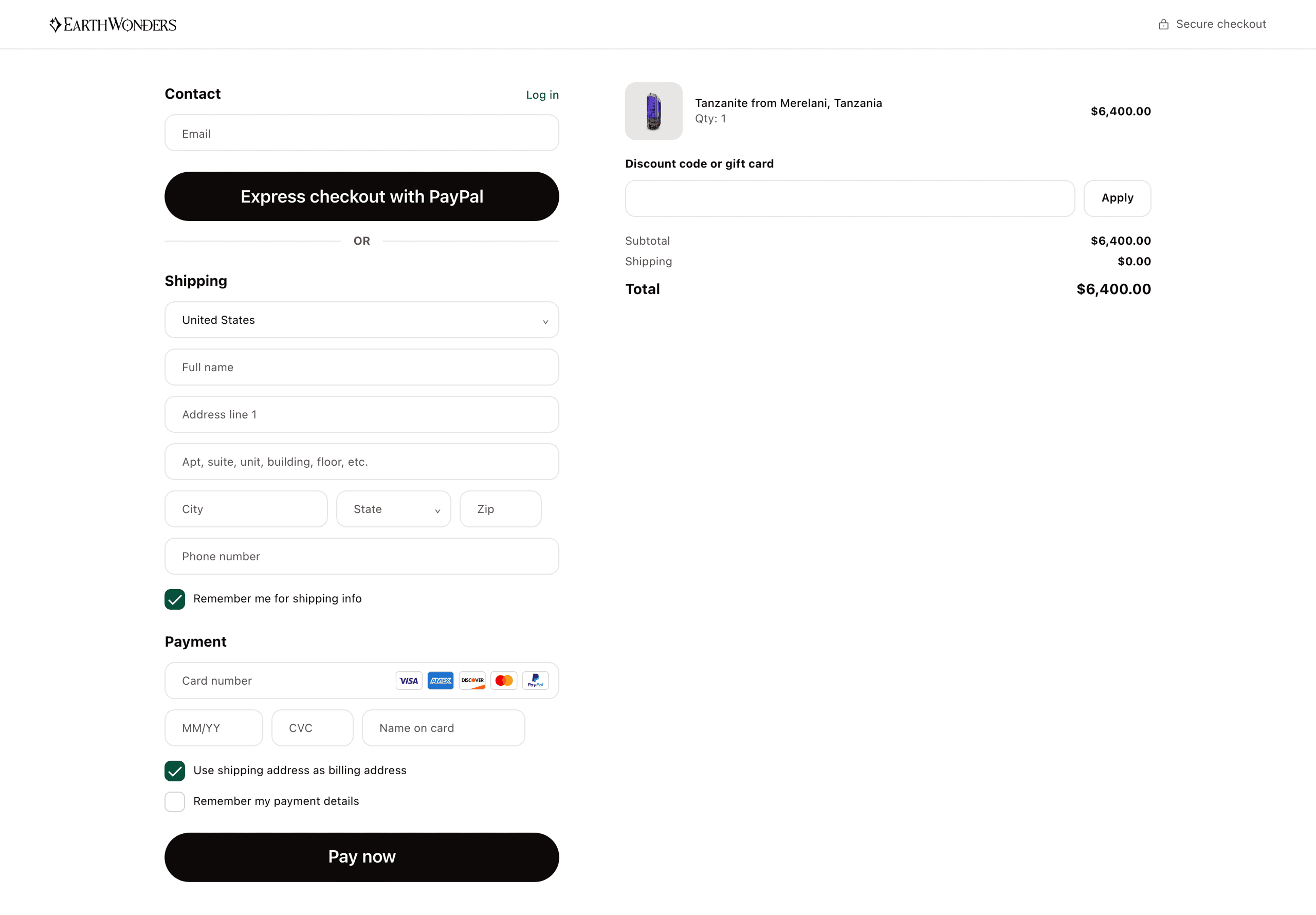
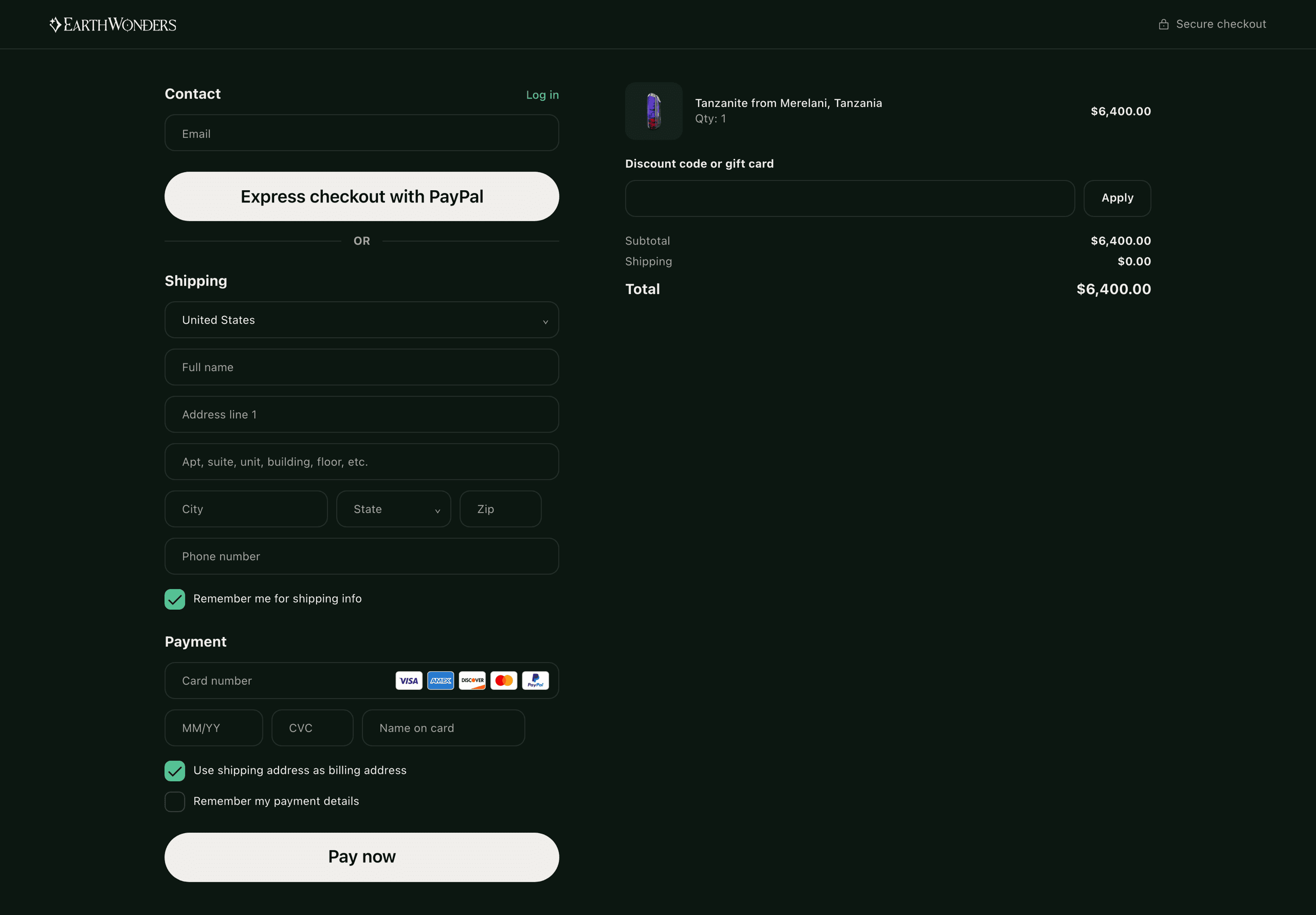
Every other surface is somewhere to wander; checkout is a task, and the layout says so — navigation gone, what you have to give on the left, what you are getting on the right, and a total that never moves. PayPal sits above the form rather than beside it, with a rule and an OR under it, because it is an alternative to the whole form and not to one field of it; for a buyer wiring four figures to a stranger for the first time, a payment name they already trust is worth more than a shorter form. What comes after the money is a stage rail with dates on it — packed, in transit, delivered — since the question in a buyer's head at that moment is not what they bought but when they will be holding it.
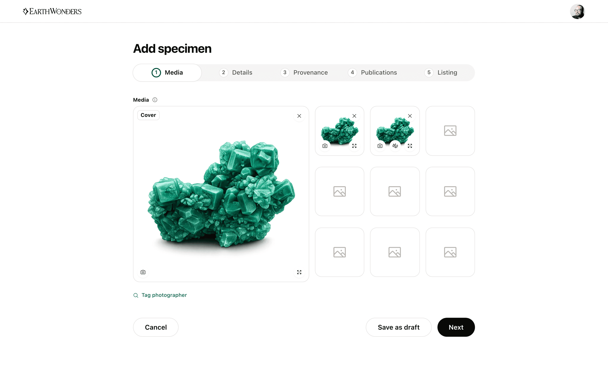
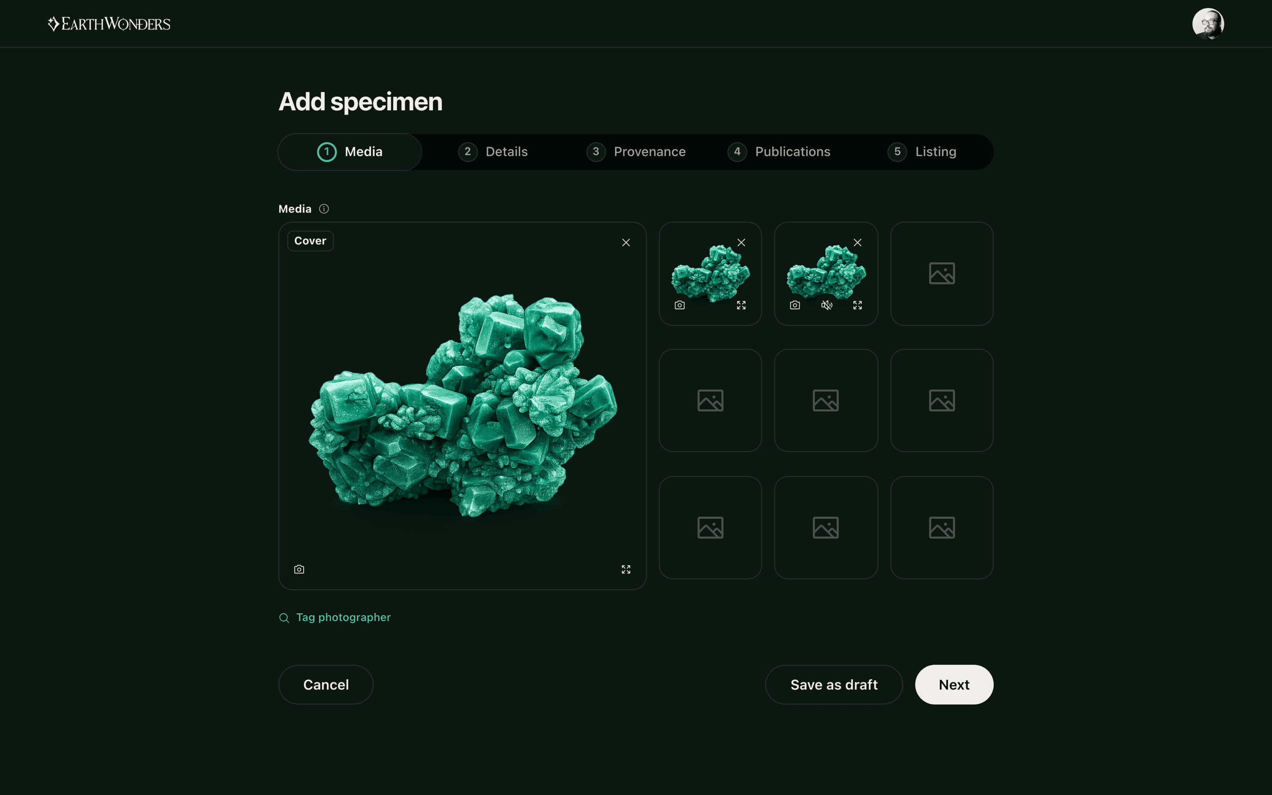
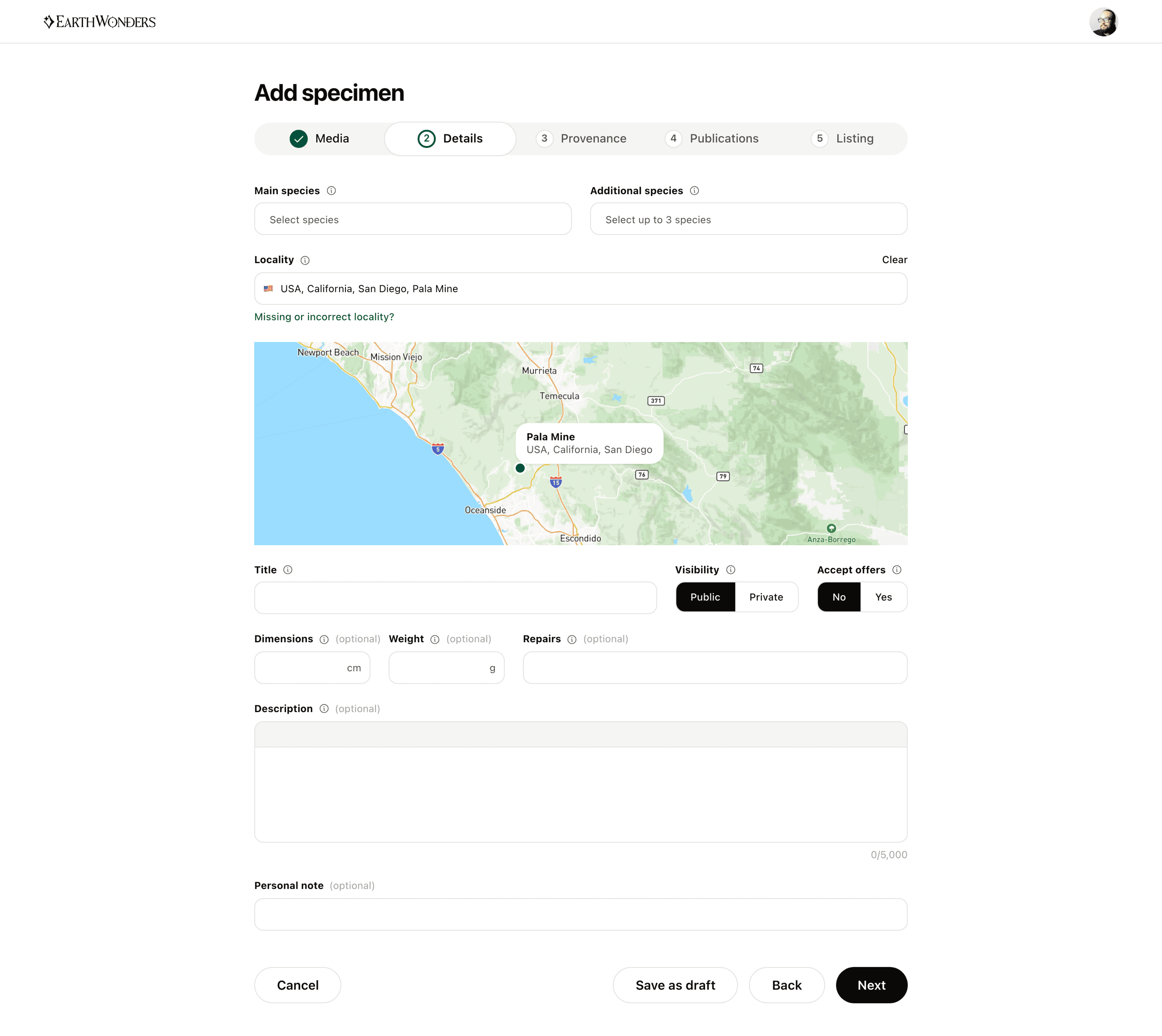
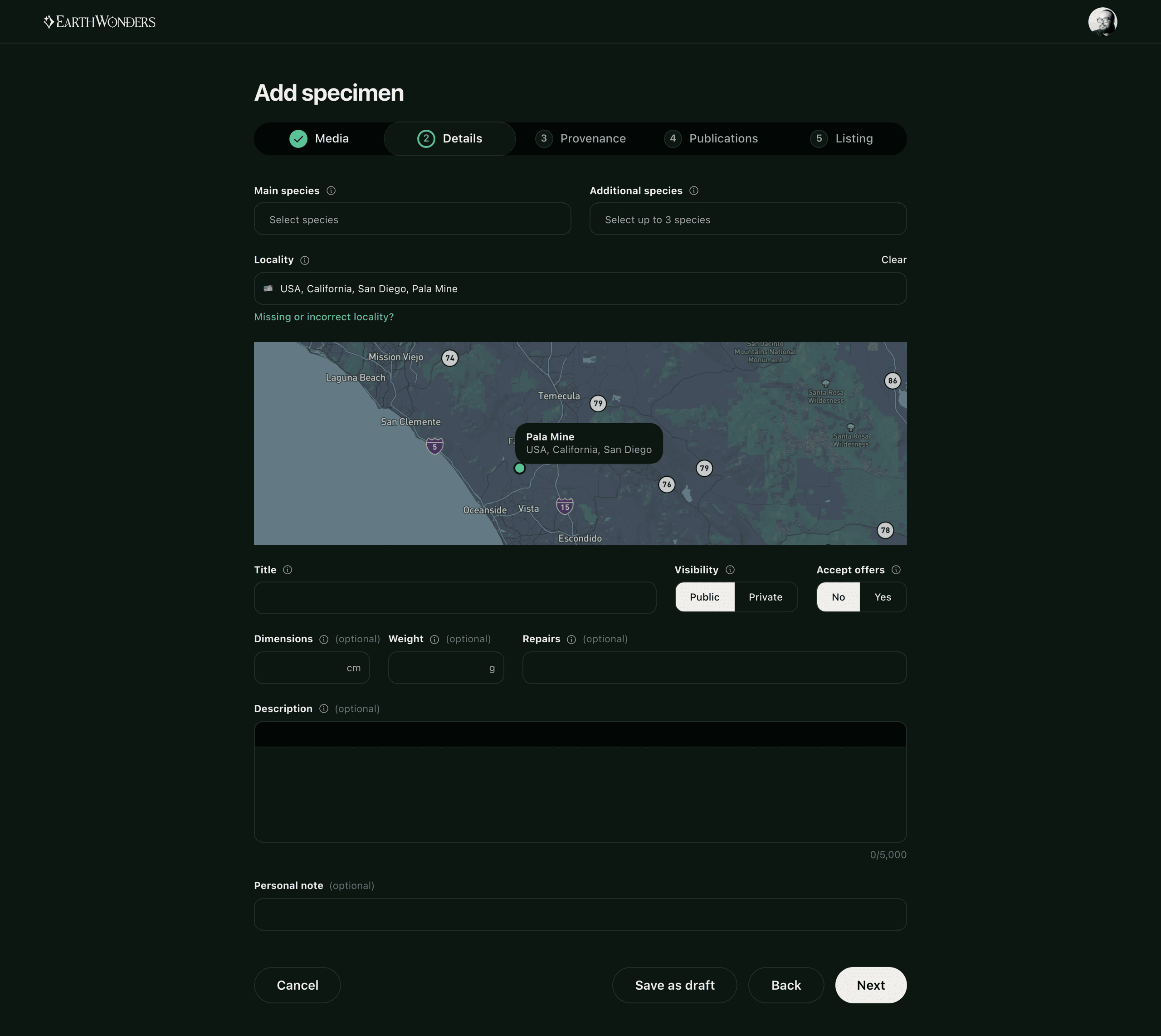
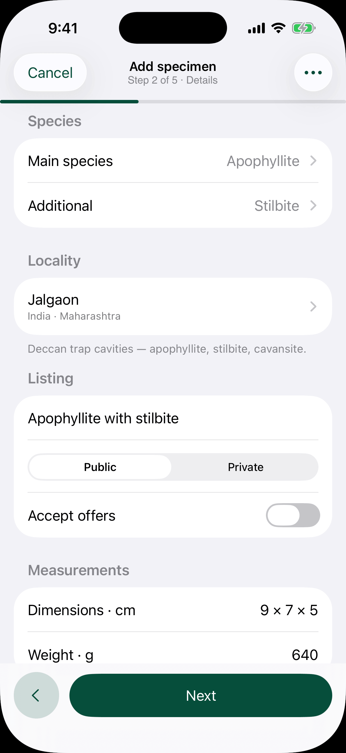
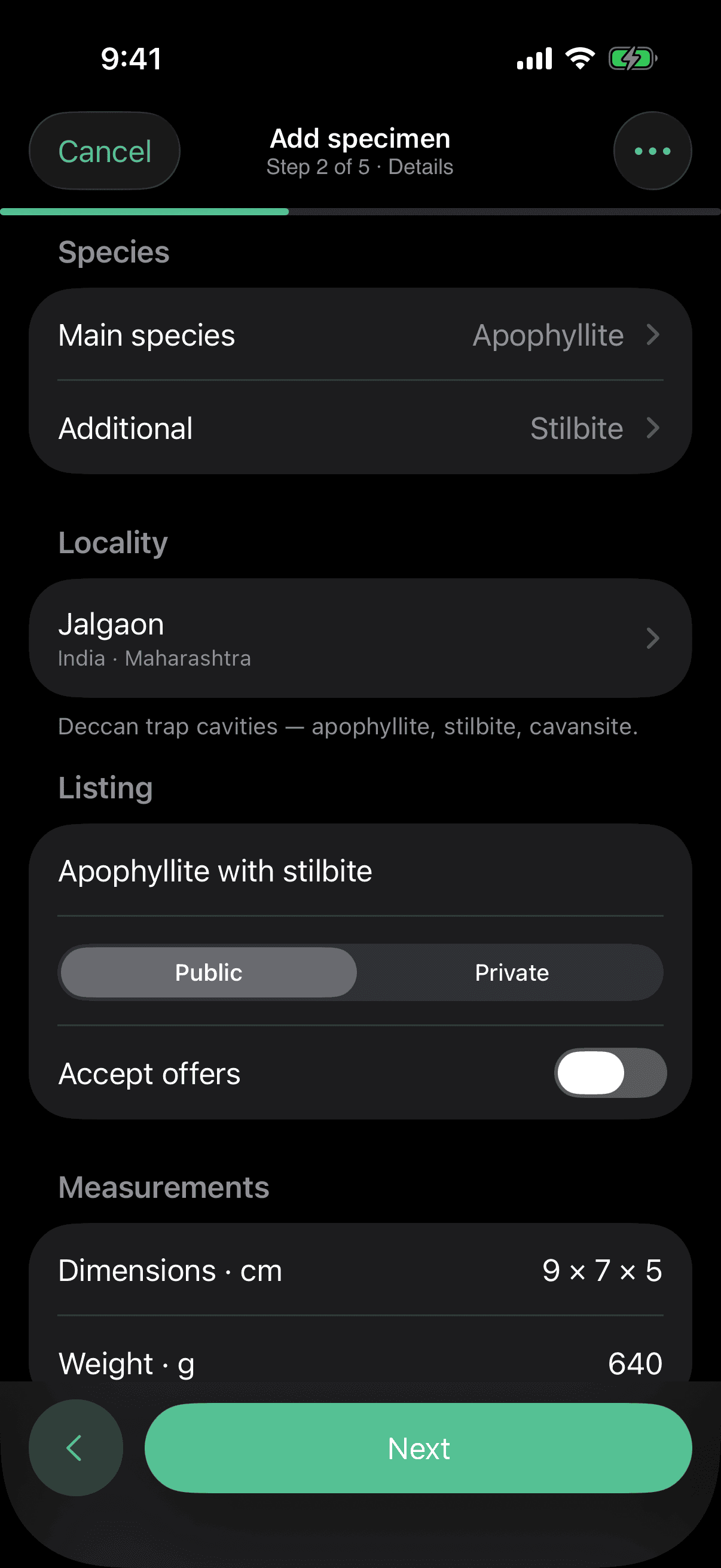
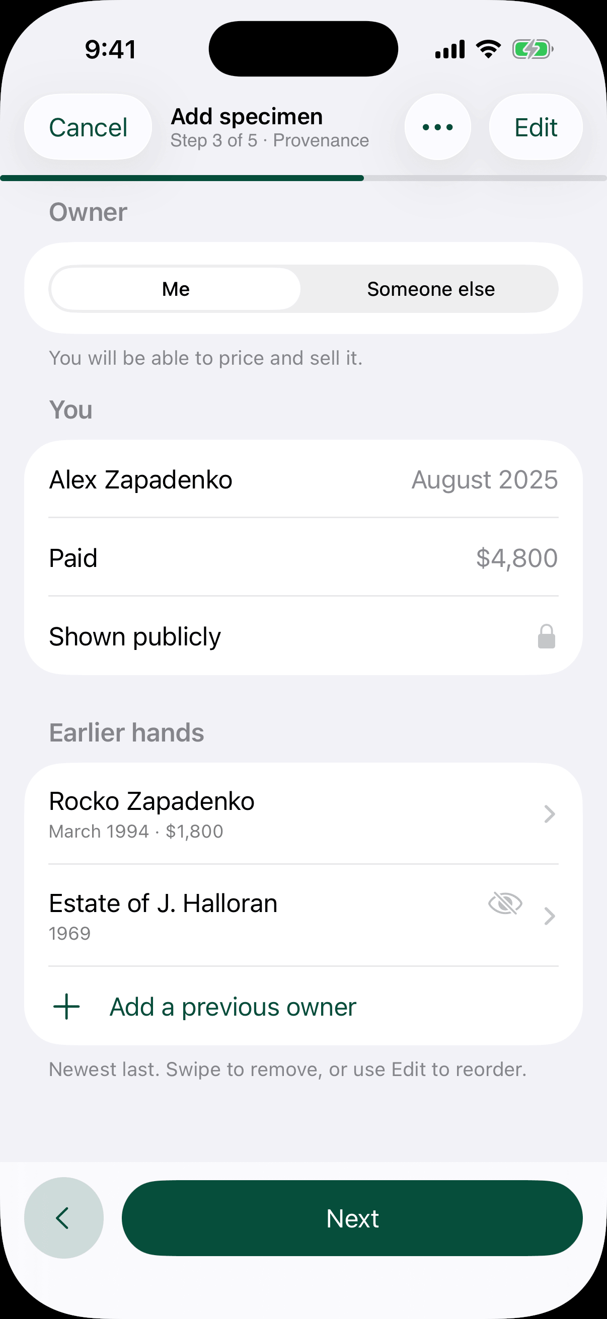
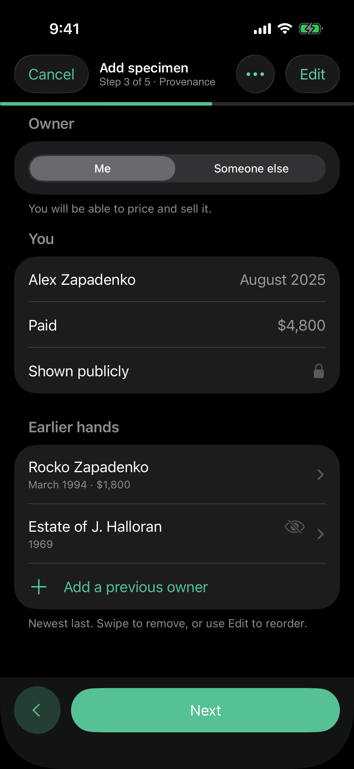
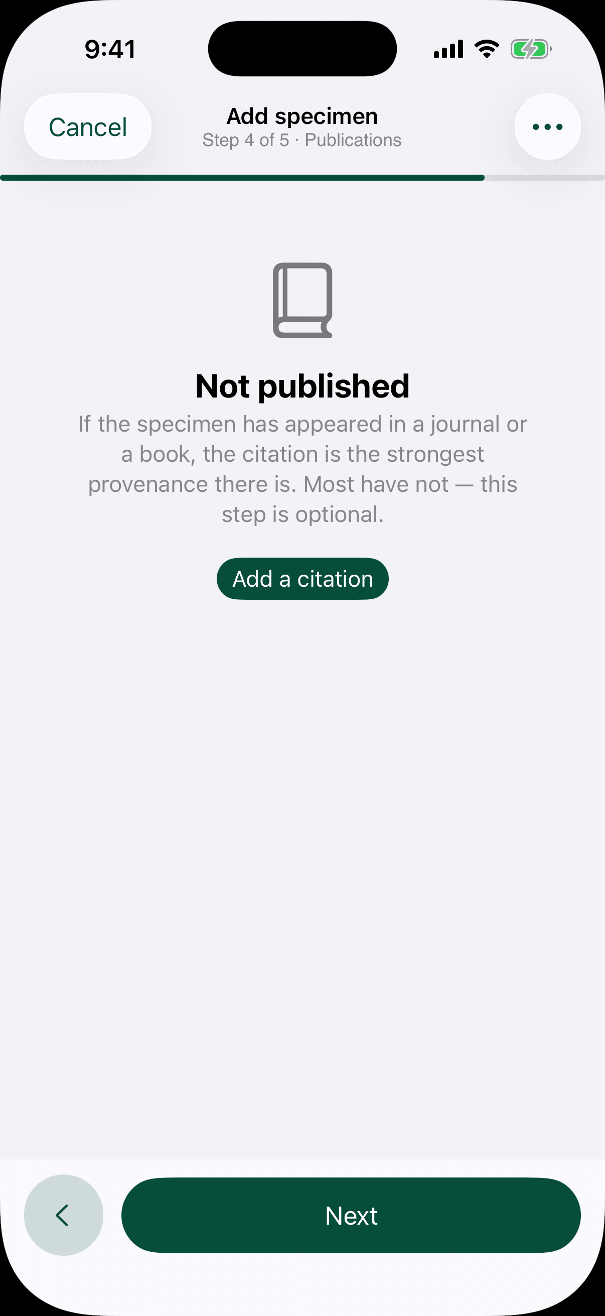
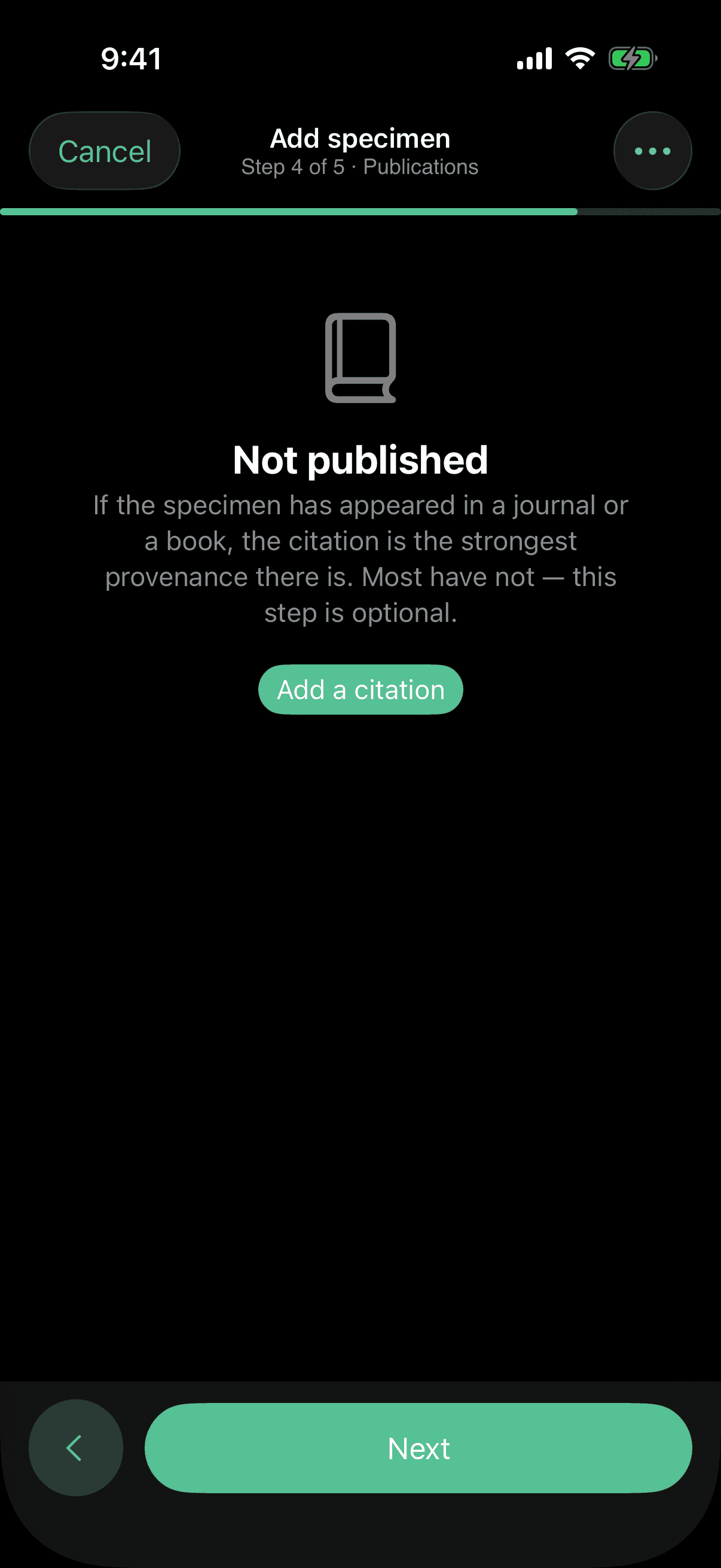
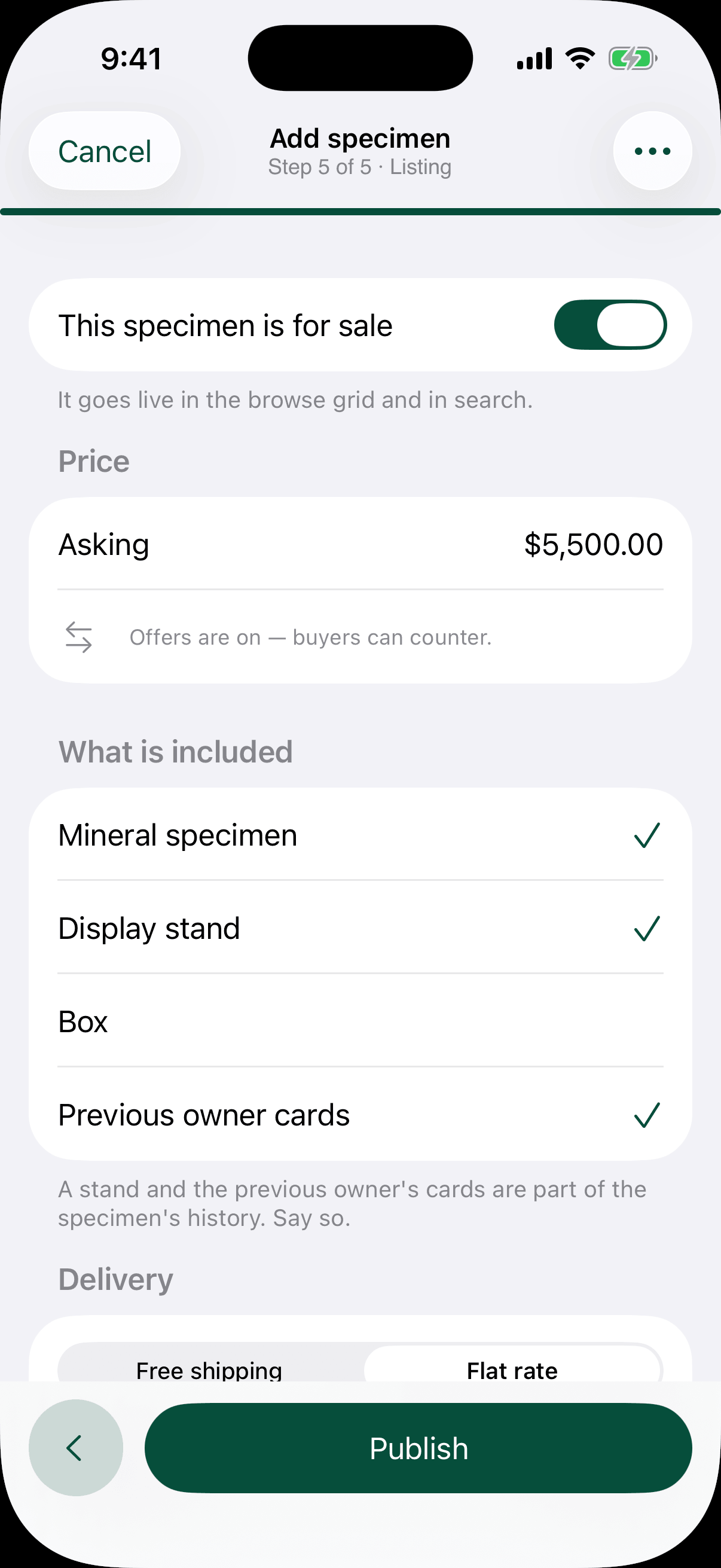
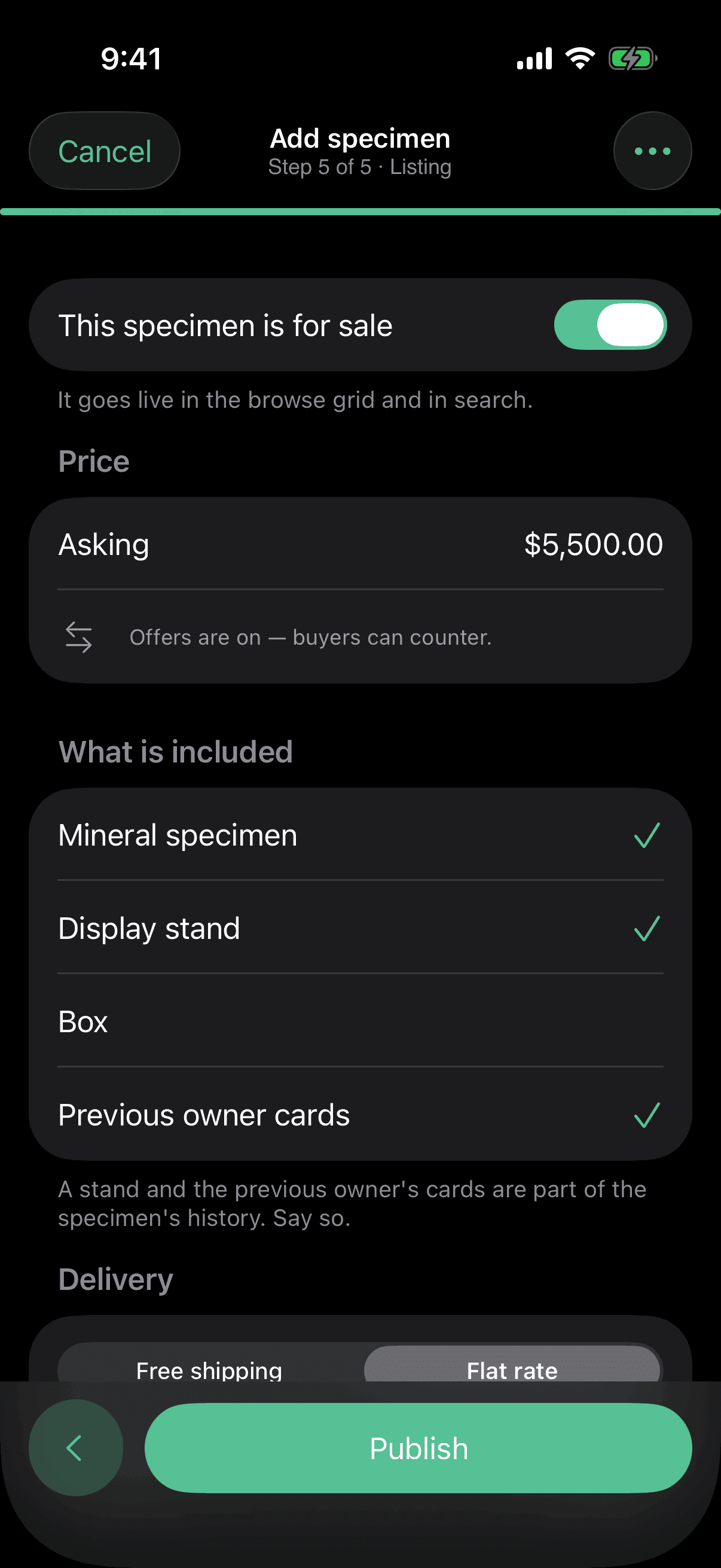
Five steps, and the camera first
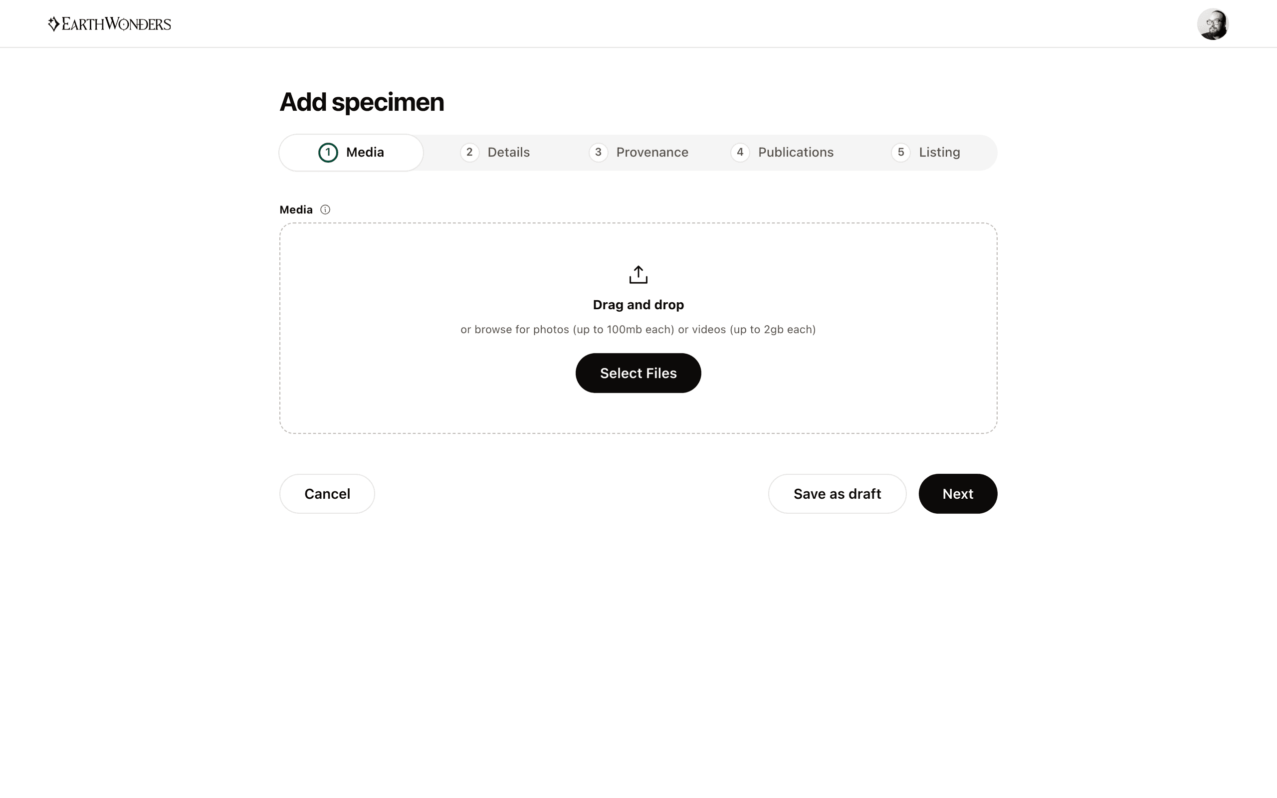
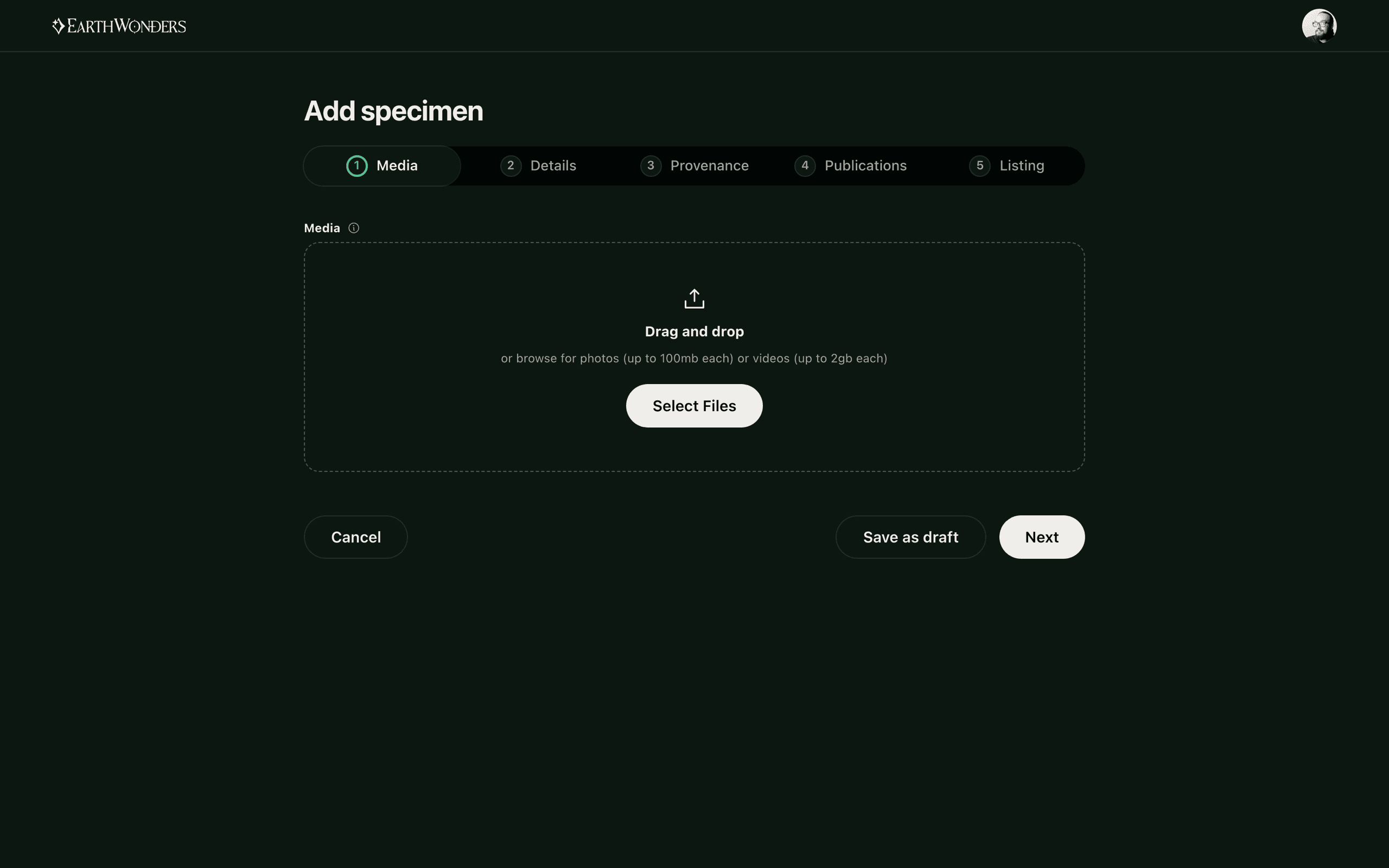
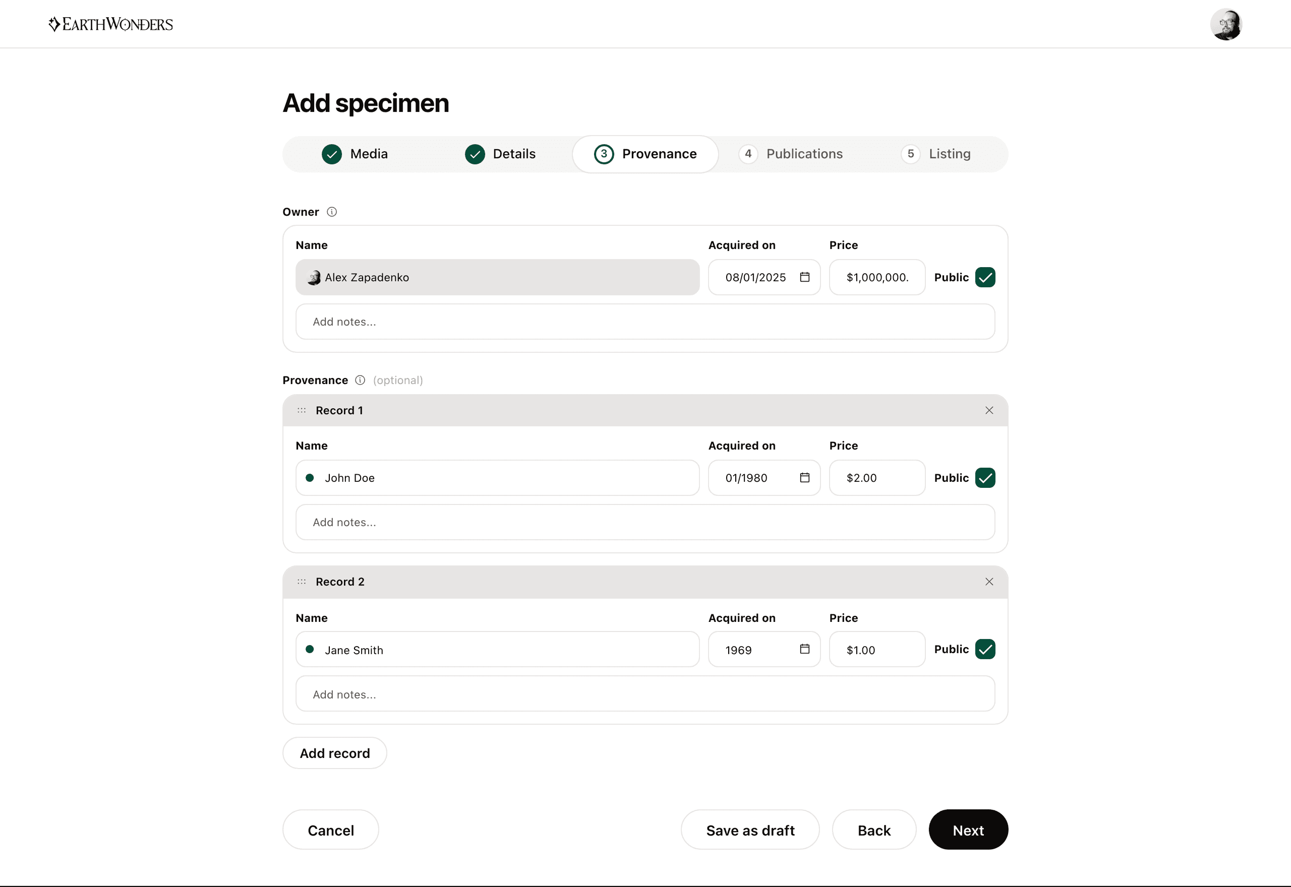
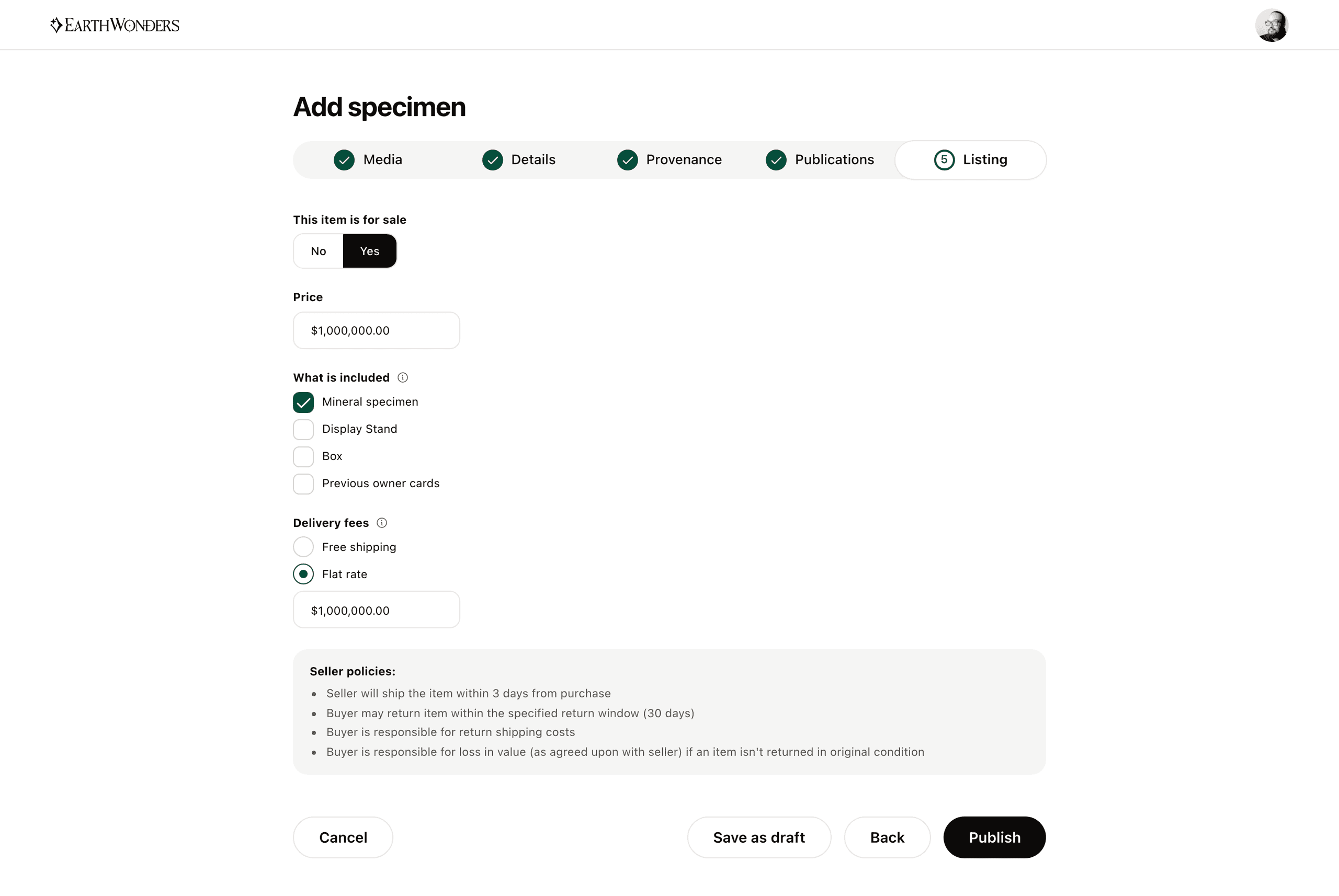
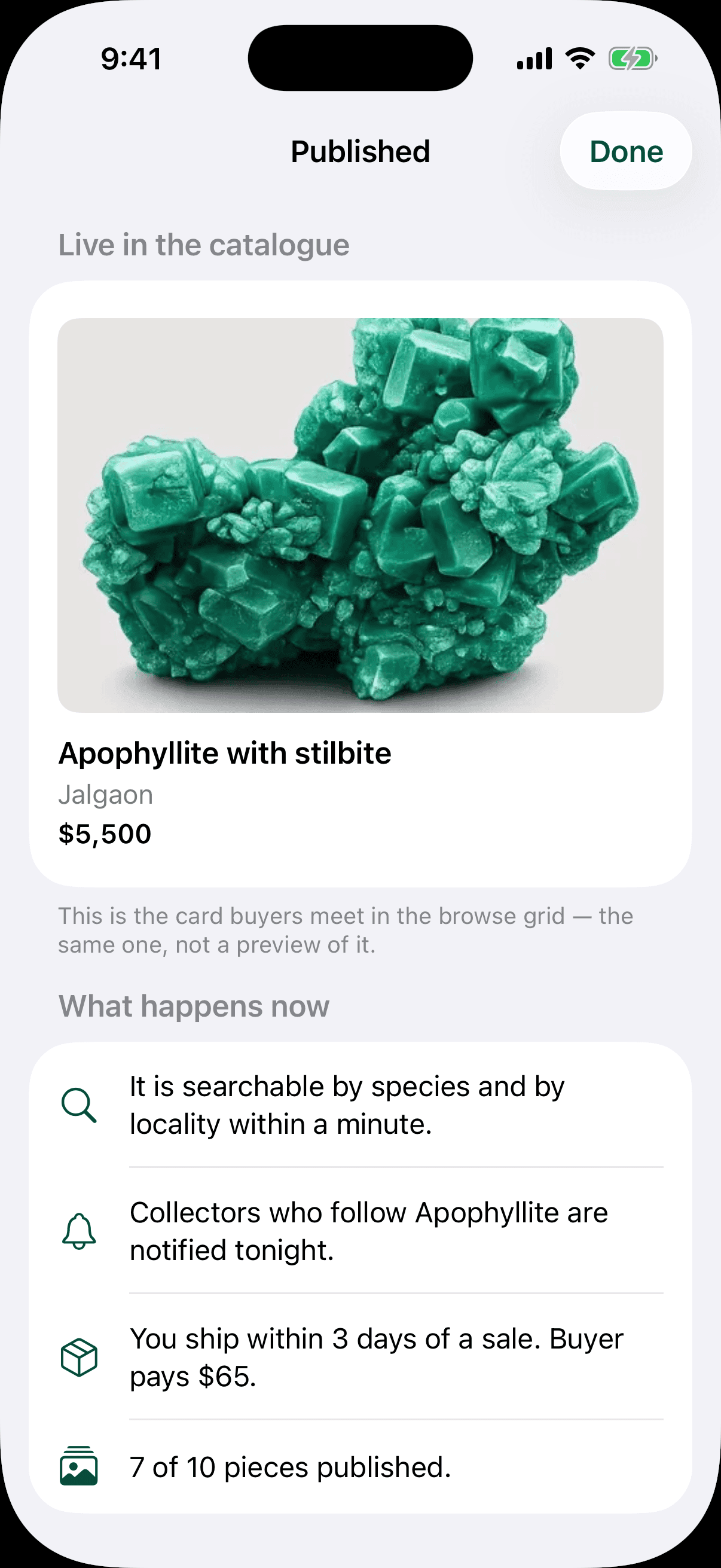
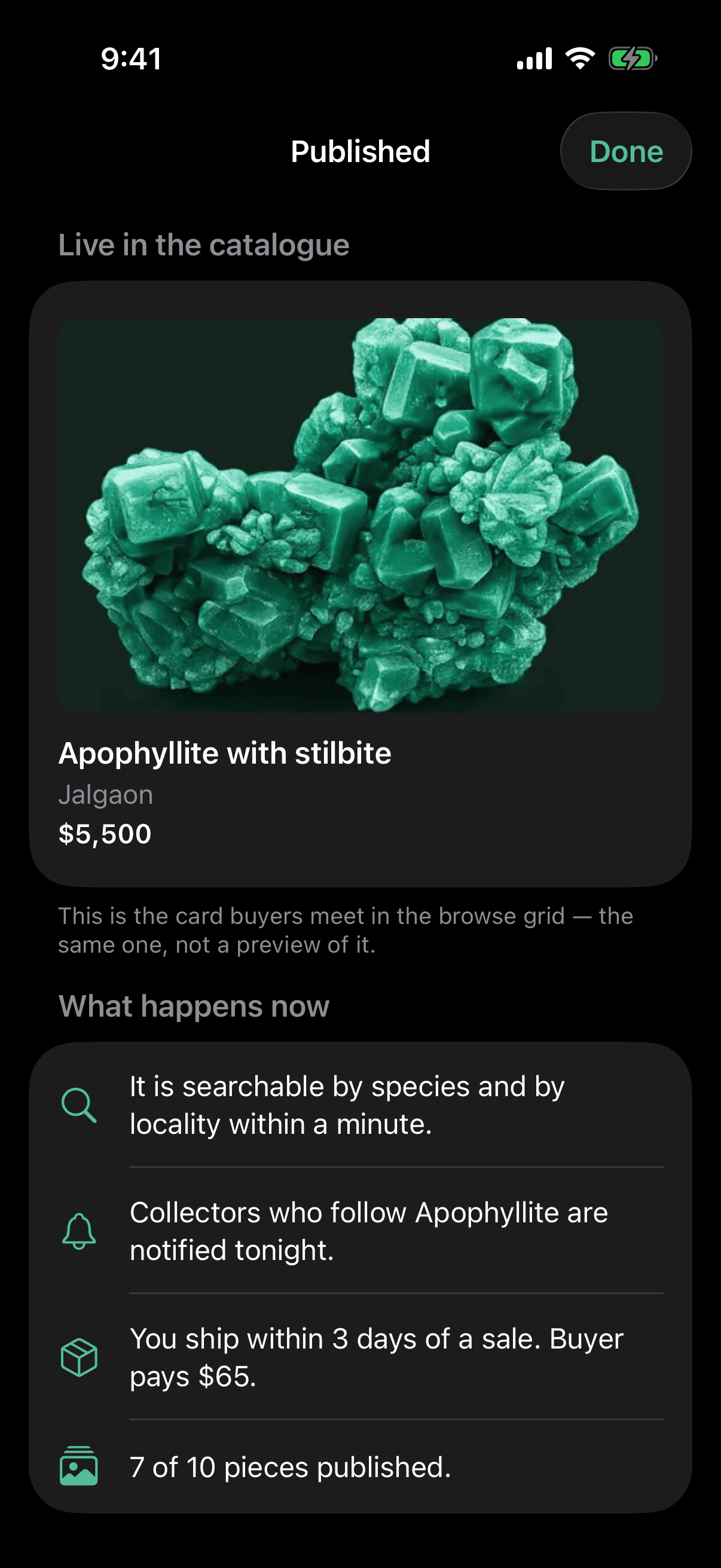
The old form was one long page and dealers abandoned it partway through. Splitting it into five was the easy half; deciding what came first was the argument. Media leads because a specimen's photographs are the entire basis on which anyone judges it, and a dealer who has already uploaded four good shots is a dealer who finishes. Everything after that is downhill — what it is, where it came from, who has owned it, what it costs — and the flow ends where it should, on the card a buyer will actually meet, rendered by the same component the browse grid uses.
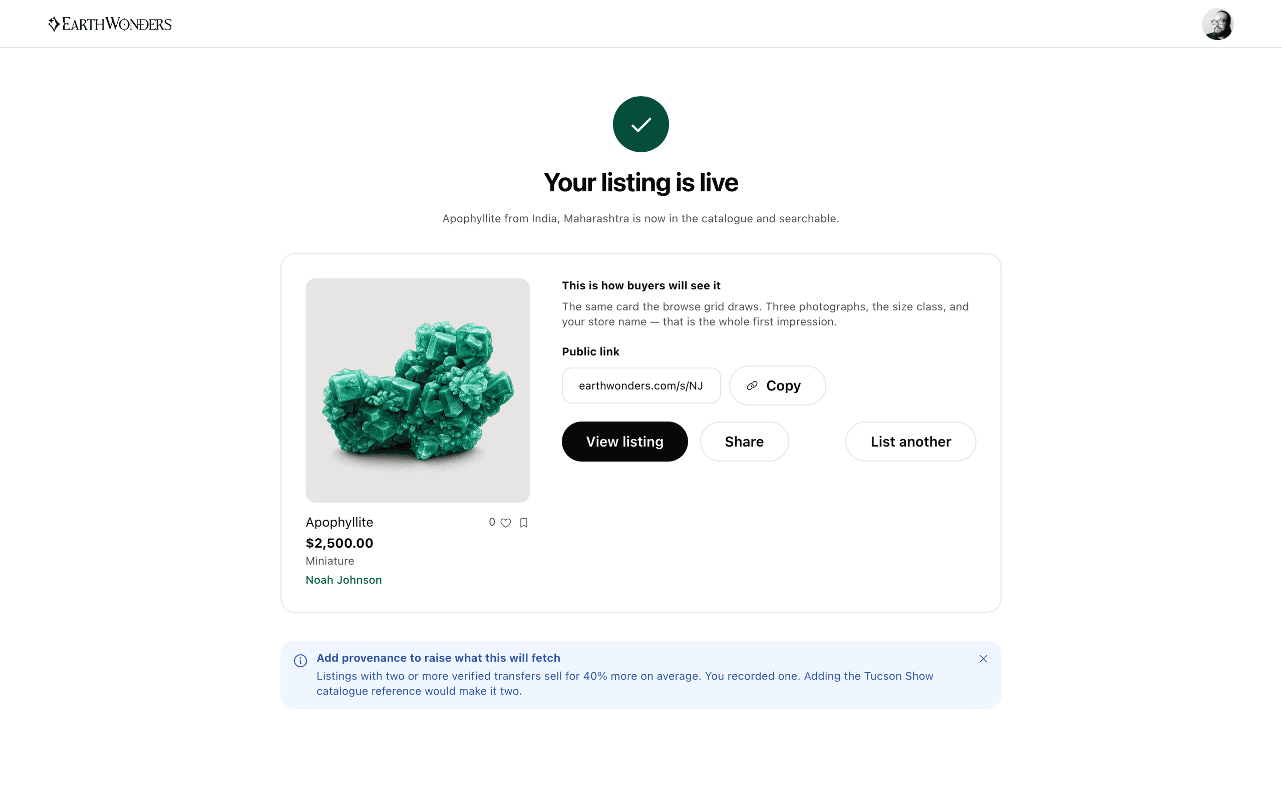
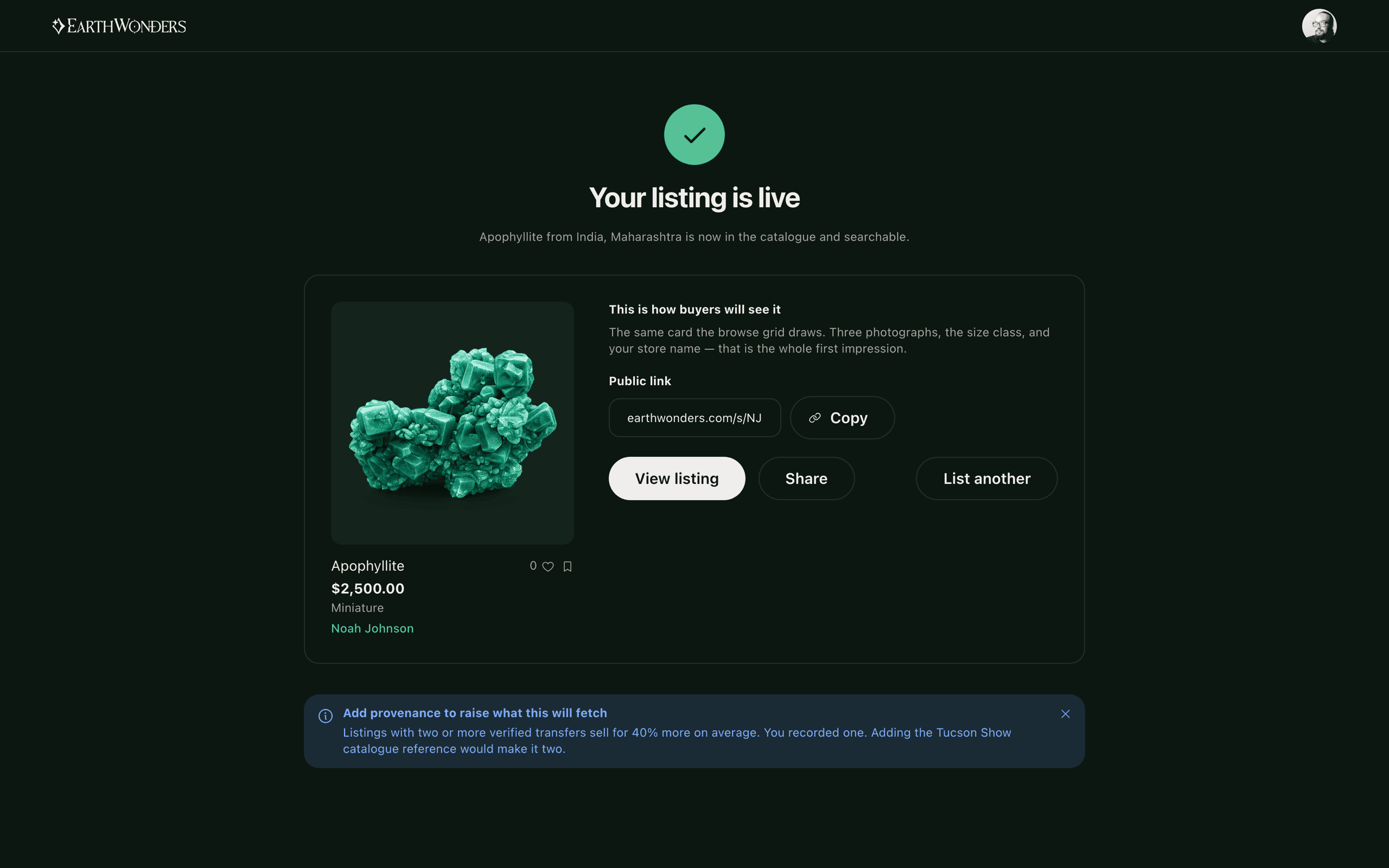
The listing starts with the camera
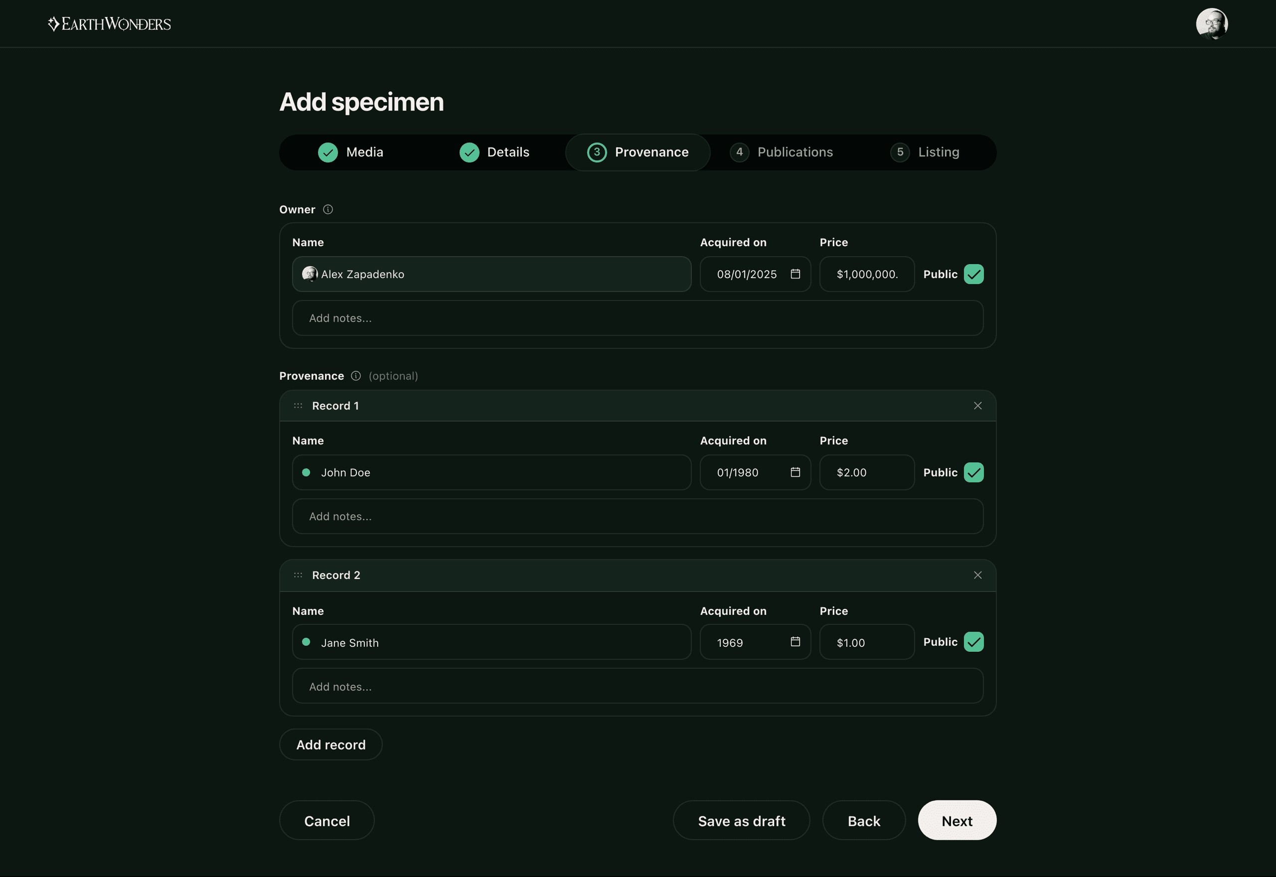
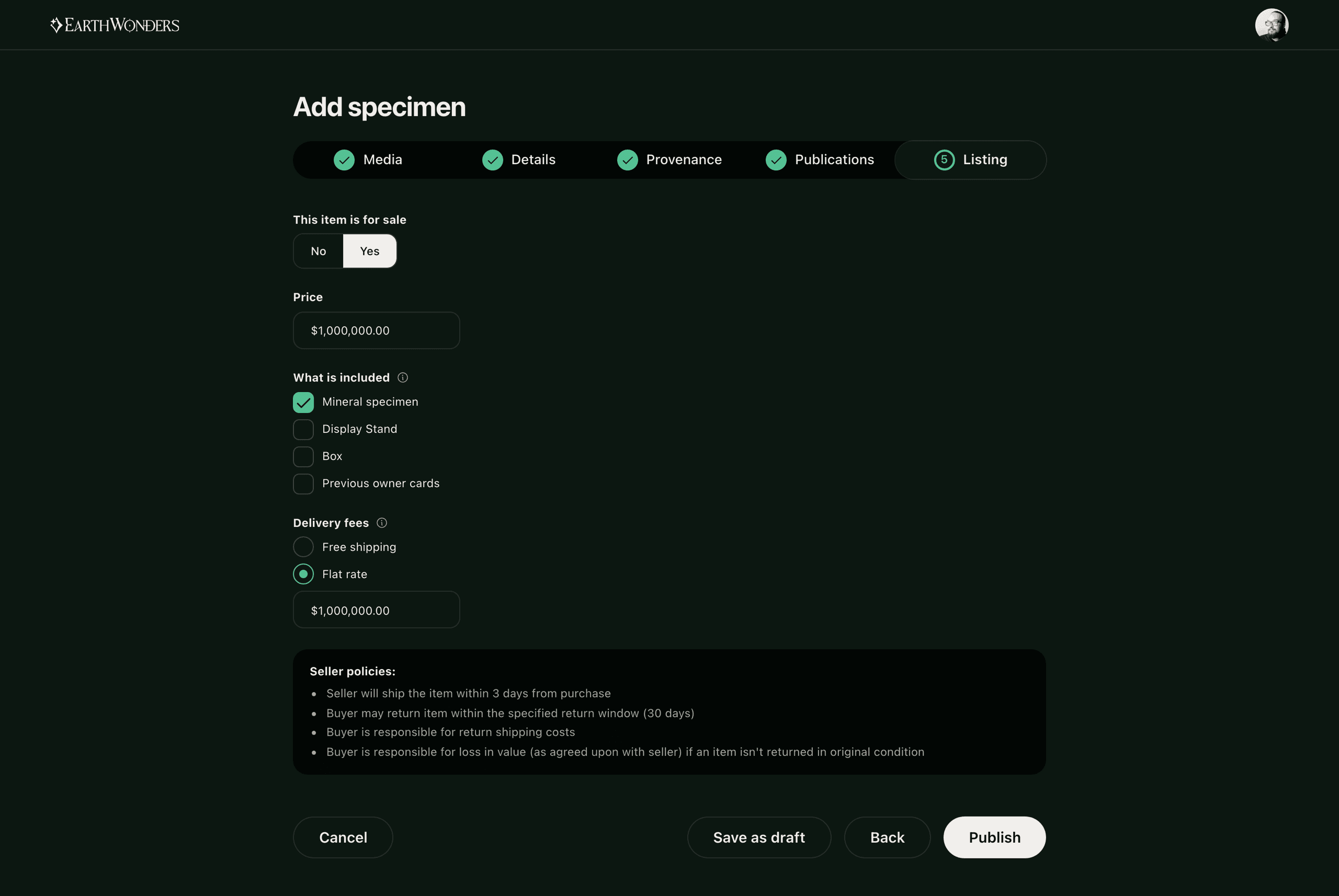
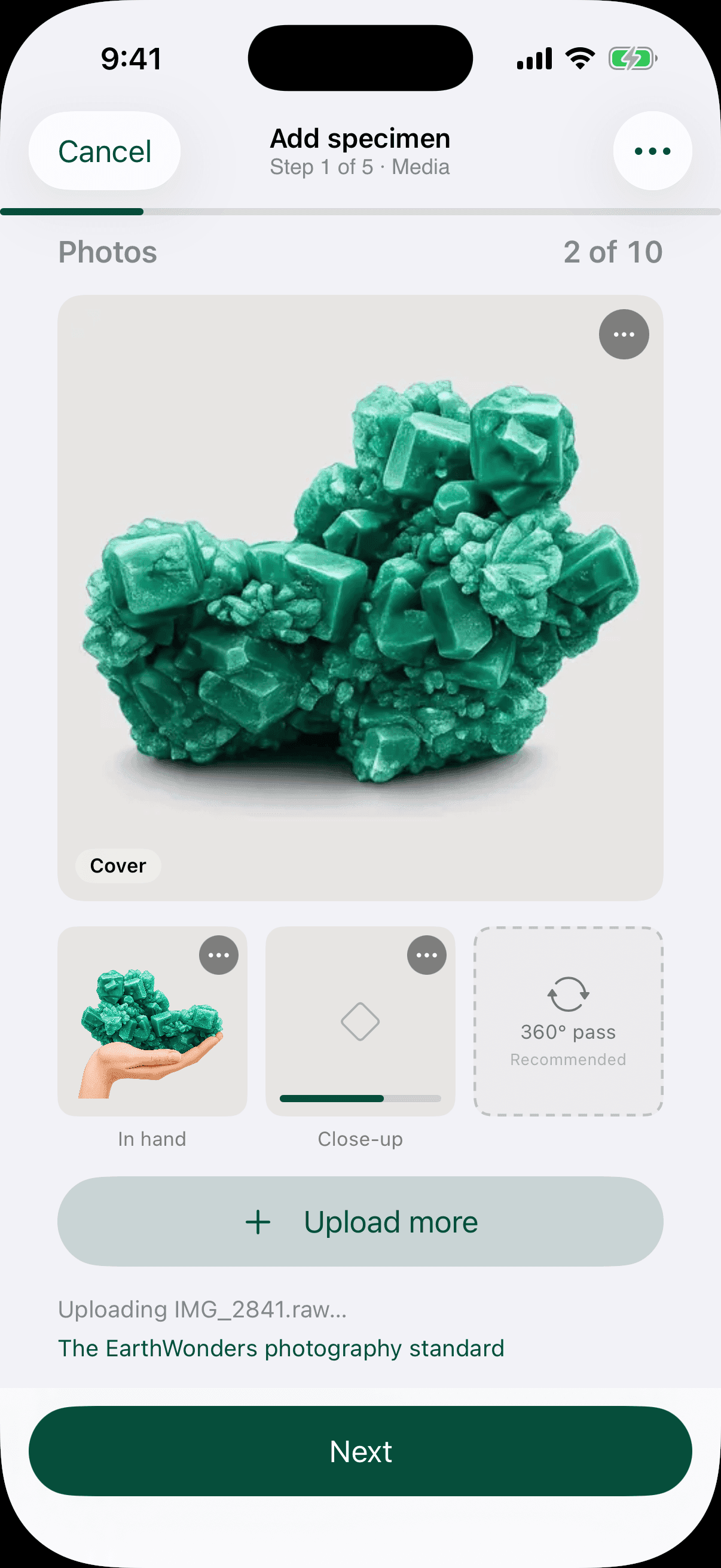
The original listing form was a single long page spanning species, locality, dimensions, condition, provenance, and price, and dealers regularly abandoned it partway through. We rebuilt it as a five-step flow — media, details, provenance, publications, listing — with media first by design, since a specimen's photographs are a buyer's first basis for judgment. To confirm the standard was achievable before requiring it of dealers, I photographed a dealer's inventory myself over two days.
Where the photographs actually get taken
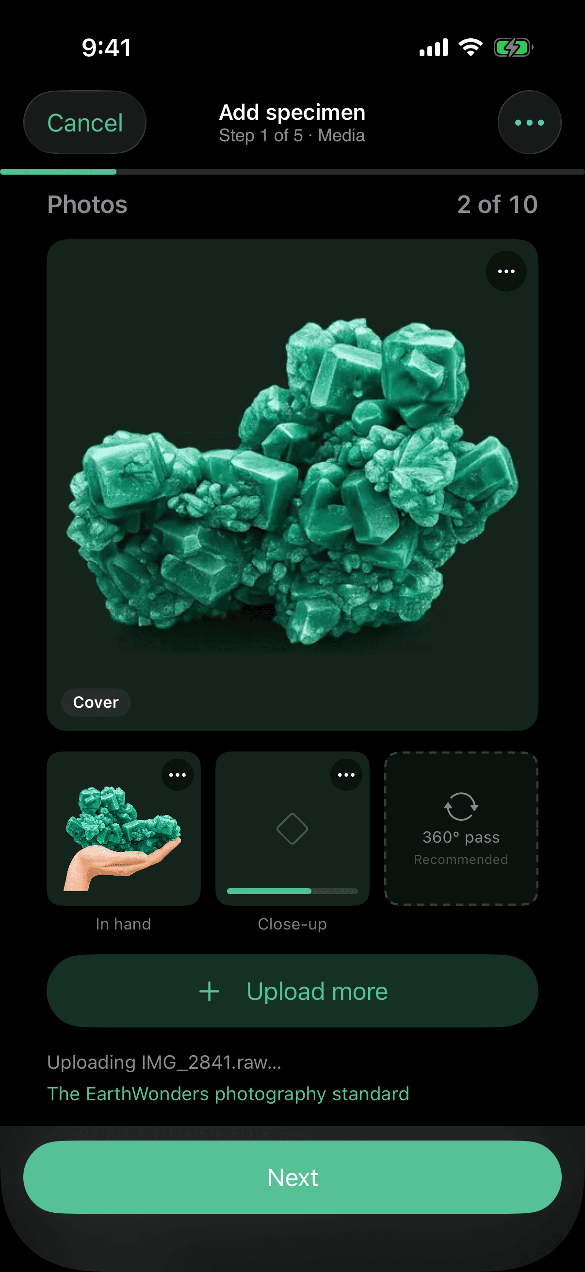
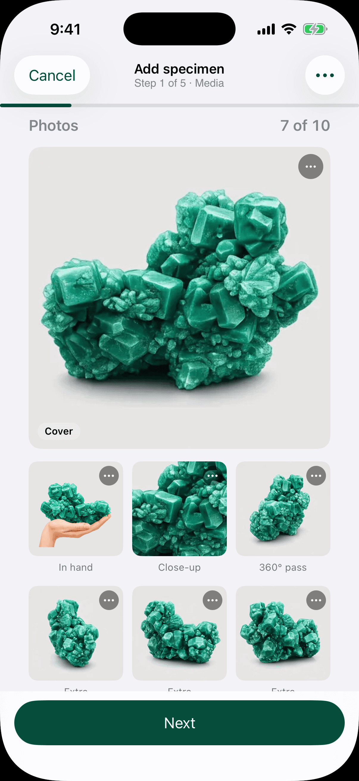
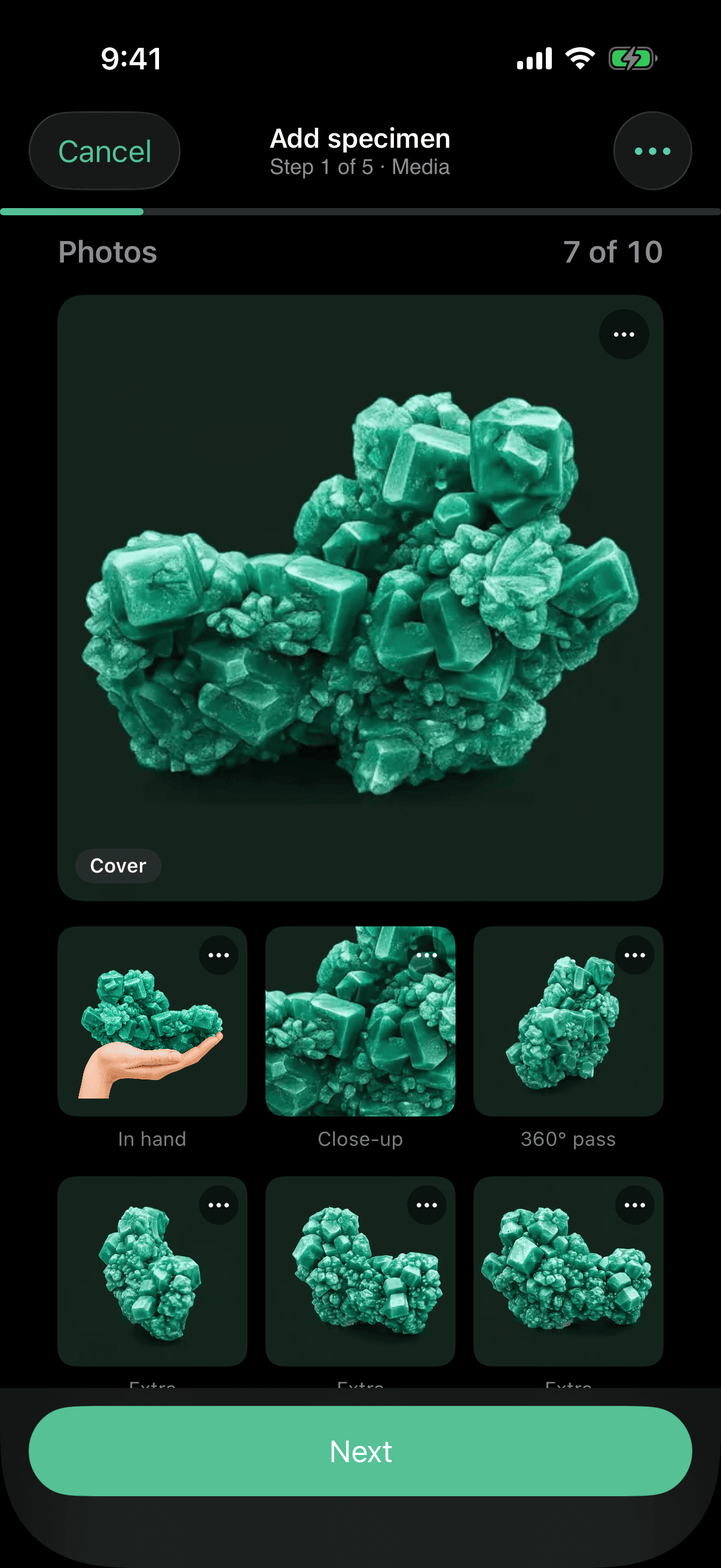
Two days of shooting a dealer's inventory settles one thing quickly: nobody lists a specimen at a desk. You are standing over the piece with a camera in your hand, and a media-first flow that only works on a laptop is a media-first flow in name only. So the step exists on a phone, with the camera as the primary button and the library second, because the shot usually does not exist yet. The step rail collapses itself to "Step 1 of 5" at that width — the design system's own behaviour, not something this screen had to be told.
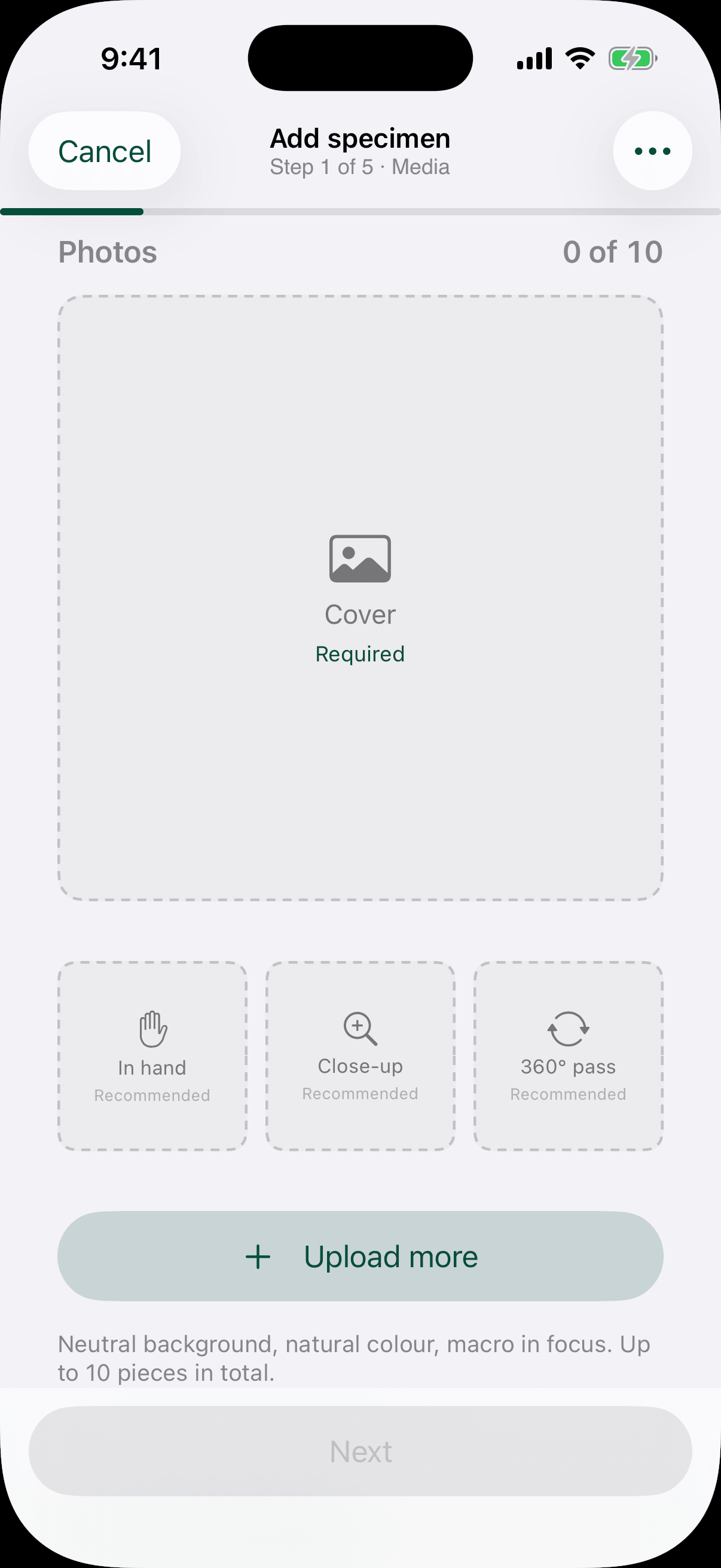
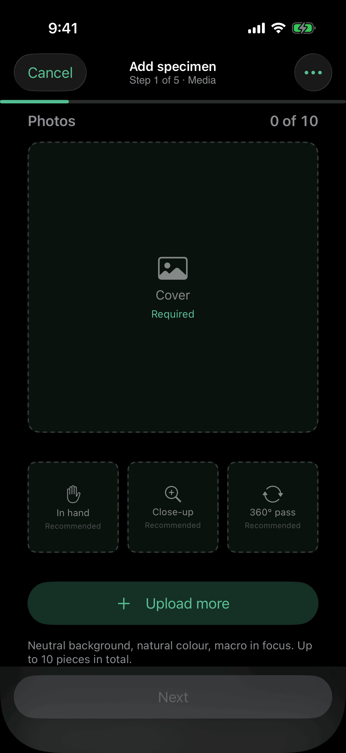
What the standard actually asks for
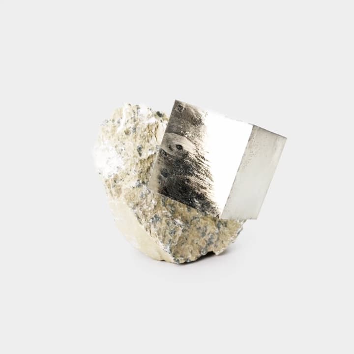
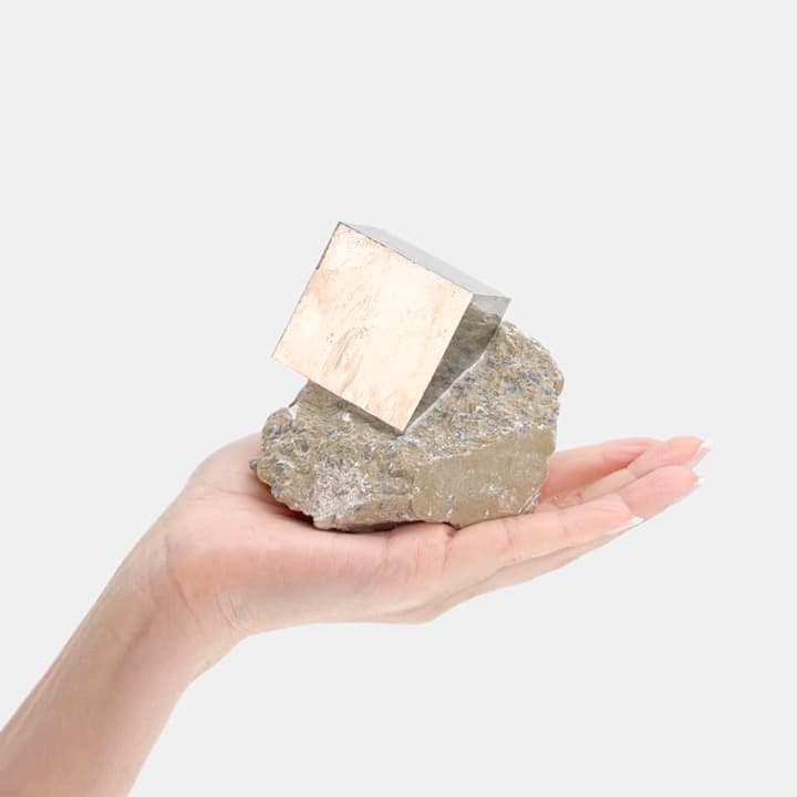
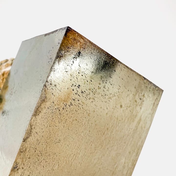
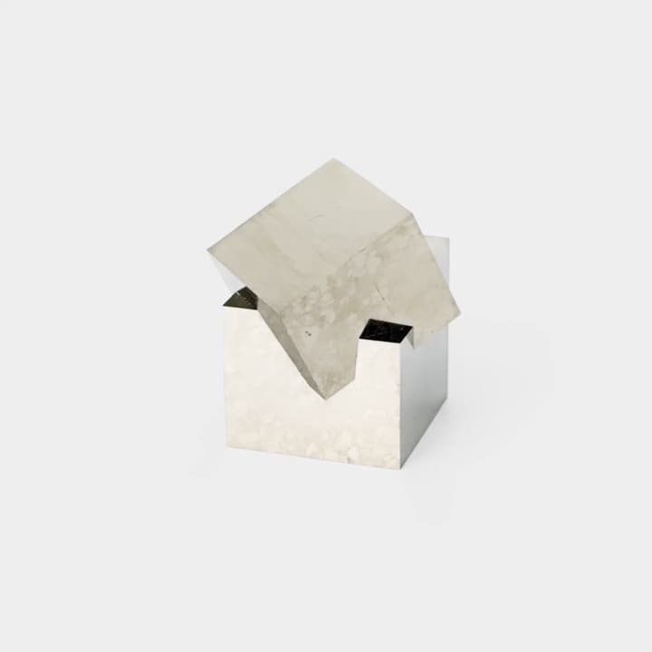
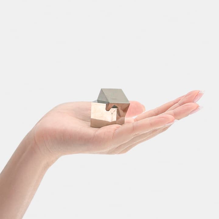
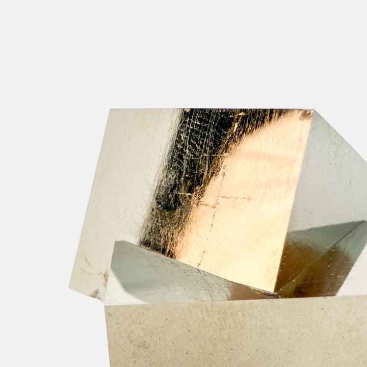
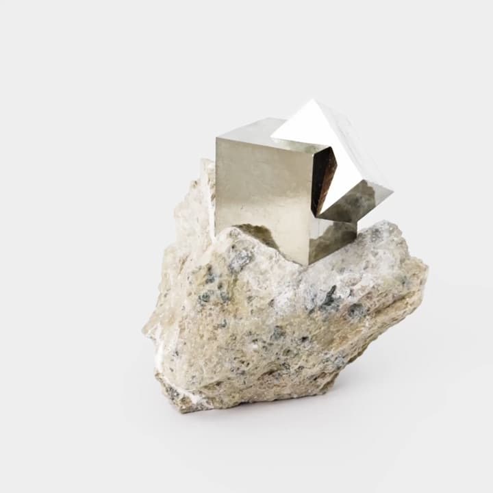
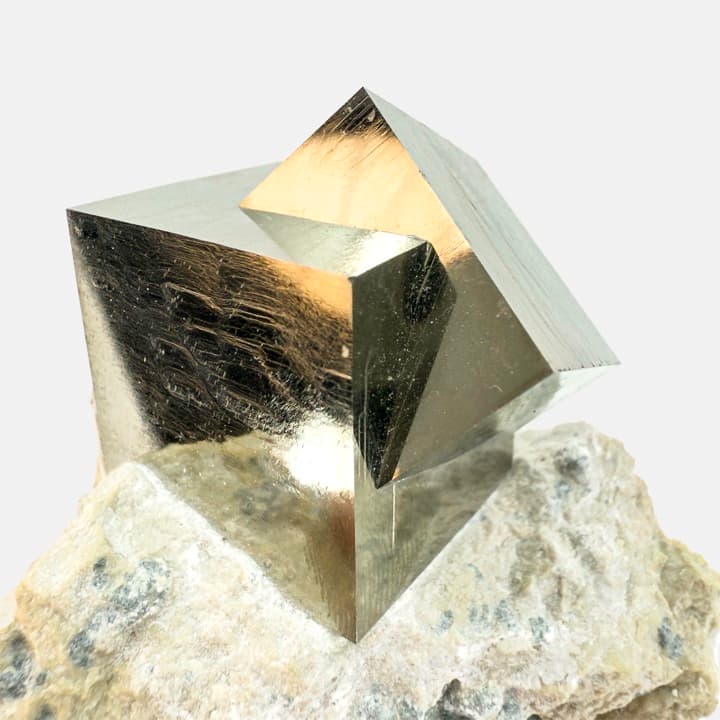
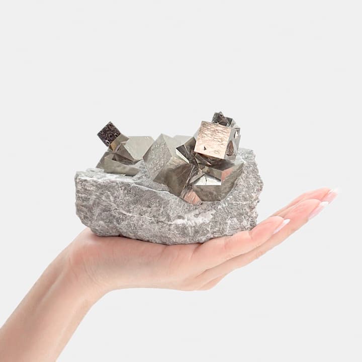
The standard is four views, and each one answers a question a photograph of a mineral is usually allowed to dodge. A cover shot for the silhouette, a hand for the scale — because "cabinet" and "miniature" mean nothing to someone who has not held one — a macro for the surface, and a 360 pass for how the piece takes light, which is most of what separates a good specimen from a photogenic one. Requiring that of dealers meant proving it could be done at volume first, so the set below is mine: two days, one dealer’s inventory, and the reference every onboarding conversation started from.



The knowledge is not where the ownership is
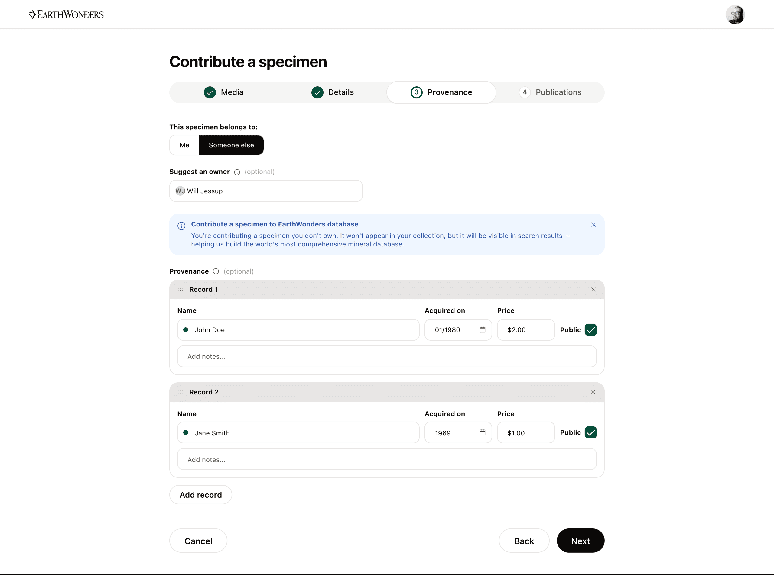
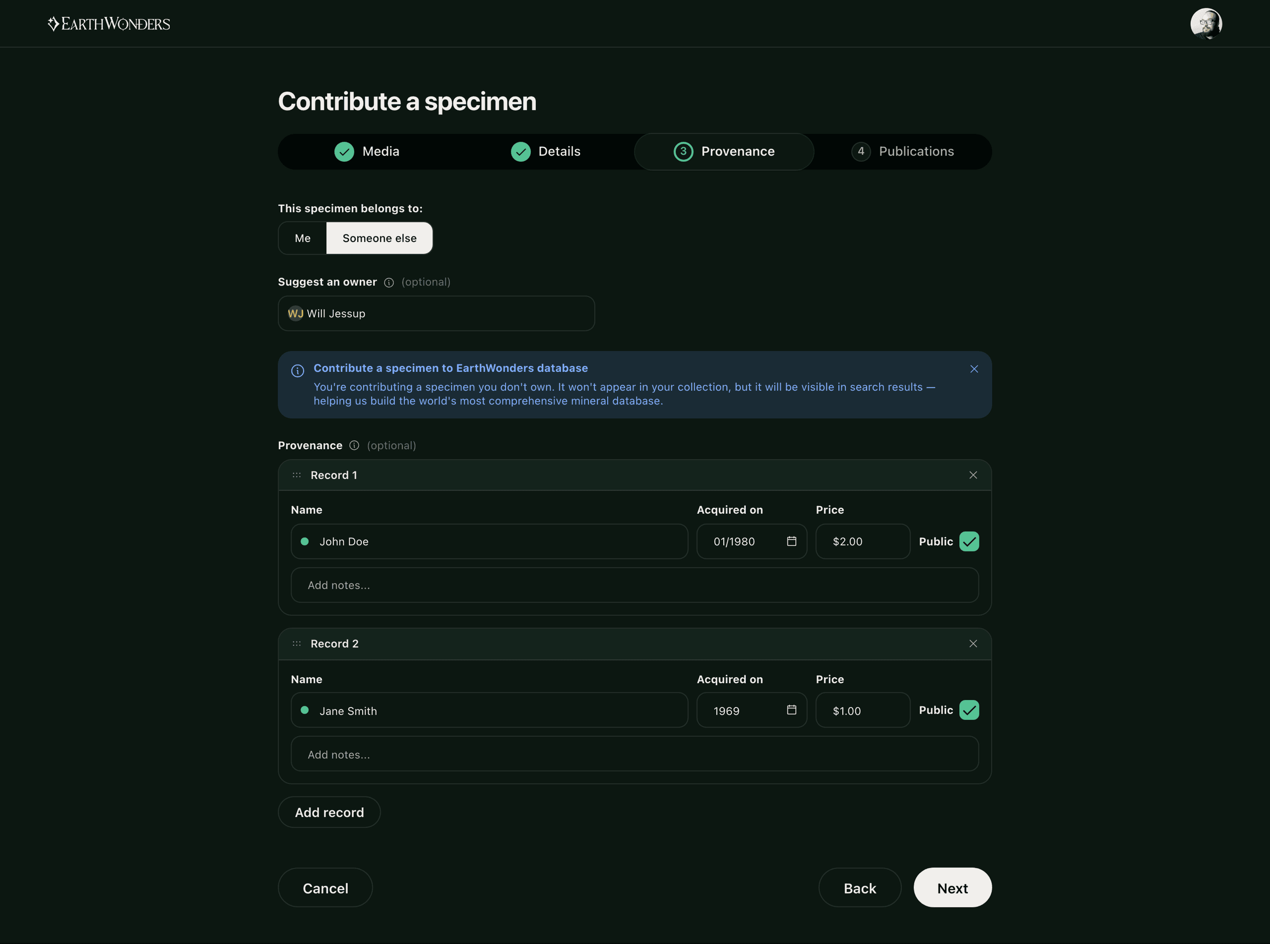
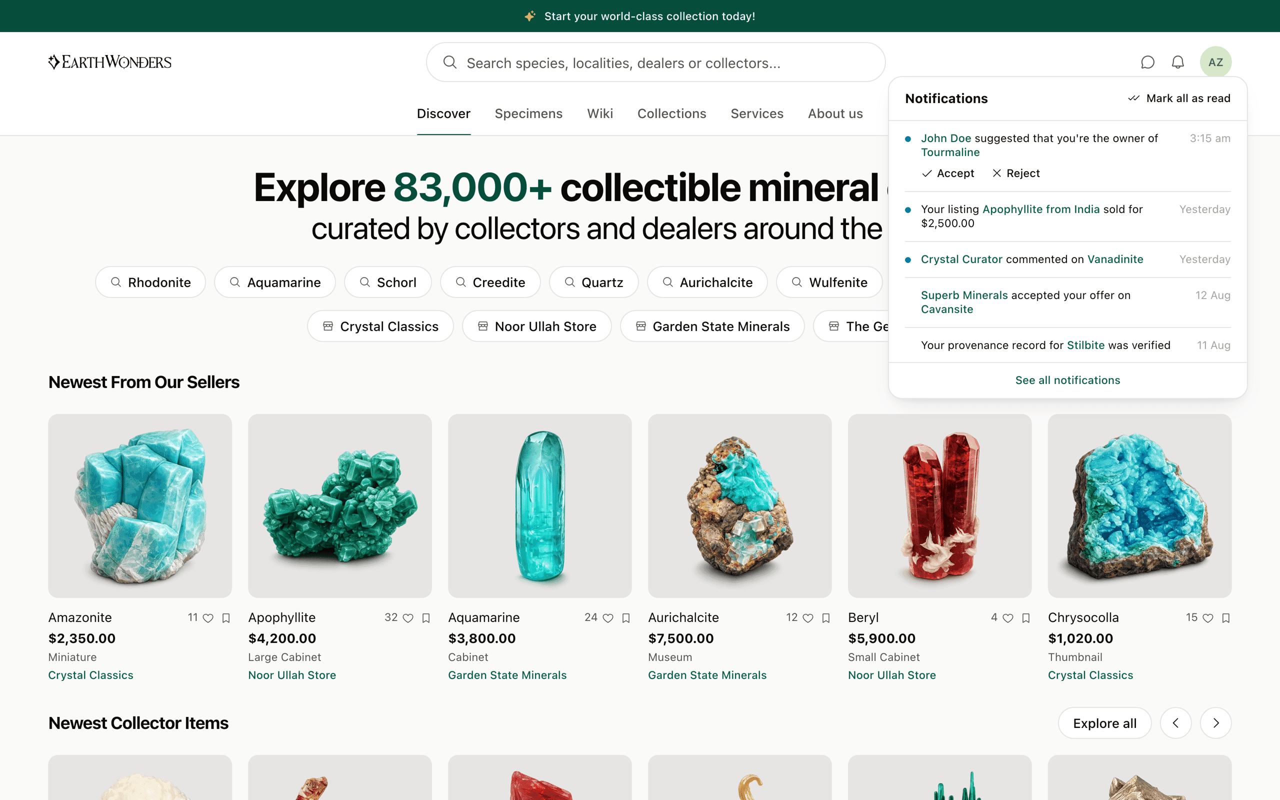
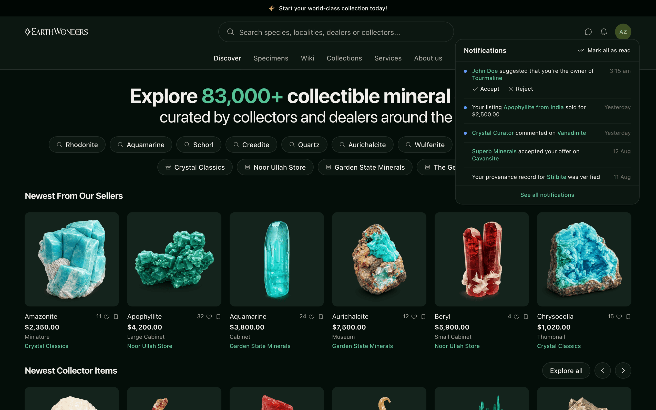
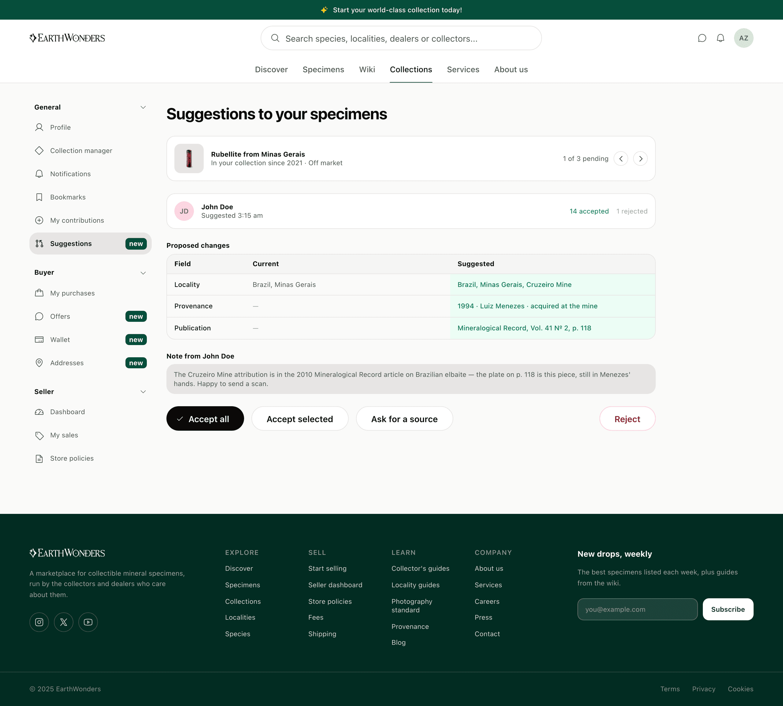
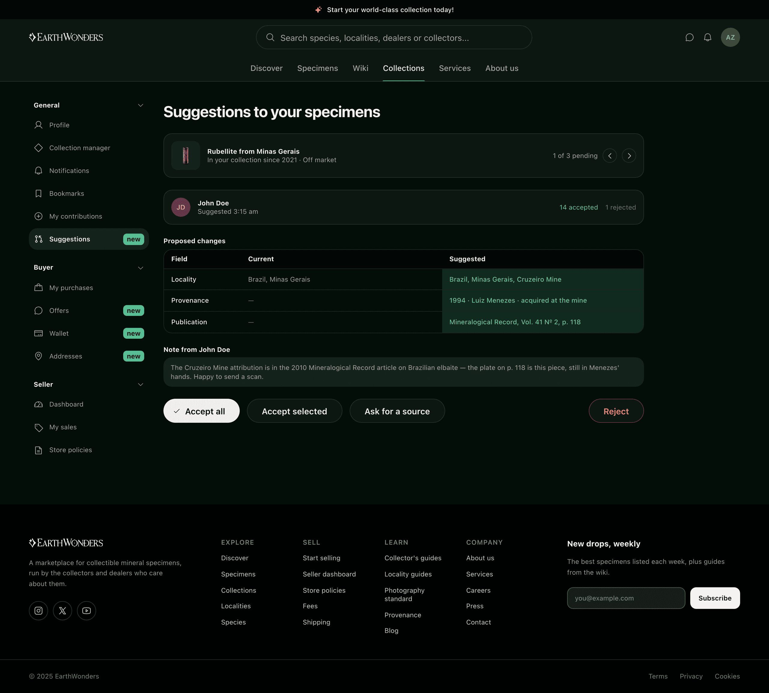
A mineral database has a structural problem: most of what is known about a specimen is known by someone who does not own it — the dealer who sold it twenty years ago, the collector who saw it in a case, the person who owns the journal it was published in. Asking only owners to record provenance loses all of it. So the listing flow forks on one question. Answer "someone else" to who this belongs to, and it stops being a listing: five steps become four, the price step disappears, the title changes to Contribute, and the specimen goes to the database rather than to your shelf. The owner gets a notification, and what they open is a diff — you cannot approve a change you cannot see, and the contributor's record of accepted and rejected suggestions sits next to the buttons, because the decision is a trust decision and that is the only evidence a reviewer has.
Two buttons, one thread
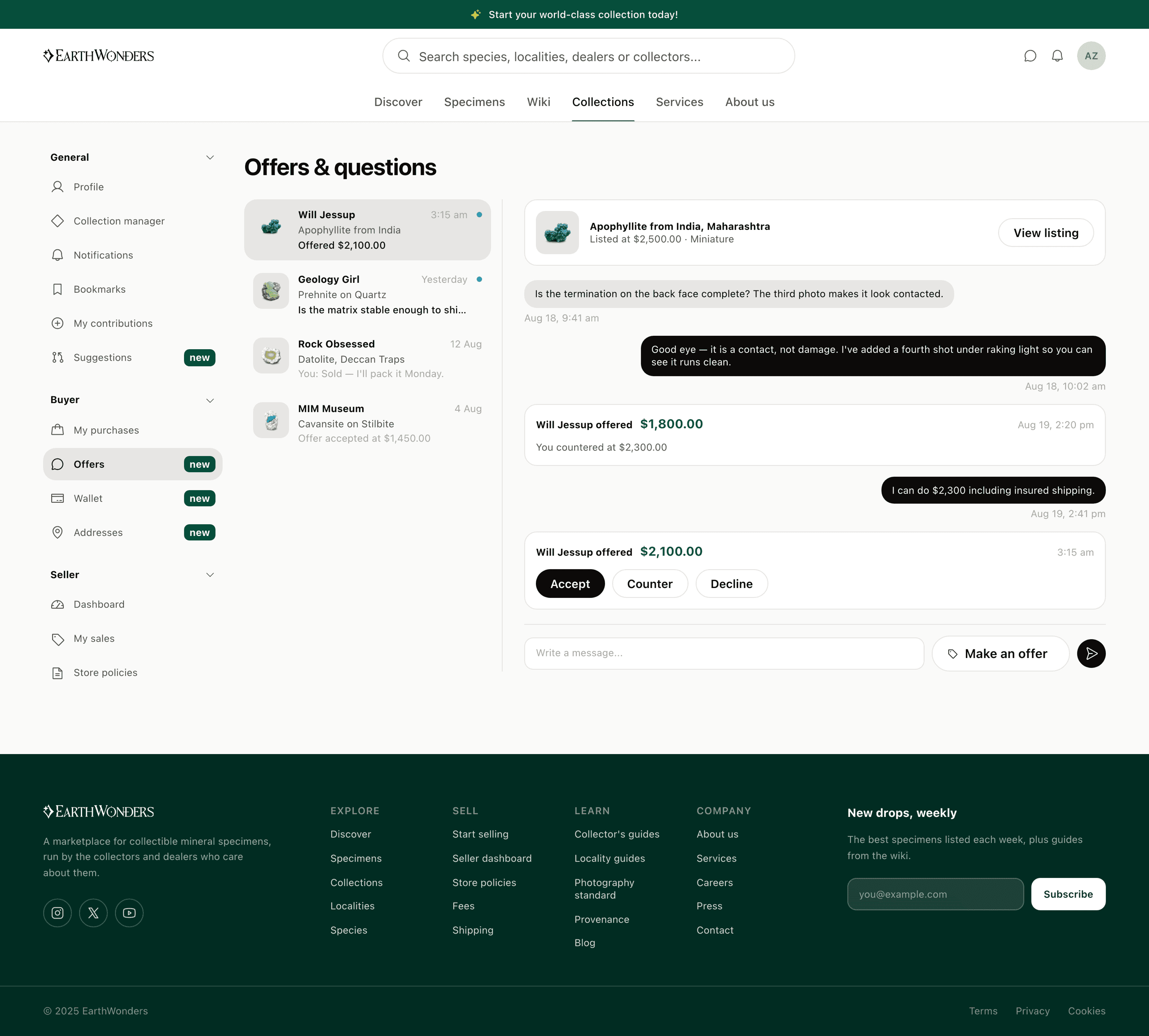
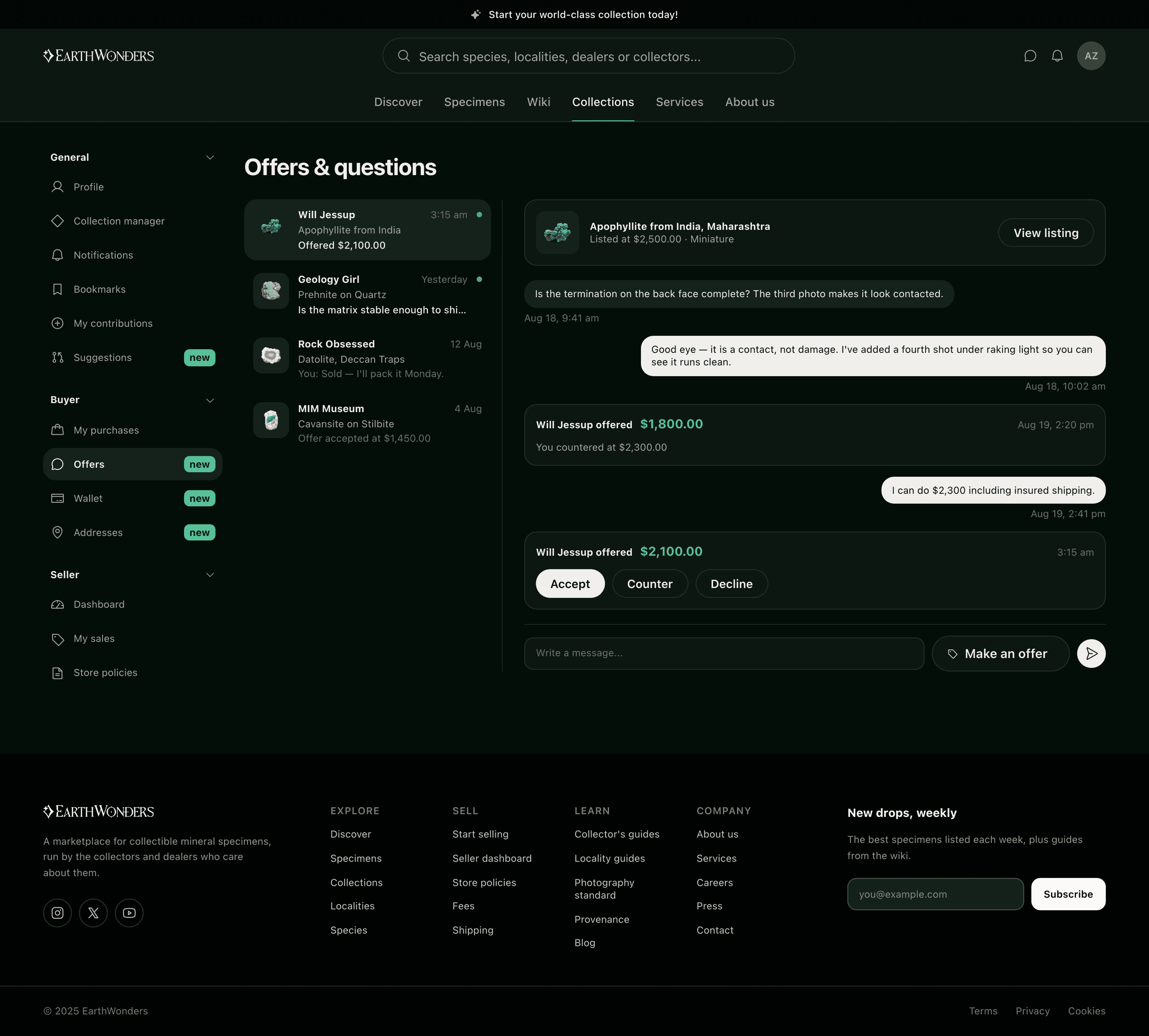
"Make an offer" and "Ask a question" look like different features and are the same object: one specimen, one buyer, one seller, and a run of messages. The only difference is whether the first one carries a number. Building two inboxes for that would have been building the same inbox twice, so offers arrive as cards in the conversation — the only messages with Accept, Counter and Decline attached — and a question about whether a termination is contacted sits in the same thread as the offer it eventually turns into. The specimen stays pinned at the top, because a counter-offer detached from the object is a number with nothing behind it.
One person, two roles
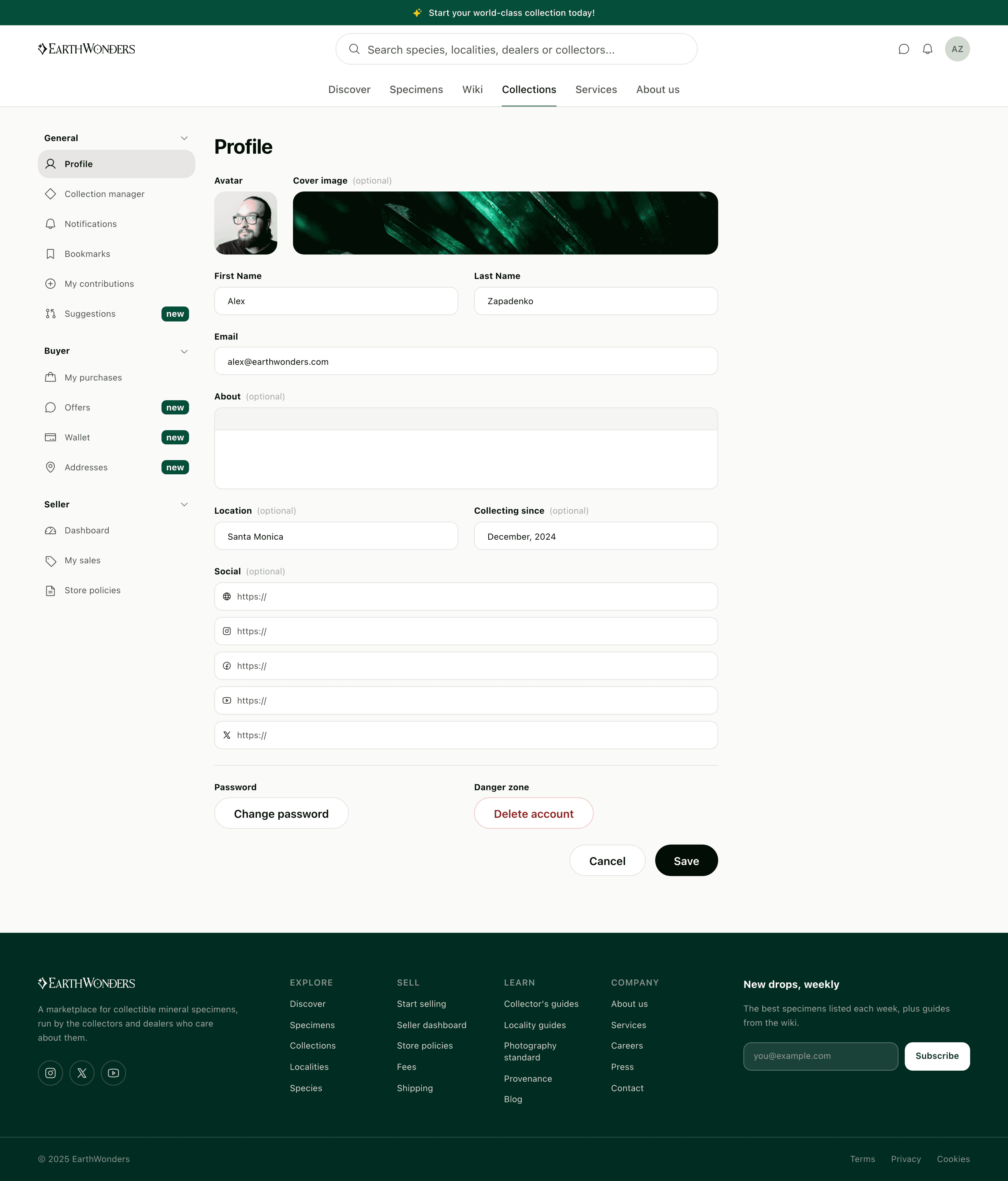
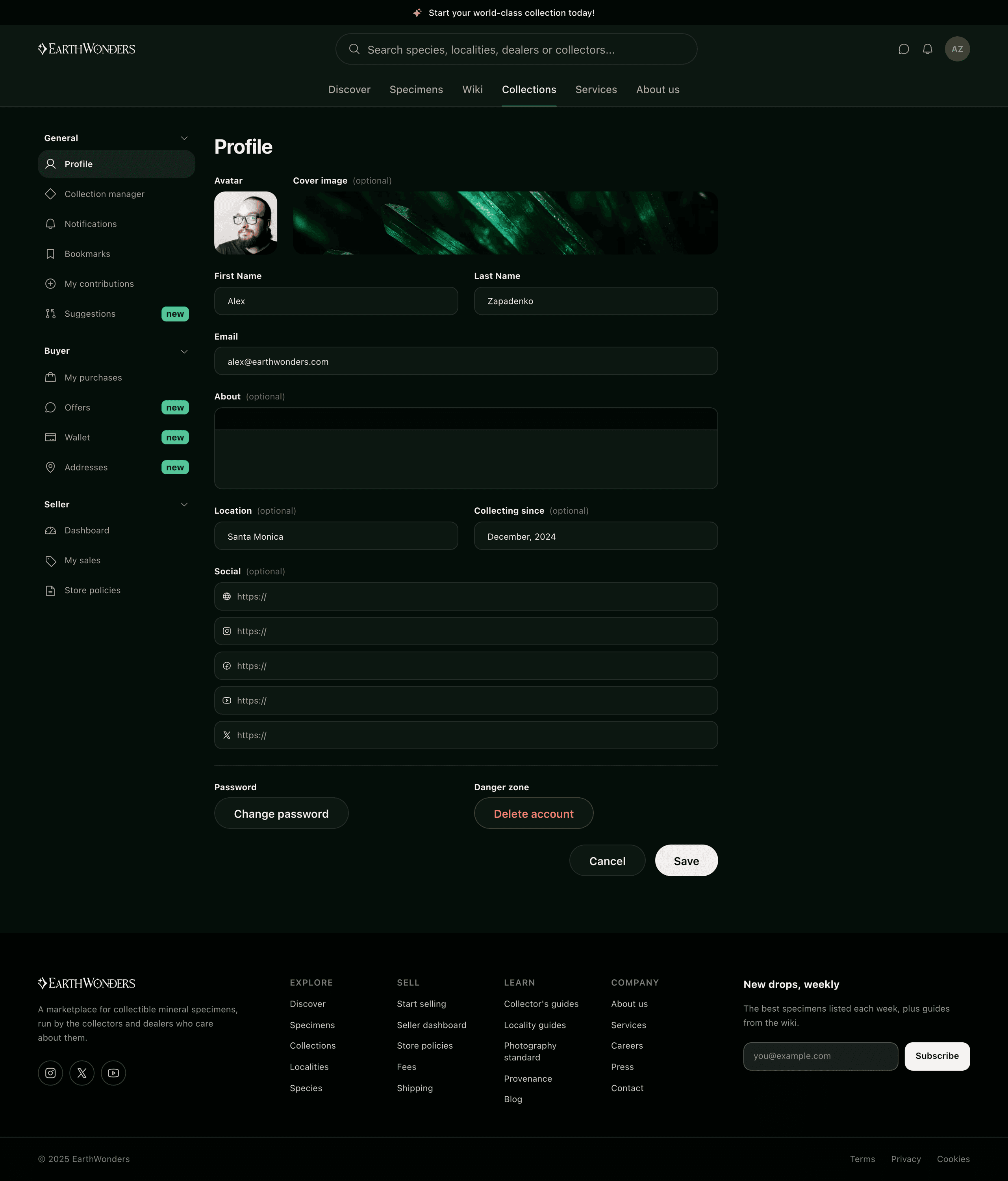
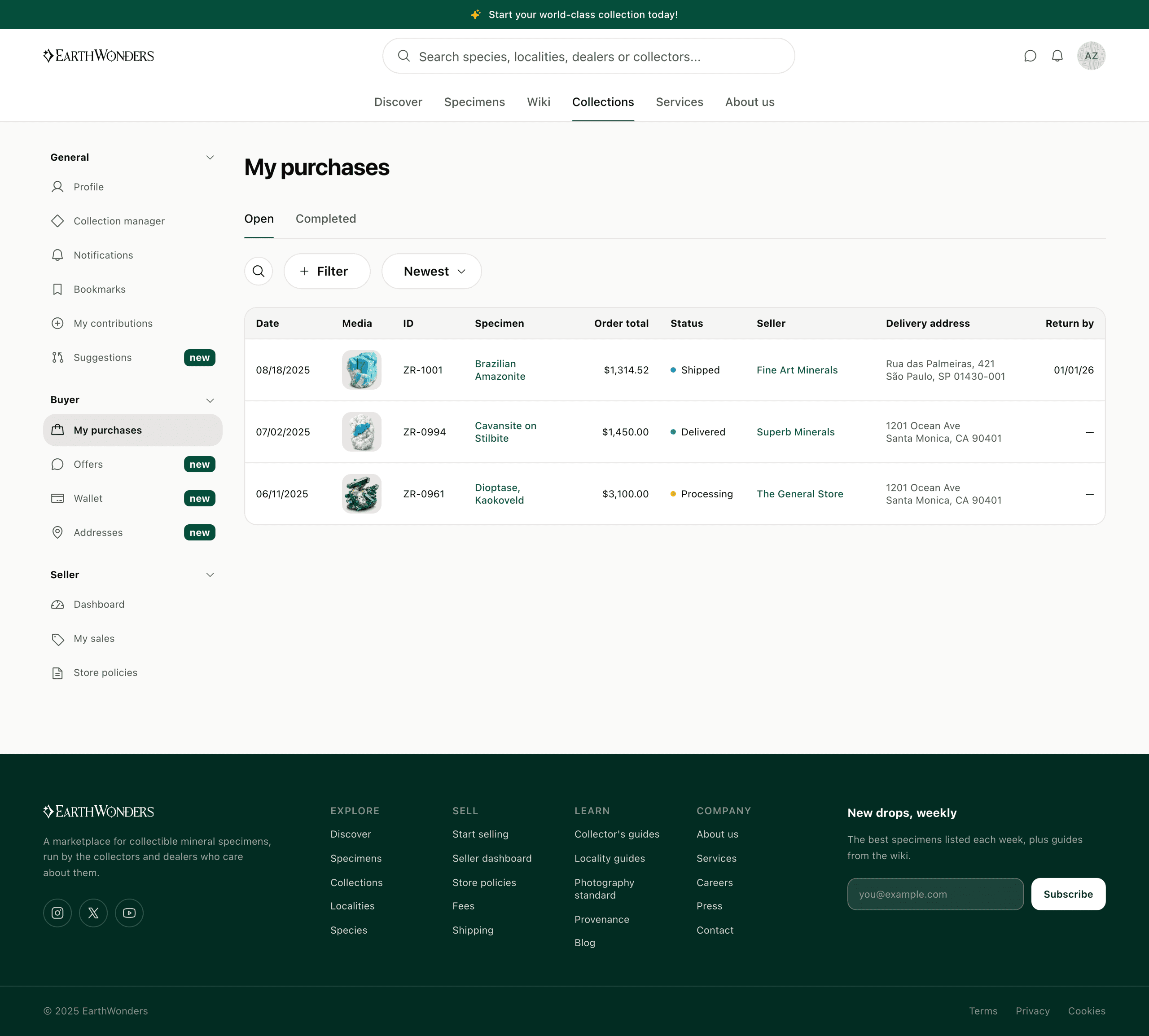
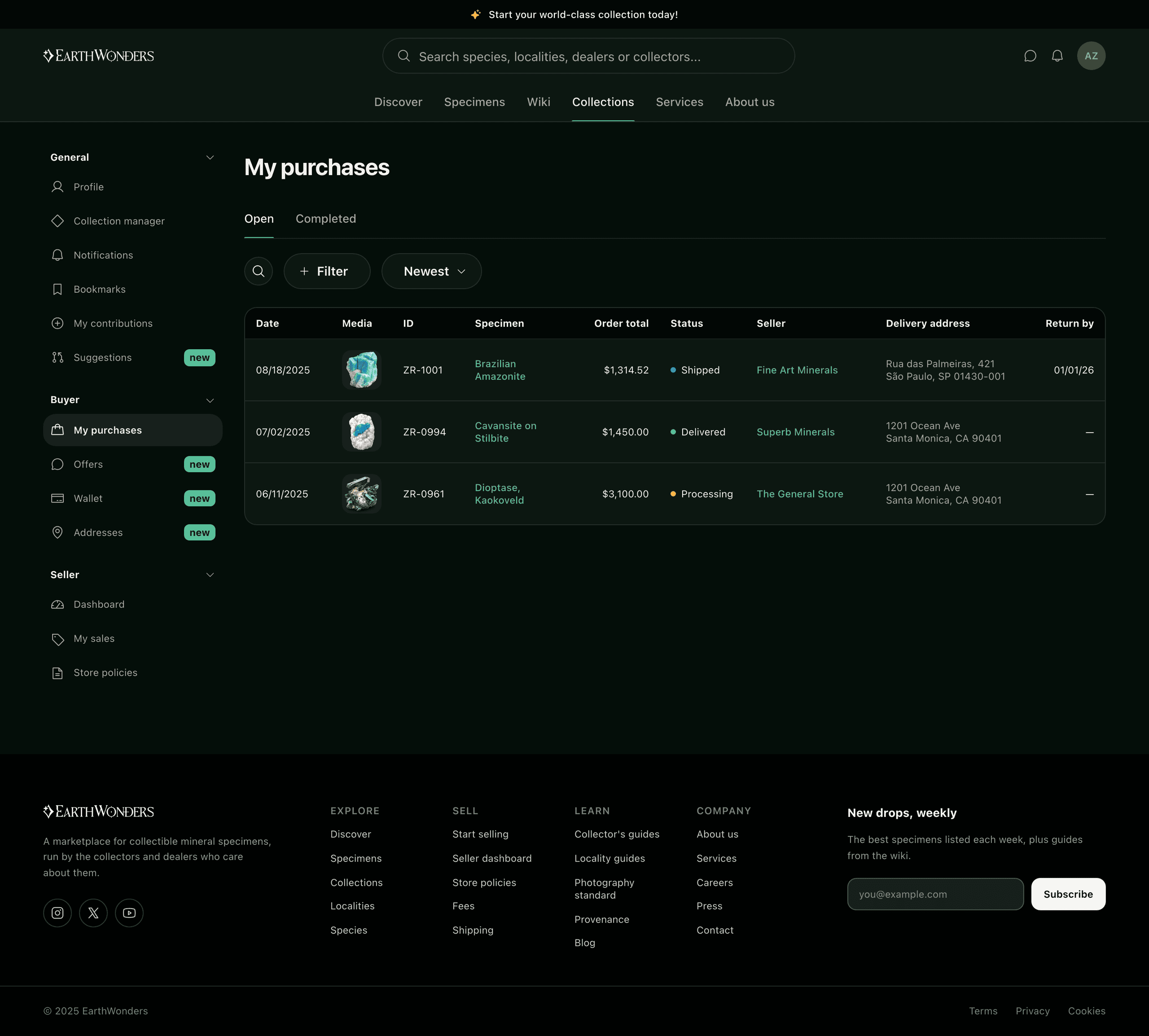
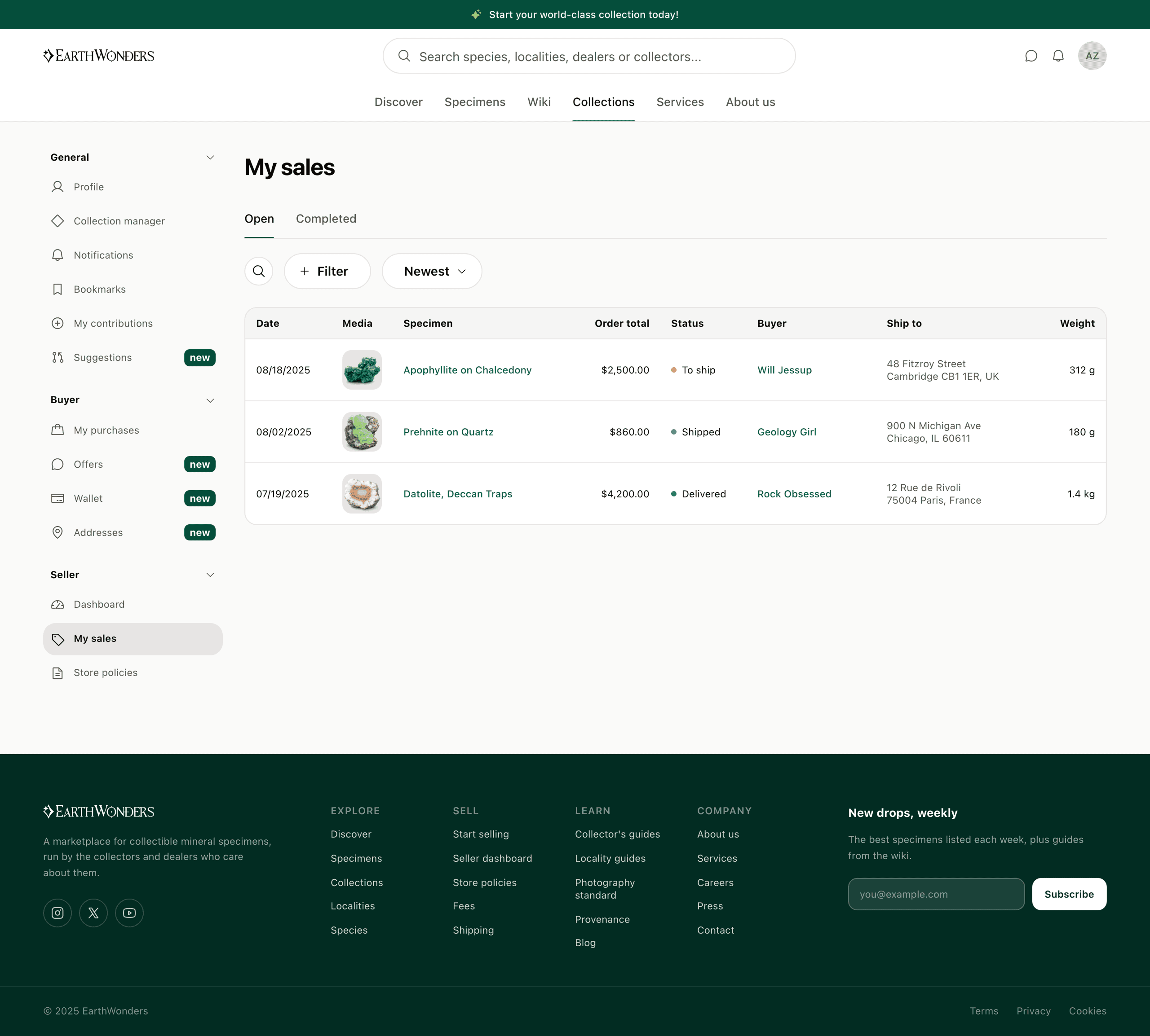
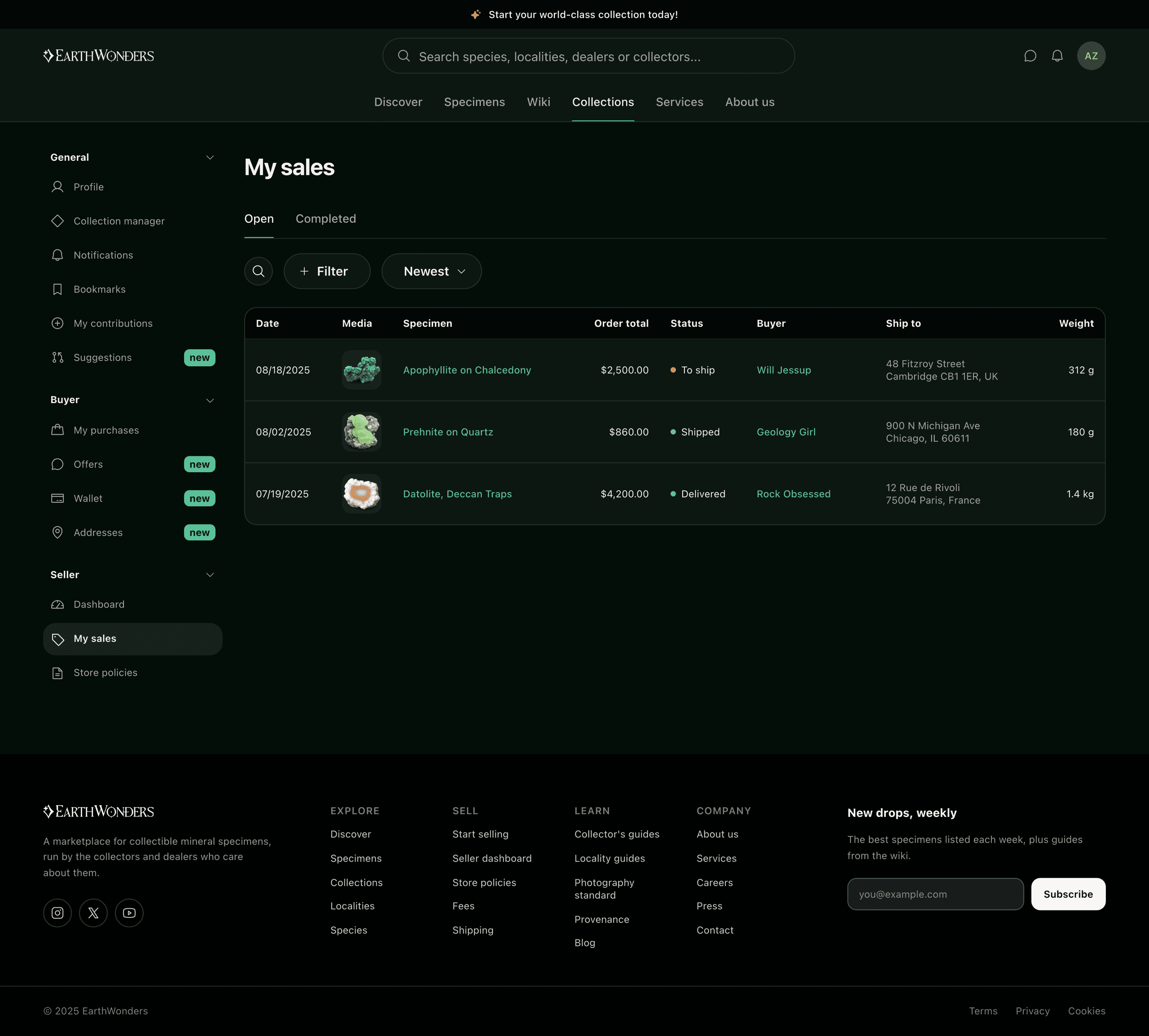
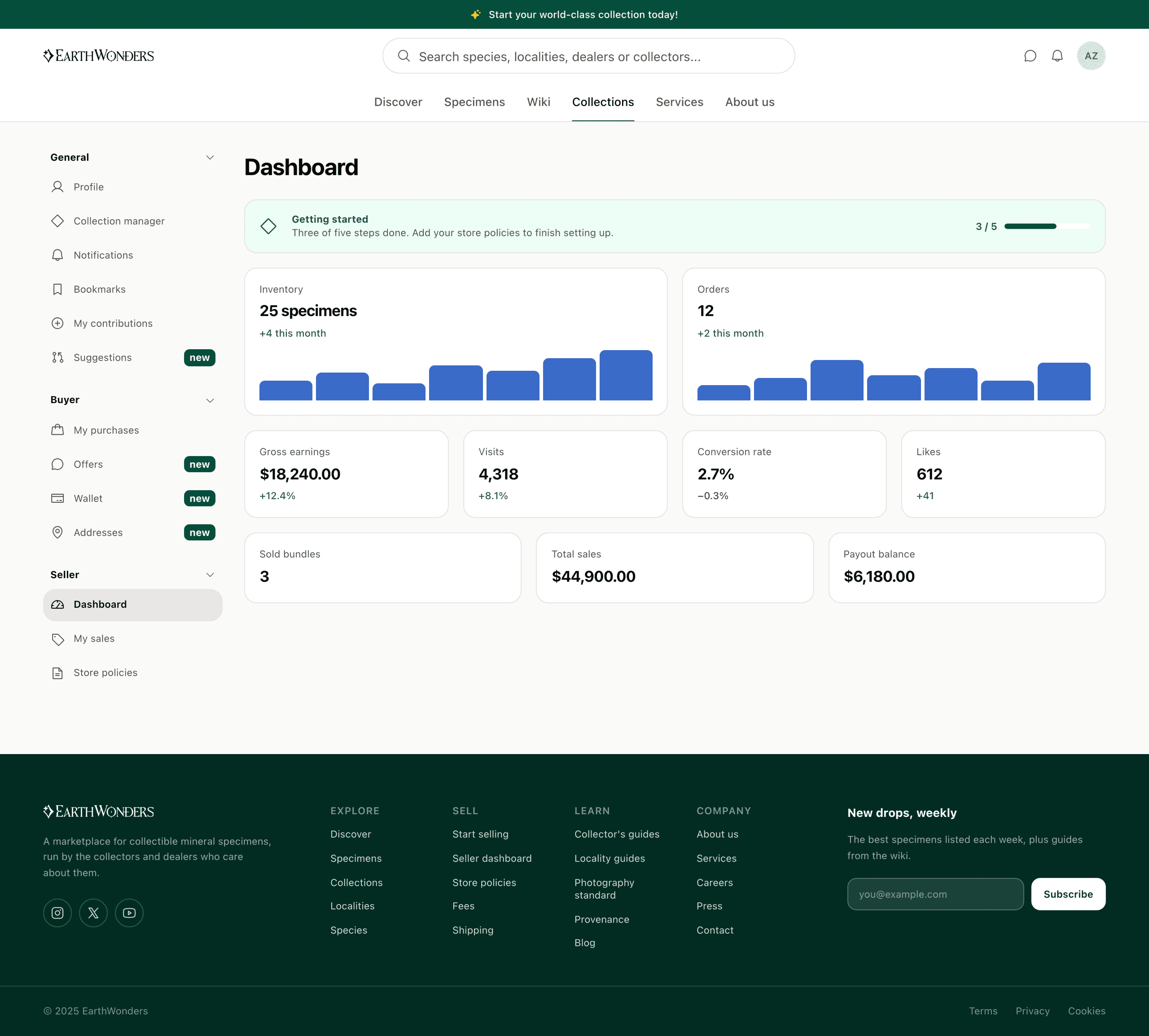
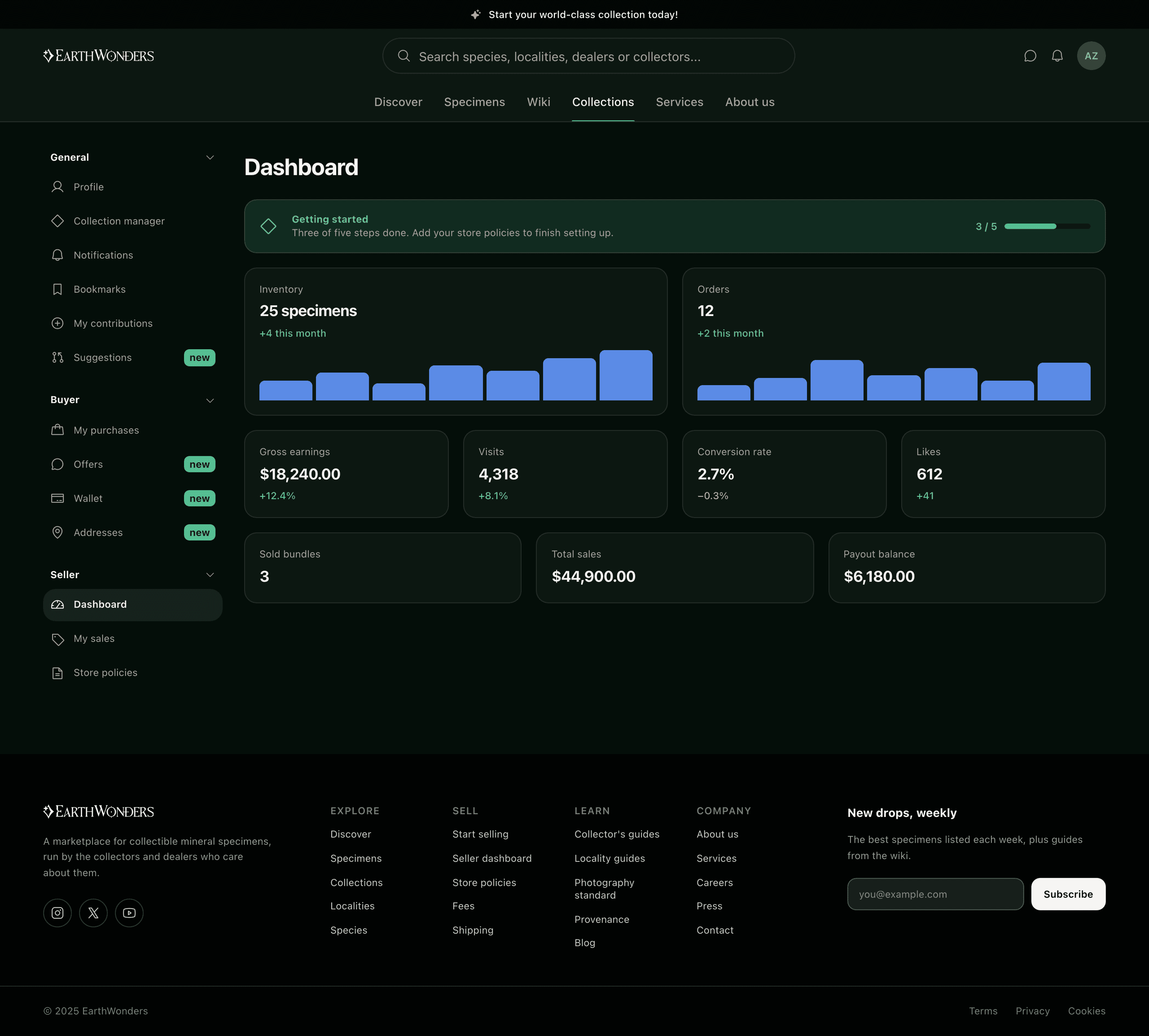
Marketplaces conventionally split buyer and seller into separate accounts, and in this community that would have been a category error: the serious buyers are dealers and the dealers are collectors, and a person's standing comes from what they hold as much as from what they sell. So there is one profile and one settings rail, grouped General, Buyer, Seller — and it never asks which of them you are. The purchases ledger and the sales ledger are the same table from opposite sides of the same transaction, which is not a saving in code so much as an argument: on this platform those are not two kinds of person.
Ownership keeps going
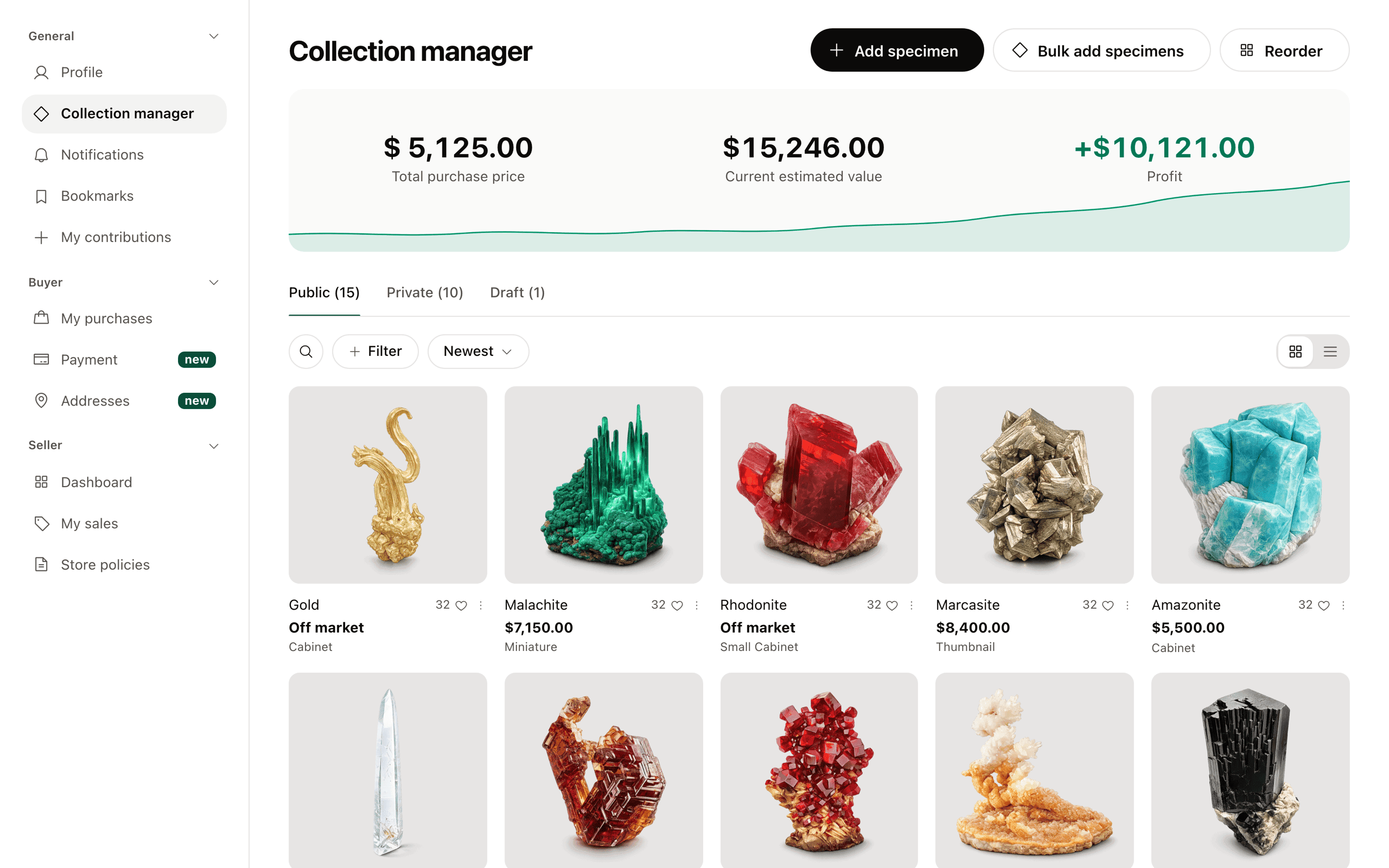
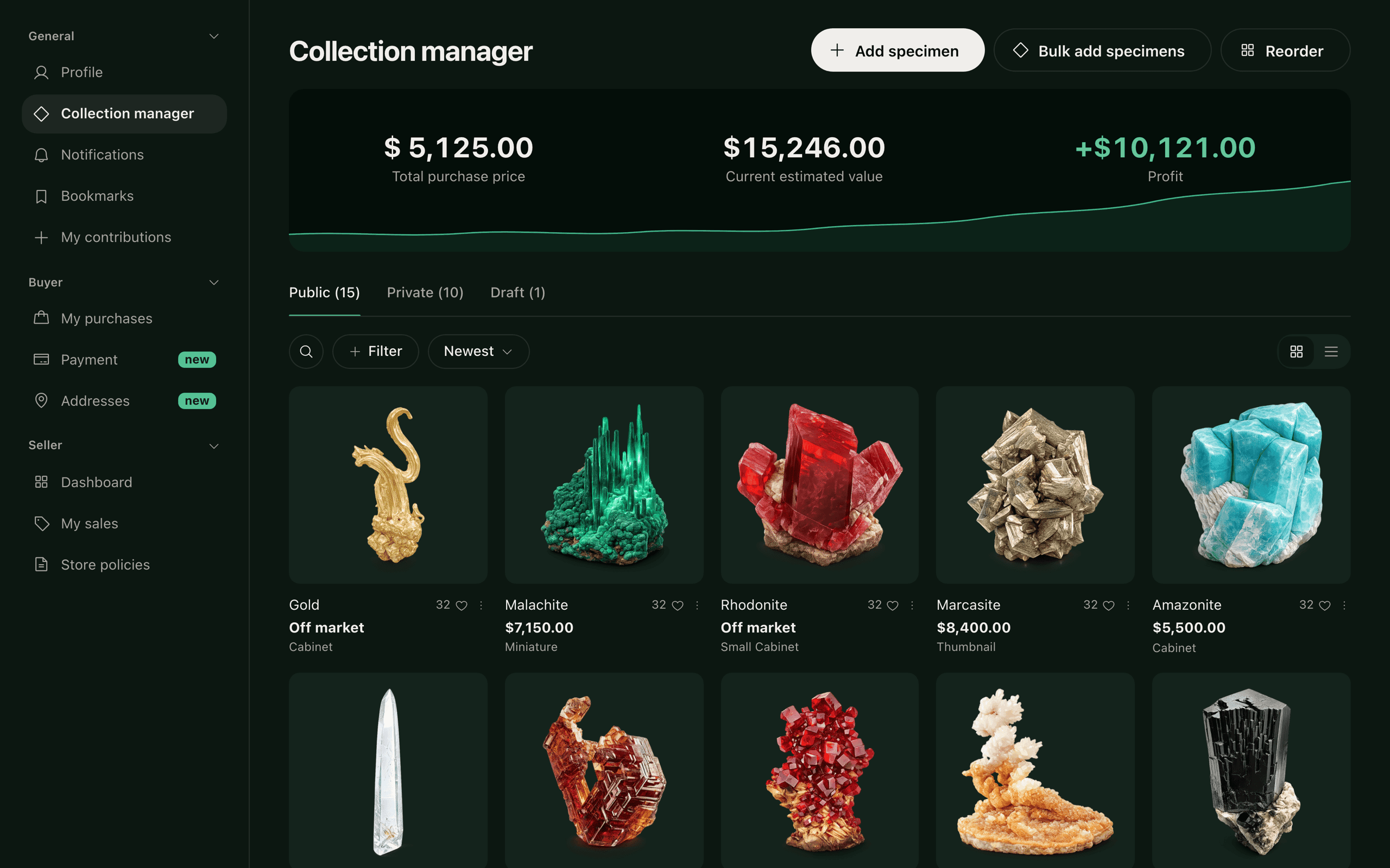
In this community a collection is a form of identity, not just inventory, so ownership doesn't end at purchase. The collection manager lets collectors organize what they hold — public, private, and draft — and track its estimated value over time, drawing on the same structured data that powers their public profile. It's the quiet half of the trust argument: what you buy here stays legible, valued, and yours.
Seeded by us, kept by them
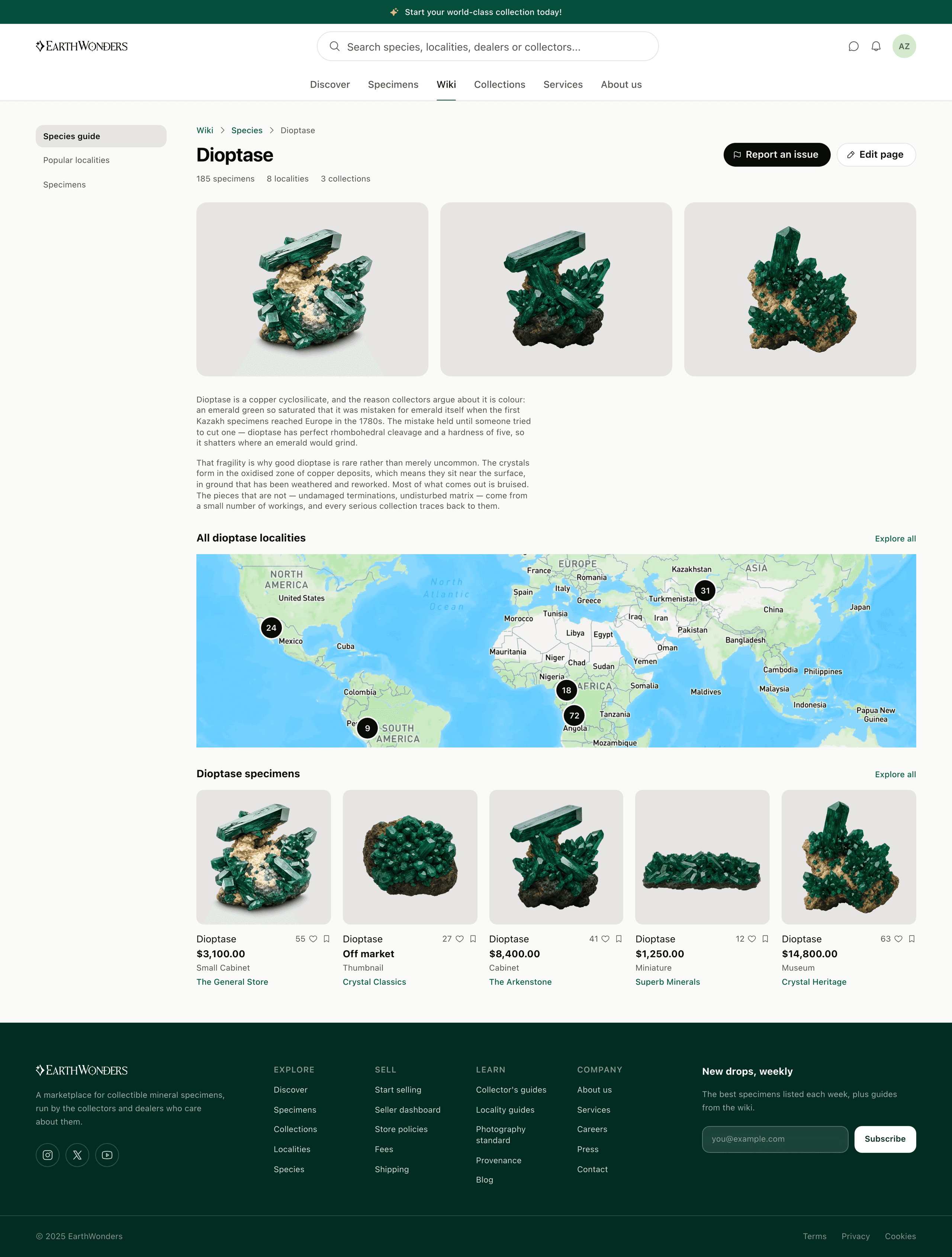
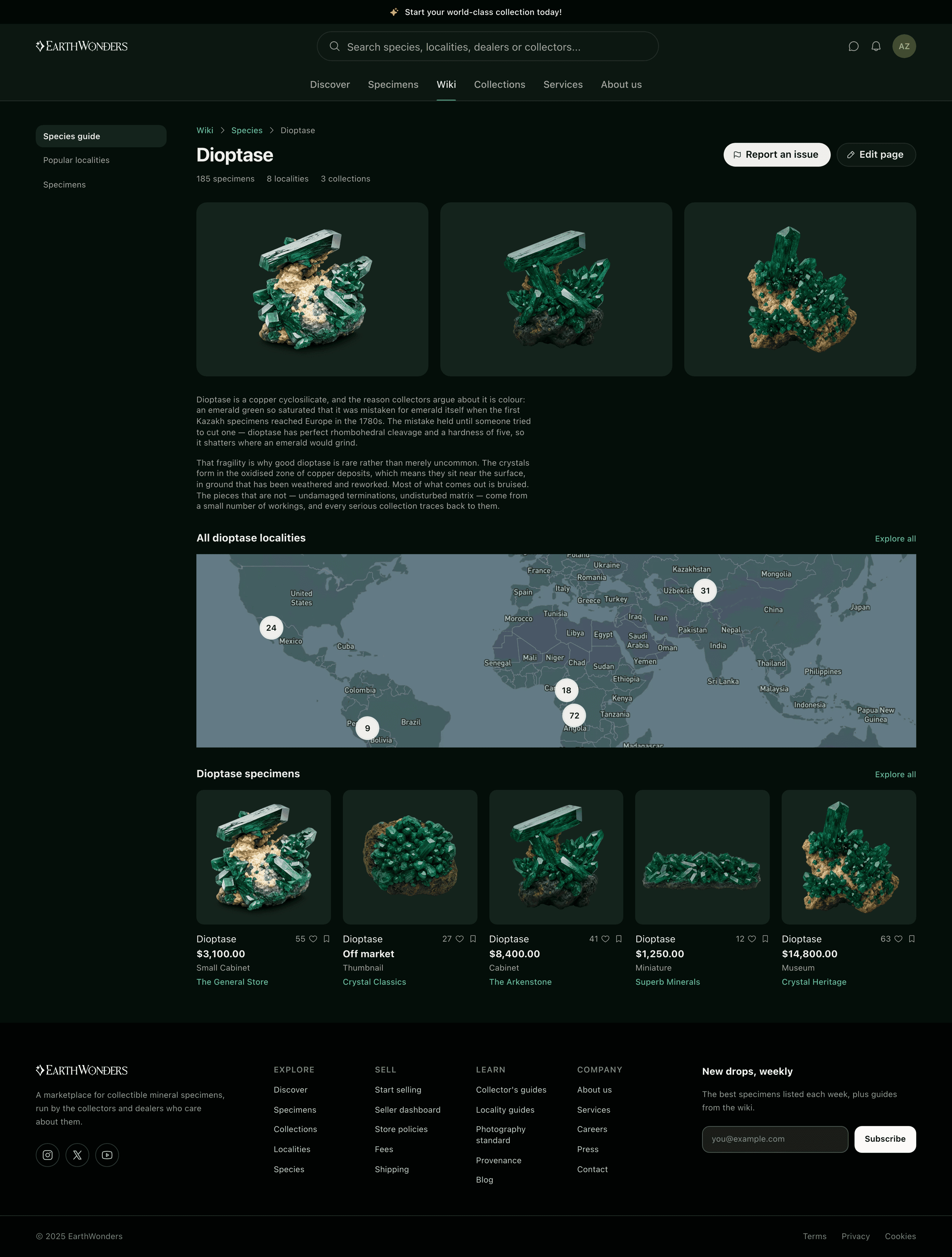
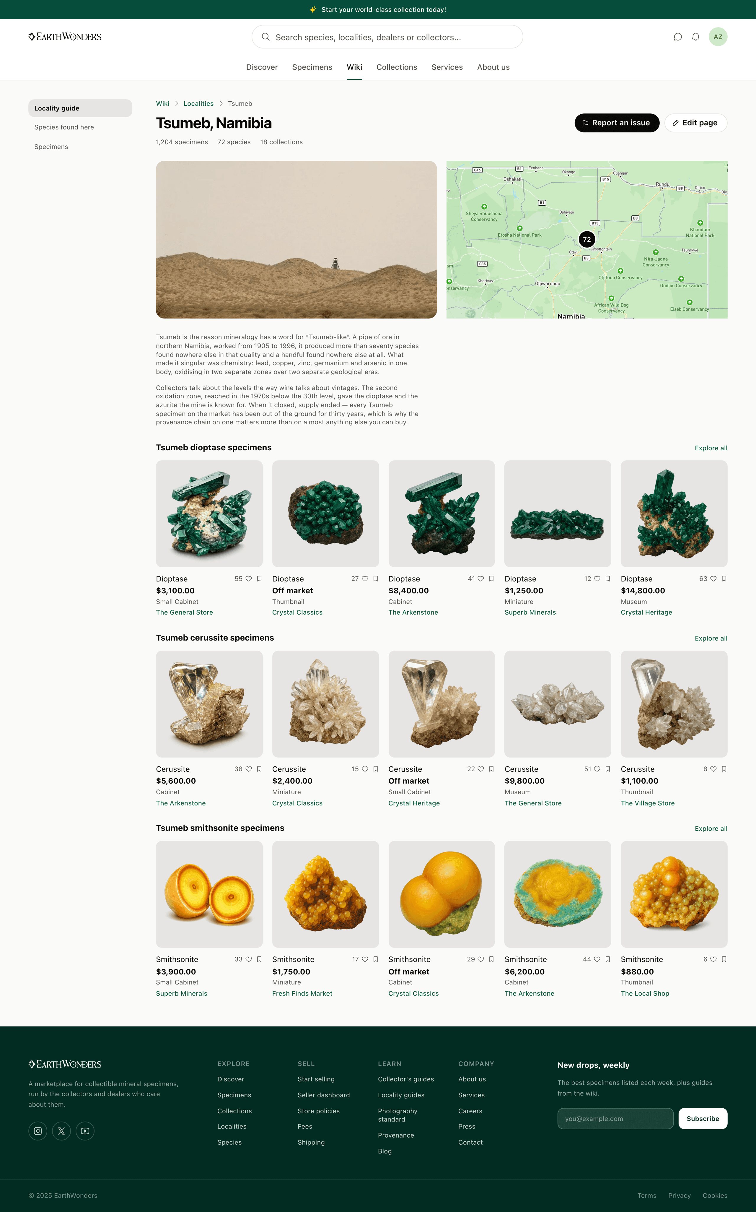
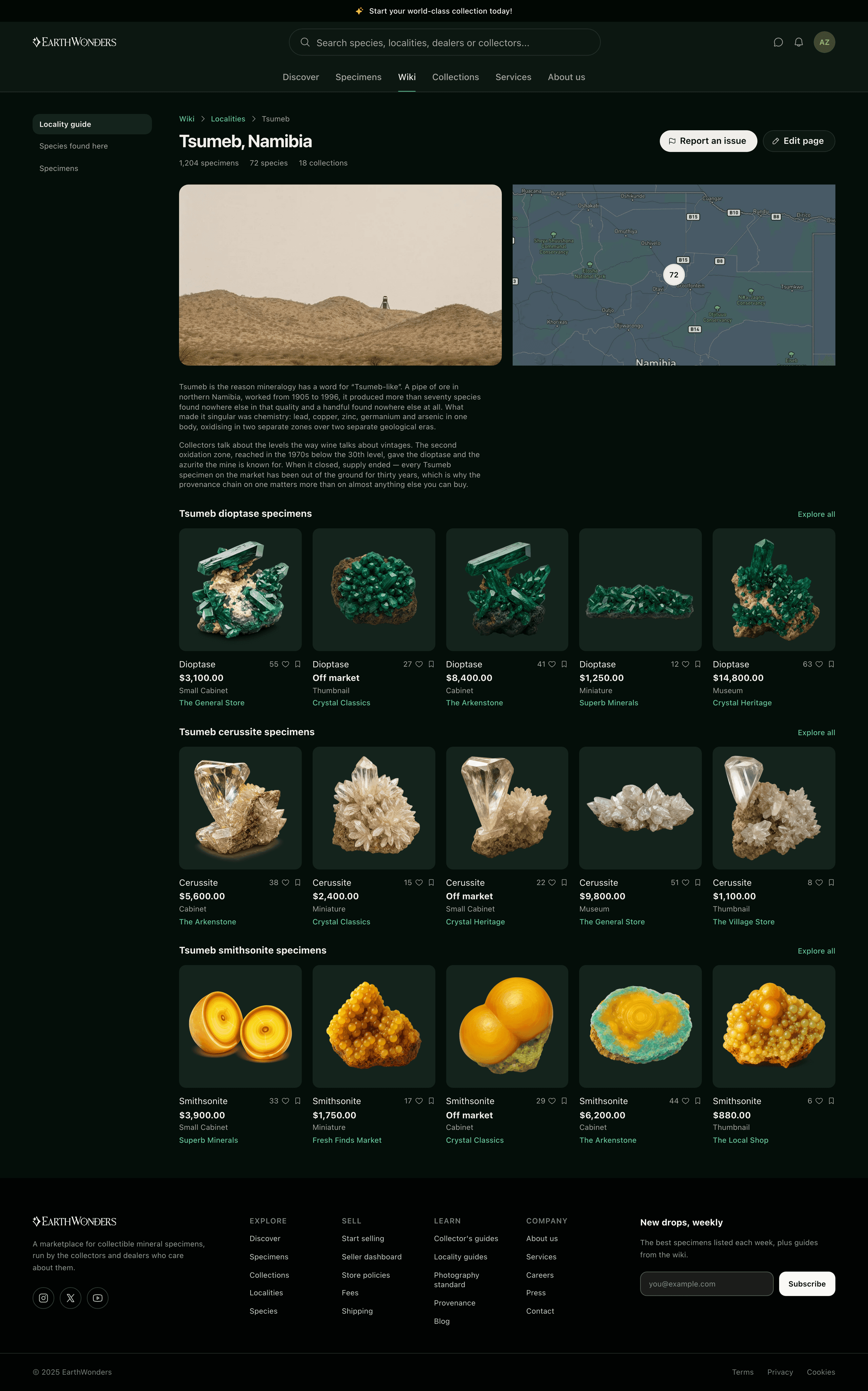
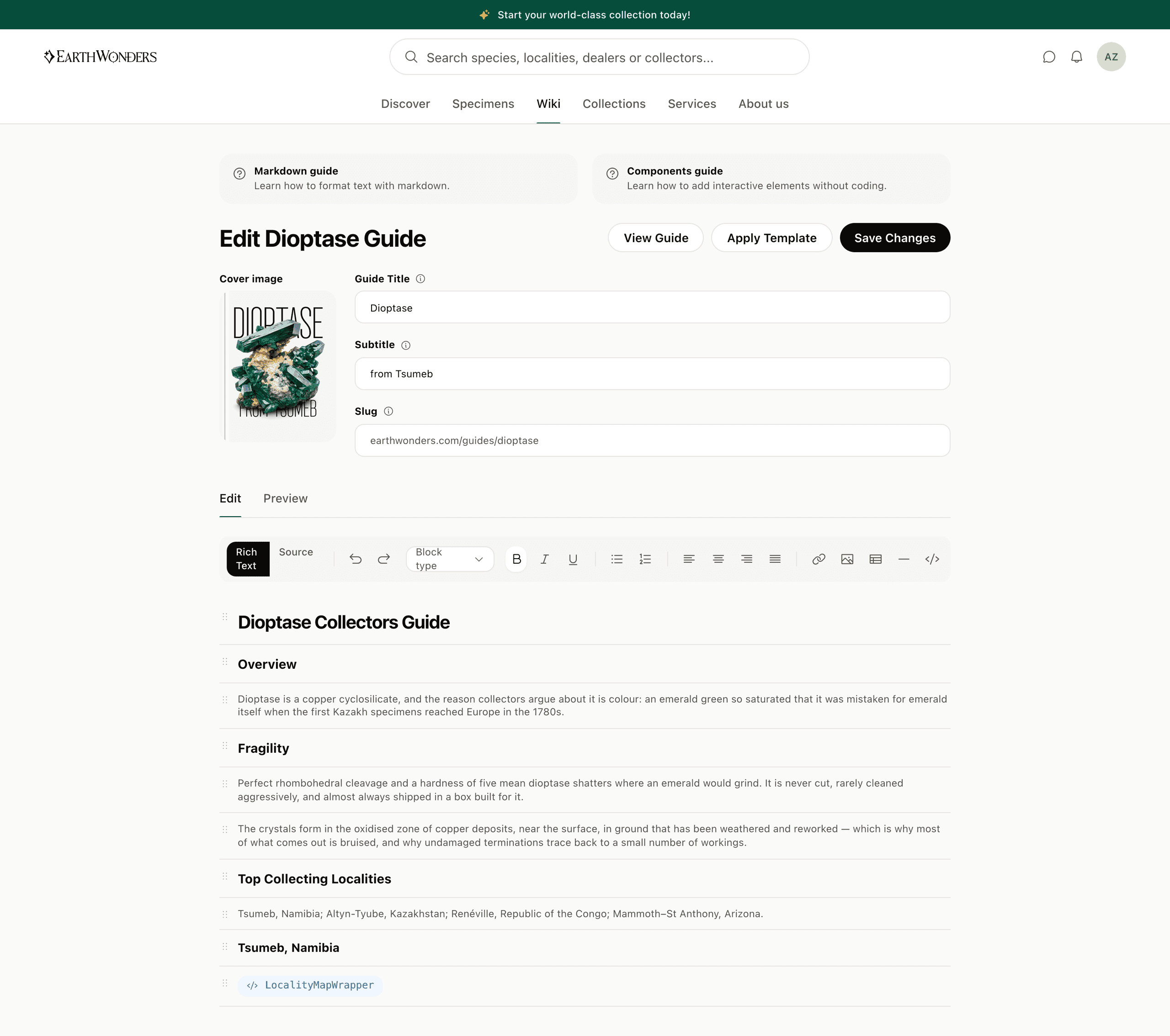
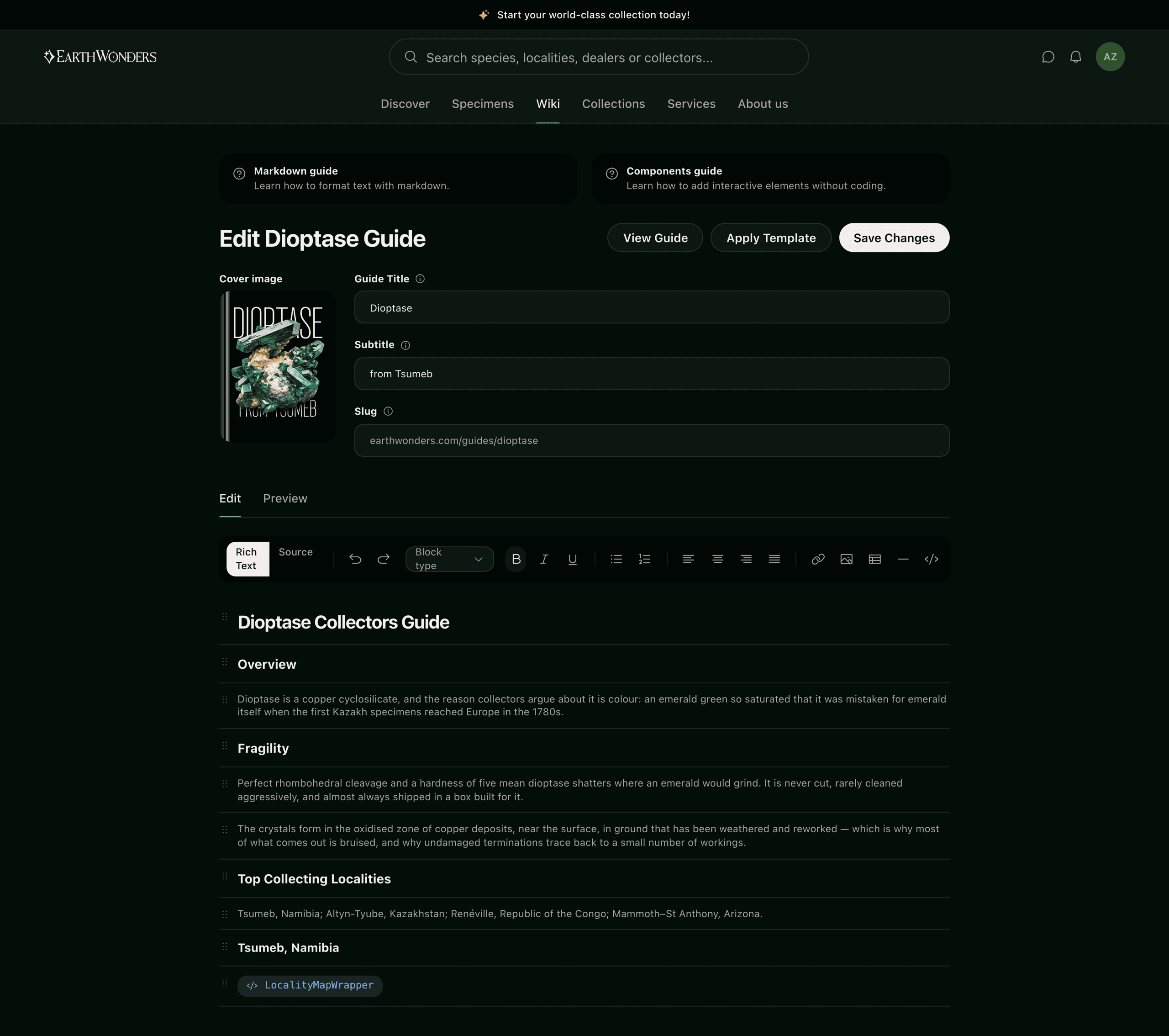
The species and locality guides were seeded with AI and then handed over, which only works if handing over is a real affordance rather than a promise. A guide page carries Report an issue and Edit page where a listing carries a price, and the editor behind them is a proper one: blocks you can reorder, an MDX source view for the people who would rather type it, a live preview, and components a contributor can drop in without knowing what a component is. The guides are also the part of the product that is not a marketplace — the reason a collector visits on a day they are not buying anything, which is the difference between a shop and a place.
A mark that behaves like the thing it sells
The identity is a drawn logotype — a crystal-and-sparkle mark, a barred O, a hooked D — finished in a metal that catches at the top and sinks into the field at the foot. It is doing the same job the photography standard does: signalling that this is a catalogue and not a listings site. The same argument runs off the screen. The retail concept puts four cases in a twelve-foot square, each with one specimen under glass on a stone pillar, and a screen in the pillar showing that specimen's record — the object and the provenance behind it presented as the same product, which is the whole thesis with the software taken away.



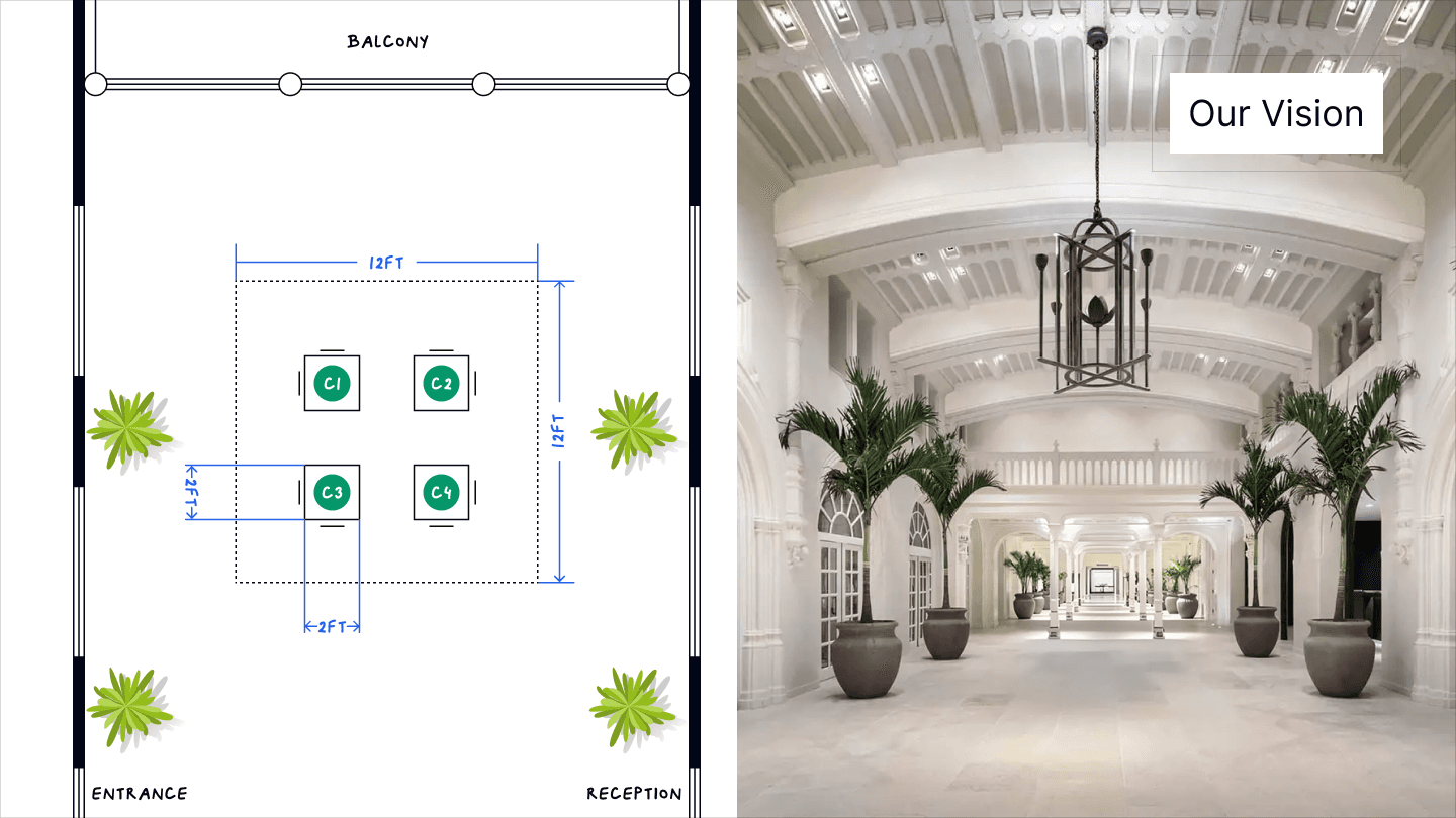
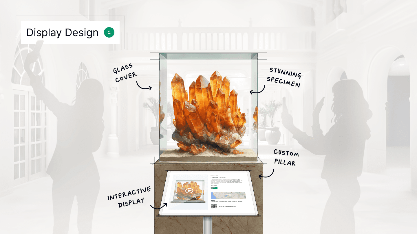
The retail concept as it was presented: four cases in a twelve-foot square, and one of them drawn out — specimen under glass, record in the pillar.
The system underneath all of it
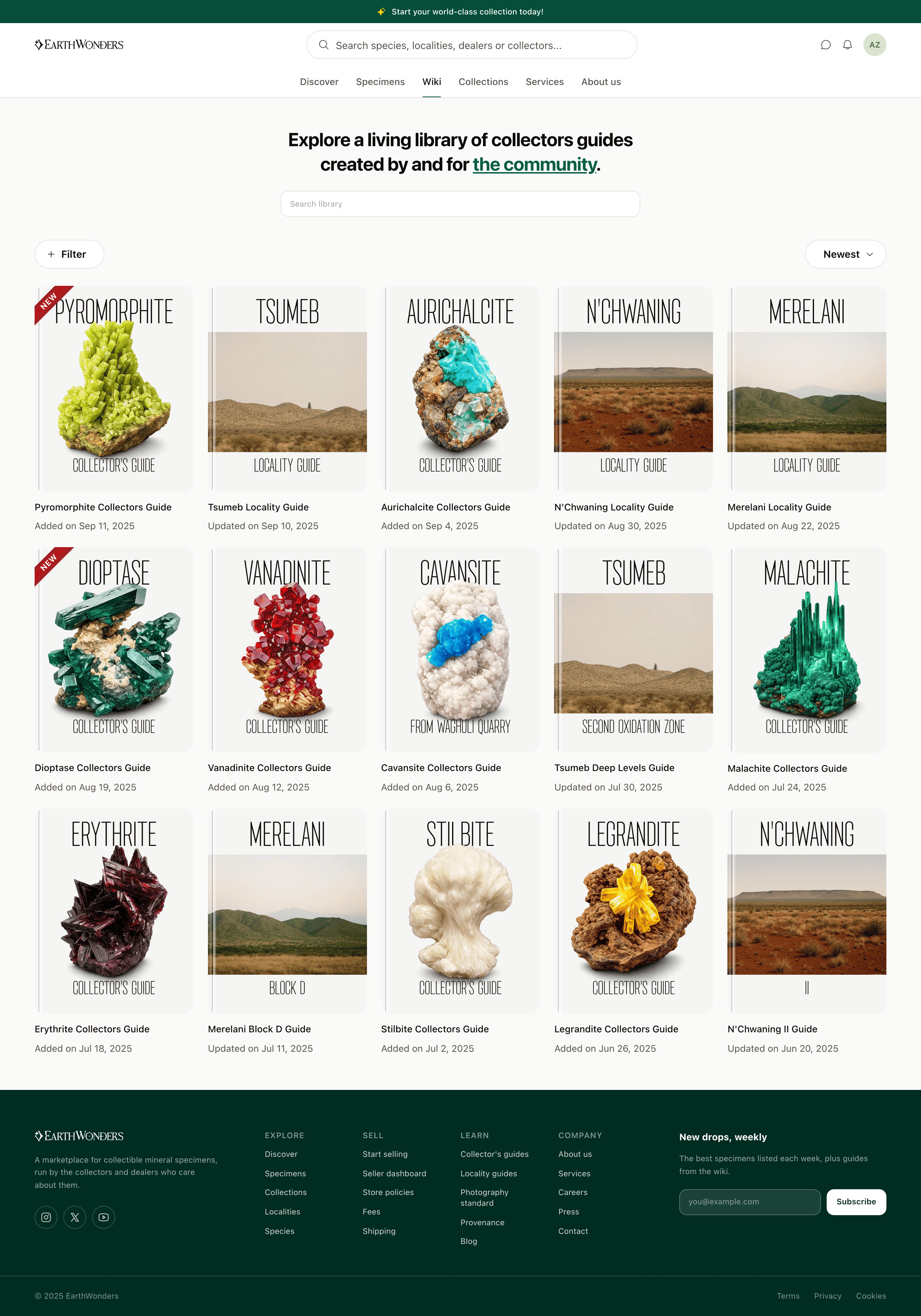
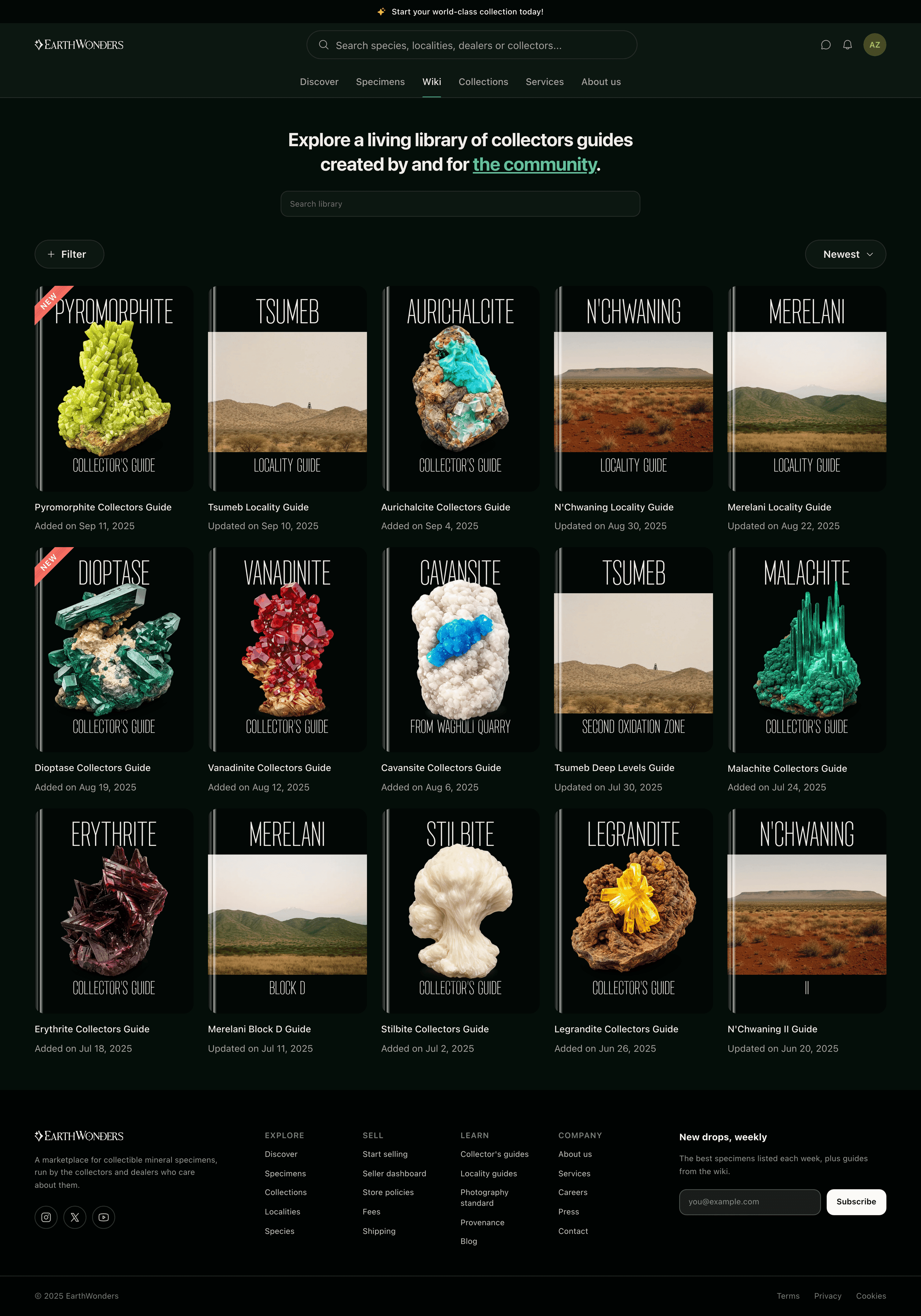
A component library went up before feature work scaled, and the reason was not tidiness. A marketplace this image-heavy comes apart when screens start choosing colours for themselves: every card is already carrying a photograph that wants to be the loudest thing on the page, and an interface that varies underneath them reads as noise rather than as chrome. So the palette is a list of roles and not a list of greens — a screen asks for the page ground, or the brand fill, or the band that frames the page, and the brand decides what those resolve to. The type scale is split the same way, a serif for what the catalogue says in its own voice and the system sans for what the interface says on the product’s behalf. The three boards below are not exports of that system. They are rendered from it, on the same tokens as every other screen here, which is why they follow you into dark mode and why they cannot quietly go out of date.
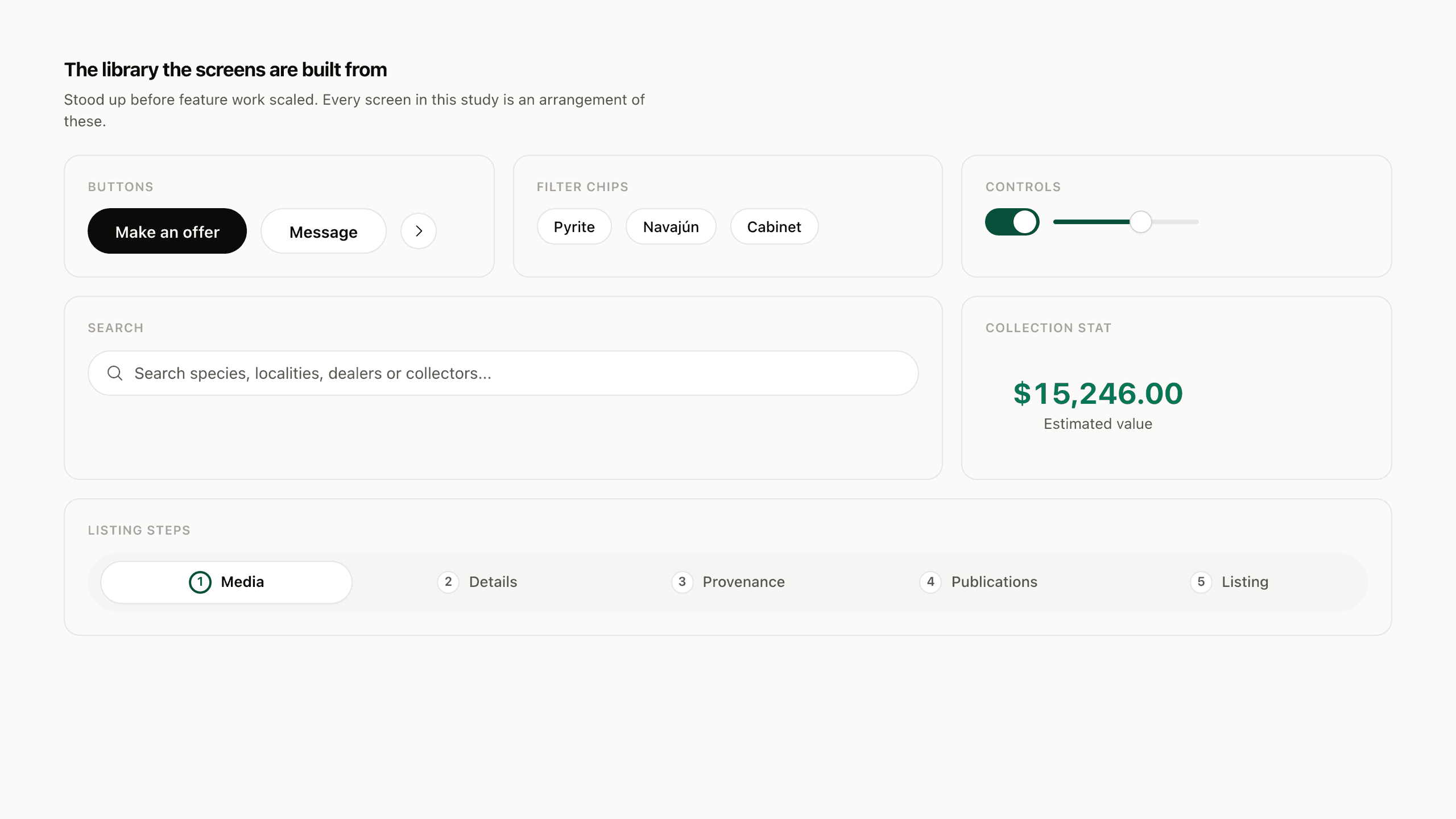
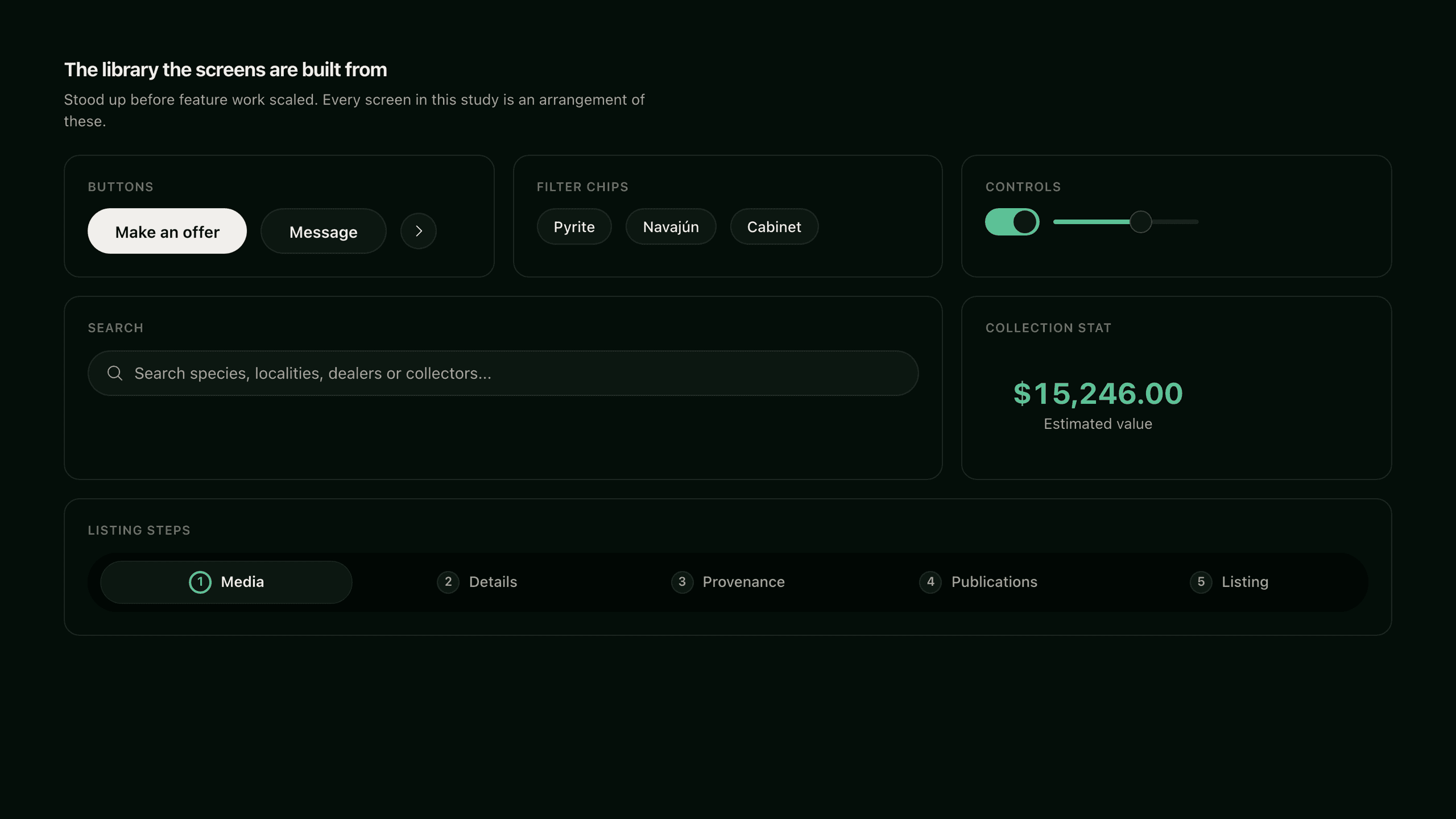
Fig. 01The library every screen here is an arrangement of.
What shipped
Shipped the MVP in six months: 84 dealers and collectors onboarded, 83,000+ specimens listed.
Seeded the marketplace by mirroring dealers' public catalogs, so sellers arrived to a storefront that was already populated.
Unified buyer and seller into a single profile holding listings, collection, and ownership history.
Added provenance — prior ownership, locality, and publication history — which the category had lacked.
Brought filter iteration down from months to days by prototyping in code and shipping directly.
Seeded the species and locality guides with AI; the community now maintains them.
Selected decisions
- 01
Grew supply dealers-first, using scrapers to mirror public inventory before onboarding.
- 02
Chose one unified profile over the conventional separate buyer and seller accounts.
- 03
Rebuilt the listing form as a five-step flow that opens with photography.
- 04
Set photography standards for every listing and produced the reference set firsthand.
- 05
Designed provenance as a structured record rather than a free-text field.
- 06
Forked the listing flow on ownership, so a contributor can record what they know about a specimen they don't own.
- 07
Auto-tagged specimen color from listing photos to power a visual discovery view.
- 08
Stood up a Storybook component library before scaling feature work.
- 09
Put PayPal above the checkout form rather than beside it — an alternative to the whole form, not to one field.