Modernizing an enterprise platform that can never stop running


BlackLine runs the financial close for large enterprises — dense, deadline-driven work reconciling accounts and certifying the numbers. Years of accreted frontend had left it a patchwork of inconsistent UI and aging components, slowing work that was already heavy.
The close never stops, so the product couldn't be rebuilt in one move. The work was to modernize it and migrate the frontend to React without disrupting the reconciliation workflows finance teams depend on — and a design system, Pantheon, was the lever that made that possible.
Role
I led design for the redesign and migration alongside two other designers — defining the component system and the plan for moving complex, data-dense screens onto React, high-traffic surfaces first, in close partnership with engineering.
Four levels of the close — dashboard, tasks, grid, line item — had to read as one interface.
What the redesign looks like from the top of the close down to a single account.
From the close down to a line item
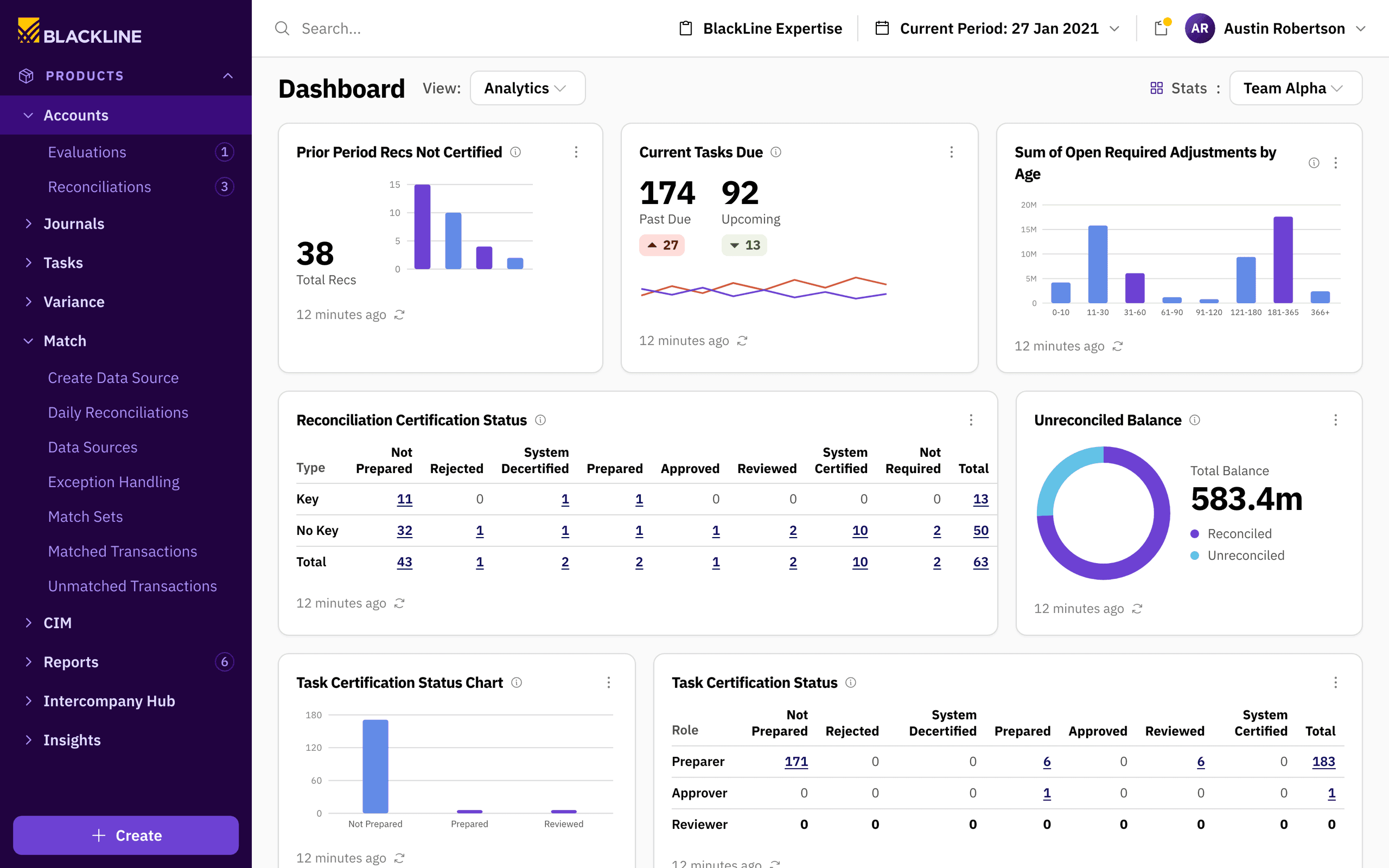
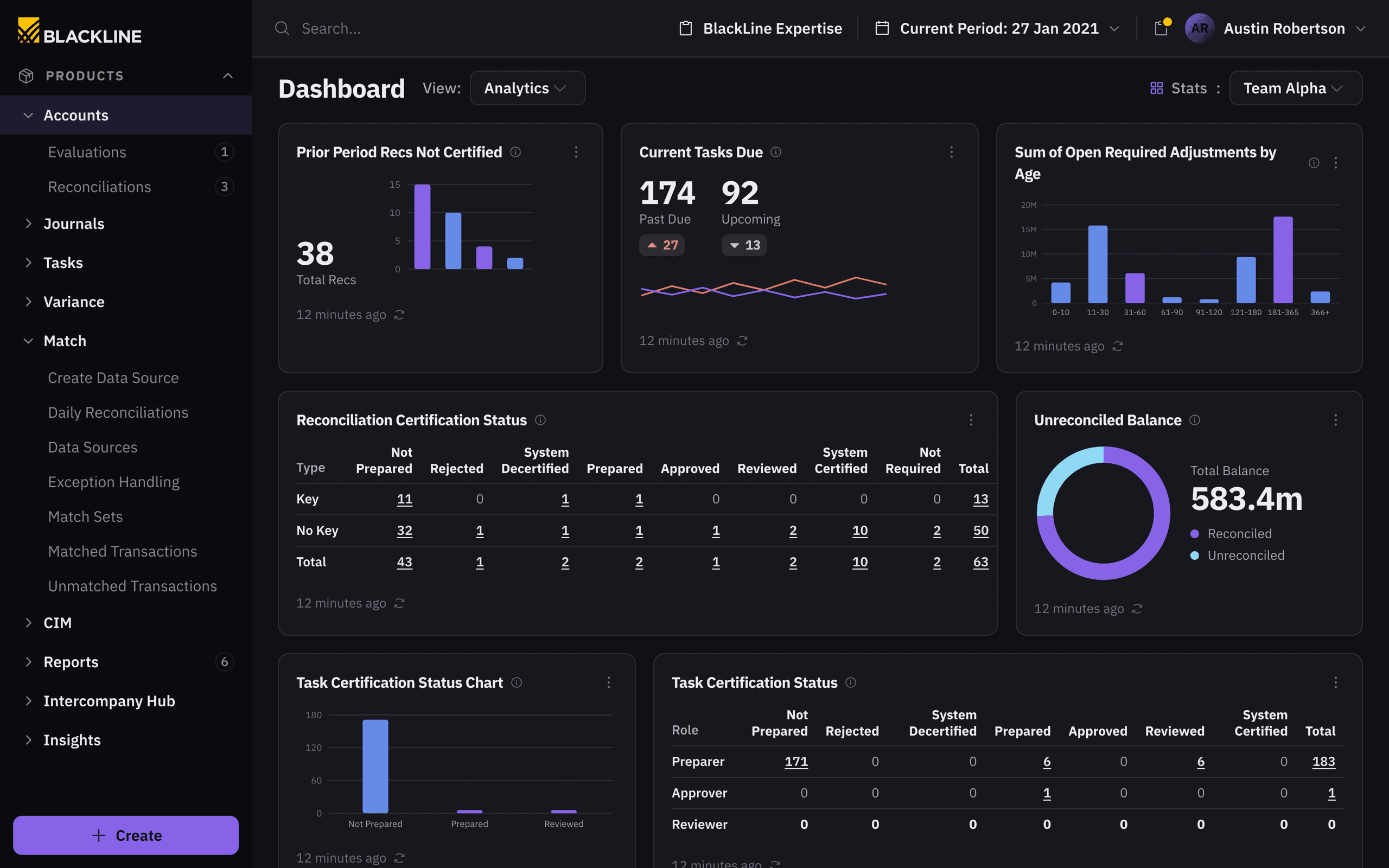
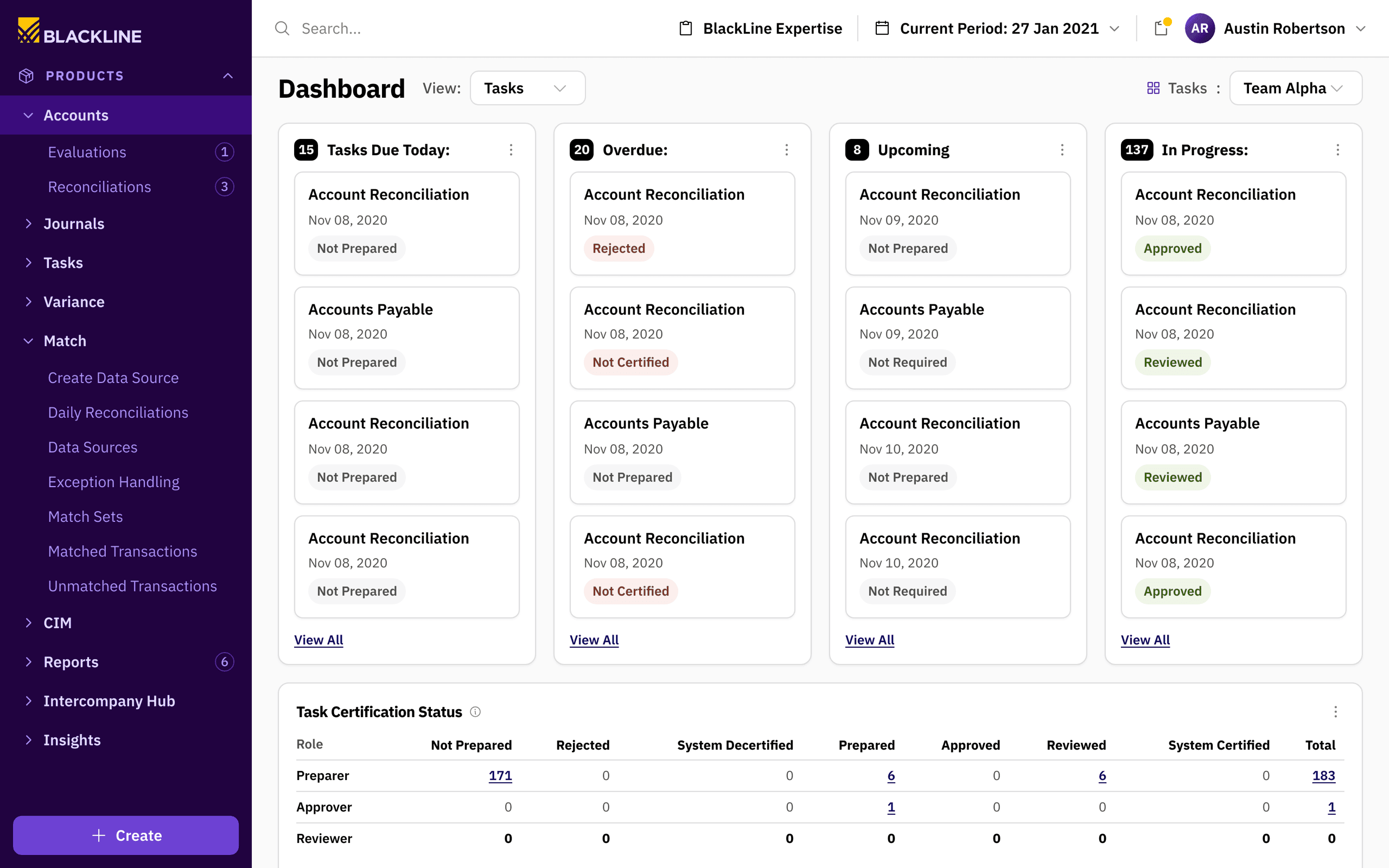
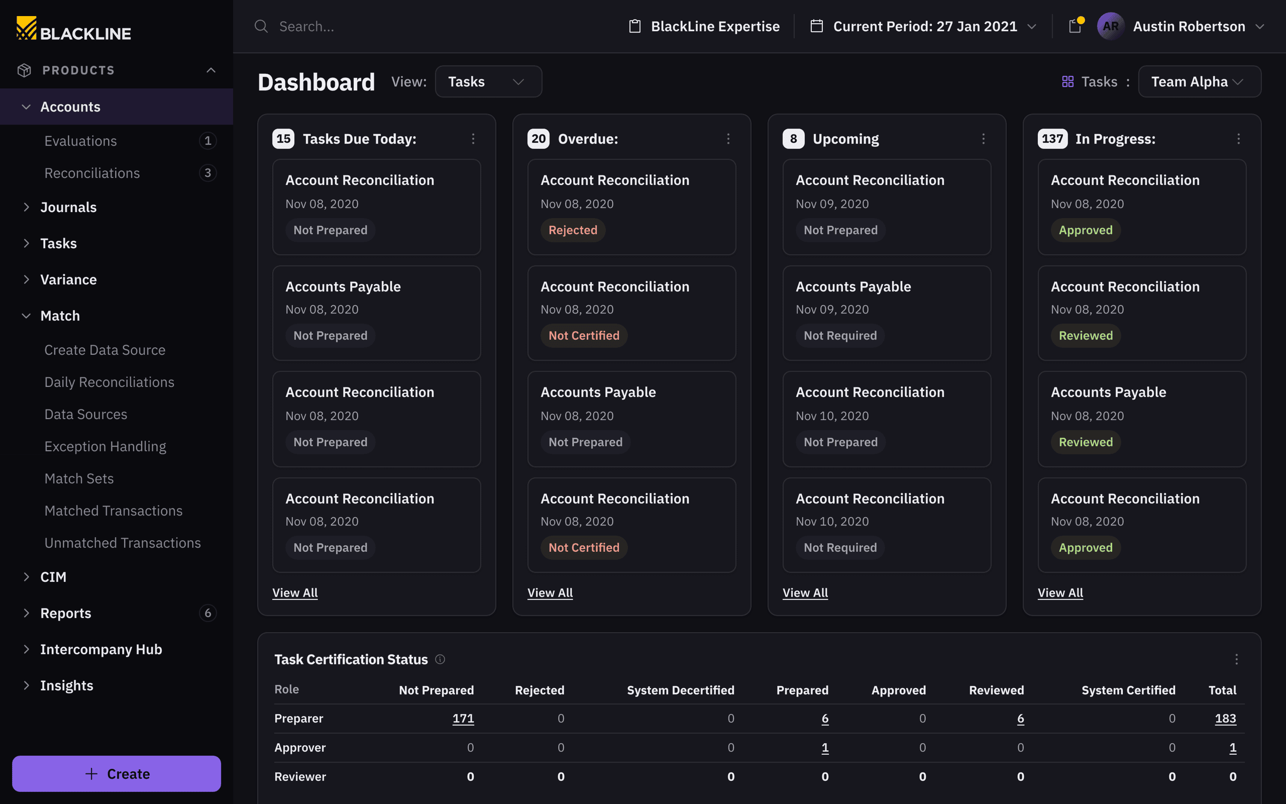
The redesign holds together as one path. The dashboard reads the close at a glance; the task view splits it by who owes what; the reconciliation grid holds the accounts themselves; and a single line item opens into a form built for the data it actually carries. Every level uses the same components, so drilling down never means relearning the interface.
A dashboard about what is owed
Financial close is high-stakes work done against a hard deadline, and the legacy interface had grown inconsistent enough to get in its way. The redesign reorganized the dashboard around the work a user actually owes — what's due, what's overdue, what's in progress — with the preparer, approver, and reviewer states that govern the close made explicit, and every count a link into the records behind it.
The hardest surfaces are the data-dense ones, and the constraint was to modernize them without changing how the close gets done.
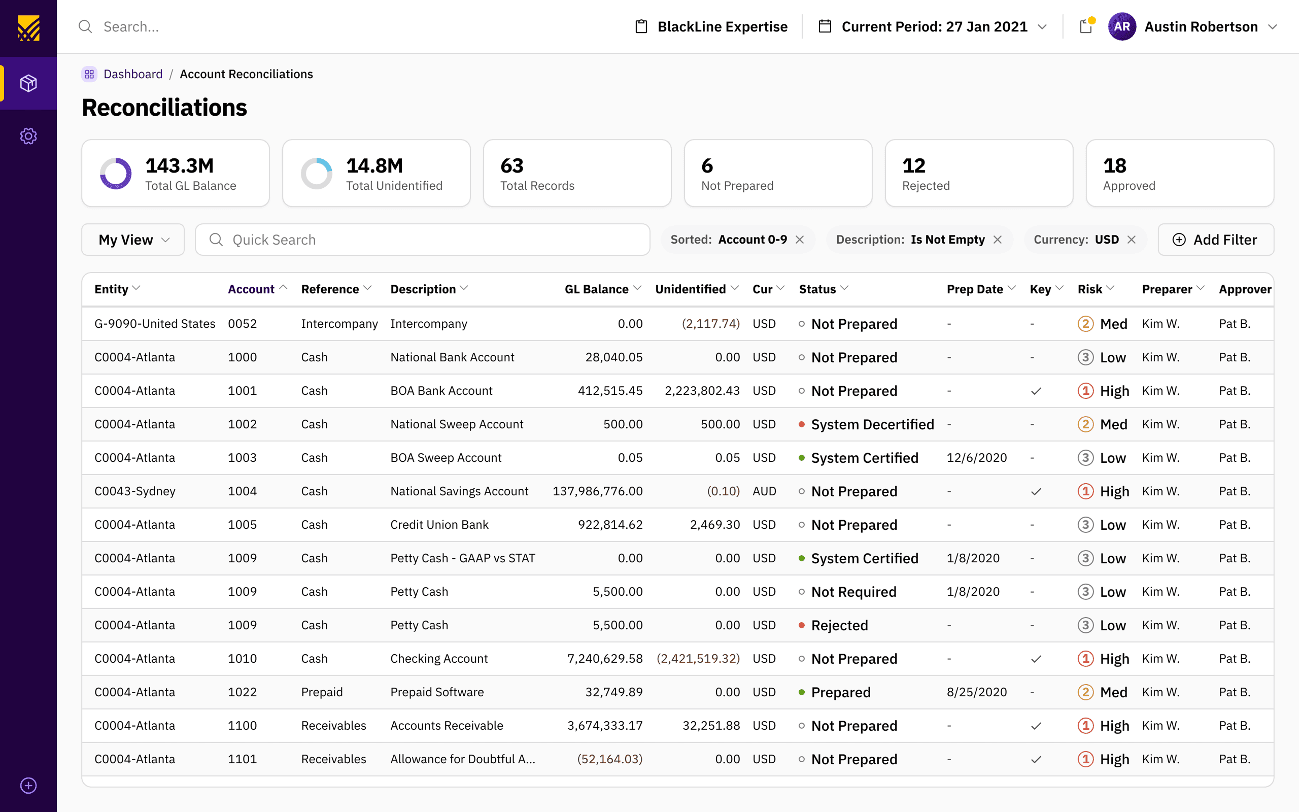
Density is the point
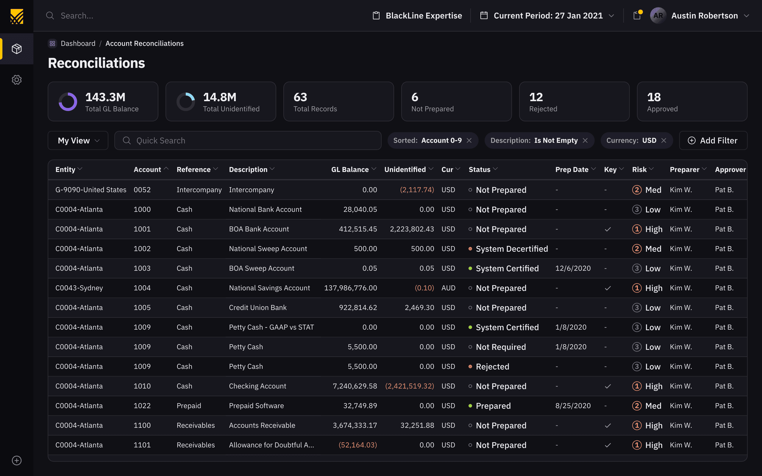
The hardest surfaces are the data-dense ones. Reconciliation grids carry amounts, accounts, transaction dates, statuses, and risk all at once, so the work was a consistent, scannable set of patterns for that volume — a strict status language, tabular numerals, negative balances that read at a glance — enough structure to read it quickly without burying the task inside it.
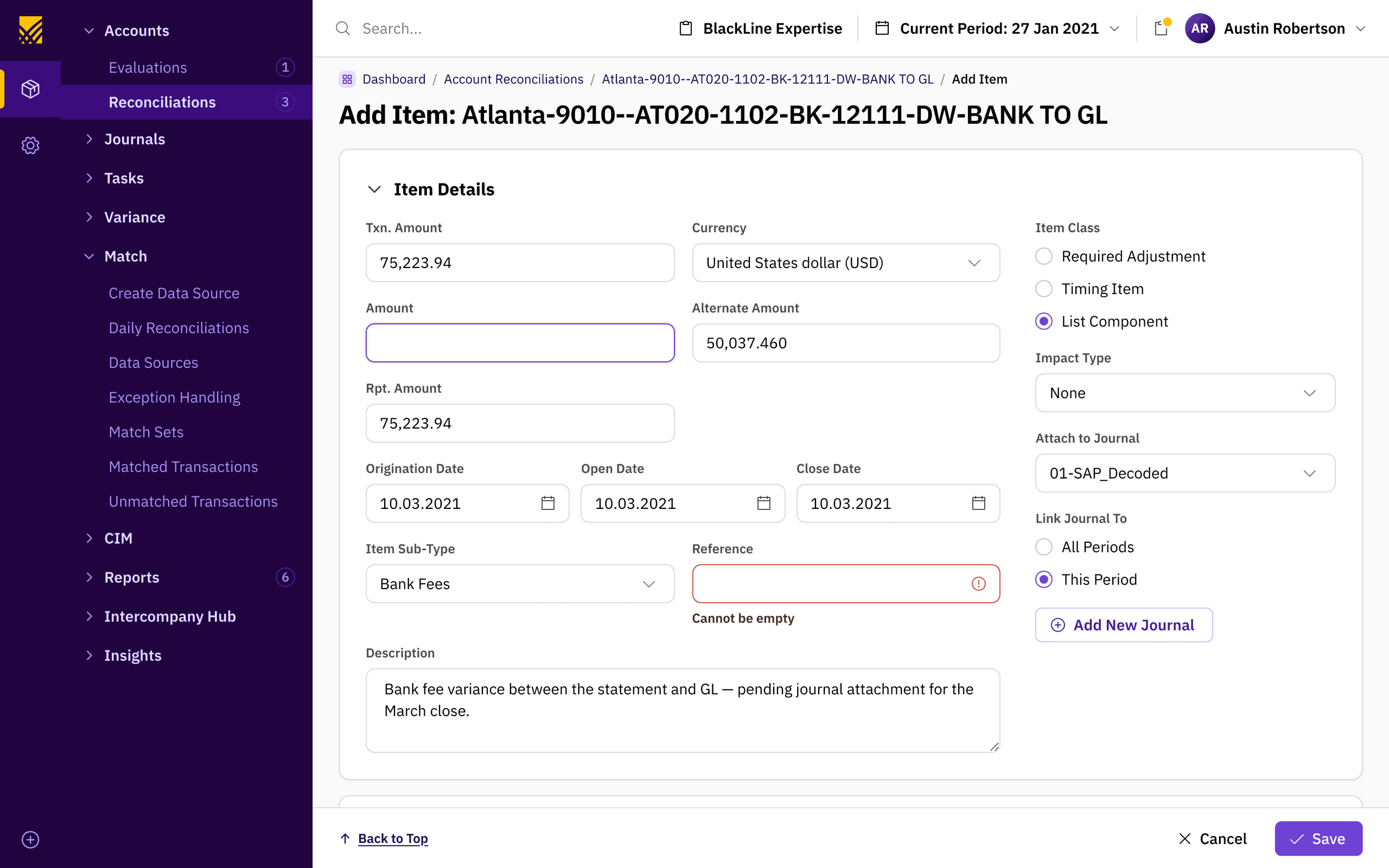
Modern surface, familiar workflow
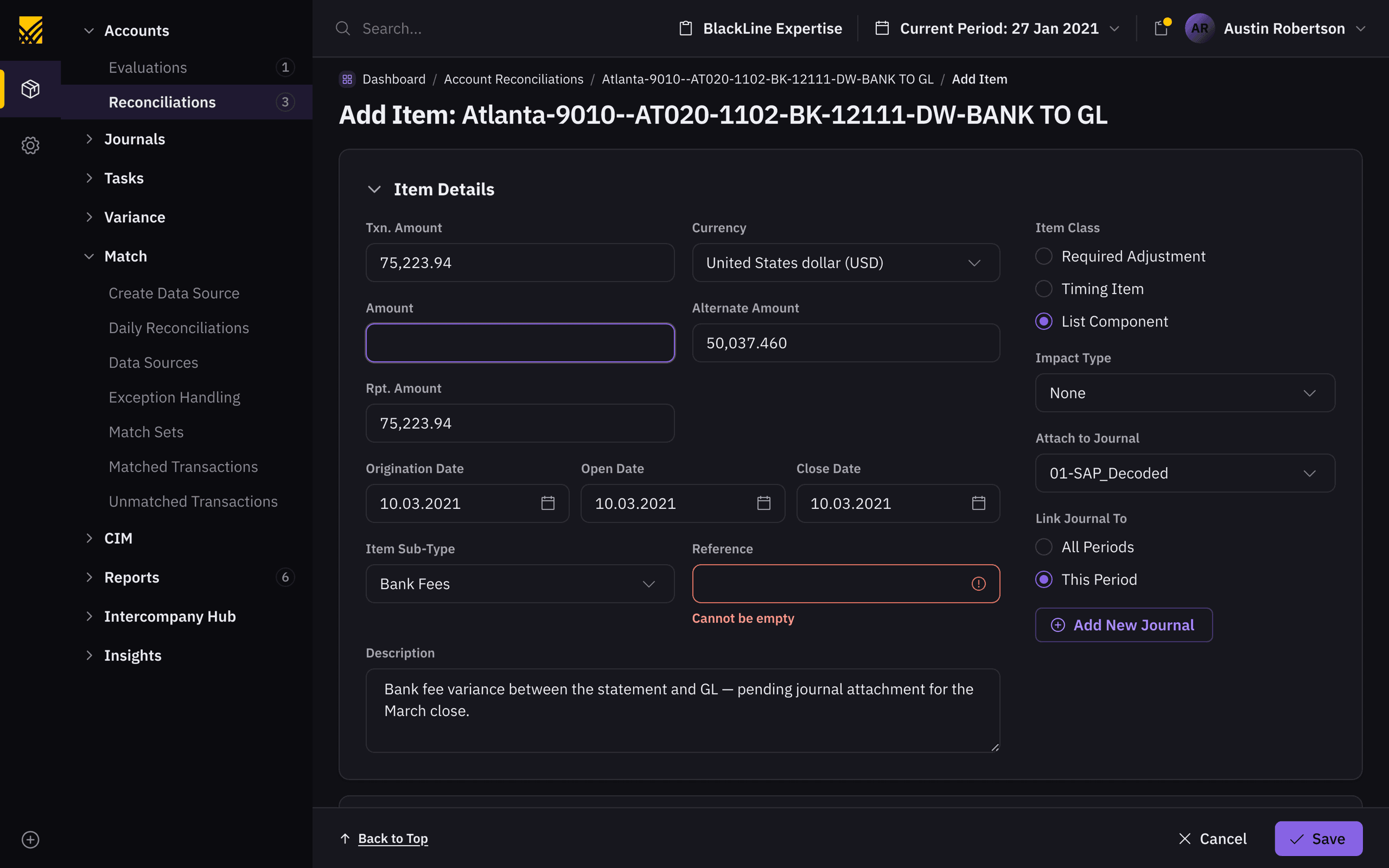
Complex inputs were rebuilt to handle the real shape of the data while keeping the workflow intact. These are screens people live in all day, so the constraint was to modernize the surface — clearer fields, honest validation, one visual language — without forcing anyone to relearn how the close gets done.
Underneath the screens is a documented system: one anatomy, one palette, one status vocabulary, one type ramp, one grid.
Layout, colour, state and type, each specified so a sprawling UI could converge.
One anatomy, inherited by every page
Before any of the colour or type, the system fixes where things go. Navigation, global header, page header, body, and a sticky action bar — the same anatomy on every screen, which is why the dashboard, the grid and this form read as one application rather than three. Pantheon documents a page footer too; this screen gives that space to the action bar instead. Hover a region to place it.
Six page regions.
One palette, and what each step is for
The system is named Pantheon, and this is its colour, at full ramp. The discipline isn't the hues — it's that every step has exactly one job, so a status green can never quietly become a chart green. Pick any swatch to see the token and what it drives across the product.
A strict status language
The close runs on state: prepared, approved, rejected, past due. A reconciliation grid can carry two hundred rows of it, so the system spends one shape on the whole vocabulary and lets colour do the rest of the work. Scanning becomes a matter of hue, not of reading.
Five semantics, one shape. Pantheon runs “success” as a lime rather than the usual green — a small thing that keeps certified rows distinct from the money.
Every state, documented
Pantheon specifies buttons and fields as full state matrices — default, hover, pressed, focused, disabled, error — which is what stops a large team drifting. The best idea in it is that focus and error are the same three-pixel ring in two hues: one gesture, two meanings. These are real controls, so it's worth hovering them, or tabbing in to see the ring arrive.
Button
Field — focus and error are one ring, two hues
Three sizes carry the whole interface
IBM Plex Sans on a deliberately narrow ramp. Almost everything a user reads in the product is 16, 14 or 12 — everything larger is display. In a screen carrying fourteen columns of financial data, restraint at this level is what keeps density legible instead of merely dense.
The grid is the contract
Twelve columns stepping down to eight, four and two. This is the part of the system that lets a 1280px reconciliation table and a phone be the same product rather than two codebases — and the part that made the React migration a sequencing problem rather than a rewrite.
The component library doubled as the migration plan, which turned a rewrite into a sequencing problem.
Sequencing the migration
You can't halt the financial close to rebuild its UI. The component library doubled as the migration plan: a React set the client's engineering team could rebuild against, sequenced highest-traffic screens first, with shared tokens and patterns keeping design and code in step across the close workflow. The system was the lever; the sequence was the strategy.
What shipped
Established Pantheon, the design system, as the single source of truth for a sprawling enterprise UI.
Modernized data-heavy dashboards and forms without losing the workflows users rely on.
Planned a staged React migration — sequencing the highest-traffic screens first — and handed it to the client's engineering team to implement.
Aligned design and engineering on shared tokens and patterns so both sides built against one source of truth.
Selected decisions
- 01
Built components for the platform's hardest surfaces — reconciliation grids, journal-entry forms, and certification-status tables.
- 02
Reorganized the dashboard around the work itself: what's due, overdue, and in progress, with clear preparer, approver, and reviewer states.
- 03
Handled dense financial data — amounts, accounts, transaction dates, sub-types — with consistent, scannable patterns.
- 04
Documented Pantheon — color, type, grid, and every component in its states — so a large UI could converge on one language.